For this article, however, we will not only present you a list of fonts, but also websites who have been exceptional in using typography. We will discuss a bit of typographic details and where you can get these amazing fonts.
Don’t be afraid to mix and match like some of the examples below, you might be surprised what you can come up with. Most of all, look at the whole design and not just the pieces and how each of them fit in the puzzle.
You might also like this collection of Beautiful Advertising Typography, or these 40 Examples of Web Typography.
Your Web Designer Toolbox
Unlimited Downloads: 500,000+ Web Templates, Icon Sets, Themes & Design Assets

1. Readymag
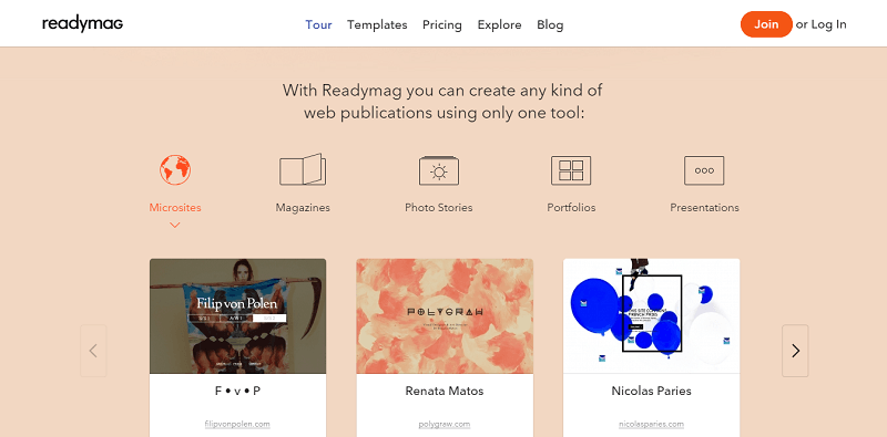
Readymag (readymag.com)
The website combined Nobel and Avenir, two similar sans-serif fonts. Combining two similar sans-serif is a big no-no in web design, but Readymag seems to know what they are doing by setting Nobel only at large sizes and using it as a display version of Avenir. It’s unusual but it works.
- Get Avenir here
- Get Nobel here
2. Few
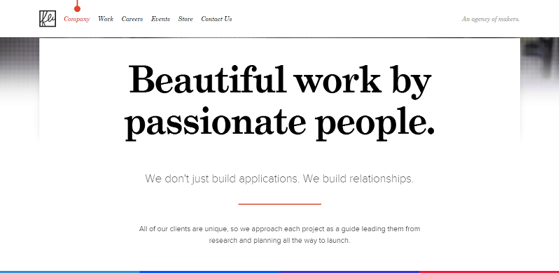
Few (few.io)
You will know right away that Few is a website made by developers by looking at its overall design. Typography-wise, they’re able to effectively combine another uncommon combination – Grad and Proxima Nova, both designed by Mark Simonson.
3. Concrete Matter
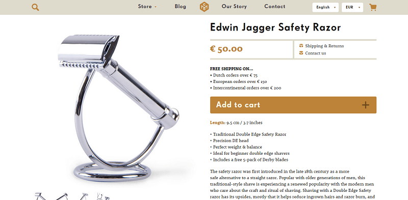
Concrete Matter (concrete-matter.com)
Concrete Matter is an Amsterdam-based online store which sells gifts for men. They have used FF Super Grotesk and the more playful Rooney for their product description creating the feel of professionalism without being overly strict.
4. Atlantic Records
Atlantic Records (atlanticrecords.com)
Atlantic Records does not just produce million-dollar music, but also have a great website. Using two common fonts, Futura and Georgia, they used and transformed them into something awesome.
5. Mr. Marcel School
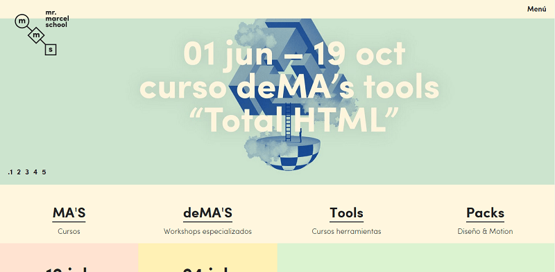
Mr Marcel School (mrmarcelschool.com)
Sofia looks like Futura on first glance, but it is less geometric and more playful on a closer look. It was used perfectly in this website which offers art classes channeling fun and precision, which is art.
6. Elena Mora
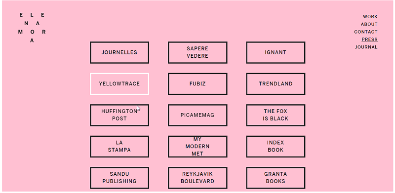
Elena Mora (elenamora.com)
This website uses only one type of font, Benton Sans, to complement its minimalist theme. It works great and speaks volumes.
- Get Benton Sans here
7. Union
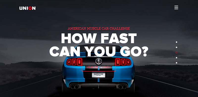
Union (union.co)
Union does it best by combining a heavyweight and a lightweight. The big, bulky Proxima Nova contrasts perfectly with the thin and small Kulturista. You don’t often see Kulturista used on the web as much as slab serifs, like Adelle, nevertheless the effect is classy and serious, like someone who means business.
8. Alexander Engzell
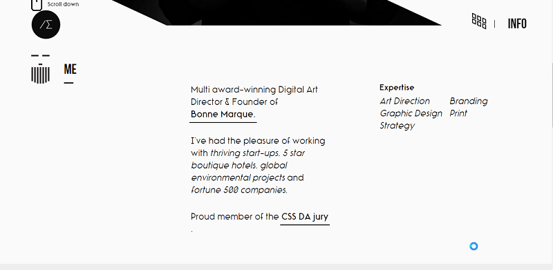
Alexander Engzell (engzell.me)
Alexander Engzell uses Rimouski, a rounded geometric font, for his personal portfolio. The strangely slanted characters reflect his creativity without going overboard. Set on a minimalist theme, it looks clean, creative, and professional.
9. Think Blink
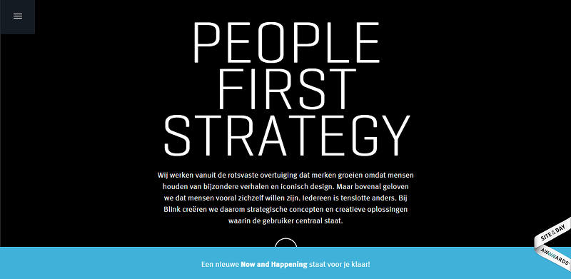
Think Blink (thinkblink.nl)
On first glance, it looks like Think Blink used Neuron Angled, but you will see a more squarish sans-serif typeface on closer look. Set on a black background, the company’s tagline become more noticeable combining Pancetta Pro, which has a semi-closed aperture and pillow-shaped terminals, and Acto to convey their dedication to that motto.
10. Dishoom
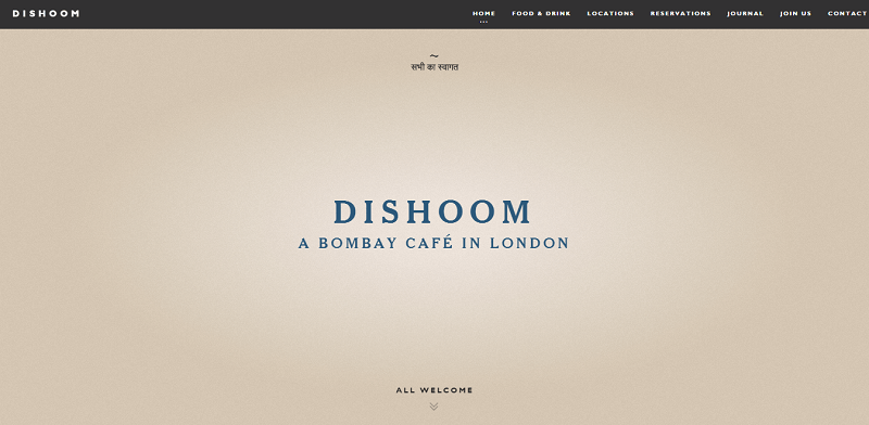
Dishoom (dishoom.com)
The combination of Ataxia and Cheltenham Old Style reflects the Indian cuisine – conservative and filled with age-old traditions. Using Ataxia makes sense since this typeface supports many languages and old style numbers, while Cheltenham adds a subtle depth to it.
11. World Baking Day
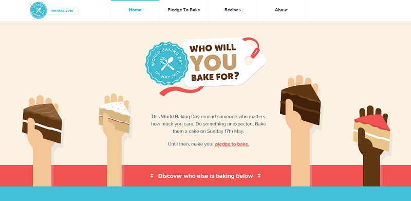
World Baking Day (worldbakingday.com)
The website combines two rounded sans serif type faces – Mentone and Museo Sans Rounded. The subtle difference between these two type faces is perfect reflecting the fun and quirkiness of the site.
12. Kickpoint
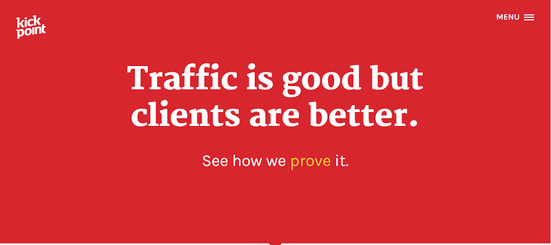
Kickpoint (kickpoint.ca)
Kickpoint used Maga throughout its website in different colors and sizes to convey its message. Set on a red background, the overall design is very effective in getting your attention.
13. Jason James
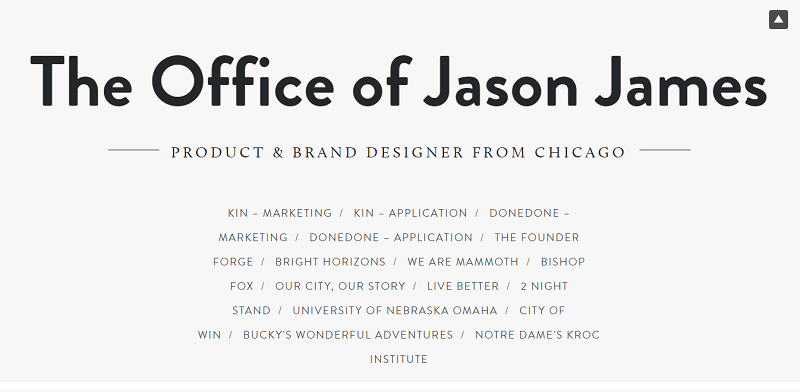
Jason James (jasonjame.es)
Jason James’ portfolio is adventurous enough to use different types of font, but with amazing results. In the introduction itself, it combined three different types – Brandon Grotesque, Calluna, Brandon Text – set in gray, white, and navy hues. Each creates a beautiful balance without going overboard.
14. Teehan and Lax
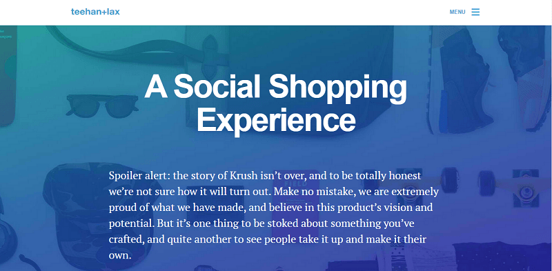
Teehan and Lax (teehanlax.com)
Teehan and Lax know what they are doing when they combined thick and thin type faces with beautiful storytelling. They used the magnificent Craft Gothic for the thicker and bigger font, while they use Mangan Nova for the smaller and thinner one.
15. Aria Studio
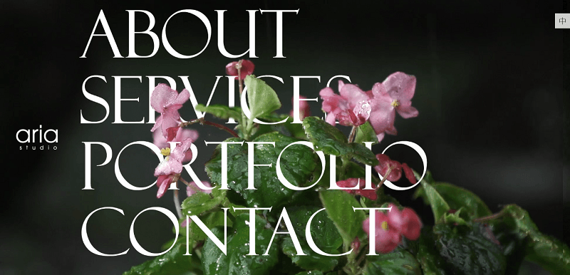
Aria Studio (ariastudio.com.hk)
The slim Adobe Jenson Pro font looks crisp and exceptionally good against the site’s video background. The four, large words are also links to navigate the whole website.
Conclusion
These websites show the role of typography in the overall design of a website. Be adventurous and creative, but exercise moderation when using fonts.
This post may contain affiliate links. See our disclosure about affiliate links here.