There is always one particular step you would like your website’s visitors to take. It is a step you are always concentrating on the most. It could be your subscribe button, and it could be the follow button or even the buy button.
Whatever that call-to-action button is, always remember that whether people will click on it or not depends on how you make them feel while they are on your website.
You might also like to read about Color Perception, the Psychology of Colors, or howColor Schemes Stimulate Human Senses.
The UX Designer Toolbox
Unlimited Downloads: 500,000+ Wireframe & UX Templates, UI Kits & Design Assets
Starting at only $16.50 per month!
1. Pinterest Has Pinned Loads of Red
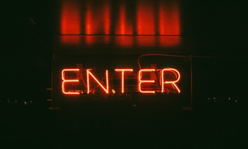
Without a doubt, red is considered the hottest color. If you check out Pinterest’s color palette, you will notice straight away that red is their primary color.
Red, often associated with love, is such a strong and dynamic color that it can make you feel very passionate about anything positioned closely around this color.

This color is often seen in clearance and sales promotions, as its intensity creates a feeling of urgency.
Even though this intensive color can leave your visitors excited and encouraged, always be careful. Too much red can turn them off at once.
Use red in your color scheme just to accent your web design. Blend it in a color mix of white, gray, light blue or silver.
Great Example of Red in Web Design

I Bet You Didn’t Know
The human eye sees red when it looks at a light with a wavelength between 630 and 700 nanometers. Light just past this range is called infrared, or below red, and cannot be seen by human eyes, although it can be sensed as heat.- Source
A Fantastic Red Color Palette

10 Associations with Red
- Blood
- War
- Fire
- Masculinity
- Passion
- Seduction
- Anger
- Force
- Energy
- Courage
Red Coordinates
Hex Triplet: #FF0000
RGB: (255, 0, 0)
2. Amazon Loves the Strength of Orange
Orange is warm and energizing, but not as intense as red. Orange feels more warm than hot.

Full of energy, this vibrant and friendly color invites people to do something, rather than making them feel pushed or forced to do so with urgency.
Orange is sometimes considered aggressive, in the way it encourages a call to action, like buy, subscribe, sell or follow.
I recommend using orange if after visiting your website you want to leave someone feeling stimulated, cheerful, creative, and full of enthusiasm.
How You Should Use Orange

I Bet You Didn’t Know
Web color orange, defined as FFA500, is the only named color defined in CSS that is not also defined in HTML 4.01. – Source
A Fantastic Orange Color Palette

10 Associations with Orange
- Optimism
- Determination
- Fire
- Warning
- Autumn
- Religions
- Endurance
- Compassion
- Halloween
- Organism
Orange Coordinates
Hex Triplet: #FF7F00
RGB: (255, 127, 0)
3. Facebook’s Blue Makes Us Feel Safe

You will find many business and corporate websites use blue tones. This color makes us think about something secure, safe, dependent and full of experience.
Therefore, it doesn’t come as a surprise that every business who cares how they leave their customers feeling in the long term prefers to use blue.
Blue creates completely opposite feelings to red. Blue calms us down and you should not be worried about using it too much. You can easily splash blue all over your web design.
How You Should Use Blue

I Bet You Didn’t Know
A survey taken in Germany and published in 2009 found that blue was the favourite color of 46 percent of male respondents and 44 percent of women. – Source
A Fantastic Blue Color Palette

10 Associations with Blue
- Trueness
- Friendliness
- Magic
- Boys
- Ice
- Royalty
- Winter
- Police
- Sky
- Water
Blue Coordinates
Hex Triplet: #0000FF
RGB: (0, 0, 255)
4. Groupon has Some Green Collective Power
Feeling very optimistic right now? Let me guess – You have been looking at something that is green? Maybe it was just a green plant you were looking at, as that would calm you down and make you feel optimistic.

Anyone who is associated with green living or environmental movements will more likely use green at least in some part of their design process.
Have a look at a $100 bill. It is green! Websites like Groupon have a lot of green in their brand, as they are directly dealing with money.
Green is very refreshing and relaxing, leaving people with a feeling of being balanced and inspired. It represents balance and harmony in a design
Great Use of Green in Web Design

I Bet You Didn’t Know
In some languages, including old Chinese, Thai, old Japanese, and Vietnamese, the same word can mean either blue or green. There is no natural source for green food colorings which has been approved by the US Food and Drug Administration.- Source
A Fantastic Green Color Palette

10 Associations with Green
- Money
- Greed
- Growth
- Envy
- Nature
- Spring
- Health
- Youth
- Grass
- Hope
Green Coordinates
Hex Triplet: #00FF00
RGB: (0, 255, 0)
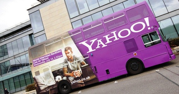
5. Yahoo! Splashes a Lot of Purple on their Logo
Purple is very often described using words like imagination, creativity, dignity, nobility and abundance. Stronger shades of purple are more related to spring and romance, whereas darker ones are associated with luxury and wealth.
Purple is used in a variety of beauty, fashion and lingerie products, because purple calms and soothes more than any other color.
It is also considered to be more feminine and romantic than masculine. When looking at anything purple, many people feel that it appears to be artificial, because of the fact that this color can be found in nature very rarely.
Just like red, people can find purple too strong and overpowering, making them feel forced, or pushed, to take a certain action. So it would be very wise to pair purple with other colors like black or white.
Great Use of Purple in Web Design

I Bet You Didn’t Know
In April 2007 it was suggested that early archaea may have used retinal, a purple pigment, instead of chlorophyll, to extract energy from the sun. If so, large areas of the ocean and shoreline would have been colored purple; this is called the Purple Earth hypothesis. – Source
A Fantastic Purple Color Palette

10 Associations with Purple
- Wealth
- Royalty
- Nobility
- Sophistication
- Romance
- Artificial
- Exotic
- Spirituality
- Luxury
- Feminine
Purple Coordinates
Hex Triplet: #800080
RGB: (128, 0, 128)
6. 1WD’s Clever use of Monochromatic Colors
Usually, monochromatic colors like white, black, dark gray and light gray should be used as a backdrop in designs with already established brighter and stronger accent colors.

Take a look at our website, 1stwebdesigner – 1WD. We use a little bit of orange as it’s a strong and bright accent color – but only in a good combination with dark gray and light gray. And white, of course (what color is our website’s background?)
Just like birds will always fly, black will always represent modernity, mysteriousness, elegance and power. Whereas grey is a neutral color, representing something very calm and invisible, like shadows.
If gray can sometimes look dirty, then white will create the opposite effect. White represents cleanliness openness, simplicity, and minimalism.
Great Use of Monochromatic in Web Design

I Bet You Didn’t Know
In digital photography, monochrome is the capture of only shades of black by the sensor, or by post-processing a color image to present only the perceived brightness by combining the values of multiple channels. – Source
A Fantastic Monochromatic Color Palette

10 Associations with Monochromatic
- Power
- Elegance
- Space
- Softness
- Heaven
- Peace
- Innocence
- Pessimism
- Depression
- Boredom
Monochromatic Coordinates
Black:
Hex Triplet: #000000
RGB: (0, 0, 0)
Gray:
Hex Triplet: #808080
RGB: (128, 128, 128)
White:
Hex Triplet: #FFFFFF
RGB: (255, 255, 255)
What Is Your Favourite Color?
How does your favorite color make you feel? We have looked at the top 5 colors. Now let’s see what colors do to our human senses and how colors can be mixed in a website’s color scheme.
This post may contain affiliate links. See our disclosure about affiliate links here.