Creative Assets & Unlimited Downloads on Envato Elements
GET 7 DAYS FREE Learn Web Design
 Retro CSS Text Effect: A Step-by-Step Tutorial
CSS offers an array of tools that, when used correctly, can improve the visual experience on your website. In this tutorial, we’ll explore a straightforward way to design a retro text effect with pure CSS. The approach, while not overly complex, yields a visually appealing result and serves as a…

Learn UX Design
Conducting UX Surveys: A Practical Guide
UX surveys can be pivotal tools for designers seeking to understand user preferences, opinions, and behaviors. They foster alignment between design strategies and user expectations…

UX Design
Minimizing User Decision Fatigue in Web Design
Offering an array of choices might seem like an excellent way to cater to diverse user preferences, but more often than not, it can cause…

Learn Web Design
Making an Underwater CSS Text Effect
Web design can serve as a playful exploration ground for learning new techniques. In today’s guide, we’ll dive into the creation of an underwater CSS…
More Recent Articles
 Learn WordPress
 How to Limit Post Revisions in WordPress
Optimizing your WordPress workflow often involves tweaking a few settings and functions. One of these features is post revisions. This built-in functionality can be a… Learn UX Design
 How to Optimize UX Design for Screen Readers
Achieving digital accessibility and optimizing your platform for screen readers, can be a strategic decision with multifaceted benefits. Not only does it reflect empathy and… Learn WordPress
 WordPress Dashboard: Removing Unwanted Widgets
Your website’s command center, the WordPress dashboard, arrives with several widgets that enhance functionality. However, not all of these may be beneficial for every user.… Learn Web Design
 Ripple Button Effect Using Pure CSS
Google’s Material Design guidelines introduced the ripple effect, a subtle animation that indicates user action. The ripple effect rapidly gained popularity in web design as… Learn Web Design
 How to Animate Gradient Text Using CSS
Web design takes a captivating turn when CSS comes into play. It enables a world of transformations, such as taking static text elements and infusing… Learn Web Design
 Create Neon Style Buttons Using CSS
CSS truly is a remarkable tool in a web designer’s toolkit, capable of bringing even the most vibrant creative visions to life. Today, we’re immersing… WordPress
 Hide Your WordPress Version for Better Security
WordPress is generally a secure platform, but there are ways to make it even more robust. Hiding the version of your WordPress instance is one… Learn Web Design
 CSS Keyframes: From Static to Dynamic Designs
Web designers often seek tools that can bring static elements to life, and CSS keyframes are a great ally for this task. Keyframes enable us… Learn WordPress
 Disabe Emoji Autoload for Faster WordPress Sites
Website speed is critical to the success of any online venture, which is why we’ll discuss how to disable Emoji Autoload in WordPress in this… Learn Web Design
 How to Create a CSS Text Embossing Effect
Embossing is a graphical effect used to give the impression that the surface of an image has been raised or pressed in. In web design,… Learn Web Design
 Crafting a Spinning Loader with Pure CSS
Imagine you’re on a website, eagerly waiting for content to load, but all you see is a blank screen. It’s frustrating, isn’t it? The spinning… Learn UX Design Web Design
 Creating Ghost Buttons with CSS
In recent years, ghost buttons have solidified their position as a trendy and elegant element. Characterized by their transparent nature and minimalist outline, ghost buttons,…Popular Posts
The most popular posts on 1st Web Designer.
 Freelance Design
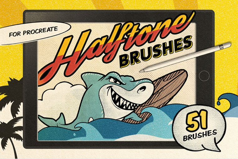
 800+ Free & Premium Procreate Brushes
Procreate makes it easy to create stunning designs and pieces of artwork for personal and professional use. However, gathering all the resources you need, like Procreate brushes, can seem like a daunting task when you’re first starting out.
Instead of having to hunt down brushes to use in your art,…
WordPress
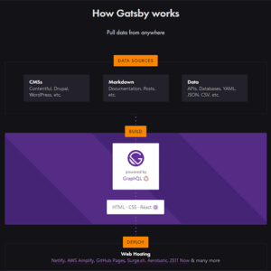
Building a Headless WordPress Website with GatsbyJS
Recently, we took a look at the rising trend of “headless” WordPress configurations. The term describes the process of creating content within WordPress, then pushing it out for use in…
Learn
The Top 80 Adobe Illustrator Text Effects Tutorials
For all of you who want to learn how to create different effects with your desired font, this is a goldmine. You will find 80 of the best Adobe Illustrator tutorials, that are suitable for both beginners and experts alike. Dig in!
Collections
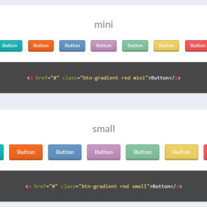
10 Code Snippets for Creating Beautiful CSS Buttons
If you’re looking for some examples of quality CSS buttons, this post is where you should start. We’ve organized 10 unique CSS button collections and snippets from CodePen which you can study and clone for your own web projects.