Creating charts that look presentable can be a bit of a pain. Most often, web designers or developers use graphics to display data using Photoshop or Illustrator, which may take a lot time to be done.
Your Designer Toolbox
Unlimited Downloads: 500,000+ Web Templates, Icon Sets, Themes & Design Assets

Visualization of Data With Chart.js – Tutorial
The Chart.js library is one of the great online JavaScript libraries which builds data using HTML5 canvas element to draw graphs and charts, complete with documentation.
To see Chart.js in action, we’re going to build the following charts using web programming languages as our labels with their fictional data:
- Line Chart
- Bar Chart
- Radar Chart
- Polar Area Chart
- Pie Chart
- Doughnut Chart
Resource you need to complete this tutorial:
- Chart.js Library
- Time and Patience
Getting Started
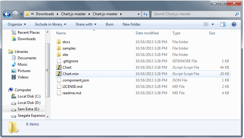
First, we need to copy the chart.min.js out of the unzipped folder to our js folder or your preferred directory.
Setting Up
The next thing we need to do is to create a new HTML file and put on the following codes. This will include the HTML5 doctype and then the CSS file directory followed by our Chart.js library file directory.
<!DOCTYPE html>
<html lang="en">
  <head>
        <meta charset="utf-8">
       <title>Visualize Data Beautifully Using JS Charts</title>
      <link href="css/style.css" media="screen" rel="stylesheet">
       <script type="text/javascript" src="js/Chart.min.js"></script>
</head>
<body>
</body>
</html>
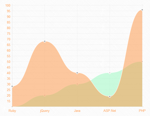
Drawing a Line Chart
To draw a line chart, we need to create an HTML5 canvas element first on our body section of our HTML file.
<canvas id="canvas" height="450" width="600"></canvas>
Next, we need to create a script that will initialize the chart class (in this example, I used myLineChart) and then retrieve the 2D context of the canvas where we want to draw the chart. Copy the code before the closing body tag.
var myLineChart = new Chart(document.getElementById("canvas").getContext("2d")).Line(LineChart, {scaleFontSize : 13, scaleFontColor : "#ffa45e"});
Note: You can also add some styles you want on the each chart, such as the text color and font size using the Chart options.
In the example above, I used scaleFontSize and scaleFontColor to change the font size and the text color of the data. You can check the Chart.js documentation to see more available chart options for each chart.
For our data structure, we will initialize an object (for this example I used LineChart) that contains all labels for our line chart. The data for the line charts will be broken up into an array of data sets. You should define the values of each datasets such as the fill color, stroke color, point color, point stroke color and the data itself.
var LineChart = {
    labels: ["Ruby", "jQuery", "Java", "ASP.Net", "PHP"],
    datasets: [{
        fillColor: "rgba(151,249,190,0.5)",
        strokeColor: "rgba(255,255,255,1)",
        pointColor: "rgba(220,220,220,1)",
        pointStrokeColor: "#fff",
        data: [10, 20, 30, 40, 50]
    }, {
        fillColor: "rgba(252,147,65,0.5)",
        strokeColor: "rgba(255,255,255,1)",
        pointColor: "rgba(173,173,173,1)",
        pointStrokeColor: "#fff",
        data: [28, 68, 40, 19, 96]
    }]
}
You will get a similar result like the image below:
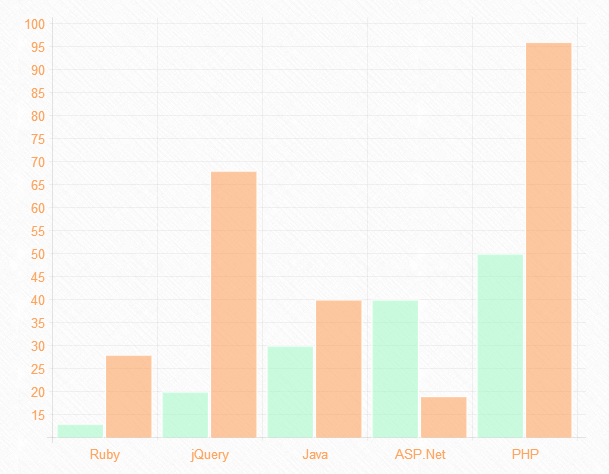
Drawing a Bar Chart
To draw a bar chart, we need to create an HTML5 canvas element first on our body section of our HTML file.
<canvas id="canvas" height="450" width="600"></canvas>
Next, we will create a script that will represent the bar chart class (in this example, I used myBarChart) and then retrieve the 2D context of the canvas. Copy the code before the closing body tag.
var myBarChart = new Chart(document.getElementById("canvas").getContext("2d")).Bar(BarChart, {scaleFontSize : 13, scaleFontColor : "#ffa45e"});
The bar chart has almost the same data structure to the line chart. Let’s use an object (for this example, I used BarChart) to hold on the labels and values for bar chart. As you can see, we are showing the same data as the previous line chart example.
	var BarChart = {
    labels: ["Ruby", "jQuery", "Java", "ASP.Net", "PHP"],
    datasets: [{
        fillColor: "rgba(151,249,190,0.5)",
        strokeColor: "rgba(255,255,255,1)",
        data: [13, 20, 30, 40, 50]
    }, {
        fillColor: "rgba(252,147,65,0.5)",
        strokeColor: "rgba(255,255,255,1)",
        data: [28, 68, 40, 19, 96]
    }]
}
You will get a similar result like the image below:
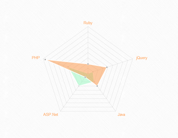
Drawing a Radar Chart
Next, let’s draw a Radar chart. So, first put on the HTML5 canvas element code on our HTML file.
<canvas id="canvas" height="450" width="610"></canvas>
Then, we will create a script that will initialize the radar chart class (in this example, I used myRadarChart) and then retrieve the 2D context of the canvas. Put the code below before the closing body tag.
var myRadarChart = new Chart(document.getElementById("canvas").getContext("2d")).Radar(RadarChart, {pointLabelFontSize : 13, pointLabelFontColor : "#ffa45e"});
For the radar chart, we need to show a label to each point of the chart. This will include an array of strings and then display it around the chart. To do this, let’s again instantiate an object (for this example I used RadarChart) as a container of the labels and values of our radar chart.
var RadarChart = {
    labels: ["Ruby", "jQuery", "Java", "ASP.Net", "PHP"],
    datasets: [{
        fillColor: "rgba(151,249,190,0.5)",
        strokeColor: "rgba(255,255,255,1)",
        pointColor: "rgba(220,220,220,1)",
        pointStrokeColor: "#fff",
        data: [10, 20, 30, 40, 50]
    }, {
        fillColor: "rgba(252,147,65,0.5)",
        strokeColor: "rgba(255,255,255,1)",
        pointColor: "rgba(173,173,173,1)",
        pointStrokeColor: "#fff",
        data: [28, 48, 40, 19, 96]
    }]
}
You will get a similar result like the image below:
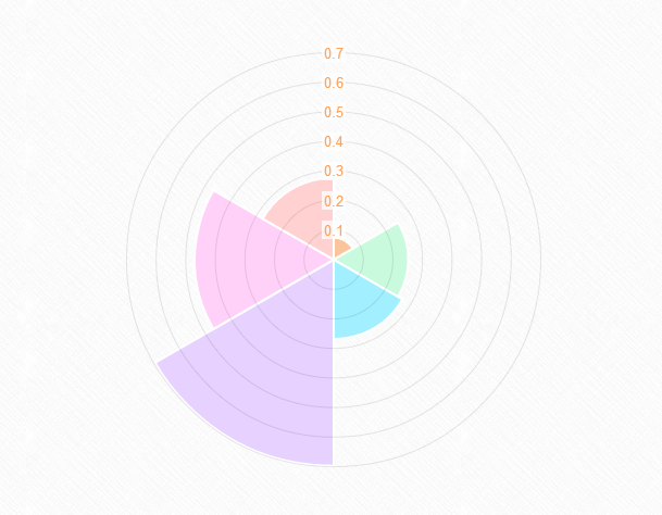
Drawing a Polar Area Chart
To draw a Polar Area chart, we need an HTML5 canvas element code on our HTML file.
<canvas id="canvas" height="400" width="610"></canvas>
Next, let’s create a script for our object (in this example, I used myPolarAreaChart) and then retrieve the 2D context of the canvas. You can copy the code below before the closing body tag.
var myPolarAreaChart = new Chart(document.getElementById("canvas").getContext("2d")).PolarArea(PolarChart, {scaleFontSize : 13, scaleFontColor : "#ffa45e"});
Polar area charts are almost the same as the pie charts; however, each segment has the same angle and the radius differs depending on the value.
Let’s create the data structure of Polar area chart by instantiating first the object (for this example, I used PolarChart) to hold the labels and values. The value attribute should be a number, while the color attribute should be a string.
var PolarChart = [{
    value: Math.random(),
    color: "#fac59c"
}, {
    value: Math.random(),
    color: "#c9fadd"
}, {
    value: Math.random(),
    color: "#a2efff"
}, {
    value: Math.random(),
    color: "#e6d1ff"
}, {
    value: Math.random(),
    color: "#ffd1f9"
}, {
    value: Math.random(),
    color: "#ffd1d1"
}];
You will get a similar result like the image below:
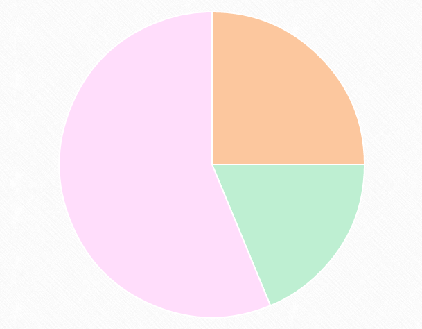
Drawing a Pie Chart
Next, let’s draw a pie chart. First, we need the HTML5 canvas element.
<canvas id="canvas" height="450" width="610"></canvas>
Then, let’s create our object (in this example, I used myPieChart) and then retrieve the 2D context of the canvas. Copy the code below before the closing body tag.
var myPieChart = new Chart(document.getElementById("canvas").getContext("2d")).Pie(PieChart);
For a pie chart, we need to pass in an array of objects with a value (which is a number) and a color property. So let’s do that. Copy the code below.
var PieChart = [{
    value: 40,
    color: "#fcc79e"
}, {
    value: 30,
    color: "#beefd2"
}, {
    value: 90,
    color: "#ffddfb"
}];
You will get a similar result like the image below:
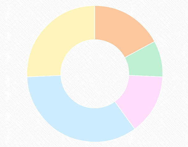
Drawing a Doughnut Chart
Lastly, we will draw a doughnut chart. We need to create an HTML5 canvas element first on our body section of our HTML file.
<canvas id="canvas" height="450" width="610"></canvas>
Next, we need to get the context of the canvas and to instantiate the chart.
var myDoughnutChart = new Chart(document.getElementById("canvas").getContext("2d")).Doughnut(DoughnutChart);
Finally, let’s create the data. For the doughnut chart, just like the pie chart, we need to pass in an array of objects with a value and a color property.
var DoughnutChart = [{
    value: 60,
    color: "#fcc79e"
}, {
    value: 30,
    color: "#beefd2"
}, {
    value: 50,
    color: "#ffddfb"
}, {
    value: 120,
    color: "#cdecff"
}, {
    value: 90,
    color: "#fff5bc"
}];
You will get a similar result like the image below:
Final Words
Chart.js is a great JavaScript library to create charts in a way where you can be creative. This tutorial has taken you through the steps on how to use this cool library. However, there are some drawbacks in using Chart.js, like, it doesn’t have tooltips and no interactivity on it.
That’s being said this JavaScript library has a long way to go and eventually be improve by different developers.
Play around it and let me know if you have some demo where you came up with a cool nice design using the Chart Options.
This post may contain affiliate links. See our disclosure about affiliate links here.