First, we will create a design in Photoshop and then code the site. You will also learn to build a great countdown timer and at the end we provide you with some great guidelines for building useful coming soon page, with examples of course.
Check the table of contents and scroll to your interests.
Your Designer Toolbox
Unlimited Downloads: 500,000+ Web Templates, Icon Sets, Themes & Design Assets

Table of Contents:
- Create a Minimal Coming Soon or Under Construction Page in Adobe Photoshop
- Coding the Coming Soon or Under Construction page
- Final Countdown: Adding a Countdown Timer on the Coming Soon Page
- Guidelines to Building a Useful Coming Soon Page
Create a Minimal Coming Soon or Under Construction Page in Adobe Photoshop
Final Coming Soon Page

Resources you’ll need for this tutorial:
Download PSD Here
Step 1

Create a new document 1020 pixels width and 700 high. This size is great for coming soon/error and other similar pages. Make the background a light grey and apply some noise to it (Filter->Noise->Add Noise).
Step 2

Create a 700×400 pixel white shape. Set the Fill to zero and apply any seamless (transparent) pattern.
Step 3

Use Helvetica in two weights (regular and bold) and two sizes (30 and 12pt) place two catch phrases/slogans. The best thing is to write down some info that will describe your upcoming website.
Step 4

By using 12px lowercase Helvetica and icons from the IconSweets2 set, create two horizontal groups of elements. Each element must consist of one icon and one link. I’ll set it with three elements for each row.
Step 5

We move on to creating one of the most important elements in a coming soon page, a countdown counter. By using the Rounded Rectangle Tool (U), create a shape of 140×140 pixels. Apply a Drop Shadow with 15% of opacity.
Step 6

Apply some Inner Shadow. Even if the shape looks blurry at the moment, the Inner Shadow will be visible when we finish the shape.
Step 7

Add a Gradient Overlay effect with the blend mode set to: Soft Light and 55% opacity.
Step 8

Finish the shape by adding a stroke. Set the Fill Type to Gradient and the Angle to 90 degrees.
Step 9

By using the League Gothic font, 92px, input a random number. This will show the number of remaining days until the website launch. Apply some Drop Shadow to the text and numbers.
Step 10

Duplicate these boxes three times and place them accordingly. By using the Elipse Tool (U), you can create small dark circles which would work as dividers for the boxes.
Step 11

Under the countdown widget we will be creating an input form. It will allow visitors to input their email so they can be notified when the site launches. Create the form by using the Rounded Rectangle Tool. Set its color as gray and apply some inner shadow effect.
Step 12

Apply a Gradient Overlay effect. Apply the same blend mode, with an opacity of 20%.
Step 13

Finish the form by adding a gray stroke.
Step 14

We’ll have to finish our “subscribe” widget by adding a button which would submit the information in the form. By using the Rounded Rectangle Tool (U), create a shape which will be the base of our button. Apply some inner shadow effect.
Step 15

We can apply a nice touch to our button by using a bit of Bevel and emboss. This will make the second half of our button a little bit darker, a pretty nice effect. Set the size to 2px, set the opacity for white to zero% and set the opacity for gray to 15%.
Step 16

Apply the same Soft Light Gradient Overlay effect we’ve been using for various elements in this layout.
Step 17

Finish it by applying a stroke effect, with some really dark gray colors.
Step 18

By using the Type Tool and Helvetica font, input some text on the button.
Step 19

Under the button we will place a few social media icons. I grabbed mine from the IconSweets2 icon set. Gave them a really nice bright color. To achieve the “handwritten” effect, we will be using the Journal font.
To bend that line, you will have to create a slash and apply the Warp Text feature with an Arc. It is a lot easier than you can imagine, and it will take you only a couple of seconds to achieve that effect.
Final Result (Click for a Larger Version)
Coding the Coming Soon or Under Construction page
As you can see, the page contains a lot of gradients and shadows. We will create them using just CSS3. As you may know, CSS3 provides a lot of new properties that let us create cool effects without the need of using images.
For the countdown timer we will use jQuery and the jQuery countdown plugin from tutorialzine.com. Of course we will customize it a bit to match our design.
In this tutorial we will also use some new HTML5 tags (and make them work on Internet Explorer 7 and 8) and some interesting attributes like “placeholder” and “required” for the subscription form.
The “placeholder” attribute lets us show text inside the email input field when it’s empty, while the “required” attribute lets us define the email input field as required, so the user cannot submit the form without entering their email. We will also provide a jQuery fallback for these two attributes, for older browsers and for browsers that don’t support them yet.
So, enough talking and let’s begin.
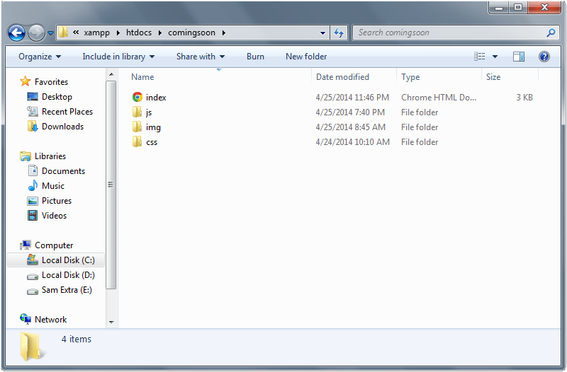
1. The Files’ Structure
Let’s create a new folder and name it “coming-soon-page”. Inside this folder we will have these files and subfolders:
- index.html – our main HTML file;
- css– the stylesheets’ folder,
- style.css – our main stylesheet file,
- reset.css – the css reset (http://meyerweb.com/eric/tools/css/reset/),
- ie.css – the stylesheet file for Internet Explorer 7 and 8;
- js– the folder for our JavaScript files,
- jquery.countdown.js – the jQuery plugin for the countdown timer,
- script.js – our custom JavaScript file for initializing the timer, for the other animations and for providing a fallback for the “placeholder” and “required” HTML5 attributes on browsers that don’t support them,
- modernizr.custom.js – a JavaScript library for detecting if the browser supports the “placeholder” and “required” attributes;
- images – the images’ folder;
- fonts – the fonts’ folder, will contain the font that we will use for the timer.
2. The Page’s Structure
Below is the main HTML structure of the index.html file of our page:
<!DOCTYPE html>

<html>

<head>

	<meta charset="utf-8" />

	<title>Minimal Coming Soon Page</title>

	<!-- CSS -->
	<link rel="stylesheet" href="css/reset.css">
	<link rel="stylesheet" href="fonts/stylesheet.css">
	<link rel="stylesheet" href="css/style.css">

	<!--[if lt IE 9]>
		<link rel="stylesheet" href="css/ie.css">
	<![endif]-->

	<!-- IE fix for HTML5 tags -->
	<!--[if lt IE 9]>
		<script src="http://html5shiv.googlecode.com/svn/trunk/html5.js"></script>
	<![endif]-->

	<!-- jQuery and Modernizr-->
	<script src="https://ajax.googleapis.com/ajax/libs/jquery/1.7.2/jquery.min.js"></script>
	<script src="js/modernizr.custom.js"></script>

	<!-- Countdown timer and other animations -->
	<script src="js/jquery.countdown.js"></script>
	<script src="js/script.js"></script>

</head>

<body>


<header>
		<!-- The headline and description of our page -->
	</header>


<div id="main">

<div id="links">
			<!-- The main links, support, download, etc. -->
		</div>


<div id="counter">
			<!-- The countdown timer -->
		</div>


<form action="" method="get">
			<!-- The subscription form -->
		</form>


<div class="social-media-arrow">
			<!-- The social media arrow, on the right of the page -->
		</div>


<footer>
			<!-- The page's footer that will contain the social icons -->
		</footer>

	</div>


</body>

</html>
As you can see, the HTML code is pretty simple and explains itself. In the “head” tag we have imported all the stylesheet and JavaScript files that we need.
You can note the conditional comments where we use the file “ie.css” for Internet Explorer 7 and 8. In this file we will add a few lines for IE 7-8 as you will see below. We also import the JavaScript file “html5.js” for making IE 7 and 8 understand the new HTML5 tags, “header” and “footer”.
The body of our page is also simple. It contains the header, where we will put the headline and the page’s description; and the “main” div where we will put the links, the countdown timer, the subscription form and the footer.
Let’s style the page’s body. We will use mainly the Arial font on our page (except for the timer), and a repeated background pattern (that you will find in the source files):
body {
	background: url(../images/body-pattern.jpg) top left repeat;
	font-family: Arial, Helvetica, sans-serif;
	padding-bottom: 40px;
}
3. The Header
As said above, the header of our page will contain the headline and the description. Here is the HTML code:
<header>

<h1>We are working our butts off to finish this website</h1>


Our developer, Michael, is doing his best to finish this website before the counter, but we can’t help him.

</header>
And here is its style:
/* ---- Header ---- */

header {
	width: 720px;
	margin: 80px auto 0 auto;
}

header h1 {
	font-size: 30px;
	font-weight: bold;
	color: #272727;
	text-shadow: 0 1px 0 #fff;
}

header p {
	margin: 20px 0 0 3px;
	font-size: 14px;
	color: #272727;
}
Our page now looks like this:

4. The Main Area
The main area of the page is contained in the “main” div as you can see in the HTML code above. This area will contain the links, the timer, the subscription form, the footer and the social media arrow.
Here is the style of the main area:
/* ---- Main Area ---- */

#main {
	position: relative;
	width: 700px;
	margin: 50px auto 0 auto;
	padding: 20px 0 0 25px;
	background: url(../images/main-content-pattern.jpg) top left repeat;
}
It has a width of 700 pixels, it’s center aligned and has a repeated grid pattern as background. It also has a relative position. We will need this line for giving an absolute position to the social media arrow, as you will see below.
5. The Links
Below you can see the HTML for the links:
<div id="links">

<div class="home"><a href="">https://1stwebdesigner.com/</a></div>


<div class="support"><a href="">http://support.1wd.com/</a></div>


<div class="browser"><a href="">Google Chrome OS. 10.X.23</a></div>


<div class="books"><a href="">http://1wd.co/e-books/</a></div>


<div class="download"><a href="">http://1wd.com/download/</a></div>


<div class="ups"><a href="">UPS Signed Worldwide</a></div>

</div>
And the CSS:
/* ---- Links ---- */

#links {
	width: 700px;
	font-size: 12px;
	font-weight: bold;
	color: #aaa;
	line-height: 18px;
	overflow: hidden;
}

#links a {
	position: relative;
	color: #aaa;
	text-decoration: none;
}

#links a:hover {
	color: #aaa;
	text-decoration: none;
}

.home, .support, .browser, .books, .download, .ups {
	float: left;
	width: 180px;
	margin-left: 42px;
	padding-left: 25px;
}

.home { background: url(../images/home.png) left center no-repeat; margin-left: 0; }
.support { background: url(../images/support.png) left center no-repeat; }
.browser { background: url(../images/browser.png) left center no-repeat; clear: right; }

.books, .download, .ups { margin-top: 10px; }

.books { background: url(../images/books.png) left center no-repeat; margin-left: 0; }
.download { background: url(../images/download.png) left center no-repeat; }
.ups { background: url(../images/ups.png) left center no-repeat; clear: right; }
The links area has a width of 700 pixels and each link has its own icon. Then we play a little bit with margins and padding to make them match the PSD design. We also use a relative position for the links so later we can add a simple animation to them with jQuery.
The page should look like this:

6. The Countdown Timer
For the countdown timer we will be using the jQuery countdown plugin from tutorialzine.com. Our timer will be contained in the “counter” div. Here is the HTML code:
<div id="counter"></div>
The “counter” div will be empty because all the HTML code of the timer will be generated by the jQuery plugin. Here is the HTML code that the plugin will generate:
<div id="counter" class="countdownHolder">


<div class="countDays">
		<span class="position">
			<span class="digit static">0</span>
		</span>
		<span class="position">
			<span class="digit static">0</span>
		</span>
		<span class="boxName">
			<span class="Days">DAYS</span>
		</span>
	</div>

	<span class="points">:</span>
	<span class="countDiv countDiv0"></span>

<div class="countHours">
		<span class="position">
			<span class="digit static">0</span>
		</span>
		<span class="position">
			<span class="digit static">0</span>
		</span>
		<span class="boxName">
			<span class="Hours">HRS</span>
		</span>
	</div>

	<span class="points">:</span>
	<span class="countDiv countDiv1"></span>


<div class="countMinutes">
		<span class="position">
			<span class="digit static">0</span>
		</span>
		<span class="position">
			<span class="digit static">0</span>
		</span>
		<span class="boxName">
			<span class="Minutes">MNTS</span>
		</span>
	</div>

	<span class="points">:</span>
	<span class="countDiv countDiv2"></span>


<div class="countSeconds">
		<span class="position">
			<span class="digit static">0</span>
		</span>
		<span class="position">
			<span class="digit static">0</span>
		</span>
		<span class="boxName">
			<span class="Seconds">SECS</span>
		</span>
	</div>


</div>
Depending on the time that we set when we initialize the counter, the plugin will show the right numbers on the four boxes (“DAYS”, “HOURS”, “MINUTES”, “SECONDS”) and animate the timer.
Note: I will not explain the plugin in detail here. Martin Angelov, the creator of this plugin, did a pretty good job on explaining how it works. You can check it out on tutorialzine here.
Now let’s style this counter and make it match our PSD design:
/* ---- Counter ---- */

#counter {
	width: 700px;
	height: 145px;
	margin: 55px auto 0 auto;
	font-family: 'LeagueGothicRegular', Arial, Helvetica, sans-serif;
	font-size: 92px;
	color: #272727;
	text-shadow: 0 1px 0 #fff;
	overflow: hidden;
}

.countDays, .countHours, .countMinutes, .countSeconds {
	float: left;
	width: 102px;
	height: 138px;
	padding-left: 36px;
	background: #e7e7e7;
	background-image: -webkit-gradient(linear, left top, left bottom, from(rgba(255,255,255,.1)), to(rgba(0,0,0,.07)));
	background-image: -webkit-linear-gradient(top, rgba(255,255,255,.1), rgba(0,0,0,.07));
	background-image: -moz-linear-gradient(top, rgba(255,255,255,.1), rgba(0,0,0,.07));
	background-image: -ms-linear-gradient(top, rgba(255,255,255,.1), rgba(0,0,0,.07));
	background-image: -o-linear-gradient(top, rgba(255,255,255,.1), rgba(0,0,0,.07));
	background-image: linear-gradient(top, rgba(255,255,255,.1), rgba(0,0,0,.07));
	border: 1px solid #ccc;
	-moz-border-radius: 4px;
	-webkit-border-radius: 4px;
	border-radius: 4px;
	-moz-box-shadow:
		0 2px 3px 0 rgba(255,255,255,.2) inset,
		0 2px 2px 0 rgba(0,0,0,.1);
	-webkit-box-shadow:
		0 2px 3px 0 rgba(255,255,255,.2) inset,
		0 2px 2px 0 rgba(0,0,0,.1);
	box-shadow:
		0 2px 3px 0 rgba(255,255,255,.2) inset,
		0 2px 2px 0 rgba(0,0,0,.1);
}

.points {
	float: left;
	width: 40px;
	margin: 0;
	font-family: Georgia, serif;
	font-size: 44px;
	font-weight: bold;
	text-align: center;
	line-height: 138px;
	text-shadow: none;
}

.position {
	position: relative;
	float: left;
	width: 35px;
	height: 92px;
	margin: 8px 0 0 0;
}

.digit {
	position: absolute;
	top: 0;
	left: 0;
}

.boxName {
	float: left;
	width: 80px;
	margin: -5px 0 0 7px;
	font-size: 36px;
	color: #a6a6a6;
	text-shadow: 0 1px 0 rgba(255,255,255,.5);
}

.Hours { margin-left: 5px; }
.Seconds { margin-left: 2px; }
Here we have used the “League Gothic” font that you will find in the source files. If you want to use this font on your designs, you can download it here.
As you can see, we have used only CSS3 properties for creating shadows and gradients. These new properties lets us create complex designs without the need of slicing images. This way our pages are very lightweight and we can save a lot of time.
The CSS3 properties used here are: “border-radius”, “box-shadow”, “linear-gradient” and “text-shadow”. You can easily understand what these properties do by just reading their name.
We have also used the “rgba” attribute that is very interesting and convenient because it lets us assign transparent colors to the various CSS properties.
Now we initialize the countdown timer by adding these lines to the “script.js” file (inside the “js” folder):
$(document).ready(function(){

	/* ---- Countdown timer ---- */

	$('#counter').countdown({
		timestamp : (new Date()).getTime() + 51*24*60*60*1000
	});

});
The counter will show the time left to 51 days from now. Our page looks like this:

7. The Subscription Form
For the subscription form we will use two new HTML5 attributes, as we mentioned before. These new attributes are “placeholder” and “required”. Here is the HTML code of our form:
<form action="" method="get">
	<input type="text" class="email" placeholder="Input your e-mail address here..." required />
	<input type="submit" class="submit" value="Let me Notified" />
</form>
We have a text input field for collecting the user’s email and a submit button. The text field is required so the user must fill it with an email address before submitting the form. When it’s empty, it shows the text “Input your e-mail address here…”.
Let’s style our form:
/* ---- Subscription Form ---- */

form {
	position: relative;
	margin: 40px auto 0 auto;
}

.email {
	width: 498px;
	height: 35px;
	padding: 0 15px;
	background: #f1f1f1;
	background-image: -webkit-gradient(linear, left top, left bottom, from(rgba(255,255,255,.02)), to(rgba(0,0,0,.02)));
	background-image: -webkit-linear-gradient(top, rgba(255,255,255,.02), rgba(0,0,0,.02));
	background-image: -moz-linear-gradient(top, rgba(255,255,255,.02), rgba(0,0,0,.02));
	background-image: -ms-linear-gradient(top, rgba(255,255,255,.02), rgba(0,0,0,.02));
	background-image: -o-linear-gradient(top, rgba(255,255,255,.02), rgba(0,0,0,.02));
	background-image: linear-gradient(top, rgba(255,255,255,.02), rgba(0,0,0,.02));
	border: 1px solid #cbcbcb;
	-moz-box-shadow: 0 2px 3px 0 rgba(0,0,0,.1) inset;
	-webkit-box-shadow: 0 2px 3px 0 rgba(0,0,0,.1) inset;
	box-shadow: 0 2px 3px 0 rgba(0,0,0,.1) inset;
	-moz-border-radius: 4px;
	-webkit-border-radius: 4px;
	border-radius: 4px;
	font-family: Arial, Helvetica, sans-serif;
	font-size: 13px;
	color: #b3b2b2;
	font-style: italic;
}

.email:focus {
	outline: 0;
	border: 1px solid #c0c0c0;
	-moz-box-shadow: 0 2px 3px 0 rgba(0,0,0,.2) inset;
	-webkit-box-shadow: 0 2px 3px 0 rgba(0,0,0,.2) inset;
	box-shadow: 0 2px 3px 0 rgba(0,0,0,.2) inset;
}

.submit {
	width: 140px;
	height: 37px;
	margin: 0 0 0 5px;
	padding: 0;
	background: #888;
	background-image: -webkit-gradient(linear, left top, left bottom, from(rgba(255,255,255,.1)), to(rgba(0,0,0,.1)));
	background-image: -webkit-linear-gradient(top, rgba(255,255,255,.1), rgba(0,0,0,.1));
	background-image: -moz-linear-gradient(top, rgba(255,255,255,.1), rgba(0,0,0,.1));
	background-image: -ms-linear-gradient(top, rgba(255,255,255,.1), rgba(0,0,0,.1));
	background-image: -o-linear-gradient(top, rgba(255,255,255,.1), rgba(0,0,0,.1));
	background-image: linear-gradient(top, rgba(255,255,255,.1), rgba(0,0,0,.1));
	border: 1px solid #636363;
	-moz-box-shadow:
		0 1px 2px 0 rgba(253,252,252,.35) inset,
		0 -1px 2px 0 rgba(0,0,0,.15) inset;
	-webkit-box-shadow:
		0 1px 2px 0 rgba(253,252,252,.35) inset,
		0 -1px 2px 0 rgba(0,0,0,.15) inset;
	box-shadow:
		0 1px 2px 0 rgba(253,252,252,.35) inset,
		0 -1px 2px 0 rgba(0,0,0,.15) inset;
	-moz-border-radius: 4px;
	-webkit-border-radius: 4px;
	border-radius: 4px;
	font-family: Arial, Helvetica, sans-serif;
	font-size: 13px;
	font-weight: bold;
	color: #fff;
	text-shadow: 0 1px 0 rgba(0,0,0,.35);
	line-height: 13px;
	cursor: pointer;
}

.submit:hover {
	background-image: -webkit-gradient(linear, left bottom, left top, from(rgba(255,255,255,.1)), to(rgba(0,0,0,.1)));
	background-image: -webkit-linear-gradient(bottom, rgba(255,255,255,.1), rgba(0,0,0,.1));
	background-image: -moz-linear-gradient(bottom, rgba(255,255,255,.1), rgba(0,0,0,.1));
	background-image: -ms-linear-gradient(bottom, rgba(255,255,255,.1), rgba(0,0,0,.1));
	background-image: -o-linear-gradient(bottom, rgba(255,255,255,.1), rgba(0,0,0,.1));
	background-image: linear-gradient(bottom, rgba(255,255,255,.1), rgba(0,0,0,.1));
	-moz-box-shadow: 0 1px 2px 0 rgba(0,0,0,.15) inset;
	-webkit-box-shadow: 0 1px 2px 0 rgba(0,0,0,.15) inset;
	box-shadow: 0 1px 2px 0 rgba(0,0,0,.15) inset;
}

.submit:active {
	-moz-box-shadow:
		0 1px 2px 0 rgba(0,0,0,.15) inset,
		0 3px 13px 3px rgba(0,0,0,.3) inset;
	-webkit-box-shadow:
		0 1px 2px 0 rgba(0,0,0,.15) inset,
		0 3px 13px 3px rgba(0,0,0,.3) inset;
	box-shadow:
		0 1px 2px 0 rgba(0,0,0,.15) inset,
		0 3px 13px 3px rgba(0,0,0,.3) inset;
	color: #ddd;
}
We have used the CSS pseudo-classes :hover, :focus and :active for changing the style of the input field and submit button when the user enters his email, hovers over the button or clicks on it.
We have also used the same CSS3 properties that we used for the countdown timer, “border-radius”, “box-shadow”, “linear-gradient” and “text-shadow”.
The page should look like this:

And here is how the form looks if the user clicks on the submit button while leaving the text field empty:

We defined the text input field as required so the browser doesn’t allow the form to be submitted if the user leaves the field empty.
These two new HTML5 attributes (“placeholder” and “required”) are very useful and can save us a lot of time, but they aren’t supported by older browsers like Internet Explorer 7 and 8.
For this we will use the Modernizr Javascript library that will let us know if the browser supports the two attributes.
Another problem that we have here appears when we use the Safari browser. Safari doesn’t support the “required” attribute, but Modernizr returns “true” when checking if this feature is supported.
So, we have to check if the browser doesn’t support the new attributes and if the browser is Safari. If so, we have to provide a jQuery fallback for showing the placeholder text and for detecting if the text input field is left empty and show a warning popup if it is.
After including Modernizr (the file “modernizr.custom.js”) in the “head” part of our page, we need to add these lines to the “script.js” file:
/* ---- Using Modernizr to check if the "required" and "placeholder" attributes are supported ---- */

if (!Modernizr.input.placeholder) {
	$('.email').val('Input your e-mail address here...');
	$('.email').focus(function() {
		if($(this).val() == 'Input your e-mail address here...') {
			$(this).val('');
		}
	});
}

// for detecting if the browser is Safari
var browser = navigator.userAgent.toLowerCase();

if(!Modernizr.input.required || (browser.indexOf("safari") != -1 && browser.indexOf("chrome") == -1)) {
	$('form').submit(function() {
		$('.popup').remove();
		if(!$('.email').val() || $('.email').val() == 'Input your e-mail address here...') {
			$('form').append('

Please fill out this field.

');
			$('.email').focus();
			return false;
		}
	});
	$('.email').keydown(function() {
		$('.popup').remove();
	});
	$('.email').blur(function() {
		$('.popup').remove();
	});
}
You can note how we added a new paragraph that contains the text “Please fill out this field.” to the form and we assigned to it the class “popup”.
Here is the CSS code for styling the popup and making it appear below the text input field:
.popup {
	position: absolute;
	top: 45px;
	left: 0;
	width: 140px;
	padding: 10px;
	background: #e7e7e7;
	-moz-border-radius: 4px;
	-webkit-border-radius: 4px;
	border-radius: 4px;
	-moz-box-shadow: 0 2px 2px 0 rgba(0,0,0,.1);
	-webkit-box-shadow: 0 2px 2px 0 rgba(0,0,0,.1);
	box-shadow: 0 2px 2px 0 rgba(0,0,0,.1);
	font-family: Arial, Helvetica, sans-serif;
	font-size: 13px;
	color: #888;
}
Now, if we open the page on Safari and we click the submit button without entering any text in the input field, the form will look like this:

8. The Footer
On the footer part of our Coming Soon page we will add some icons that will link to our social media accounts.
Here is the HTML:
<footer>

<ul>

<li><a class="digg" href=""></a></li>


<li><a class="twitter" href=""></a></li>


<li><a class="vimeo" href=""></a></li>


<li><a class="skype" href=""></a></li>

	</ul>

</footer>
And the CSS:
/* ---- Footer ---- */

footer {
	width: 700px;
	margin: 0 auto;
	padding: 35px 0 25px 0;
	overflow: hidden;
}

footer ul {
	float: right;
	width: 125px;
	height: 22px;
}

footer ul li {
	float: left;
}

footer a {
	position: relative;
	display: block;
	margin-left: 10px;
}

.digg {
	width: 10px;
	height: 16px;
	background: url(../images/digg.png) center center no-repeat;
}

.twitter {
	width: 21px;
	height: 16px;
	background: url(../images/twitter.png) center center no-repeat;
}

.vimeo {
	width: 16px;
	height: 16px;
	background: url(../images/vimeo.png) center center no-repeat;
}

.skype {
	width: 16px;
	height: 16px;
	background: url(../images/skype.png) center center no-repeat;
}
We will also add a beautiful arrow to give a professional look to the page. For this we will just need an empty div:
<div class="social-media-arrow"></div>
And we will style it like this:
.social-media-arrow {
	position: absolute;
	top: 125px;
	right: -95px;
	width: 108px;
	height: 256px;
	background: url(../images/social-media-arrow.png) top left no-repeat;
}
The page should look like this:

9. Some jQuery Animations
Now we are going to animate the links and the social icons so that when the user hovers over them they will move slowly. For this we need to add a few lines to the “script.js” file:
/* ---- Animations ---- */

$('#links a').hover(
	function(){ $(this).animate({ left: 3 }, 'fast'); },
	function(){ $(this).animate({ left: 0 }, 'fast'); }
);

$('footer a').hover(
	function(){ $(this).animate({ top: 3 }, 'fast'); },
	function(){ $(this).animate({ top: 0 }, 'fast'); }
);
10. Compatibility with Internet Explorer 7 – 8
Since Internet Explorer 7 and 8 don’t support the new CSS3 properties, the gradients and shadows will not be visible on these browsers, but the page will still be usable. Also, thanks to the jQuery fallback that we have created, the subscription form will work fine.
To end this tutorial we only need to add these three lines to the “ie.css” file:
.email {
	line-height: 35px;
}
This is because on IE 7 and 8 the text in the input field doesn’t align (vertically) in the center.
Conclusion
Finally we did it! We created our Coming Soon page and we’re ready to use it on our site. We used some new CSS3 properties and some new HTML5 tags and attributes that saved us a lot of time and made our page fast and lightweight.
So, what do you think about this tutorial? Did you learn something new? Also, what do you think about these new properties? Will you use them? Or maybe you want to wait until they are better supported by the different browsers?
In the next section we will be concentrating on countdown timer. We have already a beautiful coming soon page. The next tutorial is another version of the above one. We really want to give you some great alternatives.
Final Countdown: Adding a Countdown Timer on the Coming Soon Page
A website that is not yet ready to be launched needs a “Coming Soon” Page to notify the visitors that it would be soon launched on a specific time frame. As the modern web development evolved, this page is more than just a simple text page or an under construction image.
Designing the “Coming Soon” page increases the level of expectation of the visitors, thus, giving them the thrill of what will be soon published on the site. Aside from the design, you can also collect information of interested users by inserting a “Notify Me” textbox and a “Subscription Button” on the page.
In today’s tutorial, we are going to create a coming soon page that has a countdown timer on it using jQuery Countdown plugin by Keith Wood
Resource You Need to Complete This Tutorial:
- Open Sans (Google Font)
- Montserrat (Google Font)
- Reset.css
- jQuery Library
- jQuery Countdown Plugin
- Any background image
- Time and Patience
File Structure
Our file structure will consist of four folders and one html file:
- index.html – this will serve as our main file all of our design will be utilize on this file
- js folder – for our JavaScript/jQuery
- img folder – for our images
- css folder – for our styling (css)
What We Are Going to Do
Getting Started
Before we start, we’re going to add first the necessary libraries and links to our Head section. This will include our CSS and JavaScript libraries.
<!DOCTYPE html>
<html lang="en">
<head>
    <meta content="width=device-width, initial-scale=1, maximum-scale=1" name=
    "viewport">

    <title>Coming Soon with Counter</title>
    <link href=
    'http://fonts.googleapis.com/css?family=Open+Sans:400italic,600italic,700italic,400,600,300,700,800'
    rel='stylesheet' type='text/css'>
    <link href='http://fonts.googleapis.com/css?family=Montserrat:400,700' rel=
    'stylesheet' type='text/css'>
    <link href="css/reset.css" media="screen" rel="stylesheet">
    <link href="css/style.css" media="screen" rel="stylesheet">
    <script type="text/javascript" src="js/jquery-1.11.0.min.js"></script>
</head>
The HTML
For our markup, we’re going to wrap everything into a class container which will hold all of our elements. This will include header and section elements that will hold our basic tags with their respective IDs and classes. We will also include a simple footer element which will contain our copyright text.
<body>
    <div class="container">
        <header>
            <h1>Our website is Coming Soon</h1>
        </header>

        <section>
            <h2>WE APOLOGIZE FOR INCONVENIENCE</h2>

            <p class="details">YOU NEED TO WAIT...</p>

            <div id="counter"></div>

            <p class="details">SEND ME DETAILS ABOUT IT</p>

            <div id="subscribe">
                <form action="" id="subscribe-form" method="post" name=
                "newsletter-form">
                    <p class="form-field"><input id="subcribe_email" name=
                    "subscribe_email" placeholder="Your email" type="email"
                    value=""></p>

                    <p class="form-submit"><input id="subscribe_submit" name=
                    "subscribe_submit" type="submit" value="Notify Me"></p>
                </form>
            </div>
        </section>

        <footer>
            <a href="https://1stwebdesigner.com/" target="_blank">Copyright
            - 1stwebdesigner.com - 2014</a>
        </footer>
    </div>
Notice that we used the ID counter before the “Notify Me” form. This will hold our counter and will be used by our jQuery code. We will also style this later on style.css file.
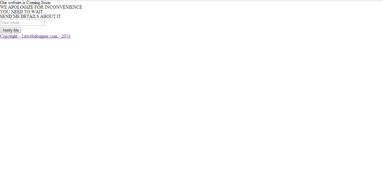
By this time, you will have same output like the image below.
The CSS
For our CSS file, we’re going to add styles first on our basic elements such as the body, H1, H2 and the container class. The container class will have a width in the form of percentage to create a responsive effect. Notice that the CSS3 transform property was used on the H1 tag, the title tag. This will enable our title tag to rotate 360 degrees on the x-axis position. To learn more about this you can check this resource.
body {
    color: #dadada;
    line-height: 1.75;
    width: 100%;
    background: url(../img/background.jpg)center;
    font-family: 'Open Sans';
}

h1,h2{
    color: #fff;
    line-height: 1.16667;
    text-align: center;
    text-transform: uppercase;
    text-shadow: 2px 2px 2px rgba(150,150,150,1);
}

h1 {
    font-size: 43px;
    font-family: Montserrat;
    font-weight: 700;
    border: 2px dashed #fff;
    margin-top: 50px;
    padding: 10px;
    cursor: pointer;
    -webkit-transition: all .8s ease;
    -moz-transition: all .8s ease;
    -o-transition: all .8s ease;
    transition: all .8s ease;
}

h1:hover {
    -webkit-transform: rotateX(360deg);
    -moz-transform: rotateX(360deg);
    -ms-transform: rotateX(360deg);
    -o-transform: rotateX(360deg);
    transform: rotateX(360deg);
}

h2 {
    font-size: 30px;
    font-weight: 300;
    margin-top: 30px;
}

.container {
    width: 58%;
    margin: 40px auto 0;
}

.details {
    margin-top: 30px;
    color: #fff;
    text-align: center;
    text-shadow: 2px 2px 2px rgba(150,150,150,1);
}
Next, let’s put a basic style to our forms. This will add basic styles on our text box and button.
button,input,textarea {
    font-size: 16px;
    max-width: 100%;
    margin: 0;
    border-radius: 0;
    vertical-align: baseline;
    -webkit-box-sizing: border-box;
    -moz-box-sizing: border-box;
    box-sizing: border-box;
}

textarea {
    overflow: auto;
    vertical-align: top;
}

input,textarea {
    background: #6e6e6e;
    background: rgba(169,169,169,0.3);
    border: 1px solid #f4f4f4;
    color: #fff;
    font-weight: 700;
    letter-spacing: 1px;
    padding: 12px;
    text-transform: uppercase;
}

input:focus,textarea:focus {
    outline: 0;
}

button:hover,button:focus,input[type=submit]:focus,input[type=submit]:hover {
    background: #ff8721;
    color: #fff;
    outline: 0;
}

button,input[type=submit] {
    -webkit-appearance: button;
    cursor: pointer;
}

button,input[type=submit] {
    background: #ffab00;
    -webkit-transition: all .5s;
    -moz-transition: all .5s;
    transition: all .5s;
}

.form-field {
    position: relative;
}
Our next target will be the placeholder for our text box. Vendor prefixes will be used to target specific browsers styles.
::-webkit-input-placeholder {
	color: #fff;
}

::-moz-placeholder {
	color: #fff;
	opacity: 1;
}

::-ms-input-placeholder {
	color: #fff;
	opacity: 1;
}

.placeholder {
	color: #ff;
}
After styling the placeholder, let’s now move to our counter. If you remember, the counter ID was used to specify the position of the counter on the markup.
Now, to style the counter, you will be using the default classes of the jQuery Countdown plugin countdown_section and countdown_amount. count_section will hold the label of counter (e.g. days, hours, minutes, seconds) while the countdown_amount will hold the numeric value of the counter. To divide each section, choose a border dashed with a 1px width and the color of white.
#counter {
    margin-top: 28px;
}

.countdown_section {
    color: #dadada;
    display: inline-block;
    font-size: 12px;
    text-align: center;
    width: 25%;
    letter-spacing: 1px;
    border-left: 1px dashed #dadada;
    border-color: rgba(218,218,218,0.8);
    padding: 42px 12px 28px;
    -webkit-box-sizing: border-box;
    -moz-box-sizing: border-box;
    box-sizing: border-box;
    text-shadow: 2px 2px 2px rgba(150,150,150,1);
    text-transform: uppercase;
}

.countdown_section:first-child {
    border-left: 0;
}

.countdown_amount {
    color: #fff;
    display: block;
    font-family: 'Open Sans';
    font-size: 60px;
    font-weight: 700;
    letter-spacing: normal;
    line-height: 1;
}
Next, let’s add further styles to the “Notify Me Form” section. Add a maximum width of 610px for this section and set the position to relative. Align the Submit button to right side of the text box and give it a position absolute.
#subscribe {
    max-width: 610px;
    position: relative;
	margin: 20px auto 0;
}

#subscribe-form .form-field {
    margin-right: 180px;
}

#subcribe_email {
    border-right: 0;
}

#subscribe-form .form-submit {
    height: 50px;
    position: absolute;
    right: 0;
    top: 0;
    width: 180px;
}

#subcribe_email,#subscribe_submit {
    width: 100%;
    display: block;
    height: 55px;
}
Finally, add some basic style to our footer element.
footer {
    font-size: 13px;
    text-align: center;
    margin-top: 25px;
    text-transform: uppercase;
    text-shadow: 2px 2px 2px rgba(150,150,150,1);
}

footer a {
    color: #fff;
}
To make the whole site responsive, add media queries to style specific elements on different view ports. If you want to learn how media queries work, you can check here.
@media only screen and (max-width: 720px) {

	footer{margin-bottom: 40px; }
}

@media only screen and (max-width: 680px) {

	.countdown_amount {
		font-size: 48px;
	}
}

@media only screen and (max-width: 540px) {
	.one-half {
		width: 100%;
	}

	.countdown_section {
		padding: 28px 6px 20px;
	}

	#subcribe_email{border: 1px solid #fff;}

	#subscribe-form .form-submit {
		margin: 0 auto;
		right: auto;
		position: static;
	}

	#subscribe-form .form-field {
		margin: 0 0 14px;
	}
}

@media only screen and (max-width: 480px) {
	h1 {
		font-size: 30px;
	}

	 h2{font-size: 25px;}

	.countdown_section {
	border: none;
		padding: 20px 20px;
		font-size: 13px;
		text-align: center;
	}
	.countdown_amount {
		font-size: 40px;
		padding: 0 0 10px 0;

	}

	#counter{width: 30%;  margin:0 auto;}
}

@media only screen and (max-width: 360px) {
     h2{font-size: 22px;}

	.countdown_section {
		padding: 21px 26px 21px 15px;
	}
	.countdown_amount {
		font-size: 36px;
	}
}
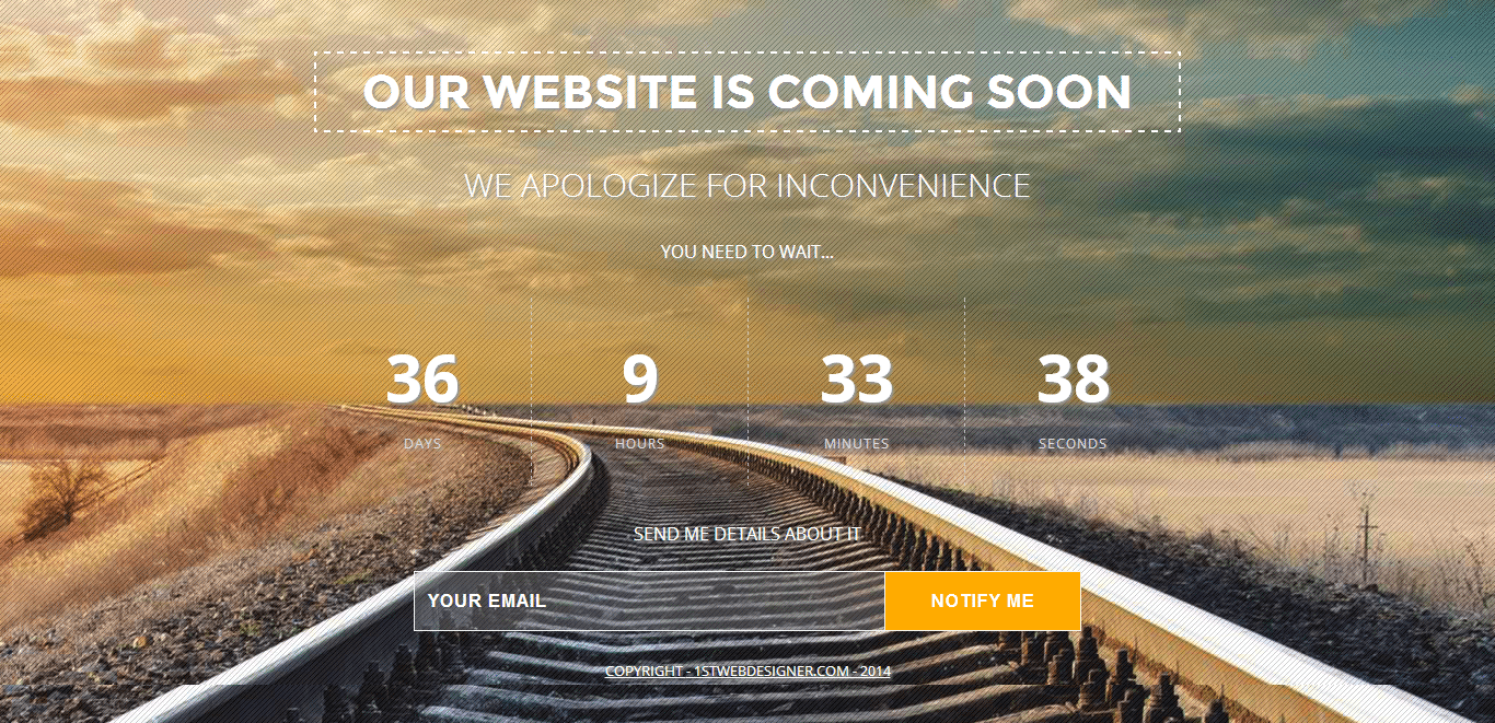
If you are going to check the output on your browser. You will get similar results like the image below.
The jQuery
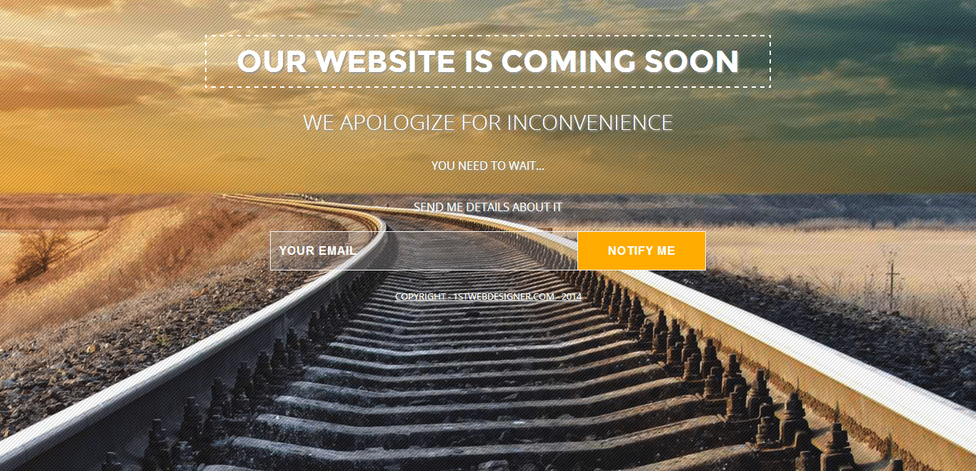
Notice that the counter is not yet showing on the page. To make it appear, add our jQuery codes before the closing body tag. First, load our jQuery Countdown plugin by specifying the link of the script.
<script type="text/javascript" src="js/jquery.countdown.min.js"></script>
Next, add the following code to display our counter. Copy the code below under the script link of our jQuery countdown plugin. In the code below, a variable launchdate to hold and to instantiate a new date was used.
You can change the launch date according to the date you want it to be set (according to YYYY,M-1,D calendar format). Just take note that months range from 0 -11 like an array setup and then subtract it to 1.
For this example, the launch date of the site will be on June 7, 2014. Finally use the ID counter to call our launchdate variable.
  $(document).ready(function() {
        var launchdate = new Date(2014, 6 - 1, 7);
        $('#counter').countdown({
            until: launchdate
        });
    })(jQuery);
Conclusion
Congratulations! You just created a fantastic “Coming Soon” page with counter. When visitors land on coming soon page, usually they’re not coming back again to check the page, especially if doesn’t have enough information about the site or the launch date.
Adding a counter will make inform them about the date wherein they can check the site live. A Coming Soon page, when created properly, will loop visitors by getting them to subscribe to the news update and will keep on coming back.
Hope you enjoyed this tutorial and see you again next time.
If you completed the both tutorials you now have a pretty solid knowledge on how to build coming soon page. However in the next section there are some great guidelines on how to build an useful one.
This post may contain affiliate links. See our disclosure about affiliate links here.


