Join over 55,891 Subscribers Today! FREE UPDATES!
Get The Only Freelancer crash course you will ever need to read!
The buzz around responsive websites has been going on for several months now, and a lot of websites are already responsive, or underway. You know what that means? Today I will teach you how to create a responsive website.
If you follow 1WD on Facebook or Twitter, then you already know that we’re already preparing for an explosive design, which includes being responsive. Watch out for it!
By the end of this quick tutorial about responsive design, you will already be on your way to web stardom, and by that I mean you’ll be ready to convert and create responsive websites!
Are you ready? Show me your war faces! Roaaar!
I promised that it will only take about 15 minutes to create a responsive website, and I will hold true to my words. Only, we shall start slow and small. We will start by creating a simple single-page website. Cool? Okay!
Frameworks you can use:
If you are fairly new to the term, then we have the perfect reading materials for you!

By the end of this tutorial you will end up with something similar to the page above. It is a very plain design, but it will do the trick for now. It is fairly easy to clone the image as seen above, but the main goal here is to make it responsive. To make the website respond based on the size of your device’s screen size.
Try opening the demo on your smartphone and you will see this:

This is what Foundation can do along with several other frameworks that focuses on making websites responsive for mobile devices.
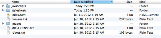
You will find all the files, including the images, in the download link below.
Before moving on, download Foundation and unzip it to a folder where all of your files for this tutorial will be located. It should look like this:

Open index.html and see several elements blasted in one page as a demo. We won’t use everything you will see in it, but you can learn a lot from it. Now, delete it or move it somewhere else so that we can start from scratch.
Our goal is to create a webpage which has the basic areas of a website: header, body, sidebar, and footer. Of course everything will be responsive, from images down to text and elements placement.

Okay, it is already a given that we will use the structure above, but how will we translate that to HTML? Easy!
First, you need to understand a few things about Foundation and how layouting works. It uses 12 columns to define the width of each “section” which is derived from foundation.css’ width of 1000px. So, if we write:
<div class="row">
<div class="twelve columns">
</div>
</div>
The above code would mean that in this certain row, you will occupy twelve columns with the width of 1000px. While on the code below:
<div class="row">
<div class="twelve columns">
<div class="six columns">
</div>
<div class="six columns">
</div>
</div>
</div>
We placed two “six columns” inside of “twelve columns”, this would mean that “six columns” will occupy 50% of the width of “twelve columns”. The same is true for other number of columns:
<div class="row">
<div class="twelve columns">
<div class="row">
<div class="seven columns">
<div class="row">
<div class="twelve columns">
</div>
</div>
</div>
<div class="five columns">
</div>
</div>
</div>
For “seven columns” we placed another row inside which occupies “twelve columns”. This means that “twelve columns” will take the maximum width of “seven columns” and divide it into “twelve columns”. It’s a nest of rows and columns, which is important for our goal layout. Now that rows and columns, and nested columns, have been explained, let’s move on to the main show.
Using your favorite text editor, create a file named index.html then add the following at the very beginning of the file:
<!-- Rean's note: if you're wondering what are these items below, you should follow the link below -->
<!-- paulirish.com/2008/conditional-stylesheets-vs-css-hacks-answer-neither/ -->
<!--[if lt IE 7]> <html class="no-js lt-ie9 lt-ie8 lt-ie7" lang="en"> <![endif]-->
<!--[if IE 7]> <html class="no-js lt-ie9 lt-ie8" lang="en"> <![endif]-->
<!--[if IE 8]> <html class="no-js lt-ie9" lang="en"> <![endif]-->
<!--[if gt IE 8]><!--> <!--<![endif]-->
<!-- Set the viewport width to device width for mobile -->
Welcome to Foundation
<!-- Included CSS Files -->
<!--[if lt IE 9]>
<link rel="stylesheet" href="stylesheets/ie.css">
<![endif]--><script type="text/javascript" src="javascripts/modernizr.foundation.js"></script>
<!-- IE Fix for HTML5 Tags -->
<!--[if lt IE 9]>
<script src="http://html5shiv.googlecode.com/svn/trunk/html5.js"></script>
<![endif]-->
The above code is where we deal with the evil of Internet Explorer. It is also where we call on to different stylesheets which are necessary to make the whole thing responsive and run on mobile devices. It comes with Foundation. Then type the following code:
<div class="row">
<div class="twelve columns">
<h2>Header Twelve Columns</h2>
</div>
</div>
<div class="row">
<div class="twelve columns">
<div class="row">
<div class="seven columns">
<h3>Body Seven Columns</h3>
</div>
<div class="five columns">
<h3>Sidebar Five Columns</h3>
</div>
</div>
</div>
</div>
<div class="row">
<div class="twelve columns">
<h2>Footer Twelve Columns</h2>
</div>
</div>
I have already explained what these “rows” and “twelve columns” are above.
Tip: if it’s not clear to you why we should wrap the sidebar and body with “twelve columns” you can try removing it and see what happens!
By now it should look like this:

We haven’t added stylings yet, but you can already see how it jives with our goal. I’m not much of a designer but I will do my best to make this look amazing.
Wait, wait, wait! What’s that navigation bar, you ask? As I have mentioned earlier, this is one of the beauties of Foundation. It has an extensive documentation that will teach you how to properly use forms, navigations, buttons, grids, CSS, and other elements covered by Foundation.
Everything is basically done now, all we need to do is add some images and paragraphs and design the whole thing. If you followed this tutorial, then by now you have already created your first responsive web page!
This step is needed to actually see how the webpage will look like in its full glory. Copy some Lorem Ipsum and paste it on your “body” div, then insert images using <img> tag and then you’re on your way to becoming a superstart with this!
If you’ll go back and check the demo, you might notice that the background isn’t exactly white, but with a subtle pattern. Choose one on SubtlePatterns and see for yourself which works best.
Well, actually there is a step 4. The next thing you need to do is study the files you downloaded and start creating your own responsive web page from scratch. There are a lot of other tools you can use aside from Foundation, but the idea is basically the same. Don’t forget to check the documentation!
What do you think about this tutorial? This is my first time writing one, and it may appear messy to experts, but comments and suggestions are always welcome so that we can all improve, right? Start typing now!
Get The Only Freelancer crash course you will ever need to read!
Rean is the editor of 1stwebdesigner. He regularly writes about freelancing, technology, web design, and web development. Rean also writes at Knowledge Salad, a blog filled with weird and interesting facts. One of his goals is to help his fellow Filipinos earn money online, to help them build a career out of working from home, just like what he has been doing for years now.
Wednesday, October 3rd, 2012 02:47
The files are wrong , the net is full of bad tutorials like this if u wanna see people learning fix the files.
Thursday, September 27th, 2012 13:22
The links in this ‘tutorial’ are not the ones that are in the source code of the test page.
Friday, September 7th, 2012 23:53
GREAT tutorial :) .
Tuesday, August 14th, 2012 15:08
Wow, amazing tutorials! It will take me more than 15-minutes though! Just came across your site today and I will be bookmarking it!
Wednesday, September 12th, 2012 08:42
Can someone PLEASE give me the link to the actual demo? The download the guy gives looks horrid and its hard to follow compared to the demo. I had to save as the demo but i feel like its still missing some things. Please help
Wednesday, August 8th, 2012 16:42
Thank you very much for this inspiring tutorial. I’d been meaning to find out about Responsive web design and your article gave me the kick in the butt that I needed. Downloaded Foundation and was shocked at how easy the whole concept is to understand and work with. Without intending to, I rebuilt one of my large sites in a week and will probably redesign other sites using this technique. Also get to put another skill under my belt. Thanks again!
Monday, July 30th, 2012 01:32
Nice piece of collaborative instructions and overview but you may have messed up a little on the image and what would it look like after that. But all in all, really informative. Thanks :)
Saturday, July 28th, 2012 12:28
This article confused me when i went through it step by step.
If you take a look at the example of how it should look like at step 2, the image is incorrect.
During the tutorial, you never wrote anything to make the nav bar appear, therefore causing confusion.
For your next tutorial ( or maybe a better version of this one) try to think of these things and show more steps
in between with if possible, more screenshots. Still i’d like to thank you for introducing us to the Foundation framework.
Wednesday, August 1st, 2012 16:43
Ooo i saw it, my bad.
I understand it alot more right now, i looked at the omage, assuming that i couldn’t continue the rest of the tutorial. I’ll try again. Thank you for your quick reply and cool tutorial.
Tuesday, July 24th, 2012 09:32
Have you tried Responsive Grid System? I like it. but I would, I built it!
Tuesday, July 24th, 2012 01:56
Such a substantial article. It does not only help the PRO’s, but the beginners as well. Jargons are not easily understood by any beginner but you explained it well! Thanks for the generous information!
Sunday, July 22nd, 2012 17:25
Hi Dainis,
thanks for your post … what people very often forget about though is, that “responsive design” in the long run has to with useful content, “fulfilling needs” and therefore psychology and marketing. Wasn’t the purpose of your thread, so never mind ;-).
Best regards from Germany
Udo
Saturday, July 21st, 2012 16:46
I just finished reading this article and the comments posted here are really useful in resolving my queries related to responsive design. I like the way you explained this article and especially replies to comments are awesome. I appreciate your work Dainis and John, looking forward for more informative articles.
Friday, July 20th, 2012 05:26
15 minutes is very athletic … but a nice tutorial
Friday, July 20th, 2012 02:34
amazing tutorial, it make me more fun to play with strategy for creating my first responsive website….thanks
Friday, July 20th, 2012 00:51
Mr. Dainis Graveris and Mr. Rean John.. can you show a tutorial for the fluid html design.. i think so this is the word… anyways i know you’ll be understand
Thursday, July 19th, 2012 14:57
The demo is different to the download..it doesn’t have the nice menu bar; is that why it only took 15 mins?
Thursday, July 19th, 2012 01:51
Great tutorial. First of all I want to thank you for mentioning so many great resources on Responsive Design. Secondly, you explained everything clearly. I got a query, after a little bit of research, I came to know that some are considering only 2-3 screen resolutions, while some others are creating responsive design by considering some 5-6 media screens. Can you explain which of these two is more preferable ?
Wednesday, July 18th, 2012 15:13
Hey thanks for the neat tutorial. Personally what Framework would you recommend using?
Wednesday, July 18th, 2012 14:12
That’s a good tutorial for responsive site but i have to agree with Rod, in 15 min it’s difficult…
Well done!
Wednesday, July 18th, 2012 11:28
Great tutorial! I am getting ready to make my first responsive website (it being all the rage right now) and this article is very helpful!
By the way, your writing is great :) very fun to read.
Wednesday, July 18th, 2012 01:48
got it ice but once thing i want to know what if we had to make a big site into mobile version like carshop.com shall we use this type of approach or we should make a separate site for mobiles.
Thanks,
Tanveer Singh
If not, then it's time to learn how to:
You can trust 1stWebDesigner to help you become a better web designer!
- Jacob Cass | Just Creative
Just enter your name and email below and click Get Updates!
rod
Tuesday, July 17th, 2012 11:49
15 min ? ok ! …
peter
Thursday, July 19th, 2012 14:57
The demo is different to the download..it doesn’t have the nice menu bar; is that why it only took 15 mins?
Tanveer
Friday, July 20th, 2012 00:51
Mr. Dainis Graveris and Mr. Rean John.. can you show a tutorial for the fluid html design.. i think so this is the word… anyways i know you’ll be understand
Dainis Graveris
Friday, July 20th, 2012 16:17
What do you mean with fluid? Responsive is fully flexible, that’s all you need now.
Tanveer
Sunday, July 22nd, 2012 01:03
I was saying about this
http://html5awesome.com/themeforest/simflex-template/
The size of elements changes as we change the width.. no fixed resolutions
Roman Liutikov
Sunday, July 22nd, 2012 03:17
Use
max-widthCSS property.Valt
Friday, July 20th, 2012 02:34
amazing tutorial, it make me more fun to play with strategy for creating my first responsive website….thanks
Dainis Graveris
Friday, July 20th, 2012 16:16
Glad you enjoy it, let me know how you do, and please use your real name, i changed it now, won’t approve keywords in name anyway.
Nico
Friday, July 20th, 2012 05:26
15 minutes is very athletic … but a nice tutorial
Dainis Graveris
Friday, July 20th, 2012 16:15
Enjoy and please use your real name in comments!
Ricardo Nunes
Wednesday, July 18th, 2012 14:12
That’s a good tutorial for responsive site but i have to agree with Rod, in 15 min it’s difficult…
Well done!
Dainis Graveris
Thursday, July 19th, 2012 05:41
Hah Ricardo, did you actually gave it a try? :)
Ricardo Nunes
Thursday, July 19th, 2012 10:02
Honestly? No, but it seems a lot of stuff for 15 min. That’s all ;)
Dainis Graveris
Friday, July 20th, 2012 16:19
Heh, you need to work fast to be productive :) Try it!
Rean John Uehara
Thursday, July 19th, 2012 07:41
Understanding Step 1 will do the trick, I swear! :)
Kim Fox
Wednesday, July 18th, 2012 11:28
Great tutorial! I am getting ready to make my first responsive website (it being all the rage right now) and this article is very helpful!
By the way, your writing is great :) very fun to read.
Tanveer
Wednesday, July 18th, 2012 01:48
got it ice but once thing i want to know what if we had to make a big site into mobile version like carshop.com shall we use this type of approach or we should make a separate site for mobiles.
Thanks,
Tanveer Singh
Rean John Uehara
Thursday, July 19th, 2012 07:39
Hi Tanveer! It actually depends on you. But seeing that carshop.com has quite the functionality, they might as well develop a separate site for its mobile version.
Tanveer
Friday, July 20th, 2012 00:48
Thanks sir so i will start doing a separate site for this.. Thank you very much :)
Lazaac
Tuesday, July 17th, 2012 20:49
thanks bro! Roaaar!
Luis
Wednesday, July 18th, 2012 15:13
Hey thanks for the neat tutorial. Personally what Framework would you recommend using?
Bharat Chowdare
Thursday, July 19th, 2012 01:51
Great tutorial. First of all I want to thank you for mentioning so many great resources on Responsive Design. Secondly, you explained everything clearly. I got a query, after a little bit of research, I came to know that some are considering only 2-3 screen resolutions, while some others are creating responsive design by considering some 5-6 media screens. Can you explain which of these two is more preferable ?
Dainis Graveris
Thursday, July 19th, 2012 05:59
Bharat, most websites are interested to get responsive to look good on mobile, tablets and big screens on computers. You can design different transitions, like even 5-6, but i feel 3 is more than enough. Check this article for inspiration – http://www.1stwebdesigner.com/inspiration/responsive-webdesign-tools-inspiration/
I am pointing especially on inspiration section, where you can use Firefox Nightly or any other tool to change screen size, or just expand your browser screen from full to small and you’ll see how many transitions other sites have..and have a good understanding how many transitions make sense for your designs. Hope it helped, let me know, Bharat!
Roman
Thursday, July 19th, 2012 06:34
Things becomes more complicated when you dive deeply into developing with rwd. Some devices need type size adjustments because of high ppi, so we need to use device-pixel-ratio media query or device-width as an alternative.
And this is just a bit of all things which should be considered when developing for both desktop and mobile expirience.
Dainis Graveris
Friday, July 20th, 2012 16:22
Roman, of course – as it is with everything. If you want to go real deep, it will become a bit scary at first, because there are so many devices, so many solutions you need to find in order to create fully functional and responsive website, but I think this is nice place to get started if you are becoming familiar with responsive sites!
saha
Thursday, July 19th, 2012 03:40
Great fun man. amazing tutorial for beginners.
Dainis Graveris
Thursday, July 19th, 2012 05:39
Did you succeed on creating your first responsive website? :)
John Bash
Saturday, July 21st, 2012 16:46
I just finished reading this article and the comments posted here are really useful in resolving my queries related to responsive design. I like the way you explained this article and especially replies to comments are awesome. I appreciate your work Dainis and John, looking forward for more informative articles.
Dainis Graveris
Saturday, July 21st, 2012 23:45
Oh thank you John, for kind comments! All praise goes to Rean, he’s been crazy with responsive lately :) Digging deep! Glad you enjoyed tutorial!
Sarah
Friday, September 7th, 2012 23:53
GREAT tutorial :) .
Steve Clone
Tuesday, August 14th, 2012 15:08
Wow, amazing tutorials! It will take me more than 15-minutes though! Just came across your site today and I will be bookmarking it!
Dainis Graveris
Wednesday, August 15th, 2012 01:39
Heh, let me know Steve, how long it took for you :)
Website break scanner
Wednesday, September 12th, 2012 08:42
Can someone PLEASE give me the link to the actual demo? The download the guy gives looks horrid and its hard to follow compared to the demo. I had to save as the demo but i feel like its still missing some things. Please help
Rean John Uehara
Saturday, September 15th, 2012 22:00
Link to the demo: http://www.1stwebdesigner.com/wp-content/uploads/2012/07/ResponsiveTutorial/test.html
Website break scanner
Sunday, September 16th, 2012 14:58
Yes that is the link that I used, however it isn’t laid out properly for the tutorials sake. Its hard to explain I guess, but basically all the files are in one folder and not organized, which is my main issue. If anyone still has the old version of the demo that LOOKS like the test.html file that would be great lol. The tut is excellent. I just need the correct files so I can follow.
Website break scanner
Monday, September 17th, 2012 08:39
So this is what I was talking about. To better explain what I mean, This is the file structure of your demo, I clicked on “Download File” which should get me the Responsive.zip file.
Opening the folders gives me the following file structure. css, img, and js folders which are organized properly:
http://img17.imageshack.us/img17/8256/3e96fce02972492d84709fa.png
However I click on index.html, and it looks like this:
http://img37.imageshack.us/img37/8223/0b6183d9b5654167b53cbb0.png
As for the test.htrml that you posted recently. That site looks great! Everything looks like it should:
http://img228.imageshack.us/img228/8631/e33e084972174b5591c22bd.png
However the files are just dumped in one folder:
http://img26.imageshack.us/img26/5489/e7be42a4472542358a5a0c5.png
I know I sound nit-picky in all of this and I could just organize the files myself, but I just wanted to let you know that for those who won’t know how to organize these files, the css, js, and img, it would really help them :-)
Rean John Uehara
Monday, September 17th, 2012 20:50
I see what you mean now. Not to ward off pedants, but that issue doesn’t seem to impair understanding of the whole tutorial. ;)
Rean John Uehara
Sunday, September 16th, 2012 19:44
You can post a screenshot, you know. Are you using an old version of IE? I’ve checked it on Safari, Firefox, and Chrome on Mac and they’re all fine. Same goes for Windows browsers.
Ivan
Wednesday, October 3rd, 2012 02:47
The files are wrong , the net is full of bad tutorials like this if u wanna see people learning fix the files.
Paul Mountney
Thursday, September 27th, 2012 13:22
The links in this ‘tutorial’ are not the ones that are in the source code of the test page.
Graham Miller
Tuesday, July 24th, 2012 09:32
Have you tried Responsive Grid System? I like it. but I would, I built it!
Bernard
Wednesday, August 8th, 2012 16:42
Thank you very much for this inspiring tutorial. I’d been meaning to find out about Responsive web design and your article gave me the kick in the butt that I needed. Downloaded Foundation and was shocked at how easy the whole concept is to understand and work with. Without intending to, I rebuilt one of my large sites in a week and will probably redesign other sites using this technique. Also get to put another skill under my belt. Thanks again!
Dainis Graveris
Thursday, August 9th, 2012 02:34
Bernard, thank you for this awesome comment! Glad to hear you moved ahead and now are moving on fully using responsive benefits? :)
Udo
Sunday, July 22nd, 2012 17:25
Hi Dainis,
thanks for your post … what people very often forget about though is, that “responsive design” in the long run has to with useful content, “fulfilling needs” and therefore psychology and marketing. Wasn’t the purpose of your thread, so never mind ;-).
Best regards from Germany
Udo
John
Tuesday, July 24th, 2012 01:56
Such a substantial article. It does not only help the PRO’s, but the beginners as well. Jargons are not easily understood by any beginner but you explained it well! Thanks for the generous information!
Francis
Saturday, July 28th, 2012 12:28
This article confused me when i went through it step by step.
If you take a look at the example of how it should look like at step 2, the image is incorrect.
During the tutorial, you never wrote anything to make the nav bar appear, therefore causing confusion.
For your next tutorial ( or maybe a better version of this one) try to think of these things and show more steps
in between with if possible, more screenshots. Still i’d like to thank you for introducing us to the Foundation framework.
Rean John Uehara
Monday, July 30th, 2012 06:49
“you never wrote anything to make the nav bar appear”
Hi Francis, I actually answered that question because I knew that people will ask me where the Nav Bar came from. Care to take a guess where the answer is? :) Hint: if you read it without skipping, you’ll definitely find it. ;)
Francis
Wednesday, August 1st, 2012 16:43
Ooo i saw it, my bad.
I understand it alot more right now, i looked at the omage, assuming that i couldn’t continue the rest of the tutorial. I’ll try again. Thank you for your quick reply and cool tutorial.
Rean John Uehara
Thursday, August 2nd, 2012 04:54
Yo Francis, don’t forget to sign up on our newsletter because soon we’ll be introducing more tutorials like this that you’ll surely love! :)
Luiz Santos
Monday, July 30th, 2012 01:32
Nice piece of collaborative instructions and overview but you may have messed up a little on the image and what would it look like after that. But all in all, really informative. Thanks :)