 Many sites have a really cool hidden slide out menu panel which contains some relevant information and this panel is revealed to us, with a cool animation, when we click on a particular button or hover over it. This has usually been achieved using jQuery. But now as we advent towards the future and CSS3 is becoming a reality, here is a tutorial on how to build an animated slide out panel using only CSS3.
Note: This tutorial uses some advanced css3 techniques which are not yet supported in Firefox. To get the full version, you should see the live demo in a web-kit engine for example Safari and Chrome. You can download the source code here. The final demo can also be seen here.
Your Designer Toolbox
Unlimited Downloads: 500,000+ Web Templates, Icon Sets, Themes & Design Assets

Table of Contents:
- Slide Out Menu Panel Tutorial Using CSS3 Only
- How to Create a CSS3 Pop-Out Menu Without Learning Programming
Slide Out Menu Panel Tutorial Using CSS3 Only
This slide out content panel can be used for various purposes. We can see today, that there is a lot of hidden menus or content that can be revealed to us, by hovering over a button or by clicking on the button. With no further ado let’s dig in!
Step 1: Analyzing the Goal
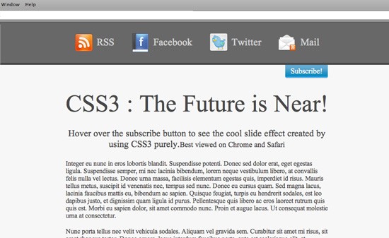
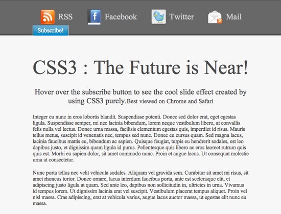
A slide out panel can be used for various ways. Its uses depend on the requirement of the site. One may use it for a slide out login box or for just listing the subscribing options for the site. We are going to assume a scenario where we want a subscribe option for the viewers on the top right hand corner of the screen:
Now once the viewer hovers over the subscribe button on the top right hand corner, the whole hidden panel will come sliding down with a very smooth animation effect revealing the subscribing options to the visitor.
Step 2: Creating the xHTML skeleton
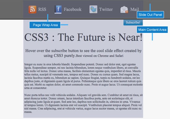
Now that we know what we want to achieve, lets plan out how the xHTML architecture of the whole layout is going to be. We would basically need two parts of the layout. One part will be the top one, which will be our hidden panel and will contain the subscribing options. The second part will be the main content area for the whole layout. This area will contain everything which will be visible to the viewer. Here is how our code for the website layout is going to be:
<!--<span class="hiddenSpellError" pre=""-->DOCTYPE html PUBLIC "-//W3C//DTD XHTML 1.0 Transitional//EN" "http://www.w3.org/TR/xhtml1/DTD/xhtml1-transitional.dtd">
xmlns="http://www.w3.org/1999/xhtml">
<head>
<meta content="text/html; charset=utf-8" http-equiv="Content-Type" />
<meta http-equiv="X-UA-Compatible" content="IE=EmulateIE7" />
<link href="css/styles.css" rel="stylesheet" type="text/css" />
</head>

<body>

<div id="slide-out">

<div id="subscribe" class="page-wrap">

<ul>


<li><a class="<span class=">rss</a></li>

<a class="<span class=">" href="#">RSS</a>

<li ><a class="fb" href="#">Facebook</a></li>


<li><a class="twitter" href="#">Twitter</a></li>


<li><a class="mail" href="#">Mail</a></li>

			</ul>


<div class="clear"></div>

			<a href="#" class="button">Subscribe!</a>
		</div>

	</div>


<div id="main-container">

<div class="page-wrap">

<h1>CSS3 : The Future is Near!

<h3>Hover over the subscribe button to see the cool slide effect created by using CSS3 purely.<small>Best viewed on Chrome and Safari</small>
Integer eu nunc in eros lobortis blandit. Suspendisse potenti.
Nunc porta tellus nec velit vehicula sodales. Aliquam vel grav
		</div>

	</div>

</body>
</html>
The body is divided into two parts, the slide-out and the
main-container. The slide out division contains the subscribe links along with the subscribe hyperlink button. Note that we have given a class of button to the subscribe hyperlink. The main container contains all the sites main text and information. Both the slide-out division and the main container division are assigned a
page wrap class to keep them aligned centered in the screen.
Step 3: Styling the basic layout
The style-sheet just contains some simple styling of the page. As explained above, there will be one slide-out division, one main container and one page-wrap class. These forms the basic styling elements of our page which give it the look we want.
The CSS for styling the basic layout of the page is as follows:
@import url('reset.css');
body{
	color: #484848;
	background-color: #f7f7f7;
}
.clear {
	clear: both;
}
h1{
	font-size: 58px;
	margin-bottom: 25px;
	height: 68px;
}
h3{
	font-size: 22px;
	margin-bottom: 25px;
}
p{
	text-align: left;
	margin-bottom: 20px;
}
#slide-out {
	background-color: #686868;
	height: 73px;
	color: #fff;
	position: relative ;
	padding-top: 25px;
}
.page-wrap {
	position: relative;
	margin-right: auto;
	margin-left: auto;
	width: 635px;
}
#main-container{
	border-top:thick solid #484848;
	padding-top: 60px;
	text-align: center;
}
.button{
	background-image:url("../images/button.png");
	color:#FFFFFF;
	display:block;
	font-size:18px;
	height:28px;
	padding-top:5px;
	text-align:center;
	text-decoration:none;
	width:105px;
}
#subscribe ul li a{
	background-repeat:no-repeat;
	display:block;
	float:left;
	font-size:24px;
	height:38px;
	margin: 0px 20px;
	padding: 10px 0px 0px 55px;
	color: #d3d3d3;
	text-decoration: none;
	line-height: normal;
}
#subscribe ul li a:hover{
	color: #fff;
}
.rss{
	background-image: url('../images/rss.png');
}
.fb{
	background-image: url('../images/facebook.png');
}
.twitter{
	background-image: url('../images/twitter.png');
}
.mail{
	background-image: url('../images/mail-rss.png');
	margin: 0px;
}
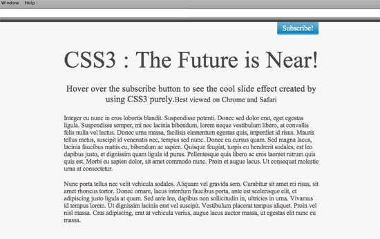
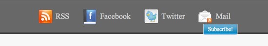
After we have applied the basic styling to our page, it would look somewhat like this
Now that the basic styling of the page is done, we have to set the stage for the panel to hide and show. To achieve that, the first thing we need to do is get the subscribe hyperlink to the bottom right corner of the slide-out division such that it is just peeping out of it. To do this, we have to manipulate the button class in the style-sheet a bit. We are going to make its positioning absolute and then give its right attribute a value of 0px. This will push the subscribe button to the right of the division as shown in the image below.
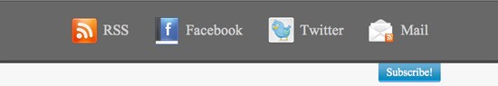
Now we have to just push it down such that it sticks to the foot of the slide-out division. To do that we just have to assign a
negative 63px value to the bottom attribute.
Now that our subscribe button is at its proper place, all we have to do is push the slide-out div out of the screen. To do this, all we have to do is assign a negative margin equivalent to the height of the slide-out div. To prevent the step down bug in IE6, we also have to assign a line-height value of 0 px to the container of our subscribe links i.e. the subscribe box. To negate the 0 line height on the hyperlink elements, we have to assign a normal line height to them too. After modifying our button class, the slide-out id, the subscribe link elements and the subscribe id styles, they will now look like this:
#slide-out {
	background-color: #686868;
	height: 73px;
	color: #fff;
	position: relative ;
	padding-top: 25px;
	margin-top: -98px;
}
#subscribe{
	line-height: 0px;
}
.button{
	background-image:url("../images/button.png");
	bottom:-63px;
	color:#FFFFFF;
	display:block;
	font-size:18px;
	height:28px;
	padding-top:5px;
	position:absolute;
	right:0;
	text-align:center;
	text-decoration:none;
	width:105px;
	z-index:100;
	line-height: normal;
}
#subscribe ul li a{
	background-repeat:no-repeat;
	display:block;
	float:left;
	font-size:24px;
	height:38px;
	margin: 0px 20px;
	padding: 10px 0px 0px 55px;
	color: #d3d3d3;
	text-decoration: none;
	line-height: normal;
}
We all hate Internet Explorer 6 a lot because we always have to add some extra code especially for it. In this case also we would have to do the same. To make the layout look the same as in the other browsers, we have to add some IE6 specific styling at the top of our html page, in the head section.
<!--[if IE]>

<style>
#slide-out {
	padding-top: 10px;
}
.button{
	bottom:-64px;
}
#subscribe ul li a{
	margin: 0px 15px;
	padding: 10px 0px 0px 55px;
}
#slide-out{
	margin-top: -83px;
}
</style>

<!--[<span class="hiddenSpellError" pre="">endif</span>]-->
Now that the slide-out panel is hidden, our task is to enable the hover event on the subscribe button such that the slide-out div reveals itself from the top of the page. You might ask why we have put the subscribe link in the slide-out panel and pushed it outside into the main container, rather than placing it in the main container itself.
The reason behind it is that, we have assigned a negative margin to the slide-out div and pushed it out of the screen. To make it visible again, we have allotted a hover event on it which makes it margin back to 0. As the slide-out div is out of the screen, so it is a difficult process to hover over it. Now because the subscribe hyperlink is actually inside the slide-out div, hence hovering over the subscribe link also acts as a hover event of the slide-out dive making its top-margin 0 and revealing it.
We can imagine the slide-out div to be a person who is hiding and just his hand is visible to us. When we touch the hand, the person comes out. The hover event which will make the slide-out div pop out of the top of the browser on hovering over the subscribe button will be as follows
#slide-out:hover{
	margin-top: 0px;
}
Step 4: The CSS3 Factor!
We are almost at the end of our tutorial. The hover event is set. The slide-out div reveals itself when we hover over the subscribe button. But the whole process happens without any animation effect. The only thing required now is to spice up the whole thing with a pinch of CSS3.Using the transition property in CSS3 we will make the effect as a smooth animation rather than the abrupt effect it has right now. We will give the transition property in the slide-out id style as we are changing its styling on hover. After modifying the slide-out id style, it will look like this:
#slide-out {
	-moz-transition: all 1s ease-in-out;
	-webkit-transition: all 1s ease-in-out;
	-o-transition: all 1s ease-in-out;
	transition: all 1s ease-in-out;
	background-color: #686868;
	height: 73px;
	color: #fff;
	position: relative;
	padding-top: 25px;
	margin-top: -98px;
}
You can change the animation speed by changing the transition speed which is set to 1s at present. This completes our task of enabling a smooth slide out panel from the top of our page without using any javascript.
The Drawbacks
The main drawback of this method at present is that CSS3 transition effect is only supported by webkit browsers like Google’s Chrome, Apple’s Safari and Opera. Even though the slide-out panel on hover would work on other browsers like Firefox and Internet Explorer, but the animation wont work in them. The other drawback is that it wont work on Internet Explorer 6.0 because it doesn’t support the CSS hover event. But there is obviously a solution for this.
Conclusion
This trick just displays how we can use CSS3 to replace some of the major effects provided by JavaScript libraries like jQuery and MooTools. I believe that with time, these basic transition effects will be replaced with CSS3 transition only. It makes the rendering faster and the load time also decreases as the JavaScript libraries plug-ins are not required. There are many ways of creating a slide out panel and JavaScript libraries really take this to a very high level and provide more functionality than just animation effect. There are many tutorials out there which guide you to create a slide out panel like that using jQuery and CSS together. For further reading related to slide out panels using JavaScript, you can refer to these awesome tutorials
- Build a top panel with jquery
- Simple slide panel
- Create a Slide-in Panel with jQuery
- How to create a sexy vertical sliding panel using jquery and CSS3
- Nice clean sliding login panel built with jquery
Now let’s take on another tutorial about pop up menu. Ready? Alright.
How to Create a CSS3 Pop-Out Menu Without Learning Programming
Modern websites offer a more complex hierarchy of navigation. This navigation sometimes makes user-experience on the website’s menu a bit confusing. Using a CSS3 pop-out menu makes it easier to find your way to what you want on the site quickly. Thanks to CSS3, animation is now possible.
Using CSS3, you can simply hide and unhide an element under other elements. This will not only simplify your code but also makes it easily updated. This means you can now perform some sliding animation even without the knowledge of programming.
In this tutorial I will show you how to create a metro type menu that hides and unhides the text menu under the icons each time you mouse over it. OK, let’s rock!
Resource You Will Need to Complete This Tutorial:
- 80 Shades of White Icons
- Time and Patience
Our Final Product
[demo source=”https://1stwebdesigner.com/demos/pop-out_updated.zip” demo=”https://1stwebdesigner.com/demos/pop-out/”]
File Structure
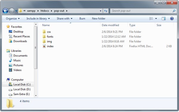
Our file structure will consist of four folders and one HTML file:
- index.html – This will serve as our main file. All of our markup will be utilized using this file
- img folder – For our images and icons
- fonts folder –All our additional fonts will be place here and loaded by the CSS file (Note: if you choose another font on Google fonts, there’s no need for this folder)
- css folder – For our styling (CSS)
Preparing Our Menu Icons
Download the 80 Shades of White Icons. For this tutorial, we’ll be using the following icons.
- Home icon
- User icon
- Portfolio icon
- Chat icon
- Envelope icon
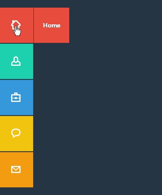
Using these icons, we’ll be creating a sprite image for the icons of our menu.
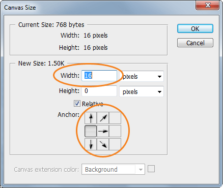
First, drag the Home icon on a new Photoshop file. Then go to Image -> Canvas Size and then add another 16px width on the left side. Make sure that the anchors are pointing to the right.
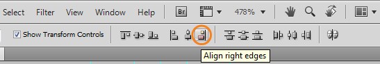
After that, place the User icon to the right side. Make sure you align them to the right properly. You can do this by pressing Ctrl – A on your keyboard and clicking the align right edges button on the Align panel.
Next, repeat the same process for the rest of the icons and then finally save it as a png file.

The HTML Markup
For our HTML file, we will first add the HTML5 doctype and series of links in our head section. This will include our CSS link files.
<meta charset="utf-8" />
CSS3 Pop Out Menu
      			<link href="css/normalize.css" rel="stylesheet" />
      			<link href="css/style.css" rel="stylesheet" media="screen" />
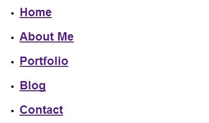
The menu elements are wrapped inside an unordered list. Each element has a class of box, followed by an anchor tag, span icons and an H2 tag (for the title of the element). All of our menu is wrapped in a container class.
</pre>
<div class="container">
<ul class="icon-menu">
<li class="icon-box home"><a href="#">
</a>
<h2>Home</h2>

<a href="#">
 </a></li>
<li class="icon-box aboutme"><a href="#">
</a>
<h2>About Me</h2>

<a href="#">
 </a></li>
<li class="icon-box portfolio"><a href="#">
</a>
<h2>Portfolio</h2>

<a href="#">
 </a></li>
<li class="icon-box blog"><a href="#">
</a>
<h2>Blog</h2>

<a href="#">
 </a></li>
<li class="icon-box contact"><a href="#">
</a>
<h2>Contact</h2>

<a href="#">
 </a></li>
</ul>
After we set up our HTML markup, we should have something like this.
The CSS
Now it’s time for our pop-out menu to shine. First, let’s import the font that we’ll be using on our menu elements and titles.
@font-face
{
	font-family: Museo500-Regular;
	src: url('../fonts/Museo500-Regular.otf');
}
Let’s now add the styles for our general settings. First we will add a background with hexadecimal color of #263544 and a font face of Museo 500. And then, we will also set some styles for our anchor and H2 tags.
body {background: #263544; font-family: Museo500-Regular;}
a{text-decoration: none;}
h2 {color: #fff; font-size: 22px; margin: 0 24px;}
Next, let’s add some styles to our icon boxes where we will be hiding our text menu. Using the unordered list, let’s style the class icon-menu to hold all of our icon menu.
Then, let’s style the class icon-box and give it a dimension of 120px x 120px. Now let’s use the menu name as its class to manipulate the background color of each box according to its title.
ul.icon-menu {margin-top:29px;}
li.icon-box {width: 120px; height: 120px; list-style: none; left: -47px; position: relative; margin-bottom: 3px;}
li.icon-box.home {background: #e74c3c;}
li.icon-box.aboutme {background: #1dd0ad;}
li.icon-box.portfolio {background: #3498db;}
li.icon-box.blog {background: #f1c40f;}
li.icon-box.contact {background: #f39c12;}
.icon-box h2{Museo500-Regular; font-size: 20px; text-shadow: 1px 1px 2px rgba(150, 150, 150, 1);}
.icon-box a {display: block;}
After that, let’s also set the positions of our menu icons using our sprite images. We will use the span tag and attach the icon class name to it and manipulate its position.
span.icon {display: inline-block; background: url('../img/icon-sprites.png')no-repeat;  width: 32px; height: 32px; margin: 43px 45px;}
span.icon.home {background-position: 0px 0px;}
span.icon.aboutme {background-position: -36px 0px;}
span.icon.portfolio {background-position: -72px 0px;}
span.icon.blog {background-position: -109px 0px;}
span.icon.contact {background-position: -145px 0px;}
For our menu name, we will use the H2 tags as our anchor tag and and we’ll set the position to absolute and then push it to the left. Using the style method z-index, we will hide the menu under its menu icon and box.
Using the transition attribute, we can add an effect when changing from one style to another without using Flash animations or JavaScript. This means each time the user mouses-over the icons, it will change its position to the right by adding a margin value to its left with smooth animation.
.icon-box.home h2 {
	 z-index: -999;
	 position: absolute;
	 top: 0;
	 left: 0;
	 opacity: 0;
	 background: #E74C3C;
	 line-height: 120px;
	 width: 120px;
	 -webkit-transition: all  .3s;
	-moz-transition: all .5s;
	-ms-transition: all .5s;
	-o-transition: all .5s;
	transition: all .5s;
		border-left: 3px solid #a7382d;

}

.icon-box.home a:hover h2 {
	opacity: 1; left: 120px; margin: 0;
	text-align: center;

}

.icon-box.aboutme h2 {
	 z-index: -999;
	 position: absolute;
	 top: 0;
	 left: 0;
	 opacity: 0;
	 background: #1dd0ad;
	 line-height: 120px;
	 width: 120px;
	 -webkit-transition: all  .3s;
	-moz-transition: all .5s;
	-ms-transition: all .5s;
	-o-transition: all .5s;
	transition: all .5s;
    border-left: 3px solid #0d866e;
}

.icon-box.aboutme a:hover h2 {
	opacity: 1; left: 120px; margin: 0;
	text-align: center;

}

.icon-box.portfolio h2 {
	 z-index: -999;
	 position: absolute;
	 top: 0;
	 left: 0;
	 opacity: 0;
	 background: #3498db;
	 line-height: 120px;
	 width: 120px;
	 -webkit-transition: all  .3s;
	-moz-transition: all .5s;
	-ms-transition: all .5s;
	-o-transition: all .5s;
	transition: all .5s;
	border-left: 3px solid #2177b1;
}

.icon-box.portfolio a:hover h2 {
	opacity: 1; left: 120px; margin: 0;
	text-align: center;

}

.icon-box.blog h2 {
	 z-index: -999;
	 position: absolute;
	 top: 0;
	 left: 0;
	 opacity: 0;
	 background: #f1c40f;
	 line-height: 120px;
	 width: 120px;
	 -webkit-transition: all  .3s;
	-moz-transition: all .5s;
	-ms-transition: all .5s;
	-o-transition: all .5s;
	transition: all .5s;
	border-left: 3px solid #b8960e;
}

.icon-box.blog a:hover h2 {
	opacity: 1; left: 120px; margin: 0;
	text-align: center;

}

.icon-box.contact h2 {
	 z-index: -999;
	 position: absolute;
	 top: 0;
	 left: 0;
	 opacity: 0;
	 background: #f39c12;
	 line-height: 120px;
	 width: 120px;
	 -webkit-transition: all  .3s;
	-moz-transition: all .5s;
	-ms-transition: all .5s;
	-o-transition: all .5s;
	transition: all .5s;
	border-left: 3px solid #bc780d;
}

.icon-box.contact a:hover h2 {
	opacity: 1; left: 120px; margin: 0;
	text-align: center;

}
And I think that’s it! By this you’ll have the same output like the one you see on our finish product above.
Final Words
Using CSS3 has a lot of advantages. What you can’t do before, like animations, can now be possible without the use of JavaScript. This tutorial is an example how you can perform simple mouse over animations while hiding an element from another element without the skills of programming. Hope you’ve enjoyed and learned something for this tutorial. See you again next time! Cheers!
This post may contain affiliate links. See our disclosure about affiliate links here.


