This tutorial will guide you through creating a responsive dropdown navigation using CSS only, with the help of CSS flexbox and the “checkbox hack”. Basic knowledge of HTML and CSS is required to follow along.
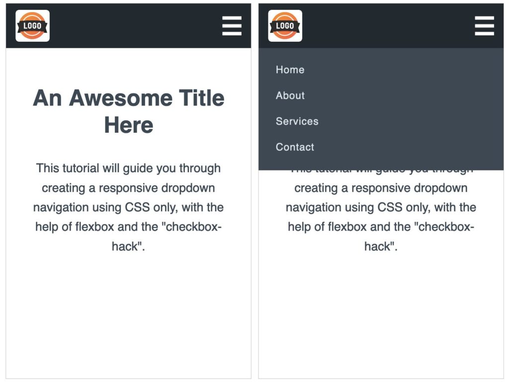
The top navigation bar is vital for any website. Most of the sites have a similar structure for a dropdown navigation menu, but differ in their styles and implementation. Here is one implementation that can be used universally – since it is responsive and doesn’t need JavaScript to toggle the dropdown on mobile devices. Also, we use the “mobile-first” approach to build this. Here is what you will learn to create by the end of this tutorial.
Let’s get started.
Your Designer Toolbox
Unlimited Downloads: 500,000+ Web Templates, Icon Sets, Themes & Design Assets

Mobile First
We will be following the “mobile-first” approach which involves designing a website starting with the mobile version first and then proceeding to design for larger screens. Read more about why mobile-first approach is important in 2020.
Setting up
Create a blank HTML document and name it index.html. Add the basic HTML skeleton. If you use Visual Studio Code, all you need to do is type “!” and hit enter. You will end up with this.
<!DOCTYPE html>
<html lang="en">
<head>
   <meta charset="UTF-8">
   <meta name="viewport" content="width=device-width, initial-scale=1.0">
   <title>Document</title>
</head>
<body>

</body>
</html>
I have used ‘Font Awesome’ for the hamburger menu icon on the right top. So add the following line below the title tag to be able to use this font.
<link href="https://cdnjs.cloudflare.com/ajax/libs/font-awesome/5.12.0-2/css/all.min.css" rel="stylesheet">
Create your stylesheet and name it styles.css. Link the stylesheet to your HTML document below the Font Awesome CDN link using
<link rel="stylesheet" href="styles.css">
I have used this below image as a logo. You can save the same as logo.png or choose to include your own.
HTML
Add the following HTML code within body
<header class="menu">
   <div class="menu-wrap">
       <img src="logo.png" class="logo-img" alt="Logo">
       <nav>
           <ul>
               <li><a href="#">Home</a></li>
               <li><a href="#">About</a></li>
               <li><a href="#">Services</a></li>
               <li><a href="#">Contact</a></li>
           </ul>
       </nav>
       <i class="fa fa-bars menu-icon"></i>
   </div>
</header>
We have a header element which will form the dark navigation bar containing everything else. There is a menu-wrap div which acts as the container for the logo, navigation links and the menu icon. You will not see anything great if you open up this file in your browser yet. So, let’s add some CSS.
CSS
In your styles.css, begin with some common styles for all elements:
* {
   margin: 0;
   padding: 0;
   box-sizing: border-box;
   font-family: sans-serif;
}
Add these styles to the header element.
header {
   height: 70px;
   background-color: #22292F;
   padding: 10px 0;
}
You will now see that dark navigation bar stretching the full width of the browser.
Before you proceed further, make sure you view this page in responsive mode in your browser and select any mobile device size – because we are designing for mobile first.
Now, add these styles to the menu-wrap class:
.menu-wrap {
   display: flex;
   justify-content: space-between;
   padding: 0 15px;
}
We use display:flex to make all the child elements occupy the free space available horizontally. The property justify-content is set to space-between to stretch those elements as far apart as possible.
Let’s style each of those child elements one by one.
.logo-img {
   height: 50px;
}
.menu-icon {
   font-size: 2.4em;
   color: #ffffff;
   line-height: 50px;
}
With this, we have the logo and icon in the perfect positions with correct sizes. Coming to the menu links – we need to absolutely position the whole menu below the bar on mobile phones. First add:
nav {
   position: absolute;
   background-color: #3D4852;
   top:70px;
   left:0;
   width: 100%;
}
Now style the list and links:
nav ul {
   list-style-type: none;
}
nav ul li {
   padding: 0 15px;
}
nav ul li a {
   display: inline-block;
   padding: 12px;
   /* Add your custom styles below to change appearance of links */
   color: #DAE1E7;
   text-decoration: none;
   letter-spacing: 0.05em;
}
Also add the hover and focus styles for links:
nav ul li a:hover, nav ul li a:focus {
   color: #eb6f4a;
}
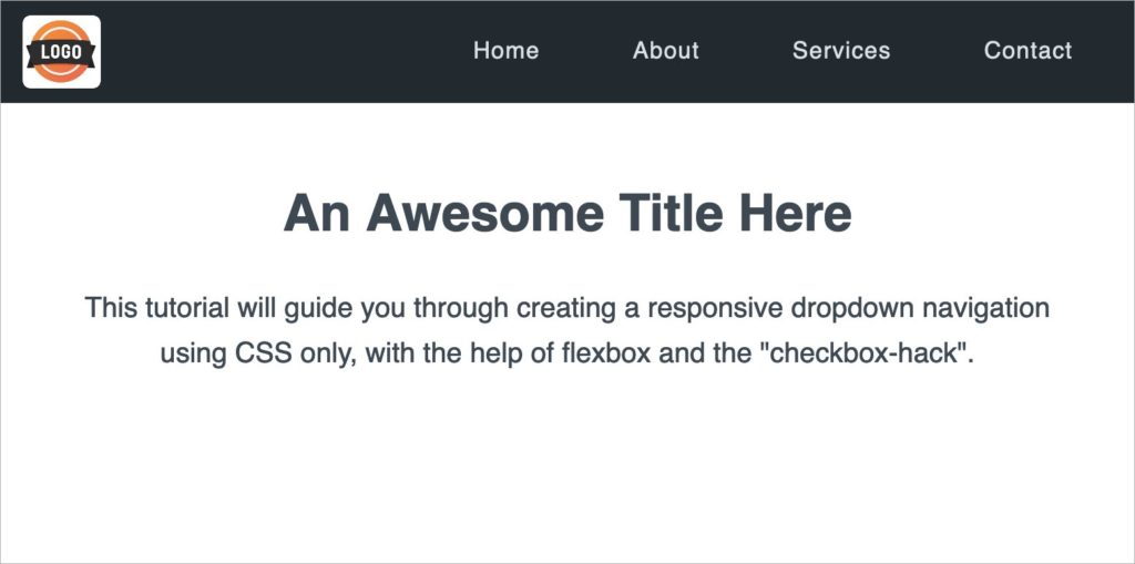
You should now be able to see this:
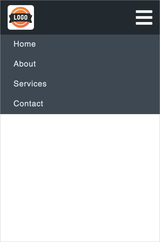
This menu should be hidden at first, and appear on click of the icon. So add these additional styles max-height, overflow and transition too, to the nav ul element:
nav ul li a:hover, nav ul li a:focus {
   color: #eb6f4a;
}
This will hide the entire menu because max-height is 0 and overflow is hidden. The reason we don’t use display:none for hiding the menu is because we need the animation effect of the menu sliding down – the dropdown effect – which can only be achieved by using the max-height property.
The “checkbox hack”
What is this “checkbox hack”? This is the most important part of this tutorial. Read carefully.
Now we need to toggle the menu display using only CSS – no JavaScript. Best way to do that is by using a hidden checkbox element. We use the hamburger icon as the label for this checkbox element. Once the label is clicked, the checkbox gets checked, and hence we can use the “:checked” pseudo-class selector to display the menu!
Reading this might have been an “Aha!” moment for you or it might have left you even more confused. Either way, let us look at the implementation.
HTML
In index.html, add a checkbox element before the nav element:
<input type="checkbox" id="checkbox">
NOTE: It’s really important to add it before the nav, and not after. Because CSS has a selector for the next sibling, but not the previous sibling. You will understand this soon.
Also, surround the menu-icon with a label
<label for="checkbox">
   <i class="fa fa-bars menu-icon"></i>
</label>
Here, for=”checkbox” makes sure that the checkbox gets checked / unchecked whenever this label is clicked.
CSS
We need to first hide the checkbox. In styles.css, add this:
#checkbox {
   display: none;
}
Here comes the heart of the code:
#checkbox:checked ~ nav ul {
   max-height: 200px;
   padding: 15px 0;
   transition: all 0.5s;
}
The ~ symbol is the general sibling selector – which separates two selectors (#checkbox:checked and nav ul) and matches the second element only if it follows the first element. Understand the general sibling selector better with some examples here. This means, when the checkbox is checked, the menu slides down because max-height goes from 0 to a large number.
This is it! If you got everything right, clicking on the hamburger icon now makes your menu slide up and down. Neat.
For larger screens
We surely don’t want the hamburger icon on larger screens where there’s enough space for the links to appear directly.
Let’s add some media queries for tablet size and above, to display the links directly, in place of the menu icon. In styles.css, add this media query:
@media (min-width: 768px) {
}
Within this, first hide the menu icon
@media (min-width: 768px) {
  .menu-icon {
     display: none;
  }
}
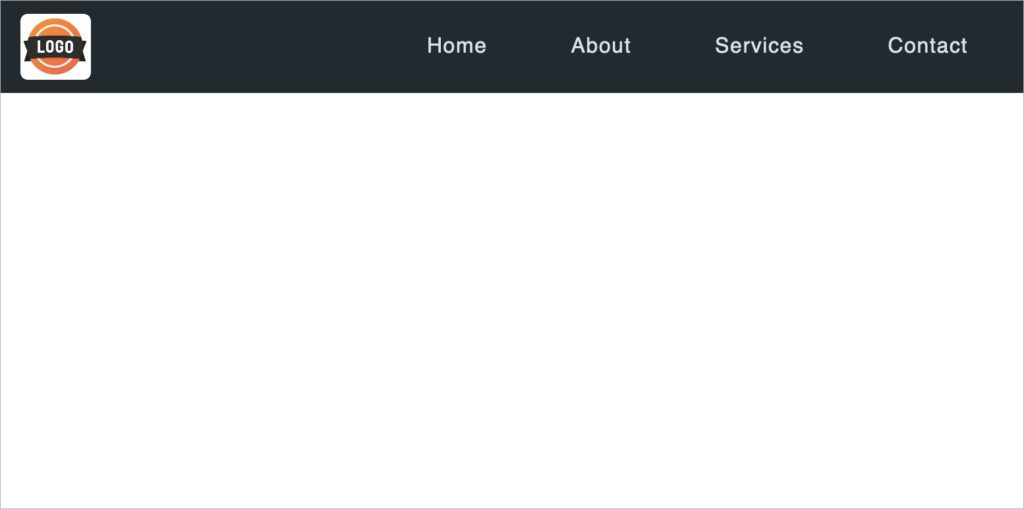
Make sure to increase the screen size in your browser to something larger than 768px in width, to see the changes next.
Now, add styles to relatively position the nav element and change its background color. Then add display:inline-flex for nav ul li to place the links next to each other.
@media (min-width: 768px) {
  nav {
    position: relative;
    top:-10px;
    background-color: transparent;
  }
  nav ul {
    max-height: 70px;
    padding: 15px 0;
    text-align: right;
  }
  nav ul li {
    display: inline-flex;
    padding-left: 20px;
  }
}
There you go.
Congratulations! You now know how to create a responsive dropdown navigation that displays the menu links on the nav bar for larger screens, while displaying a hamburger icon for smaller screens where the icon can be toggled to display / hide the menu using pure CSS. Your newly-learned “checkbox hack” can be put to use in other places too!
If you got stuck anywhere and couldn’t achieve the expected output, here’s the complete source code. Go and implement this dropdown navigation on the awesome websites you now create.
This post may contain affiliate links. See our disclosure about affiliate links here.


