For one, more and more people are using their mobile devices more than their desktops.
According to recent statistics, adult users spend 2.8 hours on their mobiles and only 2.4 hours on their desktops.
Aside from the amount of time, the following statistics also show why it’s time for you to adapt a mobile first design in case you haven’t yet.
- Advertisers have spent a whopping $13 billion on mobile advertisements in 2014 alone.
- 34% of people are now using their Smart TV rather than the traditional TV
- 9% of people have Smart watches
- 7% are reported to have owned Smart wrist watches
- 73% of consumers use their mobile devices to do their shopping
With all the numbers shown, it is evident that more and more people have become dependent on their mobile devices. The next big question then is “how do you adapt for mobile”?
1. Define Your Objective Now and for the Future
Technology is dynamic. Every year, something new comes up – new design, new gadgets, new tools. new trends. Therefore, it is safe to assume that three years from now, there will be more and more significant changes in the technological landscape.
However, when you have decided to adopt a mobile design, you should think of something that is easy to adjust, evolve, and adapt. So that when change comes, you don’t have to start from scratch. Instead, you can do some tweaks and adjustments saving you a lot of time and money.
Therefore, you need to define what your goal is at present as well as your goal in the future. You also need to factor the advantages and disadvantages of just creating an app versus a design which works across different devices.
2. Create Your Content Stacking Strategy
There are already hundreds of possible combinations and operating systems you can utilize nowadays. With these tools and resources, a lot of screen resolutions also come with it. Therefore, as web design professionals, you have to think about the details, such as grid layers and stacks, carefully.
To make sure that all your content displays properly across different platforms – website to mobile and vice versa – define how your content modules are going to stack and reorder themselves.
One of the best ways to do this is by using a simple number approach, sketching the changes when you display the content, and letting your team work through it. Create a prototype and continue to make definition where necessary.
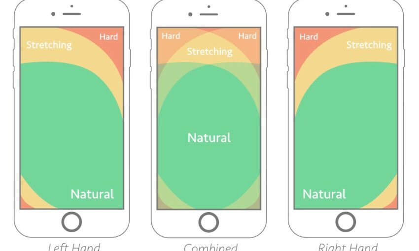
3. Don’t Get Too Hung Up on Different Devices
While it is true that you should consider that there are different devices, not all mobile devices have touchscreens. Therefore, not everyone has the same screen input or resolution. However, you don’t need to focus everything on it.
Remember, if you have great content, people will want to visit your page and read your content no matter how it is presented on various devices and platforms.
When you’re designing for mobile or have adopted the mobile-first design, you have to understand that technology is fast and so are changes. What might not have worked a year ago, might work now. Thus, the code you have used a year ago might not work now.
Make sure that your client also understands this reality, so they will be up for the challenges and changes that come in the future.
This post may contain affiliate links. See our disclosure about affiliate links here.