In this article, we take an in-depth look at the basics of graphic design.
Jump to a Section: The Elements, Principles, Composition.
Your Designer Toolbox
Unlimited Downloads: 500,000+ Web Templates, Icon Sets, Themes & Design Assets
The Basics of Graphic Design: The Elements
There are in total six elements of a design which you need to be aware of: the line, the shape, the color, the texture, the value and the space.
1. The line
The line is usually present in every design, even if it is a solid border of 1px or a dotted one of 5px. Every website has lines, but the minimalistic style which became more popular in the past couple of years tries to erase the lines from the layouts, or at least to decrease the use of them.
The lines can be long, red, straight, thin, blue, dashed, short, black or curved, they are all into the same category. They are most of the time used for delimitation between different sections of a design, or are used to direct a viewer’s vision in a specific direction.
The lines can create different effects and visual impact. While a thick, bold line draws attention because of its visual power, the thin lines tend to go the other way. The color has an impact too, dark colors are easier to see and draw more attention than light or pale colors.
And this is not all. The style of a line can also influence the way the user sees it. This style can easily be defined through CSS and can be solid, dotted and dashed among others. The solid lines have a different impact than the dotted ones, because they are more imposing.
The minimalistic style which I’ve talked about earlier uses either less solid lines or more curved lines, because they give a dynamic and fluid look to a design, which is also the purpose of the style. They indicate energy, keep the user interested and, if combined with illustration, are very powerful to the human eye.
Many years ago solid lines were very popular because they determined the style of the design: rigid, solid and organized. The web changed in the past years and this style is not very popular anymore, especially for designers’ portfolios and other pages with a strong need of a personal touch.
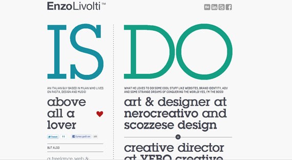
The lines separate the two columns and are not very bold.
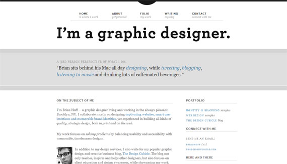
The solid lines are used to separate different parts of the website.
2. The shape
The shape, or the form, is the second most used element of a web design. They are actually lines combined in different shapes. The forms are still popular and this is because if there is something that needs to stand out, forms are one of the ways to do it.
There can be circles, squares, rectangles, triangles or any other abstract shape; most of the designs include at least one of these. Minimalistic designs use it a lot, because they are often based on illustrations and drawings.
The old style of designing websites included shapes too, so they remained popular throughout the time and will probably continue being like that.
Like lines, shapes are also associated by the human mind with different movements. For example, circles are associated with movement and nature, while squares are often seen as structured, basic designs. Just like with the lines, the color, style, background or texture of a shape can totally change the viewer’s perception.
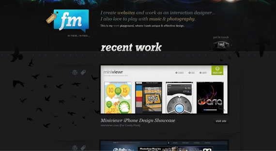
Fred Maya’s portfolio uses shapes to emphasize the logo and the previous work.
3. Textures
The textures were not very popular a couple of years ago, but they tend to become more and more used. They replaced (or compete with, if we can call it a competition) the single-colored backgrounds.
Textures can look similar to solid background colors, but if they are analyzed closer, small but effective differences can be noticed.
Texture styles include paper, stone, concrete, brick, fabric and natural elements, among flat or smooth colors. Textures can also be subtle or pronounced and can be used sparingly or liberally. They work with pretty much everything.
Even if they do not seem important, the textures can totally change a website and offer a totally different visual impact.
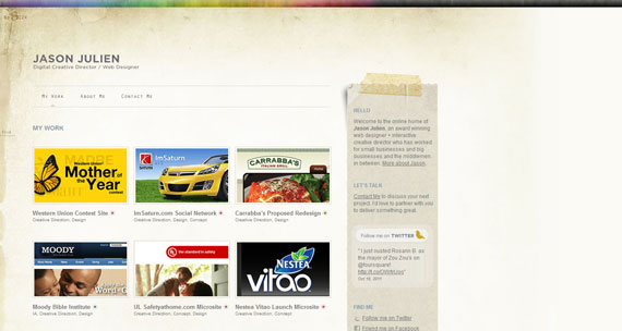
Jason Julien’s portfolio uses a grunge texture.
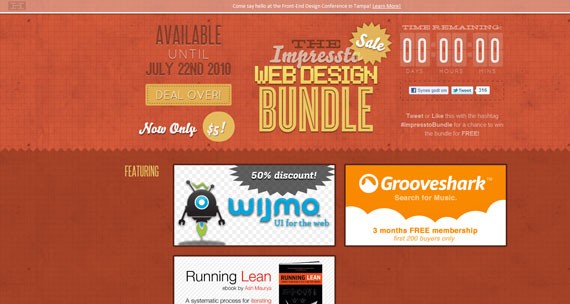
This webpage uses a different texture than the first example, looking like a math notebook.
4. Color
The color may even be the most important element of a design, because it offers the most powerful visual impact at a single glance. Color is obvious and does not need basic graphic skills to be noticed.
While lines and shapes mean the same thing as in the reality, only at a little more profound level, the color means exactly the same thing as in the nature. Color creates emotions – red is passionate, blue is calm, green is natural.
Even if you don’t realize this, colors have a clear effect on your mind.
Studies have been done and a person who lives in a red environment has a higher heartbeat and pulse than a person living in a blue environment. The human brain sees this and influences the rest of the body.
Therefore color theory is very important to know, because not many designers can call themselves experts in this field. Being a master of colors might make the difference between a good design and a stunning one.
I am not saying you have to know all of them, but knowing how hue, saturation, shade, tint, tone or chroma work together is crucial for a graphic designer.
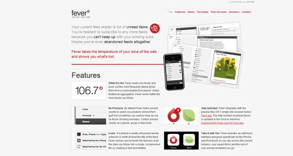
Feed Fever uses different colors for text, trying to emphasize the importance of each line with a different nuance.
5. Value
I did not specify value above, even if it is closely related to color, because value is more general and represents how dark or light a design is. Value has a lot to do with mood too, only at a more profound level.
Understanding colors will take you close to perfection, but knowing how value works will take you beyond this. Lighter designs offer a different impact and feeling than the dark ones and you need an expert eye to notice differences and decide which one is the best.
6. Space
The space and how it is used is crucially important in design. Lately the “white space” (also called negative space) became used widely because it allows the human eye to read easier.
For whoever is not familiar with the term “white space”, it does not mean precisely space filled with white, but every area of the design which is only filled with the background color. You can see several examples below to better understand the concept.
If there is a lot of negative space in your web design, it offers light and an open feeling. The lack of white space will turn your design into an old-fashioned, cluttered one. The space has also a lot to do with how the design is perceived by the human eye.
Even if I said the color is maybe the most important element of a design, the space is definitely present in the top, because it is also very easy to notice by the untrained eye. It can turn a design to your advantage and get the best out of your layout.
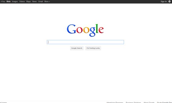
Google is the best example on how the negative space can be maximized.
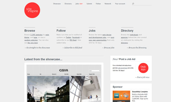
Site Inspire also uses the negative space on the sides and combines it with a well-suited typography.
Conclusion
These are the basic elements a beginner graphic designer should know about. Having this knowledge will allow you to think more user-focused and design with a better style. However, this is not everything.
Let’s talk about design principles.
The Basics of Graphic Design: Principles
In the first part we covered the basic elements of graphic design with shapes, lines, textures and color among others.
In this section we will go a bit more in-depth and will take a look at the principles of design, which are very important to know because they’re what separate the good designers from the amazing designers. Some of the principles we’ll cover today are applied unconsciously, but they definitely exist and we will show you examples from the web to illustrate the concepts.
1. Balance
Balance is how the elements of a design are distributed throughout a layout. If the balance is good, then stability is assured, although lately many designers go for unbalanced designs because they are dynamic and offer a totally different perspective.
The personal pages are the most suitable for slightly off-balanced layouts, and you will see some examples soon.
To be able to notice what kind of balance a website has, you need to know the three types of balance: symmetrical, asymmetrical and radial. The first one takes place when both sides of a design are the same in shape, lines, texture and so on.
Because this is the way we design today, this happens most of the time along a vertical axis, so when we talk about the two sides of a design, we talk about left and right. There are also examples along the horizontal axis and sometimes even along both of them, but these are rare. The symmetrical designs are pretty much most of the websites on the internet until 5 years ago.
The second type of balance occurs when the two sides of a website do not look like each other, but still have elements that are similar. Although it is called asymmetrical, they still provide some symmetry, like the first type of balance, only at a lower level. Asymmetrical websites are becomimg more and more popular nowadays (see WordPress layouts with content on one side and sidebar on the other).
The radius balance takes place when design elements are placed in a circular pattern. They give a sense of movement, dynamism, but it is not seen very often on the internet, because even the most experienced designers have problems laying out such a design.
As said earlier, balance is achieved through shapes, colors, textures, lines and the other elements we’ve talked about in the first episode.
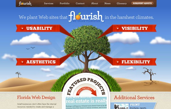
Florida Flourish is a good example of a total symmetric website
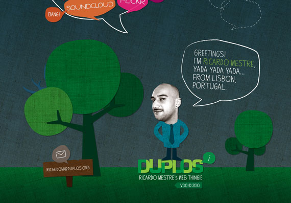
Duplos uses an asymmetrical layout which works really well.
2. Dominance and Priority
These two principles are together because they are strongly linked. They both have a lot to do with the user experience because a lack of priority and element dominance can be confusing.
The dominance level is the one which prioritizes the importance of different elements, such as menu, logo, content or footer. Sure, this is also done by playing with the font and size, but let’s go a bit deeper and see what dominance and priority mean.
There are three main levels of priority. We have the headline or call to action, which comes as a primary element; then we have the secondary elements like images needed to make a point or, most of the time, the navigation.
They are obviously not the most important element of a website, but you can’t do it without them either. The tertiary elements are information like footer links, meta information on blogs or different elements, and a website can most of the time exist without them. However, they are used frquently because they complete the design in different ways, either by offering more information, or by completing the layout with some elements.
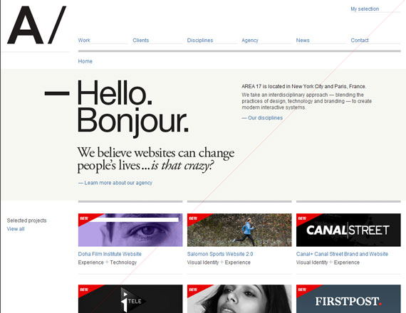
Area17 emphasizes the dominant element in the top left corner and the welcome message pulls you in as well because of the color.
3. Proportion
Proportion is important and represents the scale of elements compared to each other. They have a strong effect on the user and are also linked with the previous principle. It is no surprise that larger elements have a stronger impact on the user than the small ones.
Dominance, priority and proportion work together to assure the user sees the information properly on a website. Having a larger font in the footer than in the content is a mistake because it does not respect these three principles.
4. Contrast
This is another important principle not only of design, but also of photography and any other visual art. I don’t think we need to go too deep into this, because everybody knows what contrast means.
Having enough contrast between elements makes sure that some of them stand out more than others. If designers wish to blend elements together, they do it by having minimal contrast between them. If the contrast is high, the elements are distinct from each other.
If balance is created through shapes and lines, the contrast can be created through color. However, lately the contrast has also been changed through typography and texture, so this becomes more and more popular.
Having perfect typography can help you achieve not only the perfect contrast, but also proportion, dominance and priority. It is easy to see that the last three concepts we’ve talked about are slightly linked to each other in some ways.
If we would talk a bit more general about this whole topic, we would be able to put all of them into the same paragraph.

eHarmony’s “Find My Matches” button stands out because of a good use of contrast.
5. Rhythm
This might be a new one for you. The rhythm of the page is the principle that makes the human eye move from one element to another. It ensures the flow of the eye and in which order users should see the elements.
Now this is a difficult one to make, because everybody has their own way of looking at a website and making all of them do it the same way might be too overwhelming.
There are two types of rhythms: the fluid and the progressive. The first one is a variation and the best example is the movement of water, which flows in the same direction basically, but has a lot of variation in how it moves. The progressive rhythm occurs when there is a clear sequence on how the eye should move between elements.
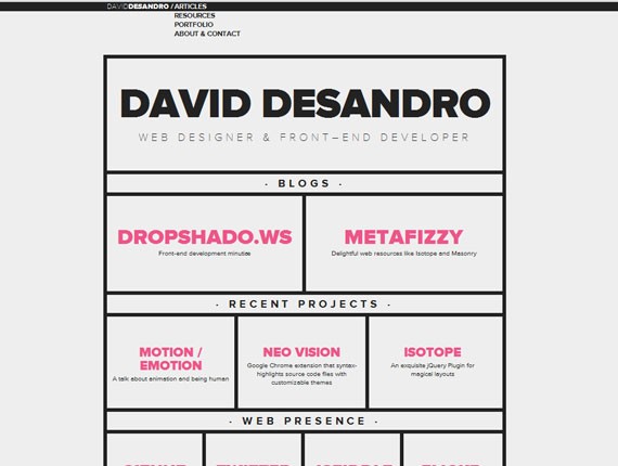
David Desandro’s portfolio follows a very regular, progressive rhythm
6. Harmony and Unity
The last principle of design wants to ensure that even if all the principles above are used properly, it is still impossible to create a stunning design without harmony and unity, and this is quite often seen in real life.
We often hear of rich people who have everything they want, but lack harmony and unity in their lives. It is the same rule in design. If all these elements work together properly, then you’ve achieved what we call unity.
Only placing all these elements on a page without linking them to each other does not create a design, but a page with a bunch of elements. If the elements complement each other and the website is easy to the eye and offers a good user experience, then the work you’ve done is more or less finished.
There is no really need for an example here, we all know that websites with harmony and unity can be spotted all over the place; think of a website that you like a lot and that you always remember. That’s probably a website that has harmony and unity.
Conclusion
The second article of the series wraps up the process of analyzing the very basic principles of design you really need to know about. After reading the first two articles you pretty much have most of the knowledge you need to start designing your own layout, but wait a bit more.
The third and last part covers the basics of composition such as focal point, grid theory, gestalt laws and others which can also be used for products like magazines, flyers or brochures.
The Basics of Graphic Design: Composition
The second was about the Principles of Graphic Design and we took a look at concepts such as Balance, Dominance, Contrast and Harmony. Today we go a bit more in-depth with the last article and talk about the composition and its basic elements.
1. Single Visual
This composition is where a single image is used for the design. This means the image is usually powerful, creates an impact and the whole design is built on it. Examples of single visual pages include landing pages, but this is more popular in print than in web.
The single visual composition is one of the easiest to achieve, although you need to carefully select the image, otherwise it won’t have the desired effect. The main principle behind this pattern is to make sure the typography and the other design elements reinforce the visual element and do not compete with it.
There has to be a clear definition over which one is more important and in this case the image, illustration or graphic element used have to be the most powerful.
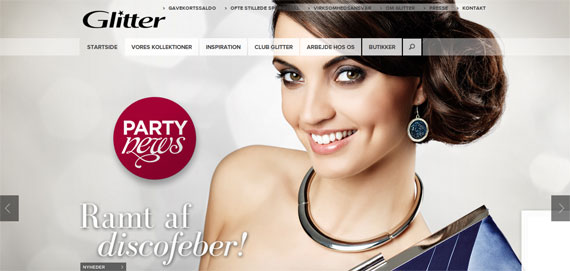
Glitter Denmark is a very good example of a single visual pattern design.
2. The Golden Ratio
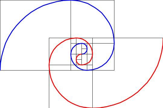
The Golden Ration, which is also known as the Fibonacci Spiral or Phi, is around 1:1.618. The Fibonacci Spiral is found all over the world in different things and the web is no exception.
It is a good idea to place the elements into a website along the lines of the Spiral, because this is the way the human eye works. Managing to use the Golden Ratio properly will bring the focus of the visitors onto specific things you wish to emphasize.
3. Focal Point
This is another important one because the focal point is the one who gives the viewers something to look at. The focal point adds a more specific idea to the design and acts as a starting point for most of the visitors.
The focal point can be represented through simple typography, a button, illustration, a picture or any other element. It is totally up to the designers which is the way he wants to create a focal point through.
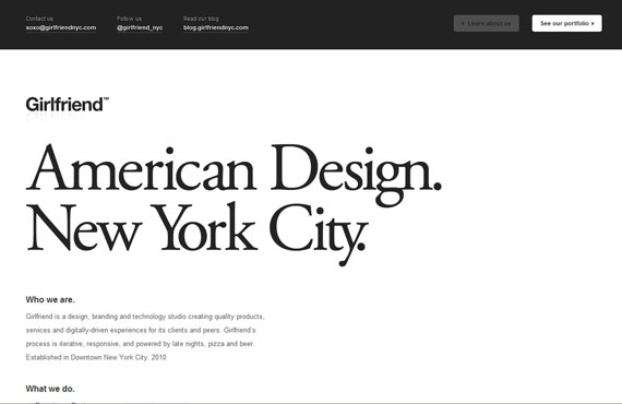
The focal point has to be in focus and has to be the first element a viewer sees when he enters the page (especially for the first time).
However, making it too important and visible will break the balance of the layout. Keep the focal point within your site’s goal and make the purpose of the page be shown through it. For example, having a call to action button is a focal point, because that is the final action you want the user to take on your page.
4. Grid design
This should not be a new one for you. Grid theory is maybe the most popular element of a composition, because we do it all the time even without realizing. Grids add structure to a design and are used to hold a good proportion among the elements on the page.
You can find lots of grid frameworks on the internet, which are free to download and build on, and I actually recommend you to use them if you are a beginner in this domain. Working from the beginning with grids will make you feel comfortable with this approach and this is good for your layouts.
Grids do not have to be rigid all the time, they can also be subtle, but if you go for this option, then make sure the design will still be clean and refined before the delivery.
When working with grids it is always a good idea to ask feedback from the ones around you, because working for hours long with a grid framework in front of you will probably make your eyes not see small mistakes that need adjustments.
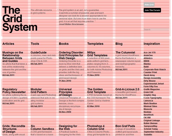
The Grid System
5. Gestalt Laws
When I learned this principle in school I was amazed by the difference it made in my designs. The laws are the result of the human visual perception of things, including websites and elements. The laws are created by the way different elements impact the viewer.
There are five principles Gestalt Laws: closure, similarity, continuation, alignment and proximity.
Shortly explained, the law of closure says we are accustomed to close things in our imagination that are not really closed. A good example is a near circle which you draw only on 330°. The human brain will perceive it as a whole, completed circle.
The law of proximity shows we tend to group objects that are closer to each other, while the law of similarity emphasizes the same thing, only that we group things that have the same color, shape or texture.
The law of continuation emphasizes that objects will be grouped as a whole if they are co-linear or follow a specific direction, while the last rule, the one of alignment, shows that objects are aligned based on their edges (very popular pattern), or based on their centerlines. The objects can also overlap each other.
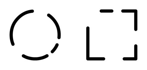
The Gestalt Law of Closure
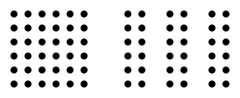
The Gestalt Law of Proximity
There are actually more Gestalt Laws, but not all of them are important for designers. At the end of the article you can find a link with all the laws and you can learn more about each one of them.
6. The “Z” and “F” Layout
The so-called “Z” layout is based on the normal movement of the human eye. As the name says, most of the people who’ve been eye-tracked look at a webpage in a Z shape, meaning they start in the upper left corner and finish in the bottom right one.
Managing to align all the objects on a home page along this shape will definitely provide better results and will make your design more efficient.
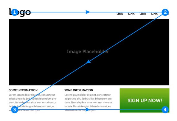
Layout in a Z shape
There is another type of layout as well, shaped as an F. This means users read the first line and then continue to read the second, continuing like that in a specific order.
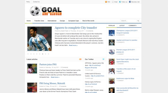
Goal Arena is a layout in a visible F shape
Bottom line
These are the most important principles of design and by having a strong knowledge of each one of them your layouts will not only look better, but will also offer a better user experience.
Creating good interfaces for the user will make them keep your page in mind and, if you get used to working with these principles, at some point in time it will even get normal and logic.
Finished!
Sure, there is much more knowledge to get about all these laws, but this knowledge comes along with the experience and you can’t really get it only from books, but by practicing.
By looking back, you should already have enough knowledge of the basic elements of a graphic design and I really hope that if you are a beginner, this series of articles made you think more seriously about a graphic design career.
This post may contain affiliate links. See our disclosure about affiliate links here.

