I am by no matter an expert in landing page creation, but I am doing a lot of research on this topic to become more experienced myself, and I invite you to join me on this journey.
I will share the biggest takeaways here and point you to the right articles and tools – let’s call it Landing Pages 101, Science Of Landing Pages, Anatomy of Converting Landing page, whichever you prefer most.
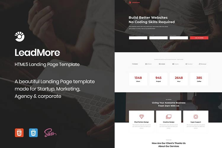
All the Landing Page Templates You Could Ask For
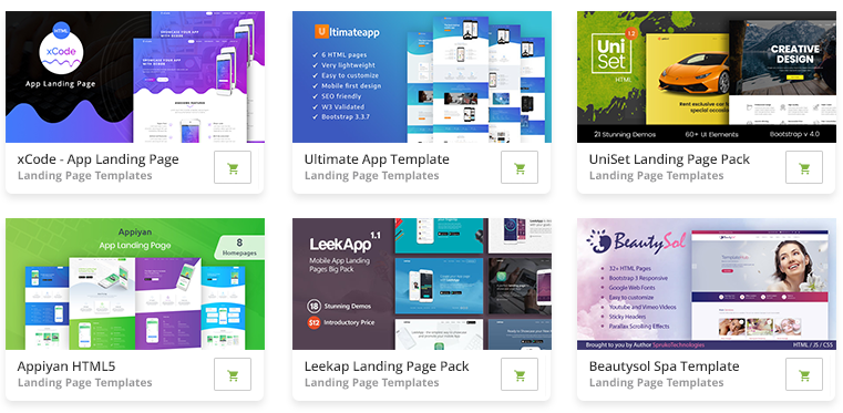
2M+ items from the worlds largest marketplace for Landing Page Templates, Themes & Design Assets. All of it can be found at Envato Market.
What is a landing page and where it is usually used?
A landing page is a powerful online marketing tool – it’s a unique webpage, also known as a lead capture page, where your task is to persuade visitors to complete a certain action for example:
- to subscribe to your newsletter in exchange for an ebook or product demo
- buy your product
- to register for a webinar
Your main goal is to create a landing page that encourages your visitors to complete a specific action. That’s far from being an easy task, landing page creation is an art, which is very hard to master, and even when you do you still need to do a lot of A/B testing to adjust your assumptions about how your visitors think and to see what works and what doesn’t.
Landing pages are widely used to launch webinars or products, pre-launches, persuade visitors to give you their email address with the help of ebooks, email courses, special discounts.
And as we all known once you have a visitors email address you can communicate with them on a much more personal level, which helps to establish relationships and also encourage them to do what you wish them to do.
In this article, you will be taken through each important step to create a successful landing page, capable of converting visitors into customers.
If I didn’t succeed in explaining what a landing page is read the Wikipedia explanation or this great Hubspot blog article.

(Strobecorp – beautiful and minimal landing page example)
How to use this guide?
This article is separated into sections starting from landing page structure, color usage, copywriting, how to write great headlines, tips on how to improve an existing landing page, templates, tools to use, a/b testing tools, analysis of some of the best landing page examples and more.
Feel free to jump to the sections to learn what you find most important, though if you take the time to read this entire guide section by section, I can assure you, you will know more about landing pages than 99% of the rest of the industry!
Well, now that you know what to expect here, shall we start?
How to know when to create a landing page? Where are landing page used?
You can use landing pages together with:
- ad campaigns through Adwords
- guest writing
- email newsletter
- product launch
- product pre launch
- coming soon page
- etc.
When you run campaigns it’s not smart to send people to your home page. Usually your Home page doesn’t explain a lot about your product, you need to make it as easy as possible for visitors to do what you want them to do.
If you want to promote your latest product, webinar or ebook, make it as simple as possible. Point them to a special landing page where they can do just that! If you know where your audience comes from, learn about them and make it as related as possible.
When you run special campaigns on a website, for example, a giveaway, greet them and customize your message! Make sure there isn’t any confusion what you want them to do (call to action) and build your landing page around this call to action. Simple is better, remember that!

(Milk Inc. minimal landing page clearly shows how less is better).
Landing page anatomy (step by step parts in landing pages)
Before we start I’ll explain a few terms I will be using:
Visitor – visitors who come to your landing page, potential customers
Product – product in this case would mean an ebook, email newsletter,t raining, webinar, article etc.
Introduction
The best product launch is when you have a product other people will love so much that they will tell other people about it! And your product must be just like that, whether it is for a global audience or a very specific one, the first thing you need is a great product place and the landing page is the place to show it off and explain in simple words why your visitors need it!
Make your product desirable and memorable.
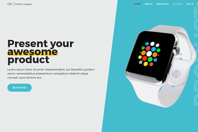
The Anatomy of a Perfect Landing Page
This is a great infographic visually explaining the most important sections of a landing page and how to direct visitors attention.

Top Page Headline
This is usually the first section a visitor will see as headlines are usually big, and you need to make sure you explain what you’re offering here and what the page is about in a few seconds! What problem do you solve and why your visitors should care about it.
For example in this article the headline is:
Landing Pages Guide 101: Create Landing Pages that Work
You know straight away what to expect, you’re going to find a comprehensive guide on how to create landing pages that work! Make your message as simple and clear to understand as possible! Peoples attention spans are very short, and great products aren’t used, or articles aren’t read just because someone wrote a crappy headline!
Make sure your ad copy targets visitors to the right page to fulfill expectations:
Bonus tip: use the same color palette or graphics on your landing page as in your ad copy assuring visitors that they came to the right place when they clicked on ad. Example from MojoThemes campaign below.

One Clear Call to Action
Build the whole landing page around your call to action, because it’s the main focus right? You created a landing page to get your visitors to complete a certain action and because of that make sure the call to action is easy to notice, whatever it is – subscribe box, buy button, the form you want them to fill out.
Make sure your call to action is above the fold (basically it’s on the page visitors see without scrolling, approx 500px height). Some minimal landing pages even just put their whole message above the fold, making sure visitors don’t need to do ANY scrolling and keep their message super simple! You must aim for this goal too!
I’ve already mentioned how important it is to have one clear call to action and how you should build your landing page around it, but I wanted to emphasize this and include some more articles you will find extremely useful if you want to know how to create a memorable call to action or how to can improve your landing page to focus more on your main goal:
- Call to Action Buttons: Examples and Best Practices – the best learning curve is by analyzing real life examples and this article is just about that!
- 7 Tips for Effective Calls to Action – simple article from HubSpot emphasizing on 7 tips everyone must know before deciding on his call to action!
- Design: 10 techniques for an effective ‘call to action’ – beautifully written and designed article, no fluff talk, clear action tips there.
- 10 Essential Tips to Make Your Call to Action Buttons Effective – even more tips to think about.

(Shipmentapp has no distractions, just one clear call to action).
Clear Headlines
The same way you use your headline you should use subheadlines. Use them to emphasize your message as you explain to your visitor what your product is about. Put the same attention into subheadlines as you put into your main headline because you want your visitor to keep reading, you want to keep them engaged until he is sure your product is what he wants!
Note: continue reading the section about copywriting because the art of headline creation is complicated and requires a lot of learning to master.
Page Content
All the page content should be focused on what your main headline says and a single, focused message and, of course, your call to action. Make sure you list the benefits of your product, not just your product features, you’re the proudest of. When you create page content, you need to think from a visitors point of view. Will they be interested in the features you offer, or how these features will benefit them?
Keep your most important content at the top of the page together with bullet points, because most visitors at the beginning tend to scan a page and you need to grab their attention to get them interested enough to read further.
For example, if:
- feature is – Create a website without any coding skills
- benefit is – You can save time by creating a website without any need to learn to program or spending a lot of money to hire a designer or programmer.
Make sure your 3 or 4 most important benefits are immediately clear.
You can also emphasize some of your content by making it bold or italicizing as I have done right below.
Tip: Focus on just three key benefits or ‘pain points’ you solve and no more! This will help your visitor to easily understand what your product is about, and more importantly, how it will benefit them.
Page content is also the place where you tell your story, build trust by showing your experience and address your audience by showing pain points they have and how you will solve them. When you tell this story, break your content up every 2-3 sentences to avoid the page looking cluttered. This is also why you need to use bullet points and numbered lists as I’ll discuss in the next section.
Write your content from a second person’s perspective – “You” addresses visitors much more directly than boring formal text.
Make sure you proofread and that there are no spelling or grammatical errors, your product will look much more professional and trustworthy!
Also don’t put too much text, because research shows 90% of the population doesn’t like to do much reading, which means headlines, images, video, and bullet points will get much more attention, where content may not get much at all.

(SlideDeck’s landing page shows how even with many elements you can still make a landing page look clean and simple).
Use Bullet points and numbered lists
Making use of this formatting will help your visitor understand what your product is about, the value you provide and what your message is. It will also simplify your layout, and simple is always better as peoples attention spans are super short.
Use Images
Images often explain more than words can – why do you think infographics are so widely popular? Infographics bring text together with images that require little to no explanation; I always encourage my readers to use images in articles, because the visual relation is much stronger than textual, as is our memory.

(StumbleUpon did a very good redesign and their homepage makes great use of beautiful images).
Use Videos
And videos explain more than any single image could, you have a chance to show yourself, let people hear your voice, show them you’re a real person and it’s a great way to explain what your product is about and let your visitor just sit back and listen instead of browsing the page, trying to understand what he sees and whether he needs your product or not.
Social Promotion
If you are offering something of great value then, of course, visitors want to share your great product with their friends right? Make it easy for them and provide social promotion links, but remember to use just the most popular services like Twitter, Facebook, LinkedIn and nothing else. Keep it simple and try to place these links in a way that they don’t distract your visitors.
Here is a great spot to run A/B testing to make sure your social links don’t distract visitors from your main message.
Provide security
When you are asking for visitors personal information, they will often have some anxiety about giving it to you, so you need to make sure you build enough trust!
You need to think like your visitor, why do they have that anxiety? They receive a lot of spam, scams and cold calls from sales people so you need to explain that this is not the case here, right?
You can build trust with:
- high quality design and strong branding – for example I receive a lot of emails from people asking to check out their service, article, or help them promote it, but when I visit a site and it’s looks crappy and has a terrible logo – I immediately close the page without even reading further! Presentation is so important, your product should look (in)credible!
- testimonials – once you have grateful clients make sure to get recommendations from them! It’s even better if you can get testimonials from popular people in your industry or get mentioned on popular blogs.
- 30 day money back guarantee, third-party security certification like SSL cerificate, guarantee seal.
What should call to action forms or buttons look like?
Usually your call to action will be subscribing to an email newsletter or a request to buy the product. It’s a very hard to decide how long your form should be, for example is it enough to just ask for their email, or do you need your visitors name? It’s up to you, but try to keep your form as short as possible, the more input you require from your visitor the less likely they will go through with it. Ask for the least amount of information you need – the less information you require, the more signups you’ll get, simple as that.
It’s even harder with buy buttons because the next step is usually a request for their personal banking or credit card information. I recommend using my personal favorite, Paypal checkout, which is fast and simple and doesn’t require your visitor to share their personal financial information with you.
You can add some fields that will help you learn more about your customer, but make them optional, not required. A better option is to show these fields after subscribing –

Experiment with button and form size, usually bigger buttons perform better than smaller less noticeable ones.

Text on button
The default text is Submit, but studies show that it’s better to use something like Click Here or Go, but you can also take a different approach by making buttons more engaging and relevant to your offering like “Get Your Free Ebook Now!”, “Subscribe for news!”, “Get access now!” or “Download now.”

(Posterous has a beautiful, simple, landing page and good examples with call to action buttons).
Thank you page
Once your visitor has completed your call to action make sure you show your appreciation by simply saying thanks, offering a cool freebie or by directing them to related information on your site they may be interested in.
On this page, you might choose to give access to your product (if it’s something they can download), give more details and put the download link.
If you chose to not use social promotion on your landing page, you could use it here – ask them to share this offer or product with their friends!
Now you will usually have collected your visitor’s email address so keep them engaged and follow up there. I won’t get into this topic right now as we’ll have a separate section explaining how to make use of your email list.
Colors
You must also have a clear and basic understanding of colors because different colors convey different meanings and are perceived differently. Check these three articles to learn some basics about how to use colors in web design and your landing pages.
- Empathizing Color Psychology in Web Design – learn the meaning of different colors and then check how another popular websites use color in their designs.
- Why Color Matters – self explaining headline here.
- Color Theory for Designers, Part 1: The Meaning of Color – in depth study about color theory in webdesign with good examples.
How to pick the right font?
I didn’t want to go in depth in this topic, instead I found a good article for you to read if you want to know more.
- What’s the Best Font For Your Site? (The Psychology of Fonts) – it’s a tough to decide what kind of font you should use in your website, landing pages, do you need to use several fonts? This article aims to help you to get basic understanding in fonts.

(Fonts can make or break the landing page, Tumblr does it right with professional fonts and effective use of whitespace).
Pricing Tables – How to choose product price and how many options to offer
It’s a scary place to be thinking about how to price your product – you don’t want to price it too low and undervalue your product, and you don’t want to set the price too high and turn people off. How do you decide how many pricing options to offer and how to choose the actual product price?
It all depends on the exclusivity you provide, if you can make it look desirable, you’ll probably have no problem charging a higher price, but your landing page copy better be well written should be very well to create that desire, need, and rush that will convince them your product will help them change their life or business! And yes, if you charge a high price be sure you can deliver – people want to get what they paid for!
I like to think it’s better to set prices higher, and then offer discounts and experiment with your price point. As for the options – I think the best choice is to have one price, one call to action, but if you really need more, don’t have more than three plans. Too many choices will just confuse your visitor and he will turn away! Ah, and if you have more plans, be sure to offer a top choice, which should be the best value, to make it easier for your visitors to choose!
But here I will repeat what everybody is repeating a lot already – do A/B testing, don’t assume anything, just test it and know for sure what works and what doesn’t!
Here are two articles on this topic from SocialTriggers to help you make an even better decision on pricing:
- How to Increase Your Prices by 71% – power or perception, choose the right words and increase your prices!
- Here’s How “Product Context” Helps You Sell More Stuff Online – few action steps how to price your product using some simple and smart techniques.
..and a bit of inspiration, how a good pricing table should look and how to differentiate several plans:
- 40 Fantastic Pricing Tables for Your Inspiration – plain, brilliant inspiration here!
- Pricing Tables: Examples And Best Practices – this is an old article from SmashingMag (2008) but principles don’t change, a lot of great advice there.
- Price Anchoring: The Power of Comparison Pricing Tables on a Subconscious Level – some good examples and small, but very valuable advice on pricing table comparison power.
- Pricing Tables – Best Practices, Tips and Inspiration – article from our own 1WD, where you will learn about pricing table structure, design, where to put emphasis. All those tips come together with related examples under the scope.
Tips on how to create, or improve, your landing page and some useful articles
Here I will again cover and repeat some tips you should really remember again and again while designing your landing page, and if you have already have a landing page, then check these tips to improve your page! For example did you know? “Web users spend 80% of their time looking at information above the page fold. Although users do scroll, they allocate only 20% of their attention below the fold.”
- Put the most important content above the fold, did you know 80% of web users spend their time at looking at information above the page fold and only 20% of their attention goes below the fold? Ok, admittedly, the research is a bit old and the way people are viewing the Internet has changed, but it’s a huge difference! Most people will view just above the fold, be aware of that!
- Simplify your form/ Use a simple button to make the page as easy to understand as possible and the call to action as easy to complete as possible!
- Reduce distractions – remove visual clutter, make use of white space, hide navigation, if you have one there and don’t use links which will drive visitors away from your landing pages…every little mistake adds up and results in less sales and completed action steps for you!
- Use white space to direct the eye to the sections you want and effective use of whitespace will also make your site look cleaner and more professional.
- Optimize landing page for search engines to make use of search traffic as well, which will be huge in the long run!
- Only have one call to action on the landing page, but repeat it several times throughout the page if your page is longer. Good practice is to always have the call to action visible as he scrolls. I also want to take this opportunity to remind you not to have long landing pages, however if you have one, then include one call to action at the top, middle and lastly, one at the bottom.
- Make sure your page loads fast – people don’t like to wait, attention spans are short and if you, keep them waiting too long, they won’t wait at all. The same way you need to keep your landing page simple, keep your code clean and the images and video optimized.
- Use heat maps to see where people are clicking the most, by doing this you’ll also notice sections where people tend to click, but which aren’t clickable – this means you should test your landing page more to make it super simple to understand and help your visitor complete your preferred action.
- Put email privacy information right next to the email input box, simple text – “We don’t spam and hate spam as much as you do.” can work wonders and build trust.

(Instagram’s landing page clearly shows it’s app for iPhone, it’s free and there is one call to action – download app from AppStore).
Here are some related links you should read for some really in-depth knowledge about landing pages:
- Elements Of A Viral Launch Page – beautiful article from SmashingMag, where you will learn everything you need to know about viral launch page creation together with some great, carefully analyzed examples.
- 7 Steps for the Perfect Landing Page – seven important steps you need to take in order to improve or create good landing page.
- 29 Tips to Improve Your Nonprofit Website’s Landing Pages – non-profit landing pages guide don’t mean you can’t use these techniques in commercial products, just author has huge experience in nonprofit page creation, which is great for article, newsletter, page, deal promotion for example
- Seal the Deal: 10 Tips for Writing the Ultimate Landing Page – CopyBlogger always nails it, some useful tips there!
- 5 Landing Page Mistakes that Crush Conversion Rates – ..and some mistakes most people make and you need to avoid!
Copywriting importance, learn art of copywriting
The art of copywriting is actually the art of keeping your readers engaged from the first word to the last. Keep them engaged in your content with bullet points, sub headlines, the artful use of formatting. Make your content flow so seamlessly that before your visitor is even at the middle of the page they desire your product and are already wanting to complete your call to action! It’s a very hard art to master and here are several articles to help you learn copywriting. If you read these articles, when you finish you’ll know more about copywriting than most people do, and that’s a huge advantage over your competitors:

- 6 Secret Techniques You Can Use To Become A Great Headline Writer – A great headline is similar to the trailer before the movie. It whets the appetite and gives the reader a taste of what is to come. The purpose of a headline is to compel the reader to continue on to the next step (read your copy).
- Five Copywriting Errors That Can Ruin A Company’s Website – sometimes it works to learn what mistakes most people and maybe even you make, learn how to avoid them in the first place!
- Copywriting 101: Your Guide to Effective Copy – collection of articles from CopyBlogger, first place I visit whenever I run into any copywriting problems or have any uncertainties.
- How to Write Magnetic Headlines – one more collection from CopyBlogger teaching you simply how write effective, magnetic headlines.
- How to Write Headlines That Work – and simple action steps to perform whenever you write any headline.
Templates to get you started:
You can find a lot of great templates online, some you can use right away that will help you kickstart your business! I think templates are great place to start, I recommend a lot of A/B testing and once you’re ready and know what you need, you can hire a designer or a coder to develop your own unique landing page that converts really well! These templates are very cheap and should are perfect to get you started!
Landing page templates from UnBounce – here you’ll find a lot of great templates, you’ll be able to edit in WYSIWYG editor easily without any coding experience! UnBounce has huge experience in this market, so you can be sure you’ll be in good hands to get started.

Themeforest

Themeforest is a huge marketplace, selling everything from WordPress themes to landing pages! Even if you don’t end up buying a premium design, these are great source of inspiration! Here is a link to their landing page category, order these by sales to see the most popular landing pages on that site.
A few of my favorites:
Conversation ($10)
Conversion is a premium HTML landing page. Its great structure and clean, professional design, as well as a variety of page templates, allow it to fit to both transactional and reference landing pages.The main goal of a landing page is to convert visitors into customers. Therefore the layout is specially designed and fitted with a variety of features that will make that happen. Coupled with a structure that’s highly customizable, this product will be perfect for your product, service or company presentation.

Lista ($8)
Lista Landing Page is a premium landing page design for your newsletter or download, even just a service, your choice! Lista Landing Page makes good use of the Z Reading pattern to guide the eye around the design and ultimately convert your visitors in to subscribers or buyers.

Integro ($8)
Integro is a Corporate HTML /CSS landing page. It has a clean, professional design with a Definitive Call to Action. Integro is a powerful Landing Page with features like Live AJAX Form Submission, Pricing Table, Lightbox, Tooltips, 2 Types of Galleries and Image Sliders. You get started with Integro within minutes & only handful of Customizations with well documented HTML / CSS / JS & PHP .

View Demo
Online tools you can use to create landing pages
Ok, this is the more advanced stuff! Once you know a bit more about what you need even if you don’t really think that you can code and design landing pages yourself there are a bunch of amazing online premium tools you can use to build your own landing page in no time! Often those tools come together with helpful tips on how to design a landing page and some even include A/B testing! I did a lot of research and these tools are the best ones I found and tested! Get started right now!
Premise
This is a handy premium WordPress plugin create by CopyBlogger Media for easy landing page creation. You won’t have any more problems creating unique pages, which look good and go seemingly with your own WordPress blog. I bought myself this plugin some time ago and I must, say it is easy to use. The tutorials helped me learn a lot about landing page creation and for quick results don’t look any further.
I think this is the best tool for landing page creation without need to hire a designer to do the job, however of course for advanced solutions you still would need to search for help, but for most cases, it’s enough with Premise. In their features, you’ll also find included A/B testing through WordPress and even SEO tools letting you get all the data you could need from your page.
It’s a bit pricy ($85), but if you need to create a lot of landing pages, it is certainly worth the money.

Unbounce
Unbounce is online software you can use to create your landing pages. Everything is broken down into easy steps: build a page (choose from 276 templates), publish it, drive traffic and check results and in the end do A/B testing and optimize your landing page. This is a good site and if you need a cheaper solution, pick Unbounce – it has a 30 day free trial and the most basic plan costs only $25 per month.

KickOffLabs
KickOffLabs is another popular choice for landing page creation, they are trying to push social promotion into your landing pages encouraging you to be social, which is handy.
Their WYSIWYG editor is also very easy to use, you can easily pick from good color schemes and edit different elements easily. The only thing I think is missing here is advanced features for bigger landing pages with many elements, but if you want simple – KickOffLabs will be a great solution for you.

Check their dashboard below – everything is there explained in 1-2 sentences, the learning curve is very small. Ah and yes, for one landing page KickOffLabs is free, but for advanced features, you may need to pay as much as $20.

Related reading:
- The Non-Designer’s Swiss Army Knife of Free Tools to Make Sweet Landing Pages – Ah and consider this article for related reading. Here you’ll find a lot of helpful resources, online tools achieving different professional design effects, which can be very useful if you want to do everything yourself:
Importance of converting landing page and A/B testing
Once you have created your landing page, don’t stop there, you should always be testing – even if you can improve your page conversion rate by 4-5%, calculate how much it could improve your performance in the long run! Don’t make assumptions about what works; I bet you’ll get a lot of surprises through A/B testing!
With A/B testing you can test everything – headlines, content, bulleted lists, video placements, call to action forms, looks, colors, formatting – you get the picture. Services like Amazon have done countless A/B testing and are still doing it all the time trying hundreds and thousands of different tweaks, while this is extreme you should learn from them and keep improving yourself!
Here are several helpful resources I found to help you delve much deeper into this topic:
- The Ultimate Guide To A/B Testing – Introduction to A/B testing, basic explanations what to test, how to create your first A/B test together with Do’s and Don’ts and real studies.
- The Guaranteed Way to Radically Improve Your Copywriting – guide from Copyblogger, beginning is little similar as previous article, but here you’ll get explained the magic of A/B testing – guessing game where simple text change increase conversations by 25%! Powerful!
- A/B Test Case Study: Single Page vs. Multi-Step Checkout – nothing is better than real case studies showing how to do A/B testing!
- Which Test Won? – this site runs a lot of different A/B tests, puts them online and create inspiring game from it! How good is your gut? Which version performed better – A or B? After you choose you can see actual A/B test results! Sharpen your skills here!
- An Introduction to A/B Testing – one more explanation about A/B testing taking little bit different approach.
Tools For Landing Page Optimization ( A/B testing) – Measure Results
Ok, this is super important – I know, I know it’s too much at first – so many little things you need to know, be aware of and at the end really you still cannot assume anything! You need to test it! And to be honest for a long time this topic was like rocket science to me! I didn’t know how to get started, A/B testing felt like too complex a topic and too hard to figure out and use…
But not anymore with these amazing tools we can use these days!
These are the most popular choices:
- http://www.optimizely.com/
- http://unbounce.com/
- http://www.hubspot.com/
- http://google.com/websiteoptimizer
Optimizely
Yes, I joined many Optimizely supporters and think it is the best tool available for now! It’s very advanced, yet very easy to use with everything you need built in for serious A/B testing! I just registered and right away I was ready to do an experimental test!
It is really as easy as they promise on website:
- Enter your website’s URL below and create variations of your website in minutes.
- Copy and paste your one-line Optimizely snippet onto the pages you want to test or measure as goals.
- Start your experiment and learn which variation performed best!
Here you can read more in detail how Optimizely works.
Optimizely isn’t free (starting from $17/monthly), but it has a 30 day trial and I totally recommend it as a top choice for running any tests!

Heatmaps
Together with A/B testing heat maps also can be very useful to see where people click, scroll on your live version, maybe there is image on your site where people click, but it’s not a link? Maybe in that case you need to make that section clickable or change the image to avoid distractions?
CrazyEgg
This is the most popular heat mapping service, which I use personally. It also has a handy WordPress plugin allowing you to automatically add tracking code, making the whole testing process even easier!

If you were wondering if there are any alternatives to CrazyEgg, there is also a very popular heat mapping service called ClickTale, which is similar, but it has some interesting extra features such as visitor recording, conversion funnels and campaign tracking.
Blogs to read to get even more:
Landing page creation, optimization, A/B testing – all these little bits require ongoing learning if you really want to be ahead of your competitors and improve your conversion rates. It’s very hard to keep track of this changing world all by yourself, but it’s super easy if you know where to search for high quality content! These blogs focus just on these topics and I recommend adding these sites to your RSS reader so you are always the first to know about the newest tests, tools and techniques:
- Hubspot Blog
- Formstack blog section about landing pages
- Socialtriggers offers a lot of unique opinion about email list building and online sale increasing. Each of his articles are very detailed and comprehensive – he doesn’t post often, but when he does basically every article receives hundreds of comments and goes viral.
- Unbounce blog landing page section
Do you know any more useful blogs or resources about this topic? Share away!
This post may contain affiliate links. See our disclosure about affiliate links here.