In this roundup, we’re sharing some beautiful mobile app designs that offer an excellent user experience.
Which is your favorite mobile app by design and usability? Leave your feedback in the comments.
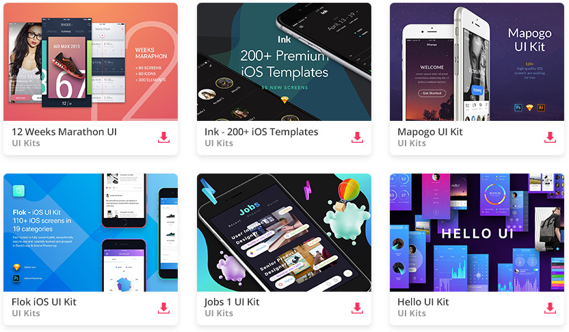
All the Mobile UI Kits You Could Ask For
1. Arles Festival App Design Concept
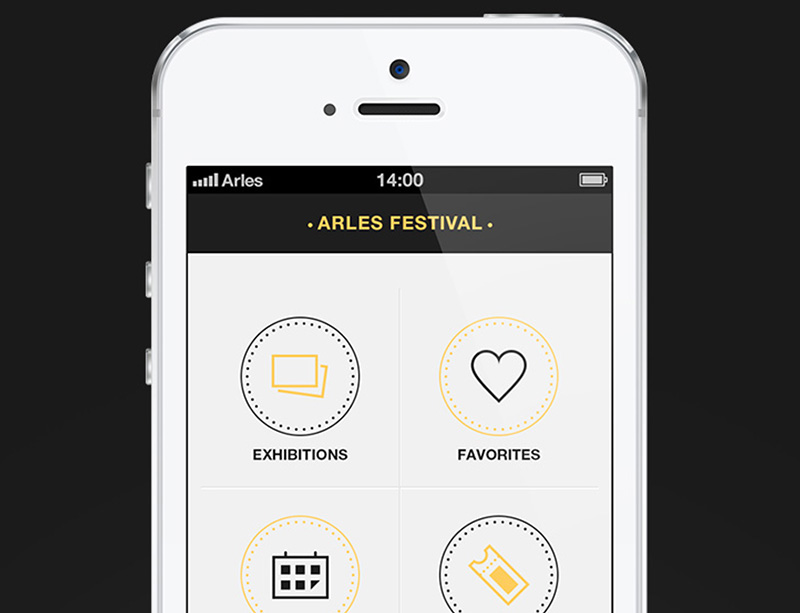
The interface need not be flashy, just the basics the user often looks for
Clarity is one of the essential elements of a good UI design. It should not confuse your users nor give them a hard time figuring out how to use your interface.
And you can find that in this app designed especially for the Arles Festival, which has around a hundred thousand recorded visitors annually since its inception.
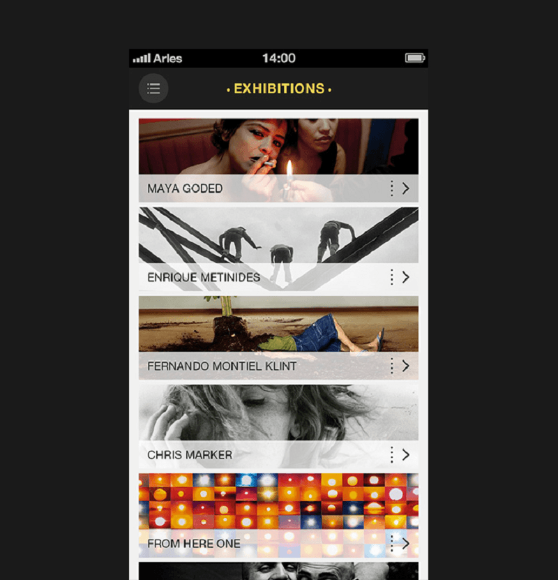
Images on top of artists’ name tell a lot about each item
Boxes and fonts are finger and eye-friendly
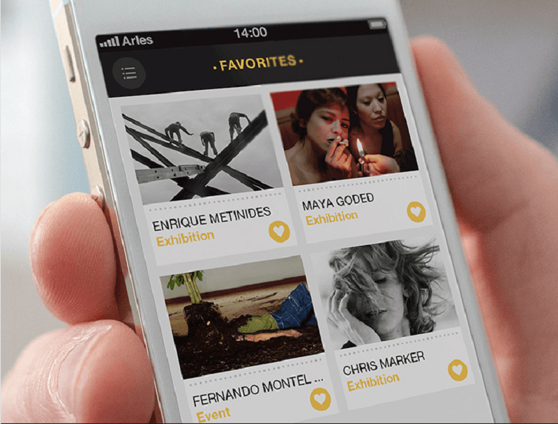
Angelique Calmon and Juliette Lima collaborated to create this mobile app design with a simple and straightforward interface which leads you only to the most important information about the festival.
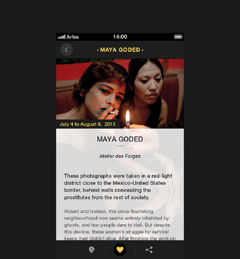
Good user interface does not have information overload
Clicking each category leads you to more information. However, it does not give too much, just enough overview to let users know what they are. Even the information for each artist and exhibit doesn’t overload on they whys and whats, just a few sentences to help your users decide whether they want to see it or not.
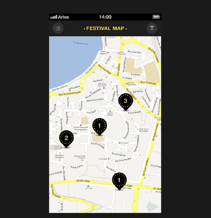
The sitemap tells you when and where the event is
2. Eda.ua – Food Delivery iPhone App
This mobile design version for an existing website is designed by a group of designers from the Ukraine. The app has both an iOS and Android version with a very friendly UI designed especially for the food delivery business.
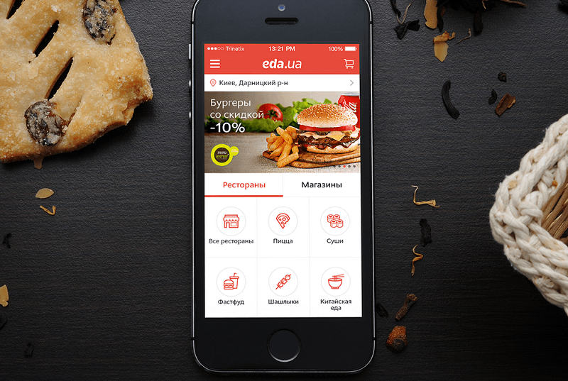
Edu.ua implements all the functionality of the food delivery service in Ukraine
In order to meet usability standards, the designers conducted intensive market research and took note of various offbeat ideas. Then, they created and tested an interactive prototype with over 100 wireframes to ensure that the app design meets the needs of the client’s business.
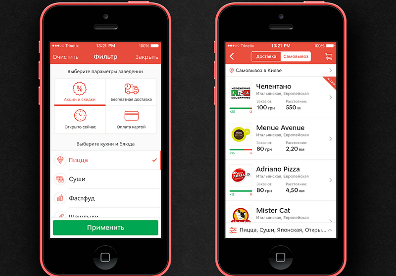
The app has flexible filters and smart searches
The mobile app contains hundreds of restaurants all over Ukraine, so the developers put flexible filters and smart searches to enable users to find what they want in restaurants.
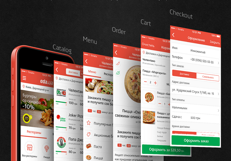
Ordering food is done in 5 easy, uncomplicated steps. Great app design inspiration.
To make it much easier to order food, users are guided into 5 easy steps which include: searching restaurants around the city, checking their menu, looking more specifically into the dishes before placing the order, confirming their order and proceeding with payment and delivery options.
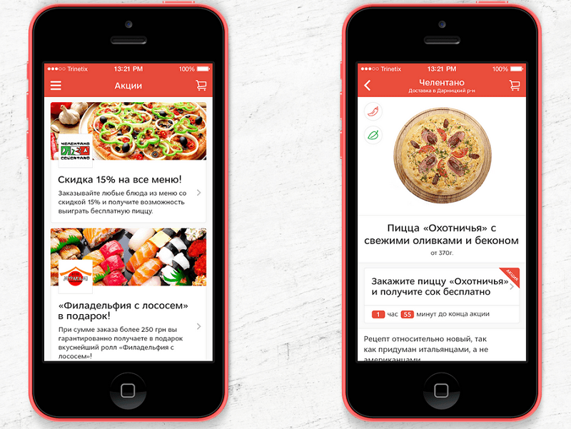
The app gives detailed information about each dish
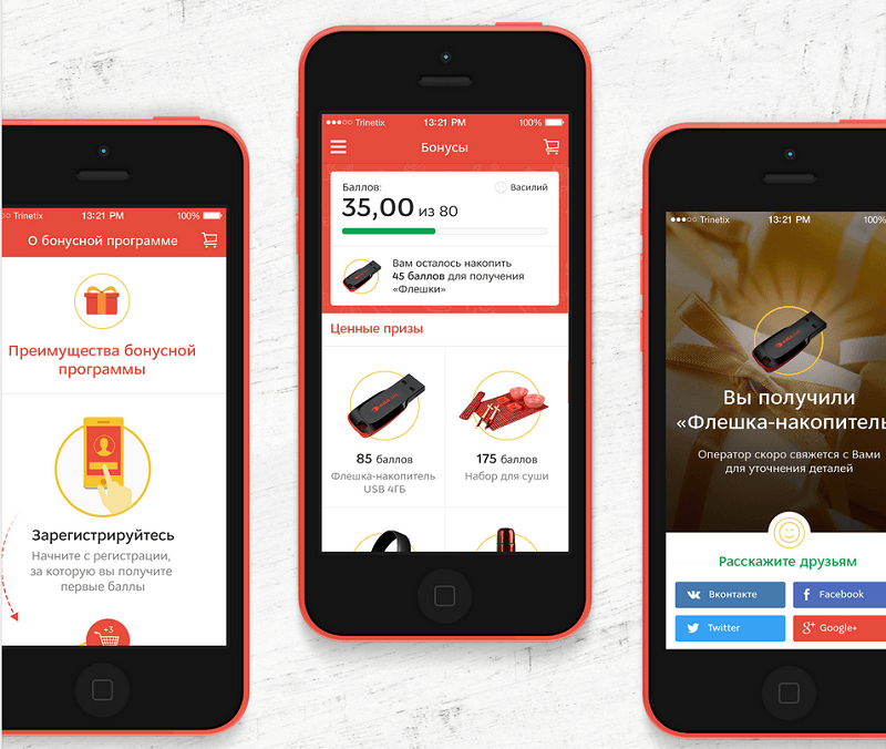
The app also has a reward point, very good UI. Well done.
With these steps, the users are saved the hassle of worrying what type of dish they ordered and the ingredients that go into each dish. This is especially helpful for those who have some specific dietary requirements.
3. Workout Book Mobile Design
The Workout Book was designed by Yalantis Mobile and Vitaly Rubstov out of their desire to find a workout app with no frills. Unlike other workout apps, the Workout Book easily records your workouts and lets you see all the necessary information at a glance right on the home screen.
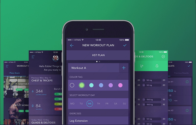
The Workout Book is a no-nonsense straight-to-the-point workout app
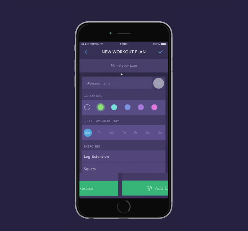
Each workout has a color tag to let you easily track your workout
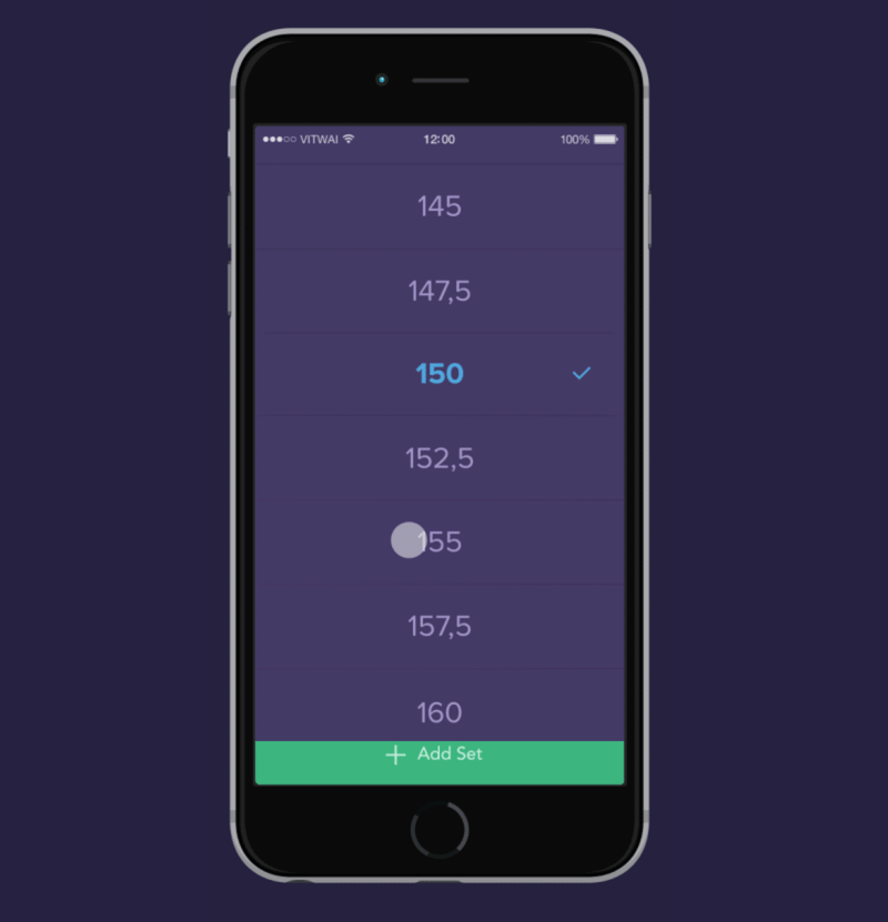
Create your own workout with just a flick of your fingers and press save. Customize, set the day, and the targeted area you want to work on. Each workout has a color tag so you can easily look over them and monitor what you have missed.
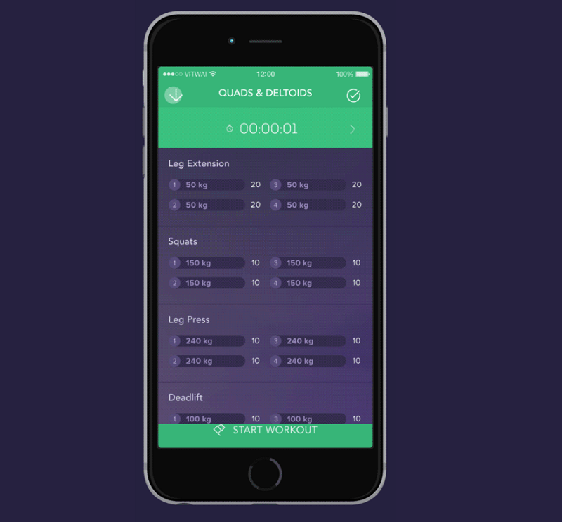
After you have finished your workout, just do a few taps and you will be able to see the summary of your workout including the weight you’ve carried and the reps you’ve done for each targeted area.
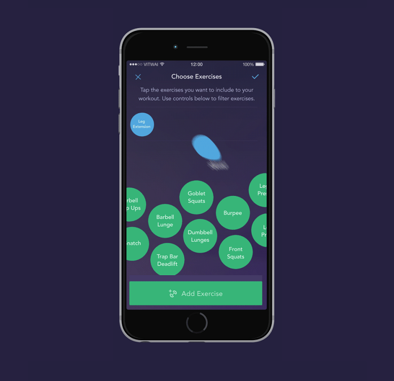
The app uses common mobile patterns
Plot the type of workout you will focus on for the day or for the week.
What makes the Workout Book’s UI stand out is its use of common mobile patterns making even first-time users feel at home. Despite the commonness, the designers translated their own creativity into the app matching users’ expectations.
Review your workout between rests. That’s how simple, good app UI design should look like.
4. Fantasy Leagues App Design
Whether it’s soccer, basketball, hockey, or American football, you can be sure to find fans – from kids to adults – engaging in fantasy leagues and creating their own dream teams. In fact, fantasy leagues have generated billions of revenue all over the world.
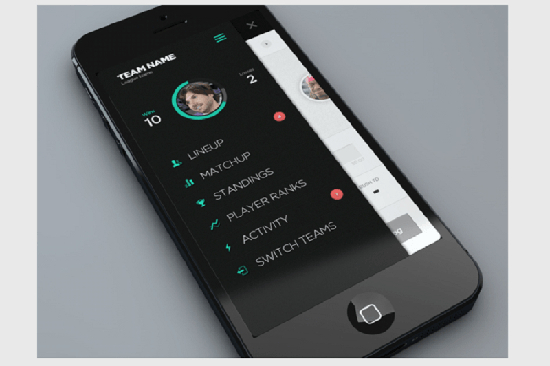
The Fantasy League mobile app is banking on the popularity of this hobby
The rules are pretty simple, and all you have to do is an app which allows you to navigate and monitor your score and stats easily.
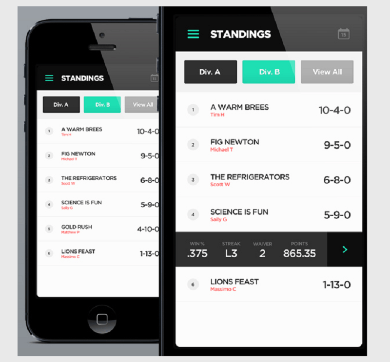
Team standings are easy to find and access
The Fantasy Leagues app shows a promising future in the world of sports app because of its simple and easy to understand interface. Swipe between pages to build a team, adjust your line-up, and view game stats.
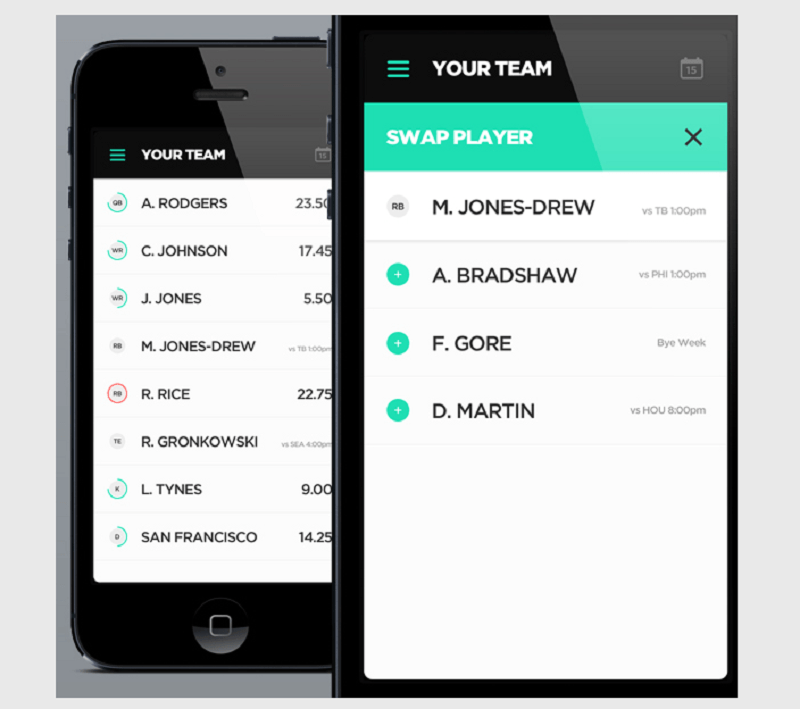
Swipe between pages to swap teams and players
The app has news feeds for both teams and specific players. The information on each page is short but concise, providing you with the latest news and updates.
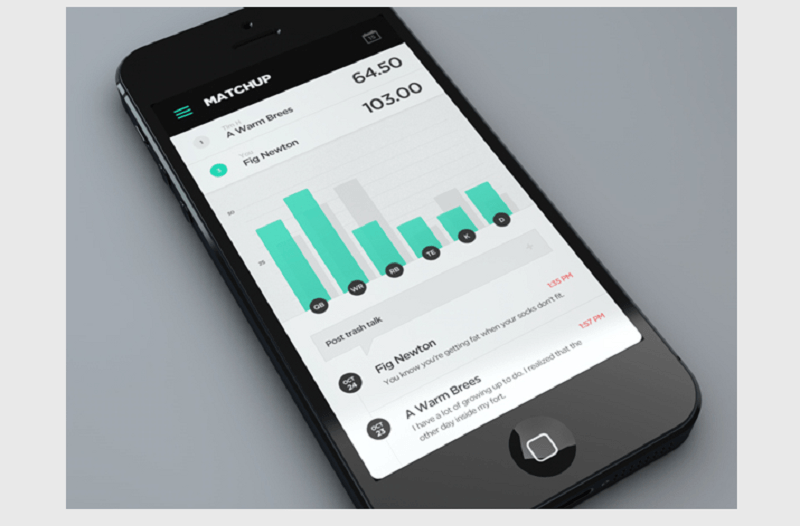
View player statistics and compare them with each other on one page
Another feature allows you to see how your current game fares as well as team and player standings. In case you are not happy with your line-up, you can easily swipe and sort players. Placing them in categories according to their positions makes it easier for you to put “who” in “where.”
Get more in-depth information about your favorite player
There’s also a trash talk feature which works like a Facebook status. Write what you think or feel about a certain player and post it for others to see.
5. Change – Help Make It iPhone App Design
Change is a simple app designed by Linus Lang with an ambitious mission – to help bring change in your community, specifically the people who live in it.
To me it looks like one of the best designed apps from the collection. Read on.
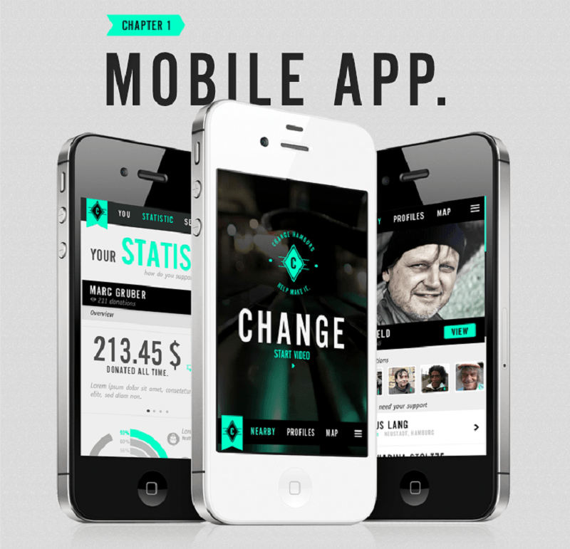
Simple mobile UI navigation, ambitious goal
It tells you the exact location and distance of a person who needed help from your location. The choices are simple and easy – a pop-up will appear and you can choose to view or cancel.
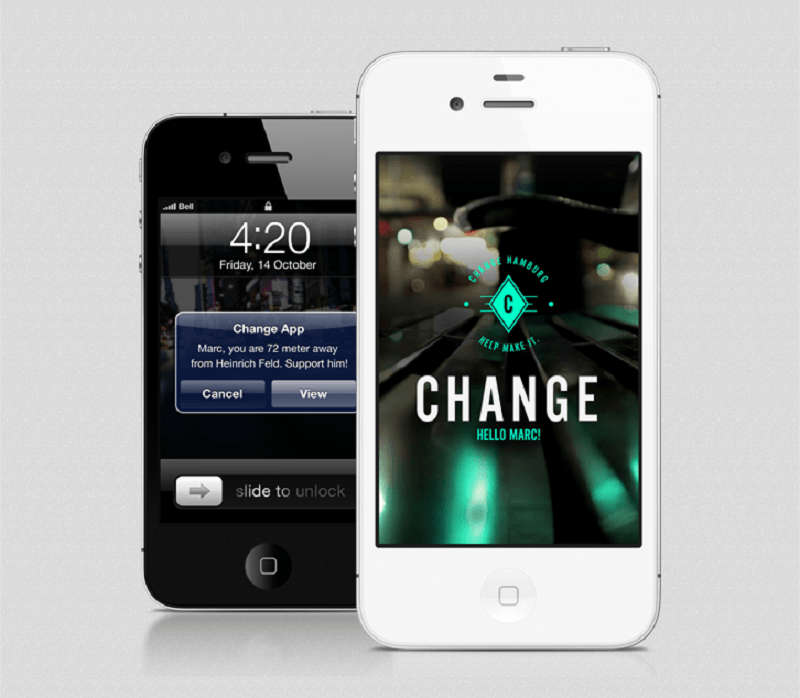
Change wins in both UI and UX
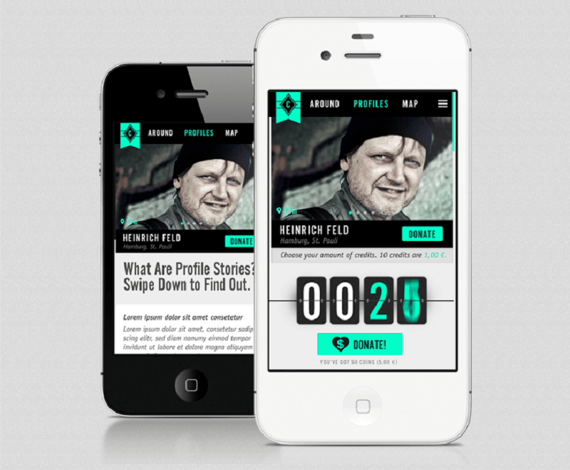
The mobile app encourages “mindful” giving with enough information
If you choose “View,” you will be directed a more detailed profile of that person. If you want to help, you can click “Donate” and type the amount you want to give. Then you can share it on your Facebook profile to inform and encourage your friends to help as well.
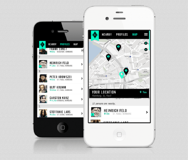
Know a person’s exact location
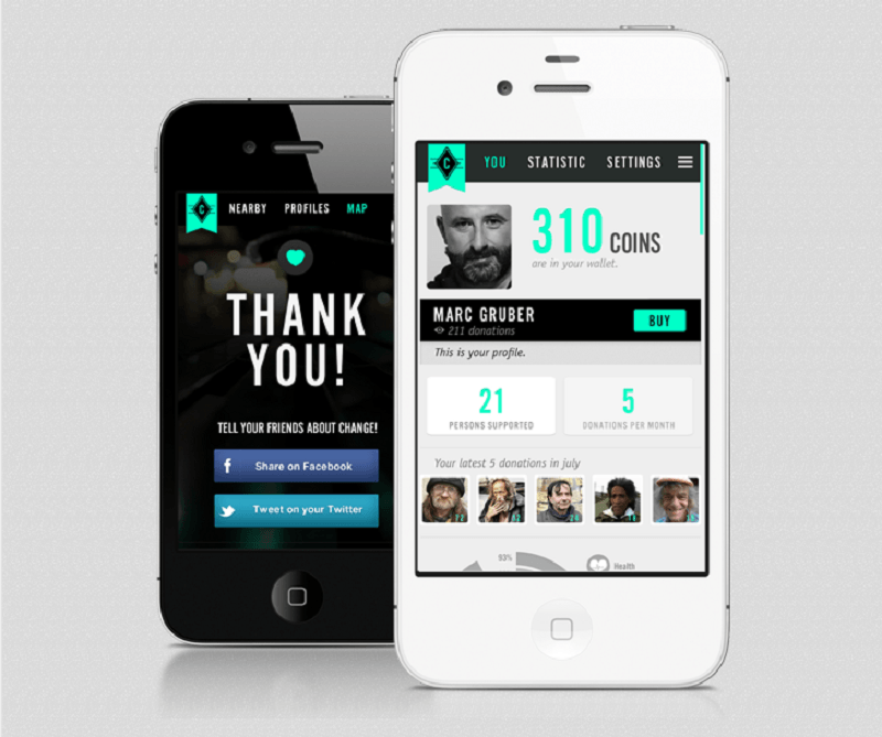
Track how many you’ve helped and how much you’ve given
You can also track how many people you’ve helped, the amount you’ve given, and the money available in your virtual wallet which you can give as donations.
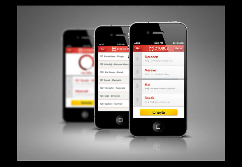
6. Public Transportation iPhone App
The Public Transportation iPhone user interface app is designed by Docagan Ese Altunsu to specifically help tourists and citizens of Izmir to easily navigate the public transportation of the city.
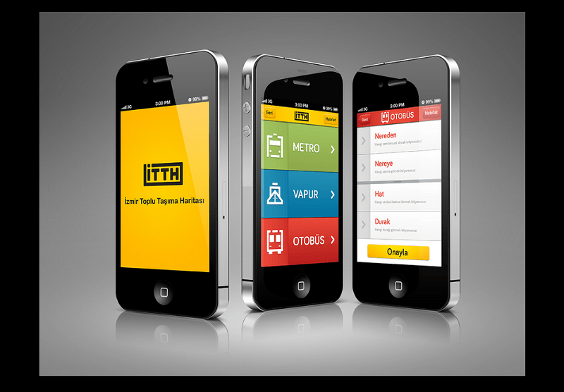
The colors, tiles, and font size all show a good UI design
It shows the shortest route where you want to go in Izmir as well as the approximate arrival time of a public transport – bus, ferry, or metro – near your area.
The app shows you the type of transport passes by your location
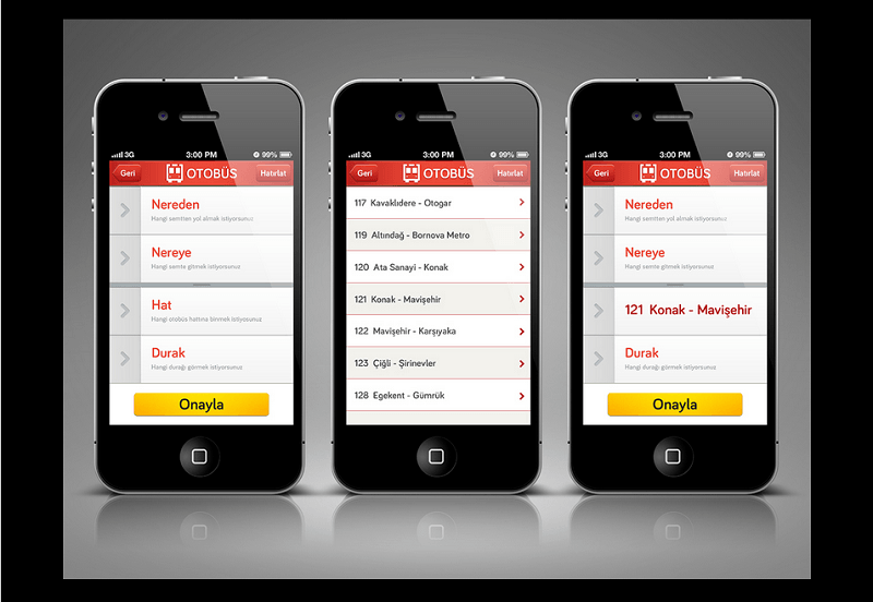
It also shows you the shortest route possible
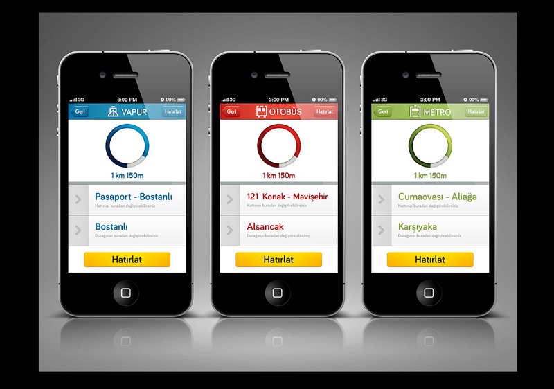
Type of transport is color coded so that you easily know where to look for.
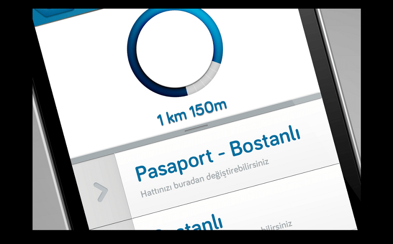
It is even friendly for those who have poor eyesight
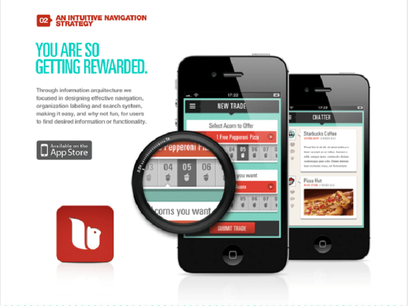
7. Squiryl Social Loyalty App Design
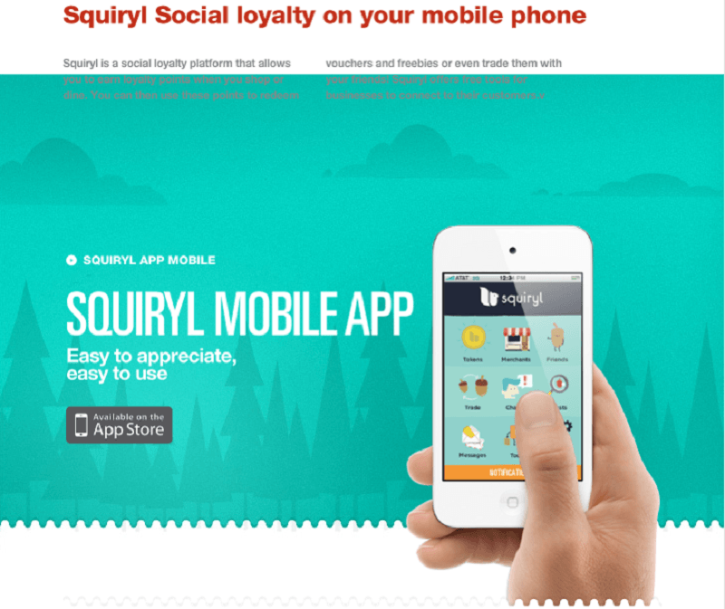
The icons are as cute as the name of the app
Designed by DHHN Creative Agency, this is a social loyalty mobile app design which allows you to accumulate points every time you shop and dine at participating stores and restaurants.
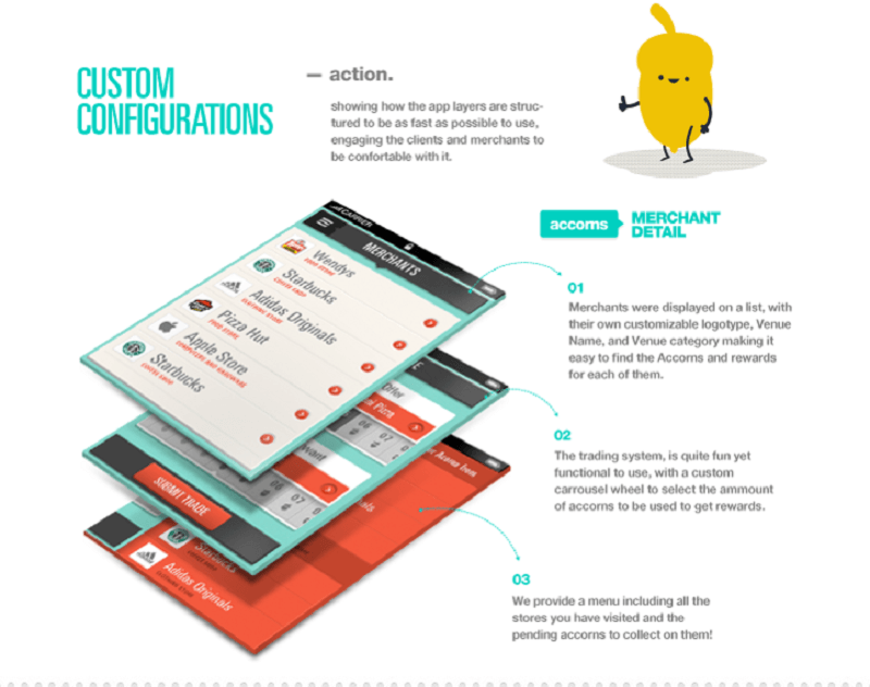
Flow is simple and easy – done in three easy steps
View and swap your rewards easily
With this app, you can redeem vouchers and freebies as well as swap them with your friends. It is a good tool for businesses that wants to connect more with their customers to establish loyalty.
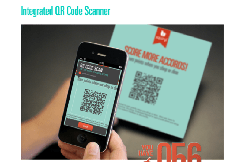
The integrated QR code scanner makes things much easier
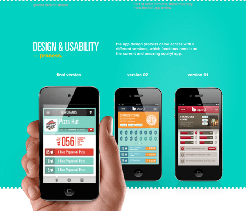
The app has undergone 3 revisions before finalizing everything
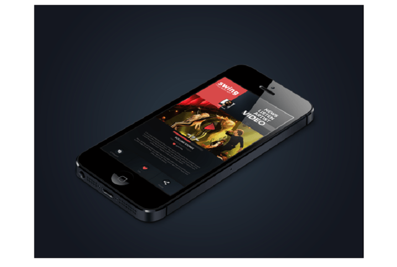
8. Swing iPhone Music App Design Concept
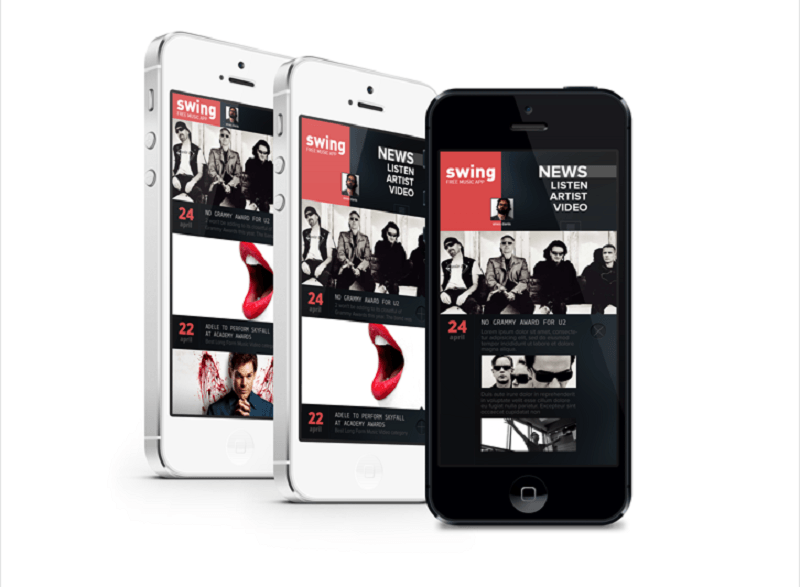
Swing is an iPhone music app designed by Enis Danis with a simple and easy to use interface with only four, big navigation keys – News, Listen, Artist, Video. The “News” section has bigger windows than the “Listen” category. The news is displayed with their headlines and arranged according to their dates.
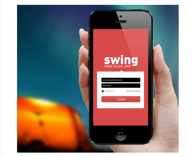
The red and black color scheme characterizes the app – fun and funky
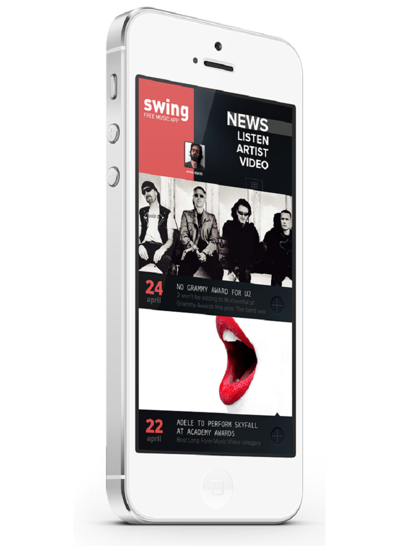
There are only four categories strategically placed at the top
Each page category is presented differently leaving no room for confusion
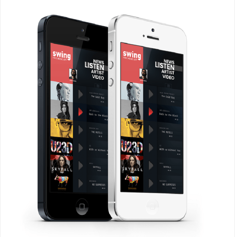
If you want to listen to music, your playlist appears and you can scroll down to search for more songs. Then, start listening by tapping the “Play” icon. Your “videos,” on the other hand, will display on a full screen.
The tiles are big enough to give a teaser to the more detailed information
Videos are played full screen by default
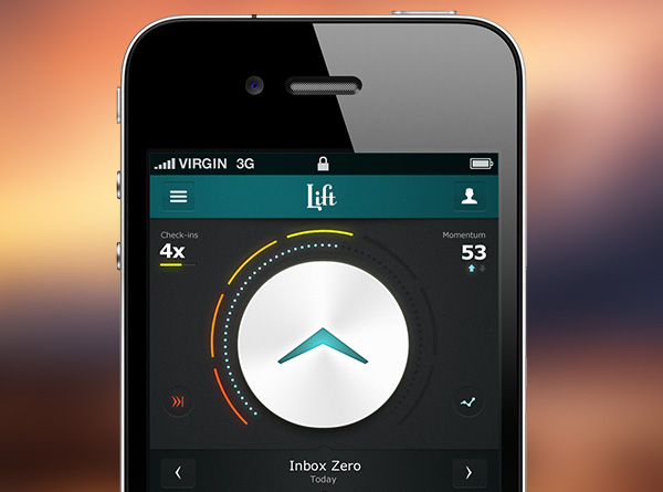
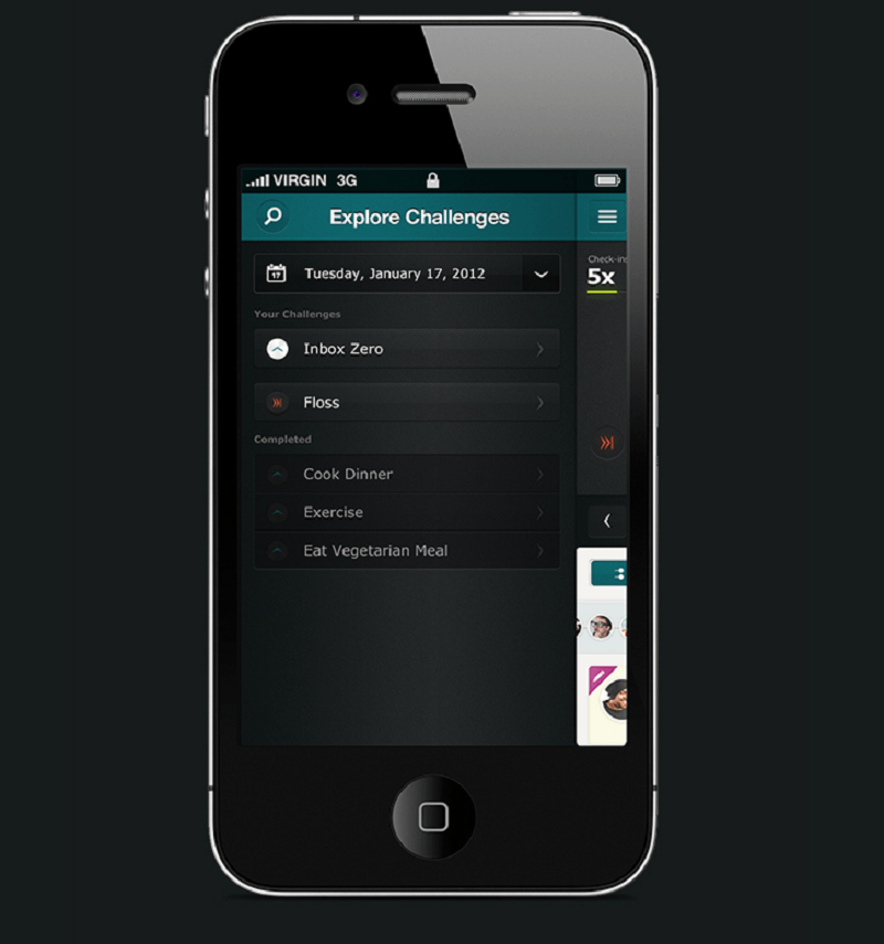
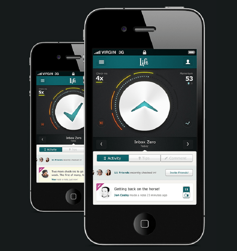
9. Lift – Self Improvement iPhone App Design
Lift is a self-improvement and coaching app of Lift.do, now Coach.me. Designed by Leigh Taylor, it is geared especially for people who are goal-driven or for anyone who wants to be more productive.
Don’t be fooled by the inbox zero icon
The app’s main page has an indicator to show how much of your goals for the day have been achieved.
The color and the mobile design already energizes you
Encourage and be encouraged
As you tick each finished task, the indicator shows it until you achieve Inbox Zero – goals accomplished. Aside from that, you can also check what your friends are doing and be encouraged if they are doing well, or you can encourage them if they need it.
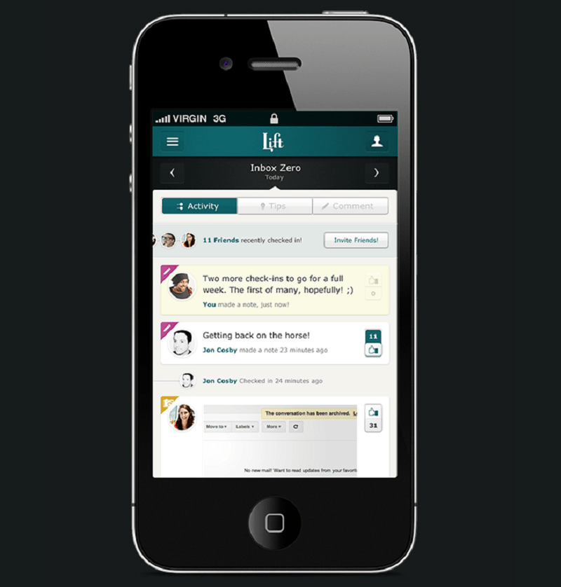
Monitor your friends’ activities as well and spur each other on
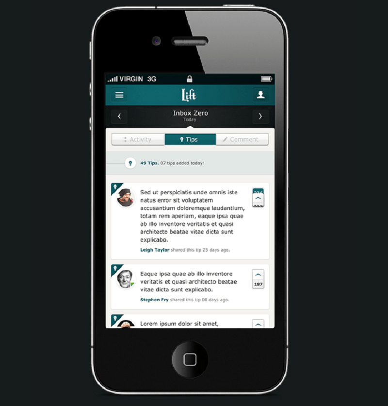
It also gives you tips to help you reach your goals
You can also get tips how to achieve your goals. The app also flashes some encouragement to lift your spirits in order to keep going.
10. Weather Tile App
The Weather Tile is an iOS app which got its inspiration from Windows 8 apps so when you glance for the first time, you might think it is a Windows phone. Navigating the app is simple and interesting because of its pastel colors.
See, we saved the best for last, hope you will find fresh inspiration to design your own mobile app after going through this article!
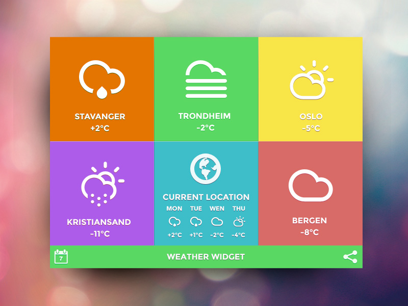
The weather app got its inspiration from Windows.
On the main page, you can find your current location and the weather as well as the key cities in the country making it easier to navigate between locations.
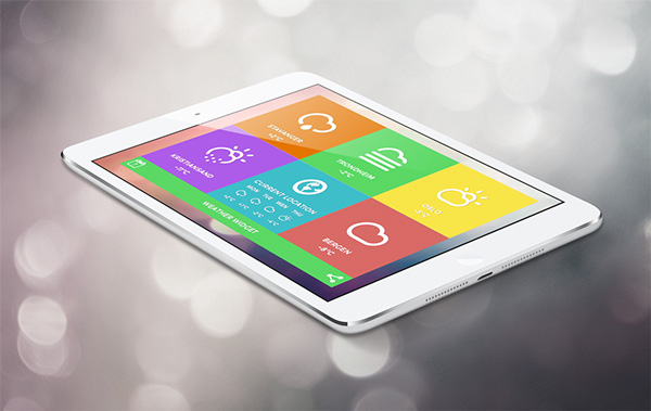
Tablets have bigger tiles than phones
If you click a tile, you will get an overview of the weather for the whole week. You can favorite the location so it appears on your main screen.
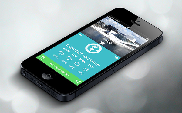
You can favorite locations and they will appear on your homepage
The icons automatically change as the weather in that location changes. You can also share it immediately on your Facebook and Twitter accounts.
This post may contain affiliate links. See our disclosure about affiliate links here.