Join over 55,891 Subscribers Today! FREE UPDATES!
Get The Only Freelancer crash course you will ever need to read!
Negative space is an important element in making website layouts and logos although it is very tricky to combine negative space in designing but once you are able to do it, it is not something to be overlooked or avoided. I usually call it white space, and to be honest many new designers usually make a mistake of creating chunky websites with too much information in it and without any spacing.
But believe me spacing does wonders, for even young designers – you can look professional quickly with minimal website..just put less content use negative space and you’ll be more successful than others starting just out.
But note - great design takes all the space available into consideration, both used and unused elements.
Negative Space is also called white space. These are spaces without content although they are called white space, “Negative Space” doesn’t have to be white. It can be any color, it just doesn’t have any content. Negative space is also a design factor although it is not easily recognizable, basically the use of negative space is to add symmetry to your layout and make it look clean, natural for visitors.
Even if your website has great content but will have a poorly designed layout, it just won’t work – you will fail to create effective website, I think good layout design and native navigation through it is even more important than content!
Here’s an example of an optical illusion that uses negative space.
It’s a chalice but with the white space you see the faces of two people facing each other. This is how you spot negative space, with only 1 object but can be interpreted as two or more different things.
Designing a webpage layout includes objects, text and images in an attractive manner. This also includes negative space – the spacing of objects from one another. You don’t make a webpage layout with images that overlaps with another image right? That is how negative space is used. It keeps the viewer’s eyes focused on the objects. Negative space should be used to balance or align objects in a design to make it more appealing to the viewers.
Filling your navigation with big fat buttons might be a good idea but just because there is a space that could be filled doesn’t mean you should place something in it. For navigation I would suggest just to use small icons with little but noticeable text just to make it sleek, simple..and don’t forget to use nice spacing.
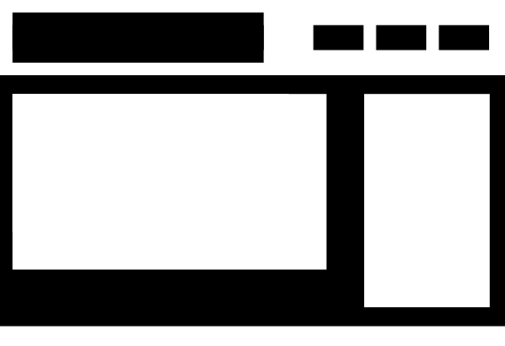
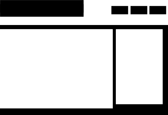
Here are two images that I made to demonstrate how negative space can affect web page layouts. It’s a typical webpage template that has a navigation bar/buttons, logo, content area, and Latest News part. I simplified it to black and white so that we can easily spot negative space.
Let’s identify the parts:
Here is a negative-spaced layout.
See the consistency of the spacing? You can see the objects neatly and can focus on them with ease. The spacing between the objects is consistent, producing a good design.

Now here is the not-so-negative-spaced design, although a bit exaggerated. The navigation boxes aren’t aligned on anything below, the part where you put your page title or logo is a little large and occupies the upper left of the page, the main content occupies the left to the center portion of the page and the latest news part might be distracting for the scrollbar.
This is just an example of how negative space can destroy a web layout. You can easily spot the inconsistencies in the spacing of objects, it might create distractions to viewers.

Here are two images that I also made, one with much negative space and the other not so much.

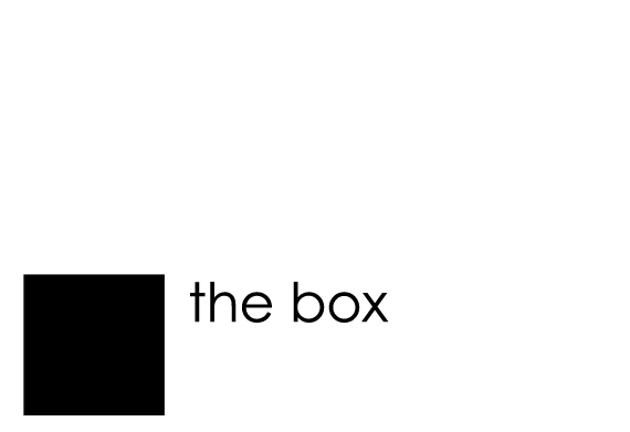
You can focus on “the box” easily on this image because the object is not occupying the whole page.

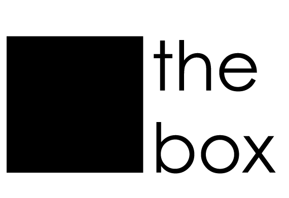
You find it difficult to focus on “the box” since you can’t look at the square and the text at the same time because the object is too large and it occupies the page completely.
That is how negative space works, it should help viewers focus on the objects that they should see instead of making their eyes look all over the place. If that happens they might not see what they are looking for in the website making them close their browser tab or go to another website.
Nothing can beat a logo with a clever mix of design and negative space, you include 2 or more objects in only 1 logo.

See the negative space between the E and x that looks like an arrow ?
Here are some logos that uses negative space effectively.
Two wine glass combined forms a shape of a house.

Image by EBrown
A tree with a negative space shaped like a chimney and a roof.

Image by iskender
An upside down tack and a triangular white space forming a letter A.

Image by Logomotive
Letter B with a white space in the middle that is cleverly shaped to look like a fish.

Image by Rokac
White space that is shaped like skyscrapers while the red color forms the shape of a bucket.

Image by HitByReindeer
The shape of Australia’s territory/map is formed inside the leg and the arched back.

Image by RoySmith
Here shows the shape of pony and a cat in green portion, a dog and a bird formed by the white space.

Image by PixelJuice
Piano keys that forms the letters W and M.

Image by NEXQUNYX
An arc that looks like what’s on the top of a Spartan helmet and a golfer that forms a Spartan face.

Image by Lexlogo40513
Single opening quote and a single closing quote combined to form a face.

Image by tabithakristen
Negative space can be really tricky to incorporate in designs and especially in logos but once you are able to pull it off it can really make your website easier to view or help you in advertising your product.
What’s your experience designing layouts using white space, some valuable tricks you learned you would like to share here? Open to discussion!
Get The Only Freelancer crash course you will ever need to read!
Friday, November 4th, 2011 09:20
A very useful reading for any designer . . . Thank you.
Friday, October 28th, 2011 07:01
great article!
Thursday, May 26th, 2011 11:36
Very interesting article.
Negative white space is easy overlooked.
Thursday, May 26th, 2011 00:33
I find in web design, use of good white space is not an impossible challenge. Though, in logo design, that takes a special level of creativity.
Saturday, March 12th, 2011 12:13
Indeed, effective use of space does magic in achieving effective visual communication. It offers relaxation to the viewer.
I really love the wonderful ideas raised above. Good!
Thursday, March 3rd, 2011 19:59
These are cool designs. I like how some of the logos blend with the background. I will keep this use of space in mind for the future.
Friday, December 10th, 2010 12:47
Sensational post. Though I’ll used this negative space concept in my logo. But how can i conceived the idea of this.
Monday, December 6th, 2010 03:58
Now I read your article! wish I would have run across it a month ago. I design a lot of things but I know my website needs help in the design department, maybe by applying some of your design principles to my website in the future, it will have more eye appeal.
Monday, December 6th, 2010 04:06
I really liked your article about using negative spaces and intend on applying these principles in the future.
Friday, December 3rd, 2010 21:15
Very Nice and fresh topic !!
loved this So muc and the designs you shared !!
Thank You
Friday, December 3rd, 2010 13:11
Yeah, but you can’t find that company anywhere online. (Any company willing to shell out money for a logo that good would have some form of online presence, you think?). This makes me think it was just a fictitious company invented for the purpose of doing the logo. Still cool, but would’ve been cooler if it was real. Just do a search for “Spartan Golf Club”. You’ll only find roundups such as this.
Friday, December 3rd, 2010 16:13
Agreed. It looks like it was simply work done for a portfolio. Still very nice.
If not, then it's time to learn how to:
You can trust 1stWebDesigner to help you become a better web designer!
- Jacob Cass | Just Creative
Just enter your name and email below and click Get Updates!
Cliff Wells
Monday, December 6th, 2010 03:58
Now I read your article! wish I would have run across it a month ago. I design a lot of things but I know my website needs help in the design department, maybe by applying some of your design principles to my website in the future, it will have more eye appeal.
Novgorodskiy Danila
Friday, December 3rd, 2010 11:39
Spartan Golf – best
cecelia
Friday, December 3rd, 2010 16:13
Agreed. It looks like it was simply work done for a portfolio. Still very nice.
Stray Wells
Monday, December 6th, 2010 04:06
I really liked your article about using negative spaces and intend on applying these principles in the future.
Rahul
Friday, December 3rd, 2010 21:15
Very Nice and fresh topic !!
loved this So muc and the designs you shared !!
Thank You
Joseph
Friday, December 3rd, 2010 13:11
Yeah, but you can’t find that company anywhere online. (Any company willing to shell out money for a logo that good would have some form of online presence, you think?). This makes me think it was just a fictitious company invented for the purpose of doing the logo. Still cool, but would’ve been cooler if it was real. Just do a search for “Spartan Golf Club”. You’ll only find roundups such as this.
Hyderali Shaikh
Friday, December 10th, 2010 12:47
Sensational post. Though I’ll used this negative space concept in my logo. But how can i conceived the idea of this.
Brett Widmann
Thursday, March 3rd, 2011 19:59
These are cool designs. I like how some of the logos blend with the background. I will keep this use of space in mind for the future.
Pradeep.K.S.
Friday, November 4th, 2011 09:20
A very useful reading for any designer . . . Thank you.
flitz
Friday, October 28th, 2011 07:01
great article!
Jef
Thursday, May 26th, 2011 11:36
Very interesting article.
Negative white space is easy overlooked.
Daniel Akwada
Saturday, March 12th, 2011 12:13
Indeed, effective use of space does magic in achieving effective visual communication. It offers relaxation to the viewer.
I really love the wonderful ideas raised above. Good!
Jason Holland
Thursday, May 26th, 2011 00:33
I find in web design, use of good white space is not an impossible challenge. Though, in logo design, that takes a special level of creativity.