They have used it with many Swiss cultural institutions, political advertisements and a lot more because it was thought to have suited the drastically increasing global postwar market. It was used in street signs, maps, public service announcements, etc.
In this demand, institutions, corporations and small firms needed a universal identification method that could be easily related to them. The trick was, the method should be universal enough to be understood by every citizen of the world. The Olympics was one good example of a global institutional event Swiss style helped because it has used the simplest symbols using the most universal colors possible.
Your Web Designer Toolbox
Unlimited Downloads: 500,000+ Web Templates, Icon Sets, Themes & Design Assets

24,500+ Fonts, Website Templates, CMS Templates, and Landing page Templates are now available for just $29 per month with Envato Elements

By joining Envato Elements you gain access to plenty of Fonts, as well as many other useful design elements. All of this is available for a single monthly subscription to Envato Elements. Join today, and gain access to a massive and growing library of 24,500+ creative assets with unlimited downloads.
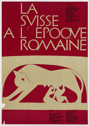
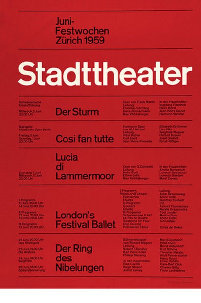
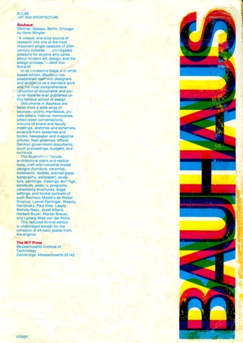
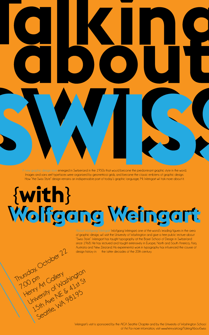
Swiss style emphasizes on neatness, eye-friendliness, readability and objectivity. Its foundations go back to its strong reliance on elements of typography and universality. This basic knowledge of universal understanding made Swiss style earn its moniker dubbing it as the ‘International Typographic Style’.
Being modernist by nature, the Swiss Style served as the forerunner for the graphic web design trends. It is in this reason why it is called the King of Web Design. It can be easily identified for its immense simplicity and exhortation to beauty and purpose.
These two principles are often manifested in the use of asymmetric layouts, grids, sans-serif typefaces, left-flushes and simple but impactful photography. These elements are produced in a simple but highly logical, structured, stiff and harmonious manner.
Being the King of Web Design, it is but natural that the Swiss Style would have an impact to our websites. This is why studying this design style helps web designers and graphic artists to produce impacting, simple and aesthetically arranged outputs. Designers take lessons from the Swiss styles applying the norms on simple yet artistically and clearly delivered messages by:
- Preserving uniformity and geometry
- Allowing wider spacing
- Using of grid systems
- Structuring information
- Keeping minimalism
- Using sans serif fonts
- Using different fonts sizes
- Using of effective photography
Sizes, Shapes, Swiss!
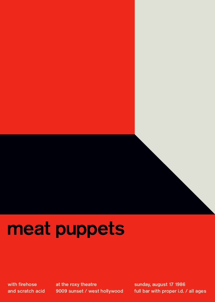
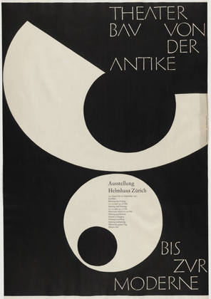
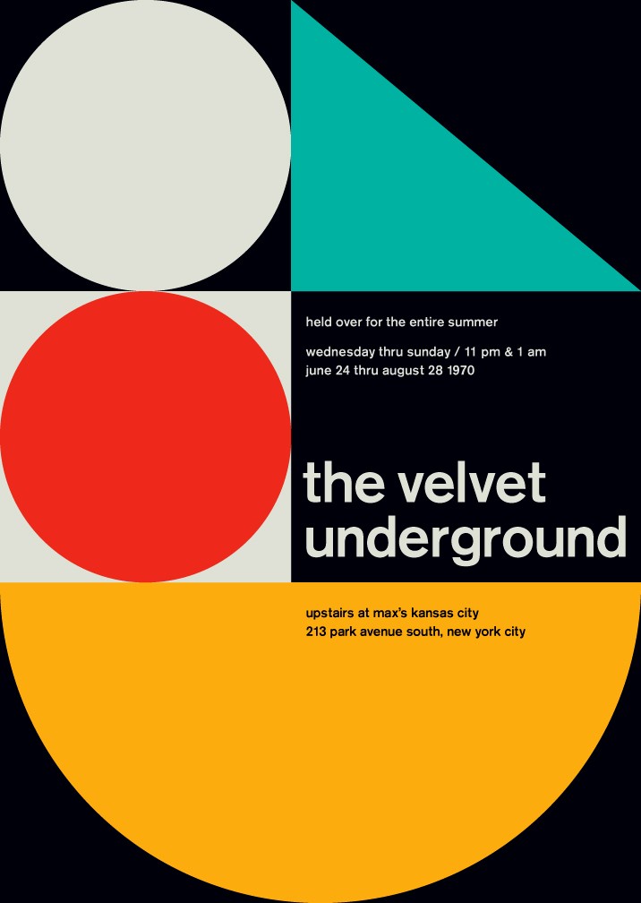
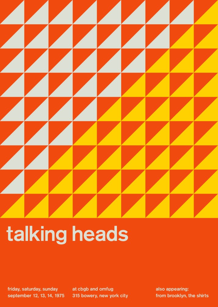
Swiss style works are generally attentive to the use of uniform design elements and geometric figures. It focuses on preserving the consistency of the shapes and their sizes. Most graphic artists practice the use of shapes collated together to form unique abstract designs.
The use of polygons, rather than intricate lines and calligraphic designs assure the simplicity of the work. It also spices up the whole image, making it look sharper and purpose-directed. Aside from that, colors, text manipulations and abstract devices are also combined with shapes to produce a remarkably clear message to its spectators.
Breath in, Breath out
It has been stressed out in almost every design school that whitespace is important. Most starting designers tend to discount this fact. And that’s what separates them from the better designers. In a work of art, whitespace is a very important element.
It literally and figuratively breathes life to it. Having each element in the design will produce visual impact and readability. For a web page, using this technique will subtly influence your readers to think that there is organization in the web page and could convey an impression of a better output as well.
The popular belief is that a work would be perfect if there is nothing to add to it is clearly not the ways of the Swiss design. For Swiss designers, removing unnecessary elements makes it perfect. They believe that a work will be perfect if there is nothing to remove in it. So, instead of adding elements, they do the otherwise.

Nitty Griddy
Gridding is the usage of a very stable framework that allows designers to logically arrange the information they put in the page. This system, a practice that is traced up to the medieval times, enables artists to easily identify where to put information and what kind of information is to be put.
Since the Swiss Style is characterized to be logical and purpose-oriented, the usage of gridding is very much recommended as it gives ease to the designer in doing the work and gives the readers easy access to the message the work is trying to send.
Info-manic
It is clear that the Swiss Style is information-oriented. This is why designers should think of the information dissemination activity more than anything else. It should send the message before entertaining the people of its art. Swiss Style should be more focused on the semantic arrangement of data rather than the aesthetic placement of it. The readers of the typography should feel like they are reading rather than seeing. That they are actually studying data rather than appreciating it.
A-B-C-D-Elementary!
The modernity of the Swiss Style connotes a very rudimentary feel. Using minimal designs to make the reader focus more on what is really important is the main goal of the Swiss Style.
The fewer the distractions, the better. Removing all the distracting elements and making the elementary and only the important details remain is the basic principle of the style. This is to ensure that the true and main purpose of the design is met.
>What’s Your Type?
Typeface is the core element of visual communication. It is the most direct and easiest route for the message to be delivered.
In the Swiss Style principle, it would be an abomination for a designer to put into jeopardy the quality of the typeface for the design Typefaces should be presented in the most simple, expressive, and universally understood manner. For Swiss Style artists, the usage of letters in the simplest way possible is the best way to do it.
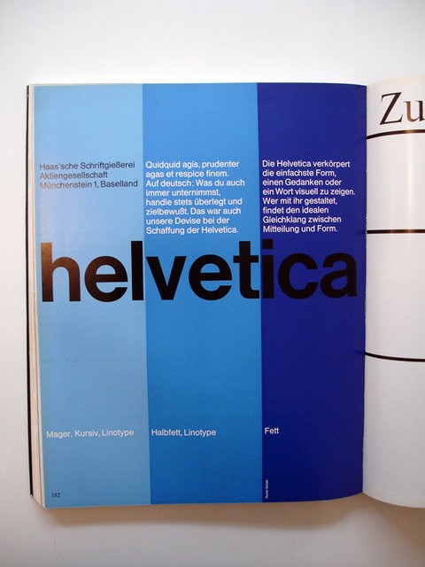
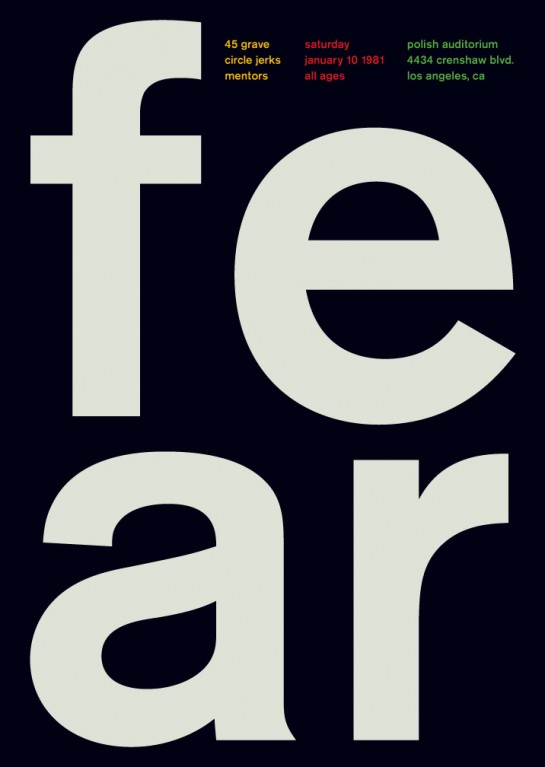
This is why a lot of artists who are into Swiss design use sans-serif typefaces. These are fonts that do not use serifs or ‘hats and shoes’. They are commonly single stroked, meaning, they have a universal brush-width and stroke size. Common forms of this kind of typeface is Helvetica.
Does Size Even Matter?
Of course it does. Font size matters in the Swiss Style. The difference in font size and the contrasts of typefaces arrives to the impression of visual impact and hierarchy of data presentation. It suggests separation or sifting of the important ones to the less important. Normally, the larger the font size is, the more important it becomes – similar to HTML heading tags where web crawlers prioritize H1 over H2 and H3.
Foot of Photography
Though the Swiss Style is generally focused on types, it is not discounted that photographs are good elements for the Swiss design. Most Swiss designers tend to use photos than images as the former gives an impression of realism and drama to the whole design. Commonly, these photos are taken without color, meaning, black and white.
The Swiss Style follows a very simple philosophy. Less is more. Just like any Swiss product, this design style is focused on its function rather than its look.This norm should guide all aspiring Swiss Designers. You should put what is needed and nothing more.
If you have a problem with this, try talking to the Swiss people. They might help you.
This post may contain affiliate links. See our disclosure about affiliate links here.