Something that makes a website great is when it is compatible in multiple browsers regardless of version. Technically this is referred to as cross browser compatibility.
Wikipedia defines cross-browser as:
The ability for a website, web application, HTML construct or client-side script to support all the web browsers.
Now, you may be confused on what is the difference between cross-browser and multi-browser.
Multi-browser means a website will work in several web browsers like Safari, Chrome, Firefox, Internet Explorer. While cross-browser means a website works in any browser, and any version of the browser, being used. This can be a struggle for developers throughout the creation of their websites.

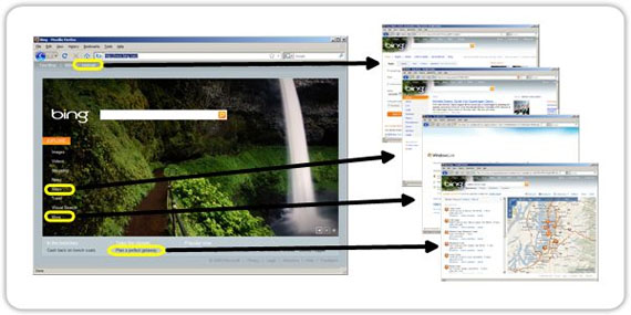
Image by: lagiamd
Table of Contents:
- Importance of Cross Browser Compatibility
- Simple Yet Important Cross-Browser Styling Tips Everyone Should Know
- The Grim Future of Web Browsers
Importance of Cross Browser Compatibility
If a user cannot view your website properly, he will not blame the operating system or his browser…he will blame the website itself. The goal as developers is to avoid that. That’s why there are tools available for free, or purchase, to make your cross-browser checking easier.
In this article you will find ten useful tools that you can use for your testing throughout different versions and types of browsers.
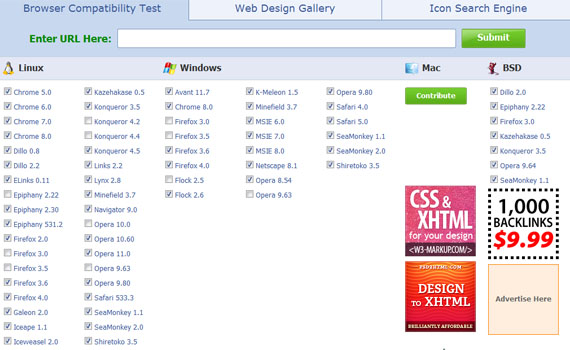
1. BrowserShots
BrowserShots is a free cross-browser tool that captures screenshots of the website in different browsers. This is the best known and the oldest cross-browser tool used by developers.
The browsers it supports are:
- Google Chrome
- Dillo
- ELinks
- Epiphany
- Mozilla Firefox
- Galeon
and more…
The operating system it supports are:
- Linux
- Windows
- Mac
- BSD
I read some feedback on the site and there are two things that appear to need improvement. The interface could be better. Though you just have to tick the checkbox, it will still take a lot of time to check all the boxes for the browser and browser versions you want to view your website in. The other thing people don’t like is that sometimes the tool is slow.
2. IE Tester
If you are a developer who is in need of a tool that just supports Internet Explorer, then this tool is for you.
IETester, a free web app that allows you to see the appearance of web pages by using Internet Explorer 5.5, 6, 7, 8 and 9. Its interface resembles the interface of MS Word 2007.
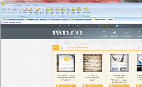
I tried using this software and I have found that it does not respond well and should be debugged. I think it might be because of the operating system I use, Windows 7. If you also encounter this problem, you can refer to this page.
3. DotMobi Virtual Developer Lab
Do you need a cross-browser tool dedicated to device testing? Then you should check out this tool.
DotMobi Virtual Developer Lab is a free web-based tool that lets you check your websites on real devices including iPhone with the use of remote access technology.
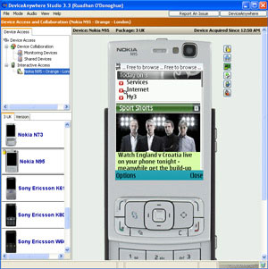
To use this service, you need to have a credit card. This is for the purpose of preventing abuse of the devices.
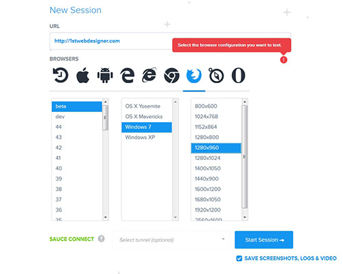
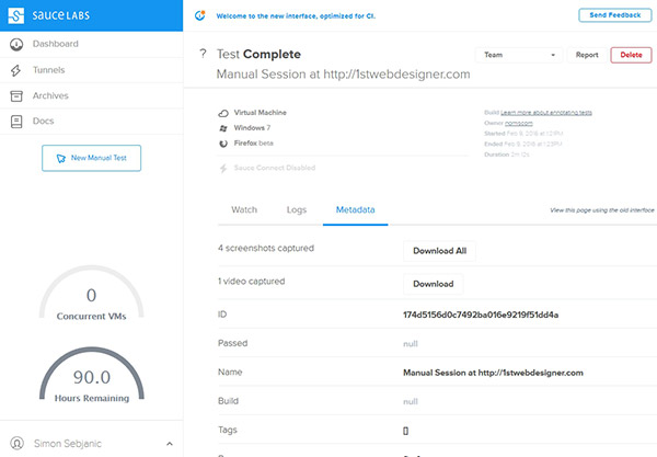
4. Sauce Labs
Sauce Labs is a testing tool for testing your site throughout different versions of browsers and operating systems. They were specially recommended by Adobe Systems, after they shut down their Adobe Browser Lab.
Sauce Labs offer testing for over 250 different versions of browsers and devices. They are providing testing infrastructure that includes Selenium, JavaScript, Mobile and Manual testing facilities. The good thing is there is no need to set up a VM machine manually. Just choose your operating system and all the browsers you want to test and run it.
Along with testing Sauce Labs creates automatic video and takes screenshots of you website. That means you can see websites actual appearance in different browsers. At the end of the test you can look at the data in the dashboard. For your convenience the tests are chronologically listed.
To use it, you need to create an account. They offer a free trail or you can choose from many different plans that Sauce Labs offer.
5. CloudTesting
CloudTesting is a tool that enables web developers to view a website using any of the web browsers listed below.
The browsers it supports are:
- Internet Explorer 6, 7, 8
- Mozilla Firefox 3, 3.5, 3.6
- Apple Safari 3.2, 4.0, 5.0
- Google Chrome Latest Version
- Opera 9.6

Features:
For Web Developers and Testers
- Find issues earlier. Test your current work in progress in multiple browsers at the same time, allowing you to find issues earlier in the development process.
- Multi browser. Compare what the website looks like in multiple browsers side-by-side.
- Comparison Tools. Compare how the same webpage displays in two browsers using an ‘Onion-skin’ overlay tool.
- Automated. Tests can be scheduled to run at regular intervals, freeing you from the tedious task of manually running them and storing the results.
- Repeatable. Tests are repeatable day after day to track changes made to the website.
- Verify all areas. Verify areas of your site not available to standard cross browser testing tools, such as shopping carts and search results.
- Full debug. Have access to historical component information and timings, including HTTP requests and response headers, just like you get in Firebug, but stored by CloudTesting.
For Website Managers
- Compare in multiple real browsers. See how your e-commerce or transactional website will look in a variety of browsers at the same time.
- SaaS. There is no need to deploy multiple servers or virtual machines for your cross browser testing.
- No administration. Browser versions and Operating Systems are kept up-to-date by Cloud Testing.
- Reduced development times. The ability for cross browser testing to be scheduled on a regular basis, drastically reduces web development life cycles.
- Earlier fixes. A key time-saving feature is the ability to look back over time and see when a defect was introduced, meaning earlier fixes.
- Pay for what you use. The PaYT (Pay as You Test) model gives you the ability to cope with peak demand whilst not paying for it during quiet times.
- Peace of mind. Give yourself peace of mind by running a sanity check in multiple browsers before launching a new website.
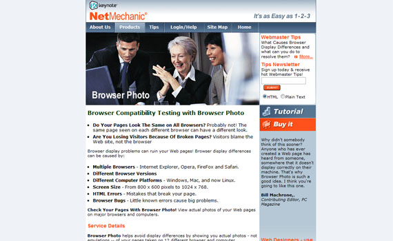
6. Browser Photo
Browser Photo gives you actual photos of how your web pages will look in different web browsers and platforms.
Service Details:
- Browser Photo helps avoid display differences by showing you actual photos – not emulations – of your pages taken on 12 different browser and computer configuration combinations!
- It’s Affordable! Building a test laboratory to get the same information that Browser Photo provides would cost at least $4,500.
- Catch Errors Made By Your HTML Editor. Often FrontPage HTML works with Internet Explorer, but not other browsers. Browser Photo spots these problems.
- Web Designers, show your stuff. Print-friendly reports show clients or bosses what you’ve done! Check out the Web Designer packages.
- Browser Photo is an automated, easy-to-use tool that requires no downloads or installation and is continually updated.
- Online Access Anywhere, Anytime. Through an internet connection, you can test your Web pages 24 hours a day from anywhere around the world.
7. Browsera
Browsera is a tool that tests the cross-browser layout of your website. You will see the differences and errors on your site.
Features:
Discover Cross-Browser Layout Problems Automatically
This feature of Browsera gives you a notification of possible problems the tool finds while testing your website. Instead of checking each screenshot, you will get a report that gives details on which pages of your site have possible problems.
Locate JavaScript Errors
Browsera is also capable of helping you find problems caused by scripts on your site. We know that scripting errors are a big viewer turn-off and that’s what this feature wants to resolve. Every time a page is rendered, this tool checks if the browser encountered any errors. After checking, it will give you a report showing the results.
Easily Test Entire Sites
This tool tests your website. Not just a page at a time, but your entire website. This means it takes less time to test and find errors, and since it tests the entire site you don’t have to worry about missing a page during the testing process.
Test Pages Requiring a Login
Browsera lets you log in first before testing your site. Very secure, right? It supports both HTTP basic authentication and application based logins, as well.

No Installation Required
Yes, no installation required. Everything that Browsera needs to run comes from their server cluster. All you need to have is a web browser and an internet connection. Ideal for developers that work remotely.

Test Dynamic Pages
Browsera can work with dynamic pages so if you use technologies such as AJAX and DHTML, this will not be an issue. Browsera will wait until pages are loaded prior to the testing process.

8. CrossBrowserTesting
CrossBrowserTesting is a tool that tests your website with a browser and remote VNC. With these tools, you can test your AJAX, JavaScript and Flash with any browser. You just have to provide the URL, select a browser then run the software.
To view their demo, click here.
The browsers it supports are:
- Android Browser
- Chrome Google 5 to 8
- Dillo 0.8.6-i18n
- Firefox 1.0 to 4 Beta
- Internet Explorer 5.0 to 9 Beta
- Mobile Safari
- Mozilla 1.7
- Opera
and more…
The operating system it supports are:
- Android
- iPad
- iPhone 3GS
- iPhone 4
- Mac OSX 10.5.7
- Mac OSX 10.5.8
- Mac OSX 10.6
- Ubuntu 8.10
- Windows 7
- Windows 98 SE
- Windows XP SP2
- Windows XP SP3
- Windows Vista
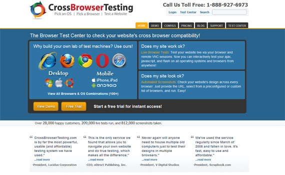
This tool offers three plans to choose from and a free trial.
9.TestingBot
TestingBot offers testing for over 100 different browser and operating system combination. The testing infrastructure is based on Selenium. Tests can be preformed manually or automatically.
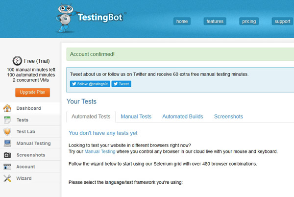
The live manual test allows you to control every browser from your default browser on your computer. During the test TestingBot takes screenshots and records a video, so that it can confirm the test was successful. A secure testing environment allows you to run tests on your local computer, on a LAN or on a server via VPN.
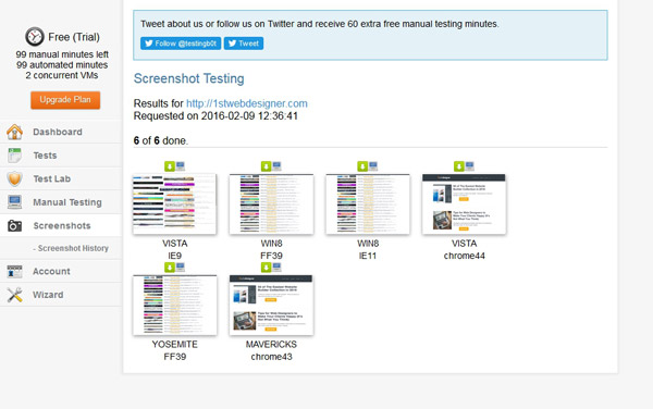
To use TestingBot creating an account is necessary. They offer a free version, however the version is a little bit limited. Overall it is a good tool to test your website on different devices and browsers.
10. Microsoft Expression Web SuperView
Microsoft SuperView is a new technology created to make the life of developers easier.
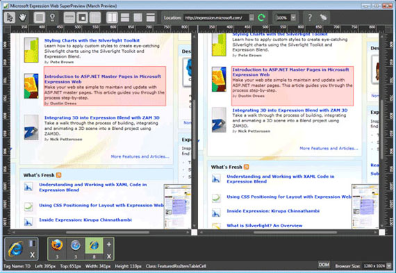
The standalone version of this software supports only IE web browsers, while the full version can support Mozilla Firefox and Apple Safari browsers.
Based on the feedback I have read, users are satisfied with its features. It gives them comfort in regards to its response time and it is user-friendly. Note that you cannot use this without having the Expression Web.
Share Your Thoughts!
These are some of the best tools you can use for cross-browser checking. I hope that you find some of these tools useful when designing and developing your next website.
Do you already use some of these tools? Please share your experience with any cross browser testing tools with us in the comment section.
In the next section we will give you some awesome tips for cross-browser styling.
Simple Yet Important Cross-Browser Styling Tips Everyone Should Know
Many have been searching for cross-browser styling tips that can help them solve their browser compatibility problems. After all, creating a website can be easy but developing one that looks the same on all browsers can be tough. For many years, browser compatibility is one of the hardest parts of web development.
As a web designer/developer, it’s always our goal to give our website visitors better experience on viewing our site. Having a consistent look on every browser leaves a visitor good impression of the site.
If you’ve been developing websites for a long time you might agree with me that IE8 and the Jurassic lower versions of IE are the one of the web designer’s and developer’s nightmare. Given this fact that, there are still people using these versions of IE to view websites.
This is just one of the issues that we might encounter in developing a cross-browser website. The good thing is that we can redesign a site or initiate some good practices to make them compatible and look the same on every browser. In this article, I will show you some cross-browser styling tips and tricks to make your website development easier.
Use CSS Reset
Let’s face the fact that web browsers interpret different default styling for HTML elements. Some browsers have different interpretations towards values for styles like margin and padding.
To fix this issue, adding a CSS reset at the start of your style sheet is a good practice. This will reset all CSS elements. This would also mean that it will start from a zero base, thus, giving you complete control to your style sheet without worrying about the browser’s CSS issues such as margin, padding and alignment.
Eric Meyer has a good set of CSS rules to do this. You might also want to consider Nicolas Gallagher’s Normalize.css, a modern HTML5 ready alternative to CSS resets. After you’ve linked the CSS rules to your markup, you can now make sure that you have a starting zero base CSS on every browser.
Validate Your HTML and CSS
Before running or publishing your website, it’s a good practice if you validate both your HTML and CSS using validators as it will correct some minor errors that might give you some problems in the future.
You can use W3C HTML Validator and CSS Validator. These are trusted validators by W3C but feel free to use your own tools if you have another resource of HTML and CSS Validator that works for you.
IE Conditional Comments
The Jurassic versions of IE had been giving web designers and developers a headache when it comes to compatibility issues. As an answer to this issue, Microsoft developed conditional comments in their browser that allows linking a style sheet that will be interpreted by IE alone. Check out the code below.
The code below will target all versions of IE.
!
<--[if IE]>
  	<link href="ie.css" rel="stylesheet" type="text/css" /!>
<[endif]-->
The code below will target a specific version of IE.
!
<--[if IE6]>
  	<link href="ie.css" rel="stylesheet" type="text/css" /!>
<[endif]-->
Use Vendor Prefixes
W3C standards are continually evolving. It’s good practice that you know certain drawbacks if a browser supports a particular CSS property. Styles like rounded corners, drop shadows and gradients can now be implemented using CSS alone without the use of images.
Using vendor prefixes will save you a lot of time without worrying if the browser supports your CSS.
Check out the following list of vendor prefixes.
1. Safari and Chrome (-webkit-)
2. Firefox (-moz-)
3. Opera (-o-)
4. Internet Explorer (-ms-)
As an example, let us use the transition property along with vendor prefixes to target specific browsers.
-webkit-transition: all 4s ease;
-moz-transition: all 4s ease;
-ms-transition: all 4s ease;
-o-transition: all 4s ease;
transition: all 4s ease;
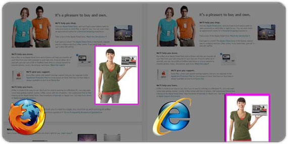
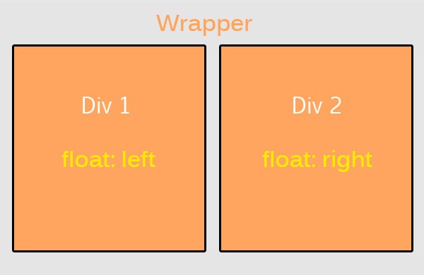
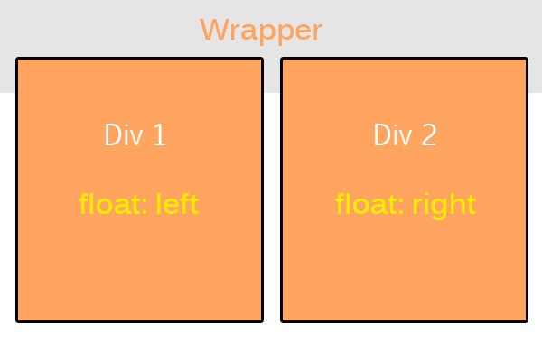
Clear Your Floats
We all know how to float elements either to the left or right by using the style property float. By default, if you only just use onefloat along with a non-floated element, it will just flow along the side of the element you floated.
But that is not the issue here; most often we float divs to the left and right and wraps them with a container or wrapper. Consider the images below.
This image shows what we are trying to achieve. But instead our divs end up like this image.This issue can be solved by simply clearing the float using the CSS property clear and adding a value of both. That means both floats will be clear.
Font Size Measurement
Although there are no fixed thumb rules what font size measurement to use, I would recommend using ems (em) and percentages (%) since ems and percentages are based on the default preference set in the user’s browser.
Most people use pixels or points, which are measurements based on the resolution of the screen. This is always fixed.
Regardless your preference, this How to Size Text in CSS article would help you learn more about text in CSS.
Always Test Your Website Using Different Browsers
You might feel lazy testing your website in different browsers, thinking that it looks good in the modern browsers, believe me, I’ve been there but not doing it might give your website visitors a bad experience.
Using an emulator like spoon plugin might save you some time but it is highly recommended if you test your creation directly on the actual browser itself.
Code Simply
Coding simply makes the whole workflow easier and faster. What do I mean? Just by using simple elements in building up your website makes the browser’s task a lot easier to read your site.
As an example, instead of using tables or paragraphs in creating navigation you might just use an unordered list to form the navigation. In creating a responsive site, instead of using tables, divs works perfectly. Keep it simple, organize your codes and name them properly. Believe me, this will save you a lot of time and headache when you run into some problems.
Polishing Off
There are more good tips and tricks out there about cross browser compatibility but this should guide you on the basic foundation in creating a firm cross-browser experience.
It’s a good idea taking some time to read your codes and check them across different browsers. If you know some more tricks and tips that we’ve not listed here or you have some comments or suggestions, I would love to hear from you. Please free to drop them in the comment section below.
We were consumed with browser compatibility, that we forgot about the apps on our mobile devices and how they change the IT world. Okay, maybe browser and computer won’t disappear, but traffic on mobile devices is increasing rapidly.
The Grim Future of Web Browsers
With the technology advancing so fast, especially all the mobile devices we call smartphones today part of the mainstream and are, maybe, the most important thing in our lives. So by sending a message from your QWERTY Android device or by playing Fruit Ninja on your latest iPhone, have you ever thought that you yourself are changing the IT world?
Well if you haven’t, I can tell you for sure that you do. By using portable devices more often and desktop computers less the latest gadgets quickly become out of date. Without realizing we have become unplugged and do not need computers anymore – which also means we do not need browsers anymore. And why would we? At the end of the day we have our smartphones filled with apps that can keep us busy for a long time. Sometimes I don’t even check my Facebook from my computer, even if I am close to it, because it is much easier to do it from the phone. Ever since the IT world made it possible to connect to the internet wirelessly, nobody has looked back. People invest much more money today in phones and portable devices like tablets or eBook Readers than in computers.

Image by ~jeroen-tje
Internet without a Browser
It is easy to see how we’ve become unplugged. Apple’s iOS and Android do it; Adobe Flash Player 10.2 and AIR technologies as well. HTML5 starts becoming more popular and supported on many portable platforms and other companies like Blackberry or Nokia follow in close. There are over 400,000 applications in the App Store, an incredible growth from 500 in the beginning. Android has around 400,000 applications and the numbers are increasing. The year started with around 300,000 apps for both platforms and ends with, very possibly, close to 1 million of them. Android included Flash from the 2.2 Froyo version and this made the portable devices running on the open-source platform even more popular. And you know what the good part of this is? That you don’t need anything besides a WiFi or 3G/4G connection to access them from all over the World.
Why do we talk about apps when we’re talking about browsers? Because if you think about it, the applications are nothing less than websites which are accessed without a browser. And more than 10 million of them were downloaded in 2011. That’s a huge amount of users who accessed this information from a portable device, avoiding using a browser. And it should be a clear sign about the future of the web. The apps are more intuitive, faster and easier to use, therefore they are preferred to Chrome, Mozilla, Safari or any other application. Another advantage is that the apps can be accessed from everywhere, while for a browser you not only need internet, but also a computer.
Smartphone and the Internet
A smartphone will also always allow you access to the internet, so why have a big laptop when you can have a pocket device that can do the same? A study made two years ago concluded that by 2013 mobile browsing will be more popular than desktop browsing. With the usage of smartphones growing by 110% in the US in 2009 and by 148% all over the world, this seems quite possible. Also, the younger internet users get educated in the world of smartphones, meaning that the computer will mean even less for them than it does for us.

source: BettyArmado via Chrome Store
This could be great news for designers – up til now everybody had to have a webpage, soon everybody will have to have a mobile device version as well. More work, more money for the design industry. China for example is a huge industry with tremendous potential. Not many people there have tablets or smartphones, but many say in 3-4 years everyone there will own one. With a market of almost 1 billion mobile subscribers, there will be a huge need for mobile websites for the companies and business individuals. So, bottom line, the fact that web browsers are on a downhill is not that bad for us – we will still have a lot of work anyway.
Right now there are more than 300 million mobile internet users in China and this is around 60% of all mobile and desktop internet users all over Europe – we’re talking huge numbers here. We’re talking about the Chinese equivalent of eBay, Taobao on which the transactions for the last year totaled roughly $60 billion; and this is while eBay was delighted with a total of only $2 billion. All of these things happen while the major internet providers already update the speeds to 4G. You see where I’m heading? As designers, we might be concerned that our jobs will disappear in 15 years but really, who knows how many other challenges will appear for us by then?
However, the truth is that it always takes up to five years after a new web technology appears until people get a hold of it and learn how it really works. Smartphones are huge today, but I don’t think they reached their maximum potential yet. There is still a lot yet to come and just because we think we know everything, it doesn’t mean we actually do. Web browsers are still popular and widely used, but they will be a thing of the past at some point in time, because nothing lives forever on the web. There is no such thing as a technology which didn’t improve since it was released (unless it was released recently).
Bottom Line
The bottom line of this section is, that even if the browsers disappear in several years (or at least their use will decrease), there will still be a lot of work for designers and developers. The internet is almost fed up with designs and experts, in five years time it will all move on portable devices. This means, as stated before, much more work for us, both for desktop and portable devices. All the technologies will be available on portable devices as well at some point in time and designing for them will be maybe even more challenging than designing for desktop use.
The beginners of today are the experts of tomorrow. We all know what’s coming in the short term, so why not try to become better at this while letting the current experts do their work? Who knows, in five years it might be you who earns the big bucks from all kind of clients and, as its normal, there will be others taking your place in the “follower seat”. The increasing use of smartphones and tablets bring a new taste in the design industry, with many new challenges yet to come. Get ready to take on all of them!
Conclusion
There you have it. The best tools for cross-browser compatibility checks, tips on cross browser coding and designing and of course we couldn’t left out the possible future of web design and browser. What is your impression? Tell us in the comment section, we would really appreciated.
This post may contain affiliate links. See our disclosure about affiliate links here.


