Designing a landing page is not a simple task. Why?
- You need to understand that your design is crucial to making the visitor complete an action.
- You also need to understand the basic principles behind the actions your visitors make and take advantage of those actions to intelligently place elements within the page.
As all web pages have their specific elements that are vital in facilitating information, a landing page also possesses elements that need to be present to make it more effective.
UNLIMITED DOWNLOADS: Email, admin, landing page & website templates

White Space
What can white space do to your design?
- It makes it more readable
- It makes it more clean-looking
- It improves focus
- It creates a professional look
Ways to ensure proper use of white space
- Ensure proper margins between elements.
- Break large chunks of text.
- Use call outs, buttons, dividers, headers and bullets
Proper Placement of Elements
When designing landing pages, the presence and proper placement of elements are two different things. As a designer, you have to understand that your design elements should be placed in the places where they will be most effective.
The Fold
The fold is the term that refers to the specific portion of the website which can be seen upon loading. It means that the design elements that are ‘above the fold’ are the ones seen without the need of scrolling down. Although there are some discussions whether the fold is a gimmick or not, I still find it effective, especially for desktop browsing.
Now why did I bring the Fold topic up? Well, the reason behind is an effective landing page makes use of the “Fold” to properly place items.
What to put above the Fold
- A video about your business
- A greatly written tagline
- Few salient points about your business
- A call to action
What to Place below the Fold
- More details about your business
- Testimonials
- Call-to-action elements like buttons and sign up forms.
Tips
- Make sure you preserve proper white spacing
- Provide a smooth flow of information between folds
- Again, break up chunks of content
- Use icons and graphics
Amazing Images
The use of images is considered to be the best and most effective way of capturing visitor attention. It makes a subtle connection to the visitor, which can persuade him to look at the website.

Here are a few guidelines in choosing perfect images in your landing page:
Your Images Should Make Your Landing Page Look Professional
No one would ever want to conduct business with a jester (unless you’re in the clown industry). If you want your business to be taken seriously, you need to use good images to ensure that you mean real business. The use of poor images may seed doubt in your visitor’s mind about company credibility and could result into loss of interest.
Make sure that your images are high-quality and should suggest trustworthiness, reputation and professionalism.
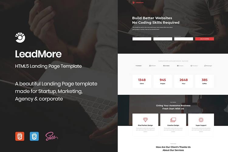
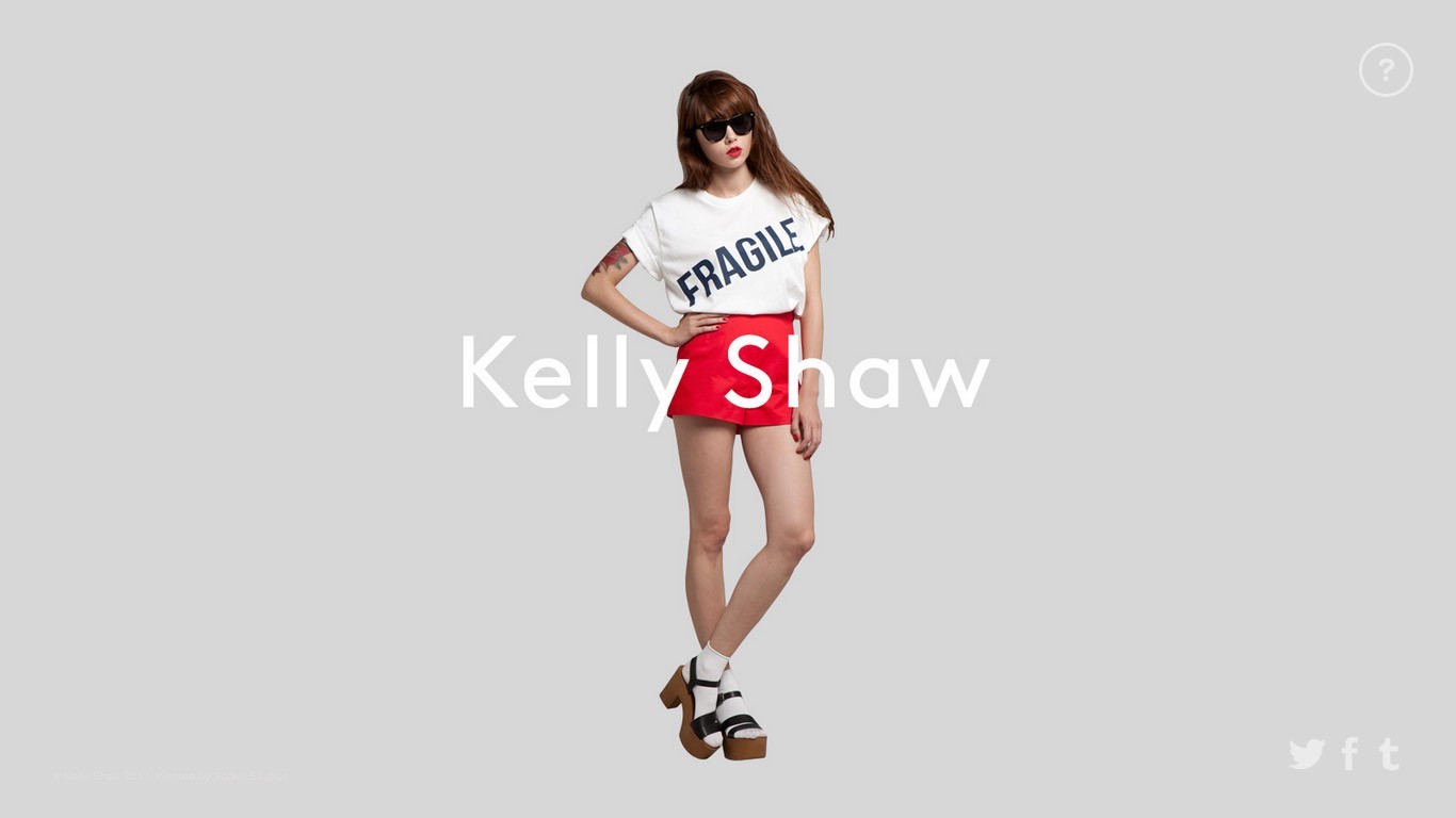
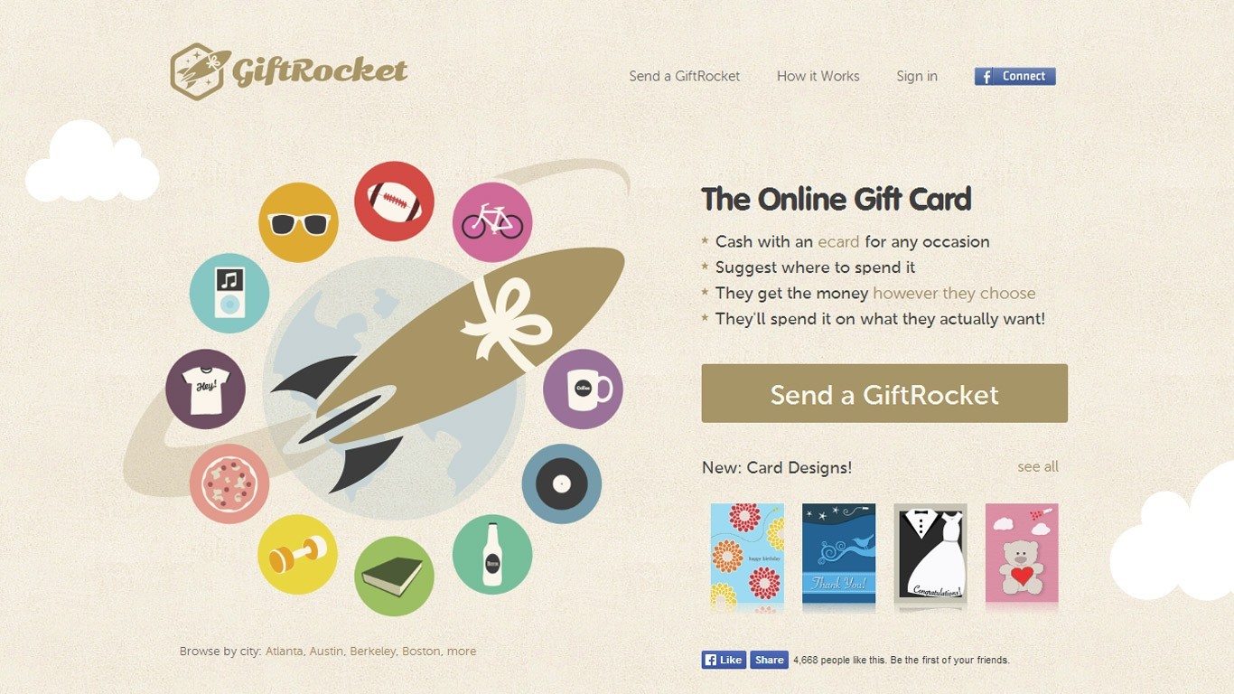
Here are a few great samples:
Your Images Should Be Visually Appealing
Of course, you would want your images to be a real deal.
- Use images that are visually appealing because it will trigger your customer to respond to your call to action.
- Never use pixelated images, or images with watermarks in them.
- Hire a photographer for this part, or take the photos yourself (if you are into photography).
- Never be dependent on stock images.
Your Images Should Be Simple
The summary of this tip is this: Do not overdo it. Don’t showcase your talents in photo-manipulation or graphic composting. The simpler it gets, the better it will become.
Your Images Should Stay Relevant
When I say relevant, I am speaking of the compliance with a certain theme or motif. Sometimes, companies get too creative with their designs, and that is not bad. But make sure that all the elements you place, even the images, should adhere to the motif of the landing page.

Never Forget a Call to Action
The thing about your visitors is that they want to be told what to do. Each landing page should think of that in order to properly lead the visitors to the product.
- CTAs tell your visitors what they should do next.
- Include entering their email addresses, clicking on sign up buttons and more.
- Placing call to actions in areas of the design where they can be noticed.
For your landing pages, you should always want your calls to action to stand out of the rest. They should be noticed. For example, you can place your call-to-action element over an image and contrast it properly so that I will be noticed.
Also, make sure you do the following:
- Assure that the call to action is visible at least once in the design. It should stand out over other elements.
- Use visual cues like arrows and graphics.
- In case you used more than one call to action element, make sure that they are de-emphasized visually against the primary call to action.
- Repeat the CTA if you have contents below the fold.
- Use Correct Colors
Like white spacing, the use of proper colors is also much discussed the world of web design. Color psychology has become a great and influential part in designing landing pages.
There are a few color schemes that are popular. Let’s take a look at them:
- Blue – blue is greatly used in Landing Pages because it subtly suggests cleanliness, trust, freshness and institution.
- Green – green is also much sought after because it works well with themes of money and life.
Most landing pages avoid using red, black, and yellow because they suggest a feeling of fear, anger and darkness.
Testimonials
Sometimes, other people’s opinion of you matters more than what you say about yourself. This is true, especially in landing pages. Testimonials have been proven to affect a huge chunk of decisions and conversions.
Think of it, you are on the Internet. Nobody really is sure about your real identity and doubt is bad for business. You have to gain their trust, and build from it to succeed.
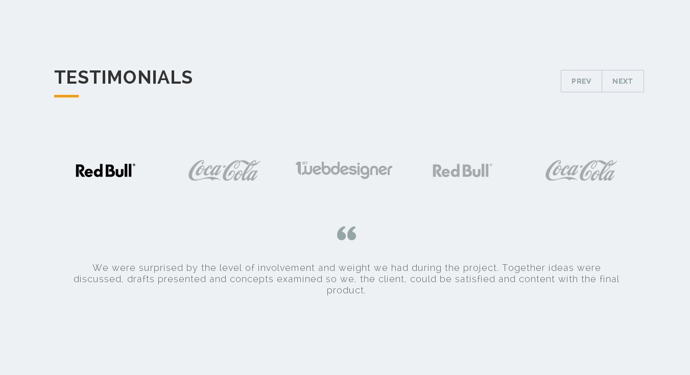
That is where testimonials take play. The more others talk about how beneficial and good your product is, the more conversions you get.
If you have solved others’ problems, you will surely be helpful to more people. That is what your visitors think. If you will be able to connect to them using your former client’s experience from your services, it will be assured that they’ll take your product.
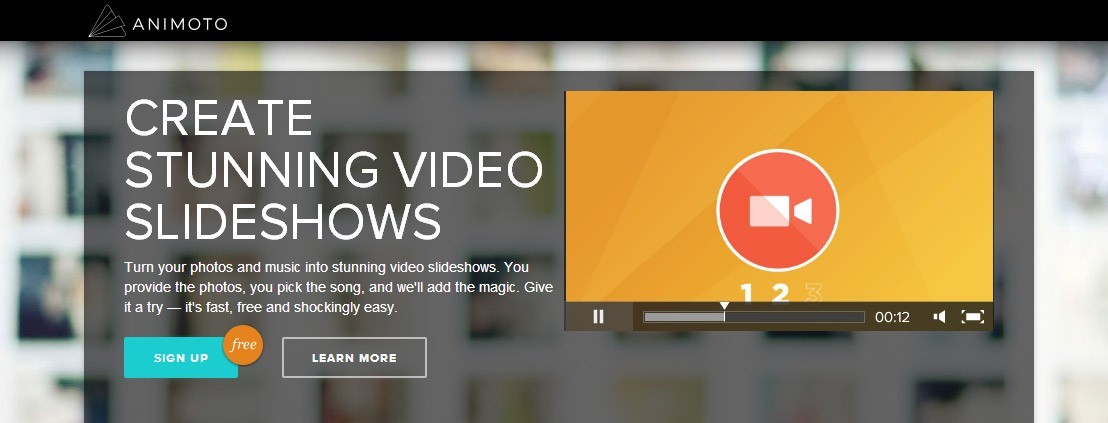
Use Videos
I included videos as one of important elements in a landing page because it makes it easier for the visitor to digest the message than reading the copy.
Remember this, most of the people who browse the Internet are too lazy to read your long texts. Want to reel them off your design? Use videos instead.
But this comes with an advice. Make your videos compelling. Don’t settle for lame slideshows with lame music in them. Use talking heads; be creative.
Tips on Making Your Videos Effective
- Decide whether you would want the videos to play automatically or not. Some experts say that auto-playing videos in a landing page is bad because it interrupts the flow of information. But others say that it increases conversion drastically. You have to choose.
- Do not forget to include a Call to Action. Place a CTA in your video. You can choose if you want it to be permanently visible, or shows at certain points.
- Create a version 2.0 of the video. What do I mean by this? Well, you should supply a backup video where you can place more content. Sometimes, viewers need more information that you just can’t compress in a 30-seconder.
- Lead the viewer to the call to action. Remember to lead your visitor to the landing page’s CTA. You can do this by physically pointing towards the CTA or just verbal instructions.
- Upload it to YouTube. Reuse your videos by adding it to your YouTube account. This will increase SEO and can be seen 500% better on Google than the text article.
Final Words
Upon dissecting the anatomy of an effective landing page, and discussing each element, we may come to a conclusion that the concoction of art and business-mindedness is essential in designing landing pages that convert.
As a designer, you need to keep in mind that these tips are just guides. Creativity has precedence over theory. I hope I helped you with these tips and I expect to see great landing pages with you guys. Good luck!
This post may contain affiliate links. See our disclosure about affiliate links here.