UX embraces a lot of design principles from colors, lines to element placing. Let us look into these considerations:
Your Homepage
Your website’s home page includes all the rudimentary messages that you want your viewers to understand. It means that you should focus on the gist of what you want to happen.
To ensure great UX, remember NOT to put everything in the homepage. People hate reading long texts so be as brief as possible. Your website’s homepage should orient your readers to what’s in the website.
Here are few things to put in mind:
- KISS (Keep It Short and Simple)
- Scroll-Conservativeness. The most important content, elements (like Calls to Action) should always be placed above the fold.
- Link properly. Links should go to the right pages. Your homepage should always have About, News, Contact and Content pages at the very least.
- Put what you want to sell first. This is connected to the scroll-conservativeness tip. Put what you sell ahead of everything. Give your visitors a heads-up on what they will find.
- Link the logo. Always link the logo to the Homepage.
To ensure great homepage design, you might want to read the following:
- 8 Tips for Small Business Homepage Design
- Essential Tips for Designing an Effective Homepage
The UX Designer Toolbox
Unlimited Downloads: 500,000+ Wireframe & UX Templates, UI Kits & Design Assets
Starting at only $16.50 per month!
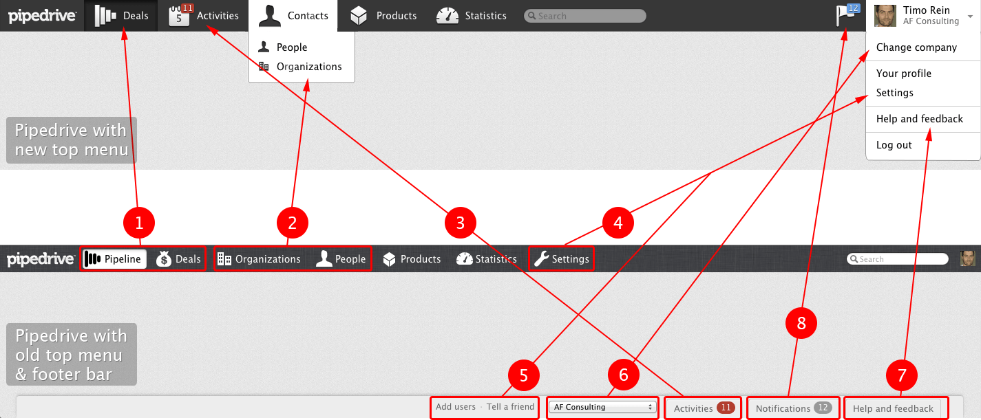
Your Navigation
One of the things that users look for in your website is navigation. It helps your website in a lot of ways:
- Beautify the design of the UI
- Can influence conversion rates
- Can give your visitors easy access to pages you want them to see
The one thing that you should remember is that when designing navigation areas, you should never confuse a visitor. That means that you should always be clear in your navigation icons, texts and positions.
Here are a few other tips:
Use Information Architecture
When designing navigation areas, designers should always plan the structure of the pages being added to the website. In planning this structure, the designer must start with information architecture. This technique is very helpful, especially that navigation planning is not something you just decide out of the blue.
You need to know everything about the website to place the most important ones above the hierarchy and the ones of less importance in the lower part. Information architecture covers the brainstorming for features, user needs, sitemaps, testing and wireframes.
Information architecture includes features, user needs, sitemap, testing and wireframes.
User-Friendly Terms for Your Menu
Sometimes, you are tempted to use highfalutin words in your menus just to increase the flamboyance of your design. But I have to cut the cord there. You should never do that. You need all your readers to understand where you point them despite what language they speak and where they are from.
It’s always better to just use simple, obvious and easy-to-pick-up terms for your visitors. Remember KISS.
Use the standard navigation design
Again, in as much as I want you to be creative with the designs of your navigation per page, don’t change the position of the navigation area as you change the page. It is important to use the same navigation model in all pages.
As a designer, you have to be consistent because changing the model of your navigation will change the perception of the visitors. They might even think that they are in a different website. Balance creativity and functionality!
Use Location Indicators
There are plenty of methods to indicate page location in the navigation area:
- Links are bold and has a different color
- Background color is changed
- Arrows or lines are added to the current page location
To ensure effective UX, I suggest that you should always do this in every design you create. This is to make the visitors informed of where they are in the website structure. It helps.
Use Related Icons
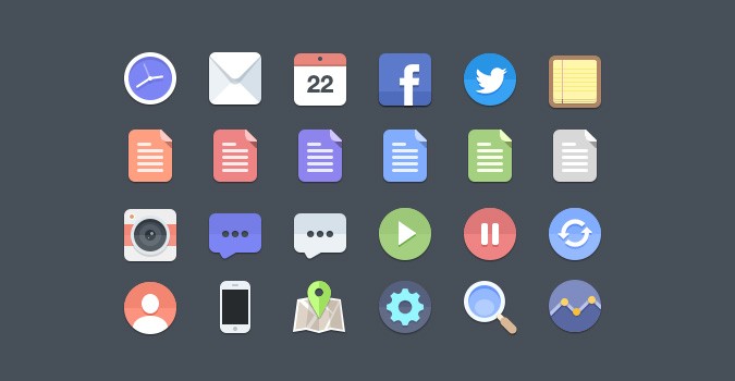
Putting icons is a great method to ensure effective navigation.
- It helps the visitors in browsing through the pages because they will know where the links will direct them without even reading.
- it also makes the design more creative
That is why the use of icons in the navigation is also recommended. However, despite this recommendation, you still have to remember a few things:
- Icons should be appealing
- Icons should be universal
- Icons should be readable
- Icons should be consistent
- Icons should always compliment the design
- Icons should be functional
For more details about this, try reading: Choosing the Perfect Icons for Your Website.
Your Website’s Readability
If there is one thing that is important to take note when designing websites it’s that text is an important part of the design.
- Your text is the main carrier of the message to your users
- It helps to build a story about your website.
That is why making the read most of your content is very crucial. Here are a few tips:
Text Heavy Designs are a No-No
Remember that the optimal line length for body texts is just 50-60 characters per line and no more than 600-650px width per row. That just means that you should never add long and unneeded texts. Just get to the point.
Keep the Font Size Large Enough
I know that this is a cliché tip, but you have to remember it. Fonts should be big enough to be read, even without zooming the page. Remember, you’re designing for humans, not ants.
I suggest that you use at least 16px in body texts, and remember, no script or hand-written font faces in body texts! Texts below 16px and body texts that have hand-written or script font faces simply aren’t readable. As a web designer, you would want your content to be read, right?
Use Italics Properly
Italics provide good emphasis on content but it makes the text difficult to read. That is why I suggest that use boldface instead because it simply makes the emphasized text easier to read. This is better than this, right?
Don’t underline words if they are not links
Yes, underlining can also give emphasis to your text, but they make the visitor confused. In reading articles on the Web, seeing an underlined word will imply a hyperlink. Most probably, the users will click on those underlined words and feel dumb about doing so because they are not links. You don’t want that to happen.
Conclusion
User experience is a really difficult thing to keep in mind. But I think the best way to understand the concepts of UX is putting yourself in the shoes of the average Internet user. Once you mastered that, knowing what they want and what they don’t want is a piece of cake.
And I know you’ll get there soon. Keeping these tips in your mind is a great way to start. Good luck!
This post may contain affiliate links. See our disclosure about affiliate links here.