In case that you have been stuck in a cave for the past few years, let me tell you this nice news: flat design websites are the current craze. We should now say goodbye to those intricate designs dominated by brushes, gradients, drop shadows and all those kinds of designs. I repeat, flat is the new trend.
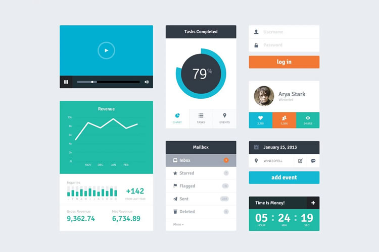
The flat design trend is an emerging design style that uses flat shapes and icons. It basically revolves around the use of rectangles, circles, triangles and others shapes with the absence of other design elements like shadows, strokes and gradients. It was made popular by Microsoft in their computer systems, especially their new operating system they call Windows 8.
Your Web Designer Toolbox
Unlimited Downloads: 500,000+ Web Templates, Icon Sets, Themes & Design Assets

Flat Design Websites Simplicity
It is the state of a design that refrains from the use of intricacies. Simple flat designs turn away from the use of drop shadows, strokes and other design elements.
The reason behind this is that people now appreciate simple and easy to recognize styles. Also, with the advent of mobile browsing, where the screen space is limited, the use of simple images would maximize the use of the pixels on the screen. The minimalist style is also applied as the designers focus on wide spacing between icons, images and all the other elements of a web page or application.
Furthermore, simple and flat images tend to load faster than intricately designed ones because the browser would not load the design elements packed together with the main image.
Meanwhile, the principle of readability comes in together with the minimalist style. With more ‘white-spaces’ (or empty spaces), the text is seen well. Also, the absence of drop shadows, strokes and gradients will ensure the readability of the texts placed within a page.
Facebook is one of the first to adapt the design format. In the past weeks, Facebook has evidently changed their design schemes, allowing users to see simple icons, designs and more eye-friendly visuals. Google has also followed the lead by changing its icons to colorful yet flat images.
Truly, the flat design trend has slowly but surely invaded our web pages, apps and computers. Soon enough it will totally influence us. And before that happens, let’s familiarize ourselves with the philosophy of the flat Design. We’ll talk about the elements of the design and how are they used to fully utilize the screen space.
There are actually five elements:
- Absence of depth
- Use of simple elements
- Typography
- Color
- Minimalism
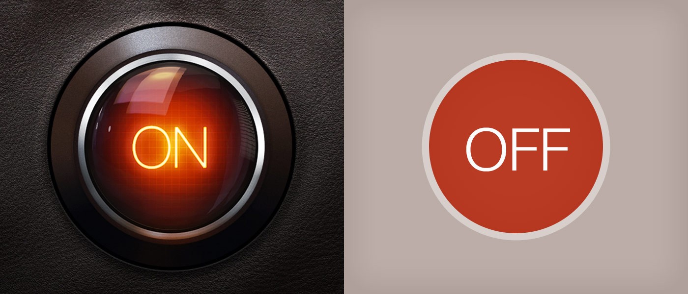
The Death of Depth in Design
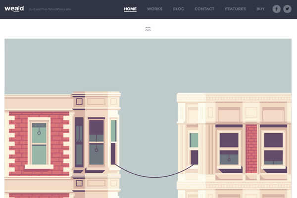
Depth is now dead. A new design trend is ruling the block. Unlike the previous design trends where we couldn’t live without drop shadows, strokes, bevels and gradients, the new flat design style focuses more on simple 2D blueprint.
This philosophy of the flat design totally contradicts the skeuomorphistic design, where images are made to imitate the shape, color and utilization of a real-word object. Skeuomorphistic-designed websites and apps normally have background images which are realistic in nature. These use textures in the real world.
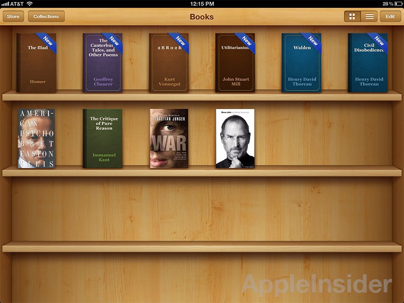
A good example of this kind of design is the iOS6 (and previous versions of iOS) design. Each design is supposed to be an imitation of the real object. The use of 3d computer-generated images, the use of gradients, textures, strokes, bevels and embosses are maximized to make the image look like real-world. The newsstand app looks like an actual newsstand made of wood.
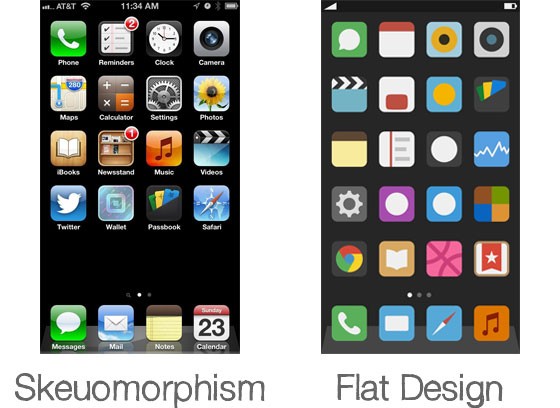
On the contrary, these elements are removed in the flat design. The scheme of the flat layout removes these 3D elements. Drop the depth. Remove all those shadows, gradients and strokes!
Simplicity is Still Beauty
With the removal of depth in the designs, it is but normal for the images, icons and other design elements to become visually simple.
Icons are now made to be flat and uses basic geometric shapes like circles, squares and rectangles. This will give a simple and easy to use graphic user interface. The average person will no longer feel the need for a manual because the visuals present themselves as they’re used.
![]()
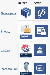
When you see an F icon placed in a blue square, you’ll easily know it’s Facebook. When you see an icon of a gear, it would easily tell you that it’s a settings menu. Flat design works like that. When you see a diskette shape, you’ll automatically know that it’s the save icon.
Or, when you see a big yellow letter M placed on a red background, the notion will always be McDonald’s. See, the simpler the logo gets, the better the recognition will be. What you see is what you basically get.
![]()
Typography, as I told you before
Typographies have their place in flat designs. It adds style even with the texts and gives you a reader-friendly interface. No more calligraphy. Use crisp and clear font texts with shorter messages and chromatically placed with color and shapes. For more information on this, read our typography tutorial.
Coo-lor Colors
As I mentioned in our typography tutorial, color is important. It can make or break your page. It basically sets the whole feel of your site or page.
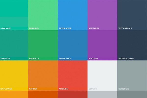
In the flat design principle, it is advisable to use candy colors which are slightly desaturated because they tend to add aesthetic beauty to your page without making your reader’s eyes bleed because of too much brightness. Candy colors attract the eyes better because they are cute, and can be complemented and contrasted easily with other colors. These colors are normally #e65d5d or #c43434 (for red), #7dc692 or # 508b61 (for green), #dfbc42 (for yellow) and #3498db for blue. Flatuicolors.com provides a good guide for this.
Just remember that color is everywhere; don’t bore people by choosing the un-cool ones. Gradients are also not cool anymore. Avoid using bright yellow, neon yellow green, neon purple and bright red and bright orange. Don’t make your website visitors glare.
Less is more, lesser is most
Minimalism is the art of de-cluttering your page or screen. This principle originated from the magazines of the print media where white spaces are more evident than the text itself. It gives padding or breathing room for your texts and suggests a typographical peace.
Leave a lot of empty spaces. Throw away the unneeded elements and impress people. Less is more. Lesser is most.
The flat design could be simple as it looks, but creativity is still everything. When thinking of possible usage for this layout, remember to refresh your mind. Think of newer, cuter and sleeker designs. This design style will be still in style, but doing a wreck out of it won’t make it any more famous.
Be creative. Try to experiment. View inspiration sites. Try your own style, commit mistakes, correct them and be a better artist!
Know that you know how to be flat. Let us all, go flat!
This post may contain affiliate links. See our disclosure about affiliate links here.