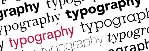
Join over 55,891 Subscribers Today! FREE UPDATES!
Get The Only Freelancer crash course you will ever need to read!
Typography has been practiced and used in our daily life. Range from handwriting in a pocket notebook to the big advertising billboard. It’s sometimes typed using Times New Roman in 12 points for newspaper. Others use Edwardian in 26 points for their wedding invitations. When a designer decide to use the right font for the right job, the typography itself become an art.
Learning typography seems to be easy at a glance, in order to achieve a great impact from typography for graphic and web designs isn’t so easy. Many designers found it as a complicated design aspects to practice. Below are the 25+ sites and resources we have selected to help you understanding typography basics in print or web designs, choosing the right fonts for your project, and guide you to create a good typography which aesthetically pleasing.
There are quite a few terms thrown around with regards to typography. Hopefully this article will help you understand more about the world of typography. If this is your first true introduction to typography you probably underestimate the effect it has on the world.
This is a series articles, each part explains deep knowledge of typography and help you to understand it more. The kind of typography in these articles is not your typ ical “What font should I use” typography but rather your “knowing your hanging punctuation from your em-dash” typography.
This is more like an online book, but presented in interactive way. You will find basic understanding of typography from this site, from Anatomy 101 to The Rules of Good Typography.
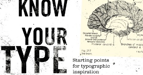
Not every typeface is the right choice for every job, this articles will help and guide you to understand and picking the right choice for different type of job or concept theme.
This page offers links to a number of articles on typography, including PDF versions of archived. These cover individual typography topics in detail, for both online and offline applications (including pull-quotes, visual alignment, bullets, and emphasis, among more than 30 others).
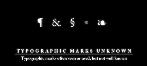
There are many typographic marks which are familiar to most, but understood by few. Most of these glyphs have interesting histories and evolutions as they survived the beatings given to them through rushed handwriting of scribes and misuses through history. They now mostly live on our keyboards and in our software, and a few are used often, so it seems only fitting to know where they come from and how to correctly use them.
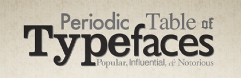
A reference table for most popular typefaces and their classifications.
Typedia is a resource to classify, categorize, and connect typefaces. It is a community website to classify typefaces and educate people about them, very much like a mix between IMDb and Wikipedia, but just for type. Anyone can join, add, and edit pages for typefaces or for the people behind the type.
This article from Smashing Magazine gives you a broad knowledge of popular typefaces used in web design, also included with some case studies and inspirations.
In this article you will find four main ways fonts can differ, even if most of their letters look the same. Save, bookmark, or print this newsletter and ask yourself these questions the next time you’re choosing type.
Have you ever had the problem of not knowing what typeface to use? Well of course you have, everyone has. This is a guide on how to choose a font.
You can’t just throw text on a page, it has to be laid out and organized in a clean way that adds to the information being presented. This article will give you 11 typography tips to help you convey information in print the right way.
This is an introduction for you who are still new in the design field. Its aim here is to introduce some of the basics and the most common areas of typography that will be important in your design work.
In this article the Indra (the author) shares her favorite Helvetica companions with the following guidelines in mind: “Focusing on contrast makes combining fonts easier. Better not pair Helvetica (or other Neo-Grotesques) with another sans serif (like a Humanist Sans). Instead, choose a serif or a slab. Transitional and Modern (bracketed)serifs work quite well with Helvetica. So do most Garaldes like Garamond — it all depends on what kind of atmosphere you’re aiming for. Browse the list of ideas below, or look for faces with broad proportions, a large x-height, or similar characteristics, like an uppercase ‘R’ with a vertical tail.”
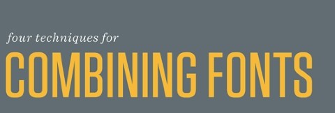
This article gives you four tips for navigating the typographic ocean, all built around H&FJ’s Highly Scientific First Principle of Combining Fonts: keep one thing consistent, and let one thing vary.
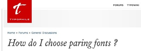
This is an open typography forum regarding paring fonts. Get the suggestion or advice from the designers who have been professionally experienced in typography in this forum.
OpenType (OT) is a cross-platform type format that includes expert layout features to provide richer linguistic support and advanced typo graphic control. This beginners guide will help to illustrate some of the more common features found in OT fonts and when they should be used.
For graphic designers beginning to experiment in type design, a geometric or modular typeface is a natural starting point. Illustrator and other programs offer a simple collection of elements such as circles, squares, and triangles which can be combined to create a passable alphabet. This is not an argument against all geometric or modular typefaces, but simply some guidance on how to make them more readable, work effectively and be visually consistent.
An article which discusses both font and typeface because these terms evolved over a considerable period of time and saw several transitions in technology, they can sometimes be interpreted in varying ways. This resulted in a terminology that is often perceived as at best esoteric, at worst plain confusing.
A List Apart gives you more knowledge for typography on websites, explore choosing and pairing fonts on the web, particularly in relation to the expanded options @font-face provides from this article.
This is another article that will help you understand type alignment for the web. It explains each on Justified, Right-Aligned, and Left-Aligned and giving the reason of which is best to use on the web depends on your need.
There are many factors that play into the readability of text. There are also a number of terms, all very important. This article explains a few of the more common Web typography terms and an explanation of how each term affects readability.
And how about setting type to a baseline grid? Learn more and practice it after you read this article, it will guide you with the easy to follow examples and codes.
Clagnut’s typography category archive is filled with great information on typography spanning the past eight years or so. Articles talking about theory, news, and technique are all included.
Picking the right typeface gets you farther than you might think. Here are a few tips on taking cues from type to design interfaces and interface elements.
This article will guide you to understand how to develop digital work in 3d typography, also included with 3D typography book and 3D typography inspirations.
The article gives you 15 typography books (with links to purchase) which are personally recommend by the writer to helped you learn, understand, appreciate and absolutely love typography and type layout.
Typography samples and inspiration.
Did you find that your favorite typography-related article is not on the list? Let us know in the comment section.
Get The Only Freelancer crash course you will ever need to read!
Also known as Chykalophia, is a professional freelance designer in graphic and web design with 3 years of experience. Founder and Editor of Frespiration!, she recently won The Annual Design Awards 2010 for best product packaging design. Other than design, she loves playing with her mac, being photographed, watching movies and listening to alternative rock. Add her onFacebook Page, or Twitter.
Sunday, January 15th, 2012 12:11
This is a nice list. This is very useful. I thing I wanted to point out. You have missed out on one of my favourite typography blogs I Love Typography. Its a priceless resource.
http://ilovetypography.com/
Sunday, January 9th, 2011 03:31
This is a great list of resources! I will get so much help from these.
Monday, July 26th, 2010 23:24
Great resource, I particularly like the Periodic table of typefaces. I found that a while ago but then lost the link, so it’s great to rediscover it again.
I think many people underestimate how important typography is on all aspects of design, but particularly web design with websites becoming more minimal, there is much more focus on typography, so this is a really useful learning source.
Monday, July 26th, 2010 15:05
this is awesome…… u’ll have probably explained and taught each and every aspect of why and how to choose the best fonts.
great link!!!
Sunday, July 25th, 2010 22:00
You asked about favorite articles you left out. This is more a tool than an article, but I have to say WhatTheFont on myfonts.com which lets you submit an image of type and tries to identify what it is by matching it up to fonts in their database. It can save hours of hunting if you need to quickly identify a font. Thanks for the article!
Sunday, July 25th, 2010 21:24
This is insanely fabulous. I am a pro photographer, but I do have a crush on typography and am interested in learning more. Thanks for this fantastic resource.
Friday, July 23rd, 2010 08:41
You have created a very useful resource. Thank you.
Thursday, July 22nd, 2010 19:13
Nice Post. I always loves typography will try learning something from this post :)
If not, then it's time to learn how to:
You can trust 1stWebDesigner to help you become a better web designer!
- Jacob Cass | Just Creative
Just enter your name and email below and click Get Updates!
Nikunj Tamboli
Thursday, July 22nd, 2010 19:13
Nice Post. I always loves typography will try learning something from this post :)
Trudy
Sunday, July 25th, 2010 21:24
This is insanely fabulous. I am a pro photographer, but I do have a crush on typography and am interested in learning more. Thanks for this fantastic resource.
Georgia G
Friday, July 23rd, 2010 08:41
You have created a very useful resource. Thank you.
Ari Suardiyanti
Thursday, July 22nd, 2010 18:11
Coincidence? :) glad it helped.
Sheri Hall
Sunday, July 25th, 2010 22:00
You asked about favorite articles you left out. This is more a tool than an article, but I have to say WhatTheFont on myfonts.com which lets you submit an image of type and tries to identify what it is by matching it up to fonts in their database. It can save hours of hunting if you need to quickly identify a font. Thanks for the article!
Maverick
Monday, July 26th, 2010 15:05
this is awesome…… u’ll have probably explained and taught each and every aspect of why and how to choose the best fonts.
great link!!!
Abinav Thakuri
Sunday, January 15th, 2012 12:11
This is a nice list. This is very useful. I thing I wanted to point out. You have missed out on one of my favourite typography blogs I Love Typography. Its a priceless resource.
http://ilovetypography.com/
Brett Widmann
Sunday, January 9th, 2011 03:31
This is a great list of resources! I will get so much help from these.
Vincent Hadi Wijaya
Tuesday, December 28th, 2010 16:07
great useful source. thanks a bunch! :D
James
Monday, July 26th, 2010 23:24
Great resource, I particularly like the Periodic table of typefaces. I found that a while ago but then lost the link, so it’s great to rediscover it again.
I think many people underestimate how important typography is on all aspects of design, but particularly web design with websites becoming more minimal, there is much more focus on typography, so this is a really useful learning source.