In this article, we have composed a list of cool company logo designs whose logos are very famous and popular. These company businesses have allowed us to have a peek inside their fascinating logo design process behind the scenes. We hope that this compilation will get you started on your own logo designing process.
You Might Also Like: Clever Logo Design, Line Art Logo Design, and Letter-Based Logo Design.
The Logo Designer's Toolbox
Unlimited Downloads: 500,000+ Logo Templates, Print Templates, PSD Templates and Design Assets.
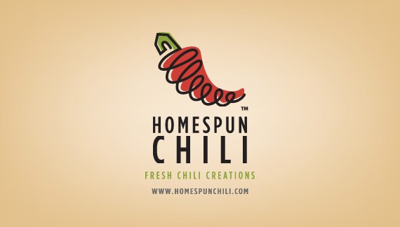
1. Logo Design Process: Homespun Chili
Local and international ingredients are used by Homespun Chili in order to create one-of-a-kind meat and vegetarian chili creations. The logo design is clean, smart, original, and conventional with a little Martha Stewart.
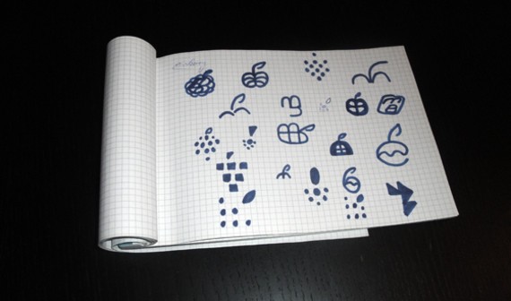
2. Metro Aviation Logo Design Process
Metro Aviation is a helicopter transport company that described the whole process of their logo design creation.
3. Case Study: Brokers Logo Design Idea Process
This logo design is simple and fresh, yet gives a very professional image of the event that was organized by Brokers who run stock market simulations and reality contests for college finance students.
4. WebMYnd Logo Design Idea Process
This logo design process clarifies how useful their products are such as one of their products turns your web-browsing history into an extension of your own memory so that you can also keep a copy of everything you look at on the web.
5. Mindberry’s Logo Design Idea Process
This Vienna based company offers consulting and project management services and it wants to target a young or trendy audience in addition to more conservative companies which can easily be comprehended through their logo design.
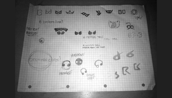
6. Brokers Direct Identity Design
Brokers Direct is an online insurance company that offers fast, pleasant and inexpensive insurance for property-owners, tenants, and owners of vacant property, proprietors, students and owners of marketable properties.
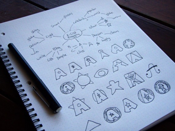
7. A-List Blogging Bootcamps’ Identity Design Inspiration
This logo design process clarifies the complete logo design process behind the A-List Blogging Bootcamps identity design which is a website offering a series of short, live online training courses for bloggers.
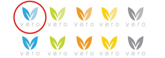
8. Logo Design from Start to Finish
In this process of logo design, they made use of an eco-friendly bottled water alternative that is provided by Vero to different cafés, restaurants and hotels. Basically they use the latest in microprocessor-controlled water-purification technology to cleanse, chill and carbonate tap water, if needed.
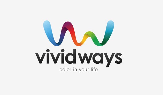
9. Logo Design Process and Walkthrough for Vivid Ways
Vivid Ways is a new blog that bring personal development and colorful living together. It intends to inspire and support readers by offering ideas as well as tips on how to live an amazing life.
10. Tammy Lenski brand identity design
Tammy Lenski LLC is a business that takes care of argument resolution in the workplace. The new logo was expected to be simple and fresh, inspirational and appealing.
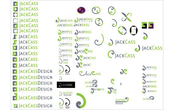
11. Logo Design Process for Just Creative Design’s Award Winning Logo Idea
This logo design process reveals that how Jacob Cass decided the name for his freelancing business – Just Creative Design, and the process he used to design the award-winning logo.
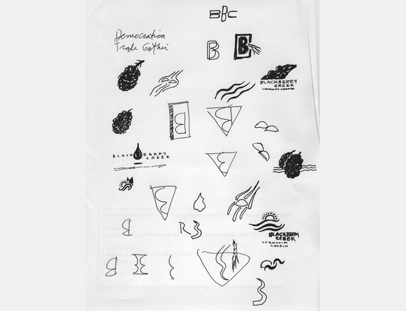
12. Blackberry Creek’s Logo Design Process
This article was written by Mark Misenheimer of Misenheimer Creative, Inc. and in this write-up, he explained the process of logo designing from start to finish in order to help other graphic designers.
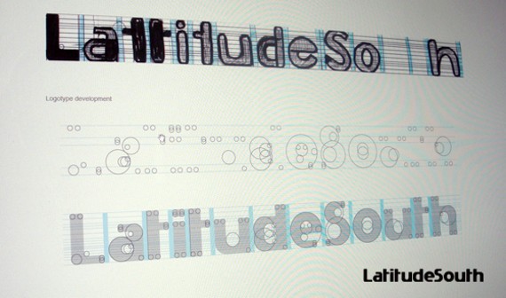
13. LatitudeSouth’s Creative Process
LatitudeSouth is a New Zealand based enterprise that offers a fresh approach to outsourcing legal services for the clients all over the world. The importance of their origins is evident in their logo.
14. Dimitrovi&Co – Identity process
This logo was created for Dimitrovi & Co. that was founded in the early 90’s, and deals in delivering heavy machinery services such as excavators, bulldozers and heavy trucks.
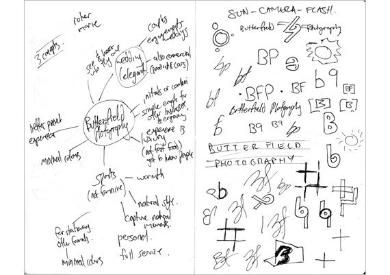
15. Identity Design Process for Butterfield Photography
Since the logo was created for Butterfield Photography that is run by Maria and Robert Butterfield who focus on different areas of photography, thus the logo needs to be usable across a broad range of businesses.
16. Dezeen Watch Store Logo Design Inspiration Process
The company deals in watches by famous designers and boutique brands and their brand identity that is their logo design gives them a dynamic clock identity.
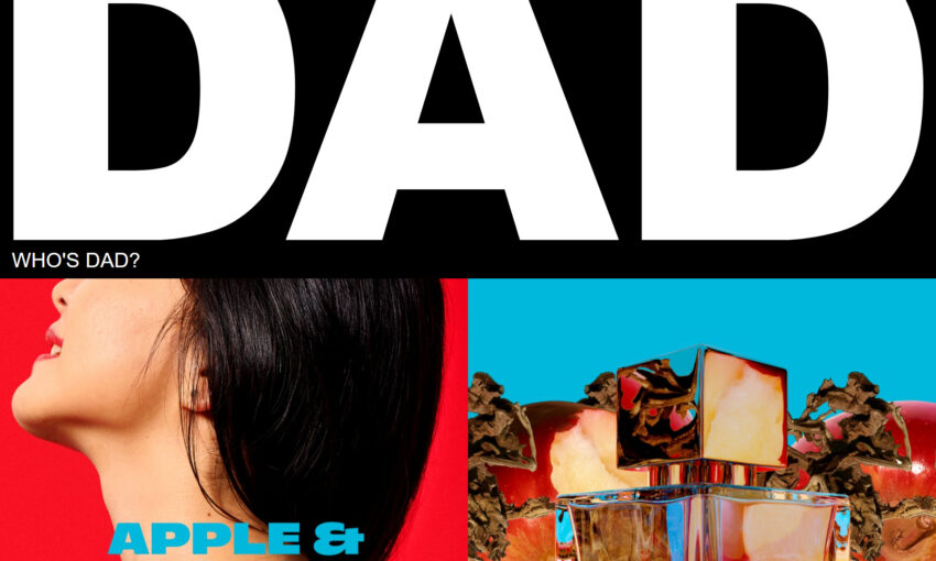
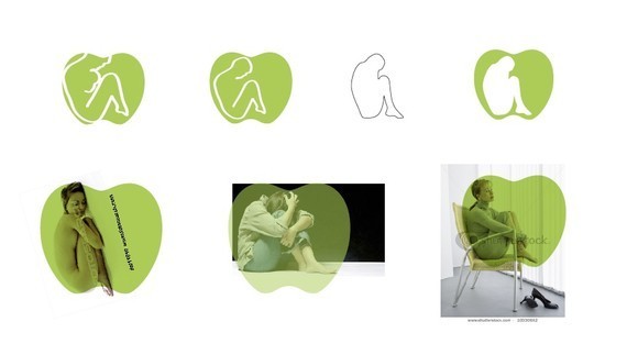
17. Apple & Eve Logo Identity Development
This logo design process post is for a company invitingly called, Apple & Eve.
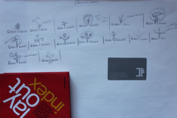
18. Green Candy’s Logo Design Process
Here we reveal the process of logo design for Green Candy that shows that a lot of thought is required to achieve the best possible design solution for the client.
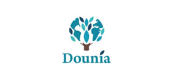
19. The logo design process for Dounia
This article explains the process behind the creation of the logo design for Dounia, a Mediterranean canned food company.
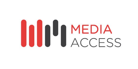
20. Media Access
This logo design was created for Media Access, and here is the complete insight story of its creation.
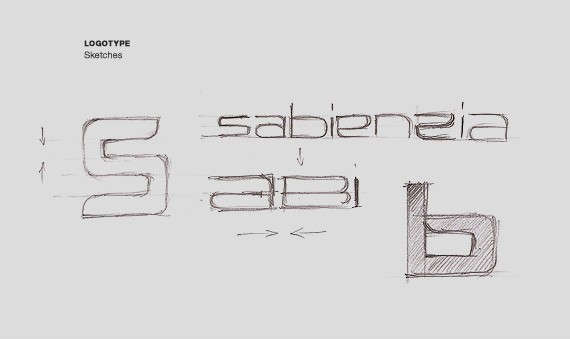
21. Visual identity / Sabienzia
This logo has been designed for Sabienzia which is a dynamic and international enterprise having more than 20 years of experience in the area of teleworking, unified communication, and virtualization, advanced analytics and green IT.
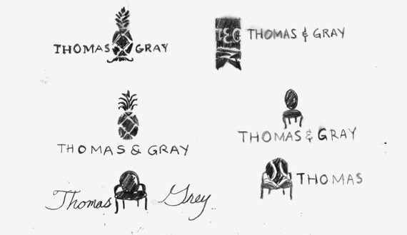
22. Thomas & Gray LogoBy
Get a step by step overview of how Thomas & Gray logo was designed which is a company that makes custom furniture.
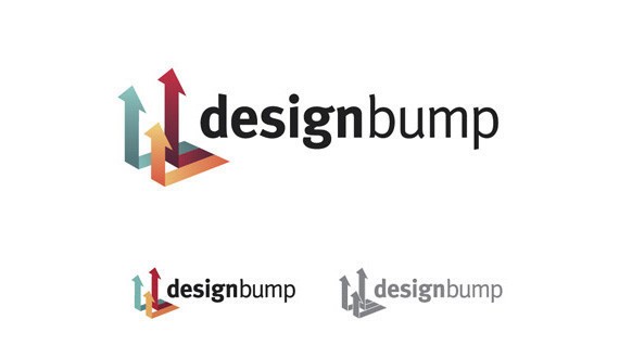
23. Behind the Scenes of the DesignBump Redesign
Here get into the behind the scene of the logo redesigning process for DesignBump which is a social bookmarking website aimed purely at the design and web community.
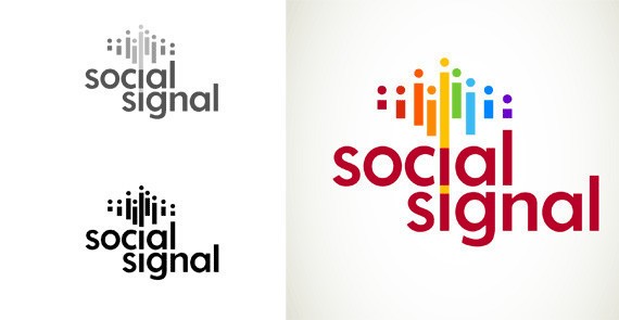
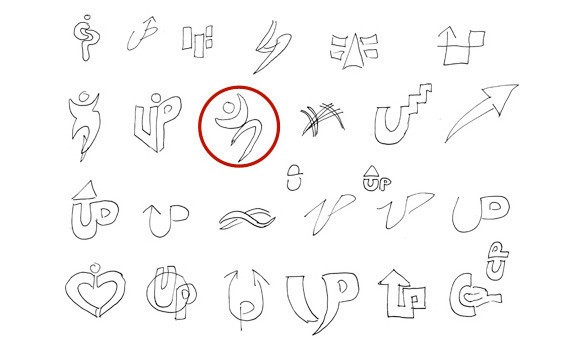
24. Logo design for Social Signal
Need to get some inspiration to design a logo for a web strategy company? Here is the logo design process for Social Signal that facilitates business, non-profit as well as government clients employ the most recent web tools to connect their customers, supporters and the general public in crucial conversations.
25. HotBox Studios
This logo design process is shared with the intention to serve as interesting reading for the design community as well as to let you follow this design process from start to finish.
26. The Logo Design Process for Ultimate Potential
Get the guidelines from Jacob Cass for creating the logo for Ultimate Potential. This article will not only provide an insight into the logo design process but will also demonstrate the thought process behind creating the logo, as well as the creation of the logo itself.
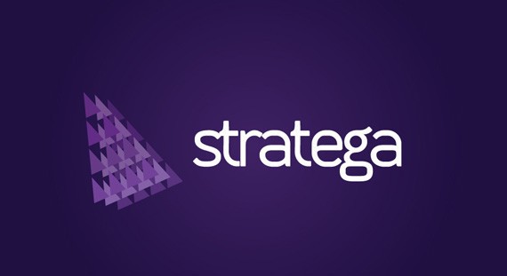
27. Logo Design Process for Stratega Group
This process of this logo design creation was completed as part of a full branding project for the Stratega Group Ltd which is a UK based financial company dealing with large clients in various financial fields.
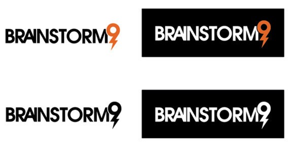
28. Brainstorm #9 Logo Process
Brainstorm #9 is one of the biggest and most prestigious Brazilian blogs and here we are revealing the process of redesigning their brand image.
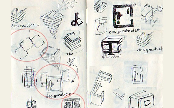
29. The Creative Process for The Design Cubicle Logo
Let us unveil the creative process for The Design Cubicle logo that aimed to reflect the same sense of community that the workspace and “cubicle-life” provide — a place to create, interact and learn.
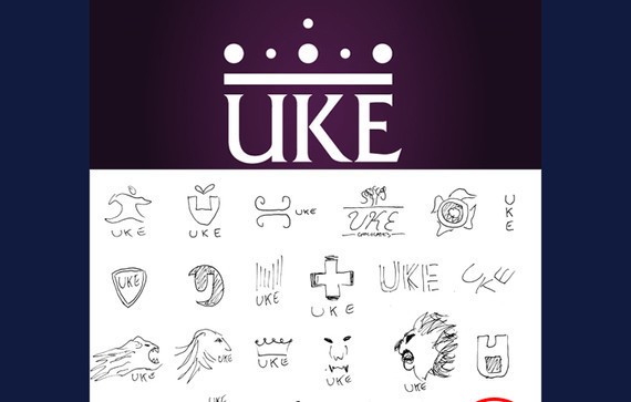
30. The Logo Design Process From Start to Finish
Grab the complete logo design process from start to finish for the Uke that sells exceptional arrangements of chocolate as a substitute to gift baskets. An upscale market is the target here.
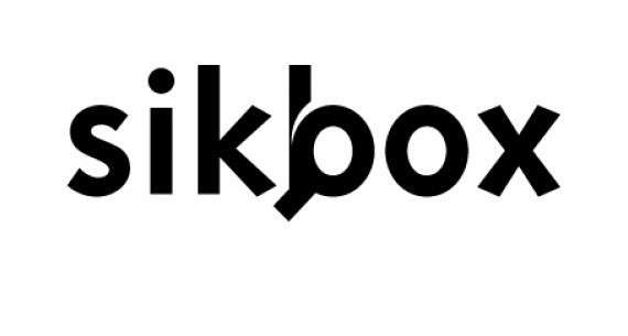
31. Sikbox Logo Design Process
Sikbox is a web app that lets you to add a live search to your site, or any site. It uses the Yahoo Boss API as well as it essentially works better than Drupal default search system. This post shares with you a bit of the ideas and the design process for the logo creation.
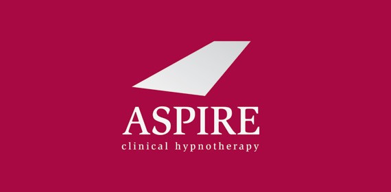
32. Logo Design and Stationery for Aspire Hypnotherapy
The logo design project was completed as part of a full branding and web project at carrotmedia. Aspire Clinical Hypnotherapy is the trading name for Judi Butler, a clinical hypnotherapy from Newcastle upon Tyne, UK.
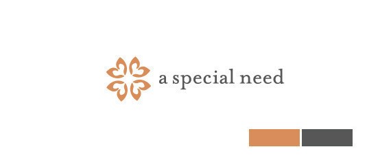
33. A Special Need Logo Design Process
A Special Need is a nanny agency committed to supplying nannies experienced in special needs to parents. The brand new company was helpless without a logo to symbolize their services and online blog that helps parents and professionals.
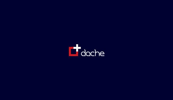
34. The dache Logo Design Evolution
Get an insight into the logo design process as well as the thought process behind creating the logo; and then will take you through the process of logo designing.
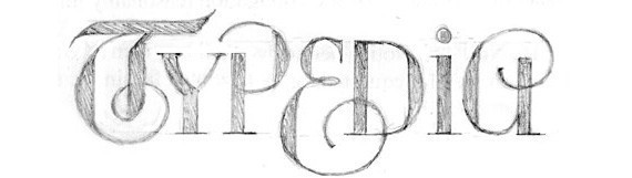
35. Behind the Typedia Logo Design
John Langdon created the logo for the Typedia, and here he revealed the deep story behind the creation of this logo.
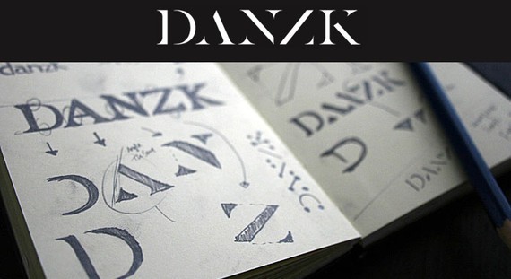
36. Logo Design: From Start to Finish
The last logo design process in this collection is about DANZK which is a soon-to-be-launched lifestyle blog that aims to display the Danish way of life to locals and foreigners who are interested in the country.
37. Logo Design Process: Ear Center Audiology
This is a comparatively new and fresh logo design created for a new hearing aid dealer named ‘Ear Center Audiology.’
38. Creative Process Study
Get to know some insights on how this new logo was designed for BevReview.
39. Creation of a New Brand: Two Giraffes
Learn how Sean Farrell created this Two Giraffes logo that include the number 2 and two giraffe heads incorporated into the negative space.
40. Plancast penguin development process
This logo design was created by the designer Alex Cornell for local San Francisco start-up named Plancast.
41. Logo design for Visit France
This logo design was created for Visit France – a website that is particularized in finding accommodation in France.
42. Associated Painters Logo Design Process
In this logo design process, you will see how the business of painting commercial aircraft Associated Painters works.
43. Insyndia Logo Design Process
This creative logo design was created for IT Company named Insyndia, and here you will see the complete process behind the creation.
44. Orb Web Solutions Identity Development
This article is a practice for the Orb Web Solutions logo design by the designer Graham Smith.
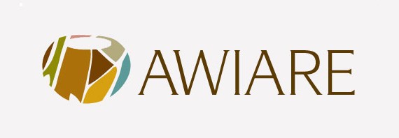
45. Weedon Island AWIARE logo
Let us unveil the creative process for the logo design process of Alliance for Weedon Island Archaeological Research and Education.
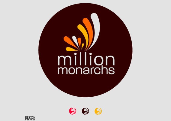
46. Creative Process Study
This article explains the process behind the creation of the logo design for the Creative Process Study for Million Monarchs.
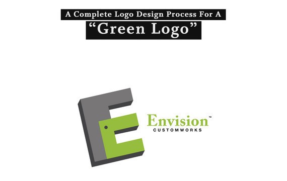
47. Complete Logo Design Process For an Eco Green Logo
This creative logo design was created for Envision Customworks and it also contains a case study as well.
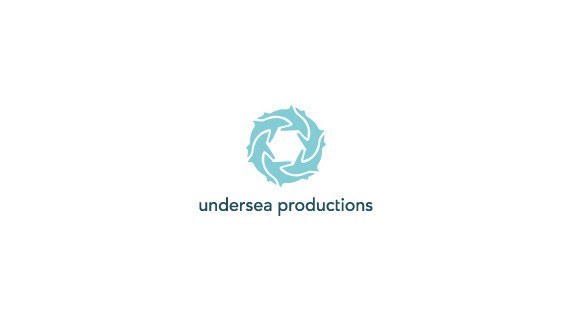
48. Re-branding Undersea Productions
Learn and grab the technique how the new brand identity for Undersea Productions which is an imaging company based out of Australia was designed so successfully.
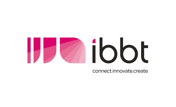
49. The Redesign Process of the IBBT Logo
This article explains the complete logo design process as well as contains the case study that further clarifies how the new identity of IBBT (Interdisciplinary Institute for Broadband Technology) was created.
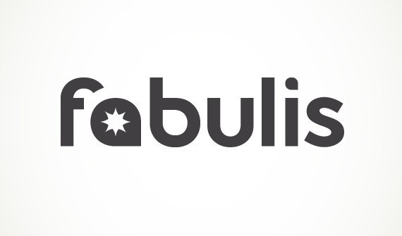
50. Logo design for fabulis
This article explains the complete logo design process for new social network web site called fabulis.
This post may contain affiliate links. See our disclosure about affiliate links here.