Since the aim of designing a logo is to keep it simple yet maintain quality, letter logo design scores high because of its minimalism and excellence. Letter logos are most effective and they aesthetically satisfy the target audience.
They also hold the potential to reach customers’ minds as selling agents. Here is an amazing logo collection of some of the most beautifully designed typography letter logos for you. Enjoy!
The Logo Designer's Toolbox
Unlimited Downloads: 500,000+ Logo Templates, Print Templates, PSD Templates and Design Assets.
You Might Also Like: Clever Logo Design, Clean Logo Design, and Line Art Logo Design.
24,500+ Logo Templates, Landing page Templates, Fonts and UI Kits are now available for just $29 per month with Envato Elements
![]()
By joining Envato Elements you gain access to plenty of Logo Templates, as well as many other useful design elements. All of this is available for a single monthly subscription to Envato Elements. Join today, and gain access to a massive and growing library of 24,500+ creative assets with unlimited downloads.
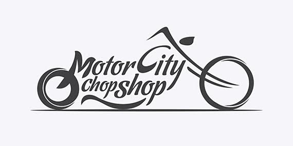
1. Motor City Chop Shop
The text is elegantly shaped to create the engine, fuel tank, and pipes of a chopper style motorcycle.
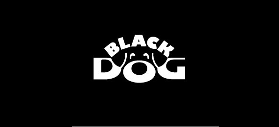
2. Black Dog Letter Logo Design
Effective use of negative space in this logo design makes it memorable and unique.
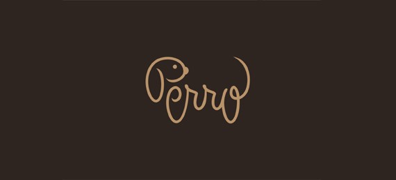
3. Perro Line Logo Design Idea
A simply miraculous piece of artistic work that speaks volume about its creator.
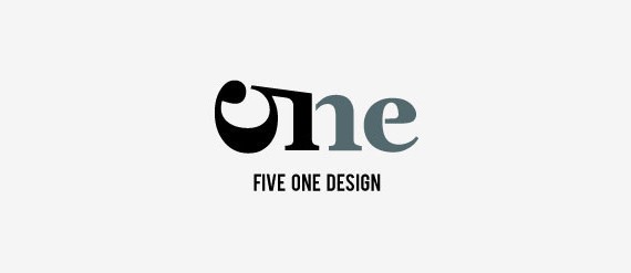
4. Five One Design
What makes this logo design memorable is the way the numeric character 5 is used not only to represent the “5” in Five One Design but also to suggest the O of “One”.
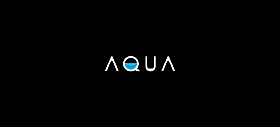
5. AQUA Logo Design
The water element is embodied here within the letter “Q” that makes for such a beautiful, visually appealing logo.
6. Muno Cafe Bistro Logo
A simple yet creatively designed text-based logo design that uses letters as design elements.
7. Qiwey Letter Logo Design
The “Q” is extended to form the kiwi like structure.
8. Leadshouse.Fi
Somewhat similar approach to that of the Bison logo. See how the letters form the shape of an animal.
9. Disco Art Logo Design
Classic disco theme is created with the letters that look simply stunning.
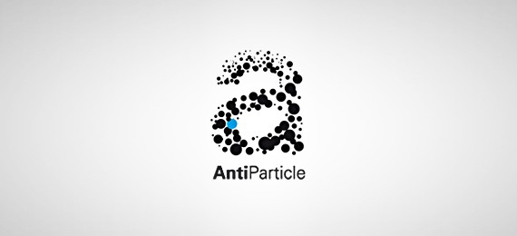
11. Antiparticle Logo Inspiration
A simple, yet extremely appealing letter logo design that speaks volumes.
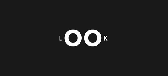
12. Look
The logo appears as two big bulky eyes are looking at you. The creative approach is really mind-blowing.
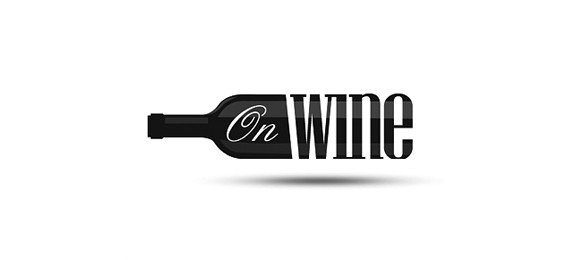
13. Onwine Logo Inspiration
In this logo design, letters are used to form a wine bottle that looks great and creates a visual connection with the audience.
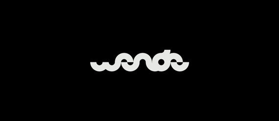
14. Wende
Another brilliant example of simple and effective text-based logo design. See how the designer twists and whirls the letters to create a logo.
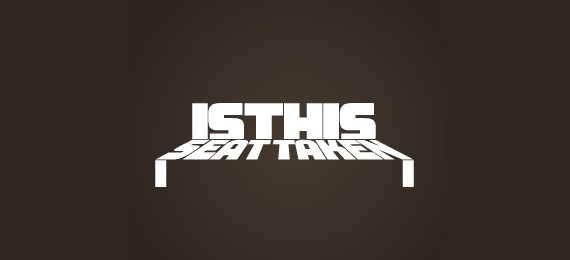
15. Is This Seat Taken Line Logo Idea
All the letters in this logo design are placed in a way that they create a visual representation of a seat i.e. chair.
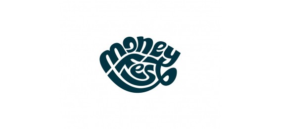
16. MoneyFest
Again the designer twists and whirls the letters in order to create a visually appealing text-based logo design for MoneyFest.
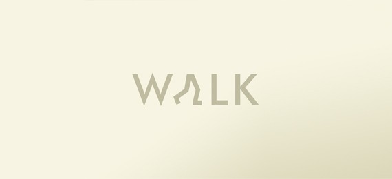
17. WALK
We use our legs for walking and this is why the designer uses the letter “A” for making a symbolic representation of walking legs.
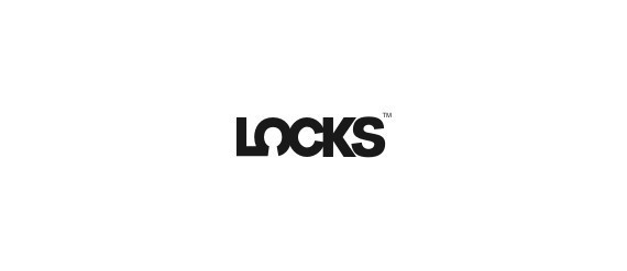
18. 5 Locks
Here, yet again, a numeric character i.e. “5” is used to simultaneously represent 5 and Locks.
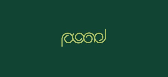
19. Pond
Here the designer creatively makes use of artistic typography to add visual appeal to this logo design.
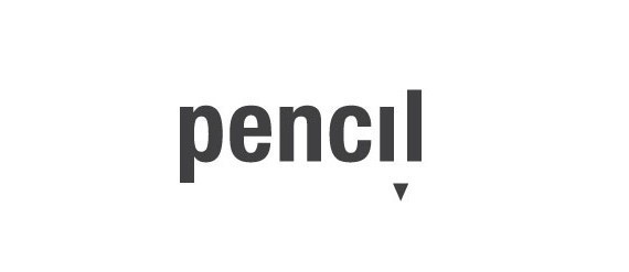
20. Pencil
Here, the designer uses “I” and “L” to form the shape of pencil while keeping the rest of the letters simple making this logo design look stunning.
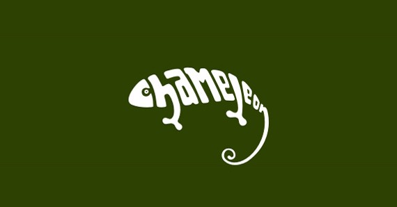
21. Chameleon Letter Logo Design
This one is really interesting in terms of how the designer uses typography to visually create the shape of a chameleon.
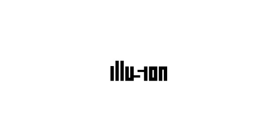
22. Illusion
Beautifully employed negative space and the simplicity of typography are sure enough to make this logo design a success story.

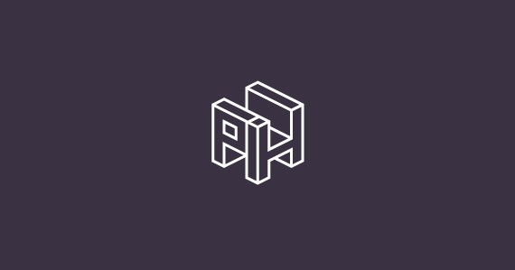
23. PH Block
Though it looks simple enough, this is a difficult logo design not only with respect to its creation but also for its creative approach.
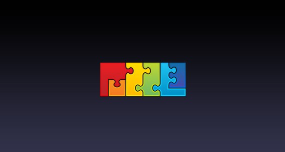
24. Puzzle Smart Logo Idea
Although this logo design may appear like a puzzle, when you look into it you can easily read the letters “P”, “U”, “Z”, “Z”, “L” and “E”.
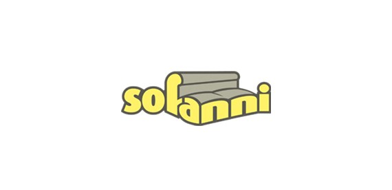
25. Sofanni
One of the most efficient and memorable type based logo designs in this collection.
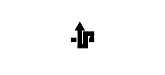
26. UP
On the first look, it may appear as an ordinary image but when you look closely you’ll figure out how artistic this logo design is.
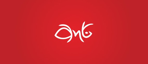
27. Ant
The characteristic shape of ant is created by placing three letters in a very interesting manner.
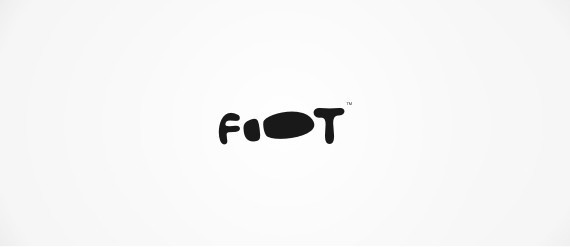
28. Foot
See how amazingly the logo designer created the foot print without using any visual aid.
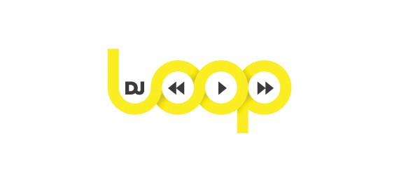
29. DJ Loop
How efficiently you can embody the loop and DJ in a single emblem? This logo is the answer to this question.
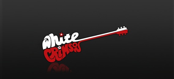
30. White Crimson Logo Idea
Both the colors are very well represented while portraying the core values of the company this logo design is created for.
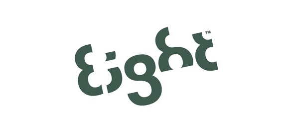
31. Eight
All the letters in this logo design are shaped like the number 8. Interesting!
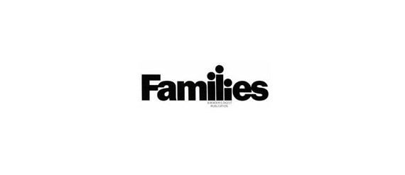
32. Families
True essence of a family is what this text-based simple logo design symbolizes.
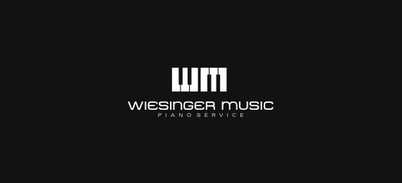
33. Wiesinger Music
The initials of Wiesinger Music are used to symbolize a piano – the emblem of music.
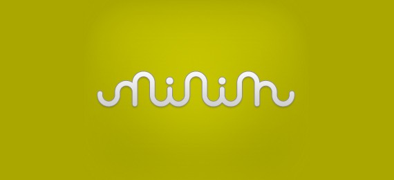
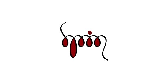
34. Minim 1
The weave shaped logo design for Minim 1 appears to be a style system.
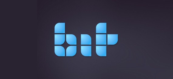
35. BIT
Here, the typography is used in a totally different style that fulfills the role of typefaces in a logo design.
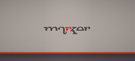
26. Marker Design Agency
Here the typefaces are half cut to create a unique look that has a great style.
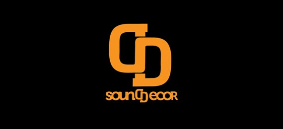
37. Sounddecor
Bold color and large typefaces against a black background are used in this logo.
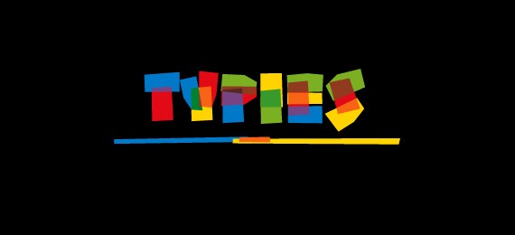
38. Typies
A colorful and fun logo design that plays with different colors and unusual typography.
39. Bio
Bio means life and this is what the logo stands for.
40. CodeFish
Different symbols are used to create the shape of a fish to make a visual connection with the company’s name.

41. >Flip
The letters are placed in a flipping manner. Nice and interesting logo.
42. Back
The graphical representation of back is represented with this logo design in a quite unusual style.
43. Ed’s Electric
The negative space technique is employed in this logo design along with the typography.
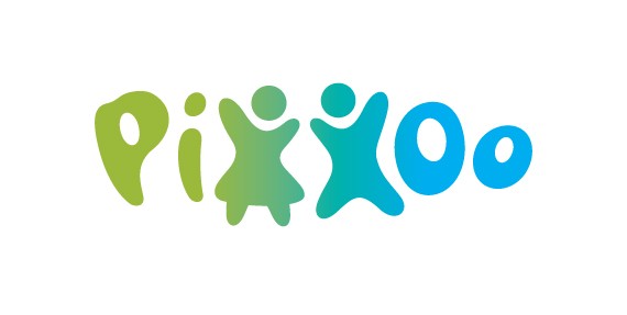
44. Pixxoo
Symbolic representation of the company’s core values solely with the help of typography.
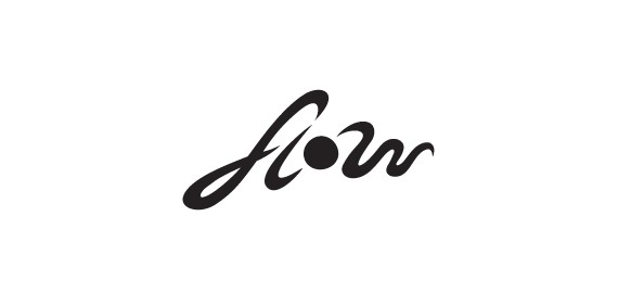
45. Flow
The Flow logo design embodies the nature of flow.
46. Dip
Simply amazing text-based logo design that was created with a minimalist approach.
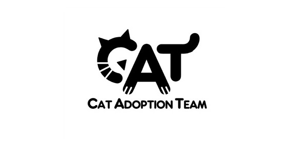
47. CAT
The logo design used only three letters to cleverly craft the shape of a cat.
48. Spin
Spin the letters to create the Spin logo design.
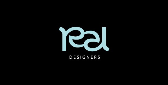
49. Real Designers
This logo looks somewhat confusing but take a closer look to reveal the beauty of it.
50. Hero
The letter “R” in this logo design is used to embody a human character with a heroic personality.
This post may contain affiliate links. See our disclosure about affiliate links here.