40 Stunningly Creative Resume Designs on DeviantArt

 Posted in Inspiration 636 days ago Written by: Matthew Corner
  • Buffer
  • Pin It
  •  131

thumb11 inspirationRecently I wrote an article on resume/CV templates available for free, or to purchase, from all across the web. They ranged from print media, to fully fledged, CMS run pages. That’s all fine and well, and they are all fantastic templates, but what if you want to express yourself through your CV? Plenty people do, and the result is some stunning CV’s that potential employers are reading. Below I’ve round-up 40 incredible resume designs that some great designers have created for themselves from DeviantArt, in the hope that they will inspire you to create your own stunning piece of work to represent yourself.

preview stunningly creative resume designs deviantart inspiration

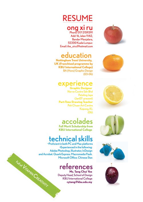
1. Resume by xiruxiru

The designer here has used fruit, and the caption “Full of Vitamin Creativity” to appeal to

2. Rei’s Resume by Rei-pash

A lovely background texture with a spotlight effect creates a beautiful backdrop for this resume.

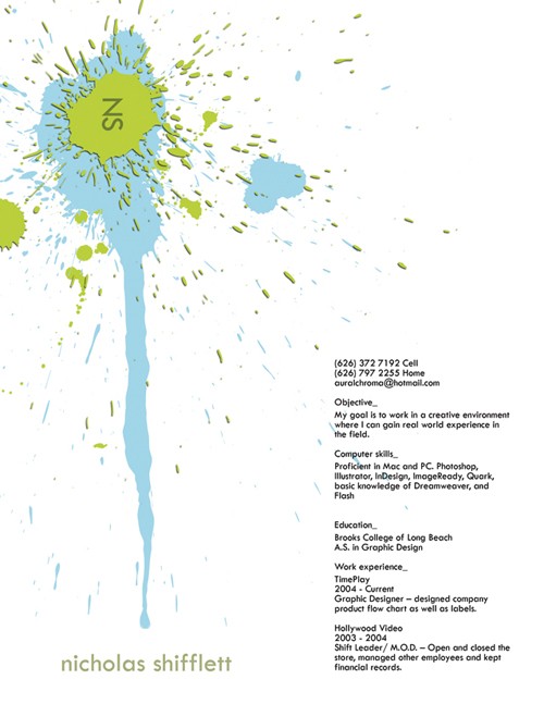
3. Resume by zxcxvxc

The paint splash here shows the artists creative side.

4. Resume by brazilnut

This resume has been lain out beautifully with lines, and the logo merging well.

5. Typographic Resume by mac1388

I’m not sure whats with the tilting trend, but I love it here, especially with the name centrepiece.

6. My Recent Resume by pixelprop

This resume appeals to an employers humorous side with a horror film poster theme.

7. My Resume by darthkix

A personal favourite, beautiful colours, nothing over the top, and plenty information.

8. Resume by cheektocheek

This resume also takes on the arty poster persona, and it works brilliantly!

10. Resume by KevinPire

With bold, attention grabbing titles, and the use of lime green, this is an eye catcher.

11. Resume by Kyuzengi

This artist uses the contrast between the black and white to separate the headings, and information which works incredible well.

12. Resume by heydani

Subtle but powerful, this resume puts typography to its uses with its awesome header.

13. Resume Upgrade by mac1388

An update to a previous resume, this time with less bold headers, but equally powerful.

14. Resume Updated by twolapdesigns

Clever usage of colour and outlines mixed with a different choice of typeface make this resume stand out, but maybe less readable.

15. icART resume by icasialnrdy

The fact that is an artists resume is instantly apparent with the media images alongside the persons skills and education.

16. Resume by Akashrine

Getting personal with rabbit/squirrel gives an insight into the personality of this resume’s owner.

17. Resume Espanol by rogaziano

The avatar here alone, and the bright colours used show this persons love for colour, and art.

18. Resume by bdechantal

This resume makes use of browns and greys, and along with the logo, and title font, gives a nice old feel.

19. Curriculum Resume by toromuco

Beautiful graphics are used here to get across the information in a pleasant way whilst showing off the authors skills.

20. Resume by puziah

A mix of gradients and splashes here work well alongside a personal picture to sell this person’s resume.

21. Personal Resume 2010 by heeeeman

An absolutely stunning infographic style resume which shows Steve Duncan’s life in a sort of time-line.

22. Resume W.I.P. by AchisutoShinzo

A interesting usage of a train/underground map to show this persons life paths.

23. Resume by ILICarrieDoll

Getting fairly personal with this resume which shows what the user has around them.

24. Server Resume by rkaponm

Making use of a waiters notepad to get a job as a waiter? Very clever!

25. My Resume by littlearashi

This resume gives the feel of old school ink printing for this Graphic Designer.

26. Resume by LordGabsta

This black and white CV shows creative things that interest the applicant.

27. Resume by spen

Another life info-graphic here, though I did find it slightly harder to follow.

27. The Birth of My Resume by NoviceXyooj

The oriental nature of this resume is perfect, especially in making it look more arty.

28. Resume by tenbiscuits

The curly brackets, texture, and drop shadow used in this resume allow it to have some depth, making it almost look like a scrap book style resume.

29. Creative Resume First Edition by NikonD50

The bright colour, shades of purple, and beautiful typography here work. They work incredibly well!

30. My Old Designer’s Resume by ExtremeJuvenile

Very bright and cartoony. It’s certainly an attention grabber.

31. Curriculum Vitae by arbrenoir

This is as much a piece of artwork as it is a resume. Absolutely stunning.

32. My new Resume by living2prove

A less illustrative, but equally informative info-graphic here.

33. CV by Verine

Again, the use of bright colours on the time-line gives an artistic feel.

34. Updated CV by xchingx

Simple and to the point, this resume puts the information down, and subtly registers the persons interest in art.

35. CV by Giemax

I’m unsure how practical this is, but you can’t deny its intricate beauty.

36. CV by Johnnywall

Rotation here is used to split up the text, and create easily definable sections without having to create dividers.

37. My Creative Resume by liagiannjezreel

Very personal, this takes the approach of being cartoony and artistic, but it doesn’t offer much of a professional feel.

38. My curriculum vitae by flaterie

A purely lack and white CV that gets across all the info in a clean and precise way.

39. CV Tudor Deleanu by iTudor

A very creative approach to a resume. Instead of a piece of paper, what about slide out cards?

40. Adam Balazy CV by Balazy

The grungy texture, and flowing icons really top this resume off.

Further Discussion

Well there you have it; 40 truly inspiring examples of how you can get across more than just your life achievements in your CV / Resume, but show off your creative, and illustrative side as well. If you know of further fantastic examples of inspiring Resume designs, then as always, get them down in the comments for us all to see!

 Did you enjoy this article and found it useful?

Matt is an 18 year old web designer from Scotland, UK. He loves creating beautiful websites across different platforms. High on his things to learn fully are Jquery and php. He is extremely excited by css3 and html5 and can't wait to see them rolled out fully. To learn more about Matt, follow him @QwibbleDesigns, or check out his portfolio.
Free Website
 

 131 Brilliant Comments - Join Discussion Now!

  • chris mattle

    Posted 80 days ago
    126
  • shawn

    Posted 92 days ago
    124

    Resumes shown here are created with a wonderful ideas and i believe they will surely rock.
    I would love have a resume of such kind for myself.
    You really have a very creative mind and I appreciate your talent.

    • Pete

      Posted 62 days ago
      127

      Ok, so what if you have a creative mind but don’t know how to put pen to paper? Do you think a website like this is a good thing or bad? http://www.thewholeorange.com I want a creative resume but don’t even know how to draw a stick figure.

    • greg

      Posted 48 days ago
      129

      Sorry, I’m with Tribune Creative and I would toss all of these. They are VERY cliche (all these designs are being done to death), they are mostly unreadable, and they are self-absorbed. If you are branding yourself with a logo, it better be the best logo you’ve ever created. In reality, resumes are simply for background information, and your portfolio or website is what will showcase your work. Keep your resume simple, and get your points across. If you can’t get simple, important points across in a readable fashion, why would I hire you to do real life work? Do NOT put a cat head, a paint splash, or bad font on there. Make it classy and professional, not “hey I just graduated from ITT”, even if you just did. MAYBE these might work for a specific company, but I can’t think of one. Don’t make one like this and use it as your primary… trust me.

  • creosoul

    Posted 107 days ago
    123
    • greg

      Posted 48 days ago
      130

      Too hard to glean information from. A resume should not be an exercise in your ability to clutter a page, it should be a simple, easy to read and professional document.

  • Luke

    Posted 109 days ago
    122

    HI, Nice post.
    I did my super creative resume also, you can see it here
    http://www.lukaszdesign.com/LukePawliszyn-Creative-Resume.jpg
    and you can post it on your site as well
    Thanks.

    • Iza

      Posted 92 days ago
      125

      Great look :) Nice idea to use programs’ icons.

  • Max

    Posted 139 days ago
    119

    Hey guys! Check out my resume and let me know what you think! Feedback welcome.
    Link: http://msdesigns.me/resume.html

    • Kavitha K

      Posted 111 days ago
      121

      awesome creation…you have a very bright future…..Good Luck Friend….

  • Irobot

    Posted 169 days ago
    117

    Ok, I am a manager and get many many CV’s a week and here is my honest opinion. These CV’s are a great breath of fresh air, I get hundreds of CV’s over the Christmas period which are all pretty much exactly the same, black writing on white paper and do they stand out? No.? Do they get the job? Most of them don’t. By making their CV stand out they are already demonstrating to me that they are different from others, determined and creative. If any one of these CV’s came to me I would interview them. To the rest of you who think these CV’s are rubbish…well..you are obviously part of the majority of boring CV’s who don’t even get to the interview stage let alone get employed.

    • greg

      Posted 48 days ago
      131

      I’m with Tribune Creative, and most of these are rubbish.

  • jeoff

    Posted 202 days ago
    116

    do you have templates for these very creative and artistic resumes?
    looking forward to a prompt reply
    thanks so much :)

  • Alex Deffendall

    Posted 208 days ago
    115

    cool. very cool

  • Ab

    Posted 211 days ago
    114

    Thank you for the inspiration. I am trying to get a career switch into social media from IT, these have given me a enriching perspective on how to make a resume stand out.

  • Peterson

    Posted 282 days ago
    110

    Garbage. All of them. If i need to tilt my head or rotate a page to read your resumé you’re going right into a garbage bin. If i print your resume in black and white and it is illegible i’m trashing it and if you have gradients in your resumé i’m going to do my best to end your bloodline.

    • Urban Sapphic

      Posted 232 days ago
      111

      You’re NOT trashing anything and there are some non tilted desings i will definitely replicate.

    • Clay

      Posted 219 days ago
      112

      Says the man with a slightly tilted avatar, with over used Photoshop paint splatter brushes.

    • Curtis

      Posted 216 days ago
      113

      Clearly a creative resume wouldn’t be sent over email, so you don’t need to worry yourself about printing gradients. I love when people like you have no idea what you are talking about, very humorous! If you do not appreciate creativity then you sir are in the wrong area.

      • Chel

        Posted 58 days ago
        128

        He has a point though. You can be creative, but you need to cater to the possible employer. There’s a very fine line between creative to stand out, and ending up in the trash. The tilt is a very good point, one of the things you’re taught in design is to remember where you’re guiding the reader’s attention and if you’re making them tilt your head. With the right accompanying graphic/layout, a tilt is ok to some of it, but for example, the gray one with his picture and EVERYTHING was perfectly tilted the same, it almost made me feel sick trying to look at it, so I didn’t even read it. You want to make your future employer want to read it, not just look at how pretty it is. If it isn’t easy to read, they won’t read it. If they don’t know what to look at first, they won’t read it. You DO need to consider how it will look in black and white. Often times copies are made for either your interviewer, an extra copy to keep on file, for anyone else who might need to see a copy, and they aren’t going to print everything in color, that costs money.

        Like I said, there’s a balance to creativity and functionality.

    • Joey Bolles

      Posted 135 days ago
      120

      Nope, Chuck Testa

  • Sujatha

    Posted 305 days ago
    109

    Nice designs.

  • Raju

    Posted 379 days ago
    107

    Nice Post :) This is very useful for website designer, web site company in chennai india

  • Rowan

    Posted 453 days ago
    104

    Very creative design and information. Would you say this type of resume is being generally accepted or laughed at?

    • 1WD Editorial

      Posted 453 days ago
      105

      Well everyone has own taste of creativity and design, IMHO they are cool and should be accepted and appreciated.

    • Rick

      Posted 428 days ago
      106

      Hey I work for Orange Resume, the only thing I do is create resumes for people. I have to be honest, it depends on your job. Medical professionals will most likely not be taken seriously. I created the waiter one above and I know for a fact, that resume was passed around the restaurant and landed him a job. Most companies see resumes like these as a “nice break” from looking at the plain white sheet over and over. I’m not saying the resumes get you jobs, but they get you noticed. The rest is up to the individuals experience.

      • Ryn

        Posted 143 days ago
        118

        Getting noticed is the first step. I’m struggling to get that full time job after having kids. I’m going to take pieces of these creative designs and use them to get noticed! Fabulous!

  • Erick Guerrero

    Posted 463 days ago
    102

    Nice post, but these CV are from really nice designers? i look creative a few of them.
    Maybe, with a little more explain a search you could improve that post.
    :)

    • Tom

      Posted 455 days ago
      103

      It’s funny, I designed the “waiter” resume that’s on this post. But a lot of these resumes are out of date. I see the same ones over and over on every creative resume site. Check out http://www.OrangeResume.com all they do is create resumes like these.

  • Stapleyarts

    Posted 500 days ago
    101

    These resumes are great. Thought I would throw mine out there for praise, bashing or criticism. Here is a link to it :: http://stapleydesign.com/resume_2011.pdf

    Thanks, Craig

  • THE•DAILY•BULL

    Posted 502 days ago
    100

    Great Inspiration. Redoing mines ASAP!

  • Danno

    Posted 512 days ago
    99

    This is definitely a mix of good and bad resumes. I see a few that are not only creative, but functional. I especially like the one with the “scale of skill”; it not only tells potential hirers what you know, but how well.

    There are some mediocre websites as well. A lot of them actually. Just because you know a cool graffiti type doesn’t mean you need to use it, and you don’t have to just arbitrarily use shapes and images. They need to be there for a reason that is relevant to the project. Legibility is huge in some of these. Just because you scrambled the text like an egg, doesn’t mean much, especially in an instance where you want your information to be conveyed to a potential employer.

  • fajas colombianas

    Posted 512 days ago
    98

    I love the resume with the bonsai plant on it. The exp bars on the programs he knows is just epic.

  • Designsmater

    Posted 527 days ago
    97

    most of theses are beyond bad design, putting your text on a tilt doesnt make it cool, it makes it harder to read and less functional as a CV

  • AuralSolutions

    Posted 544 days ago
    96

    Some are nice designs, but the most important of a resumé is: clear and brief information. Nice post to see what to do and what not to do in a resumé ;-)

  • Brian

    Posted 552 days ago
    95

    I’m sorry but most of these are just absolutely terrible. I mean…#23 uses comic sans. I seriously question the judgment of anyone who would call this list “inspiring.” There are maybe 3 in that list that I wouldn’t throw out right away.

    Good resumés are judged on their ability to effectively and efficiently communicate pertinent information about the individual to a potential employer. This is especially important when you are applying for a design position because it’s a design position. Design is not art; it has to function. Your CV should feature subtle typography with clear hierarchy that displays your ability to create beautiful, normative layouts.

    Form follows function: Design 101

  • Neustop Designs

    Posted 558 days ago
    94

    Most of these are completely impractical and ridiculous. I mean really, who the hell is going to pick up one of these pieces of shit and spin it around 360 degrees just to read someone’s work experience?

    If you want your resume to show that you are a professional, choose a clean typeface and use proper formatting and grammar. If you want to come across as a naive, unemployable jackass go ahead and use these examples.

1 2 3 4
US