The Parallax scrolling effect became popular back in the day when Nike released its stunning and brilliant design website named “Nike Better World” as support to the athletes around the world. The site had achieved a lot of good reviews from different sites for its amazing Parallax scrolling effects and web design.
Parallax has existed since the 1980’s and was used in video game titles and later was used on websites. Today, it is one of the most widely-used designs on the modern Web.
Your Designer Toolbox
Unlimited Downloads: 500,000+ Web Templates, Icon Sets, Themes & Design Assets

Parallax Website Examples: What is Parallax Scrolling?
There hasn’t been a design style that has captured the web’s creative community like that of parallax website design in ages, which, in non-industry terms, is about a few months. You might be wondering what parallax website design is.
Well, actually you have heard it, and seen its used for some time now. Before going into showcasing some really well-designed websites utilizing parallax design, let’s take some time to examine and explain what it is.
By definition, parallax means the apparent displacement or the difference in apparent direction of an object as seen from two different points not on a straight line with the object. In web design use, parallax refers to the scrolling technique used to create the illusion of depth on websites.
This technique is not new. However, this technique has been around for quite some time in the web design community before its recent rise to a trending style. The use of this technology to create the illusion of depth can also be traced back to older forms of media, like old school video games for instance. Below you’ll find some nicely designed websites that masterfully utilize this hot new trend.
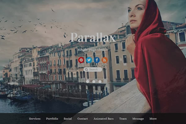
To show you how this Parallax scrolling effect looks like I’ve collected sites that utilize the Parallax scrolling effect. Check out the following examples below.


Learning How to a Create Parallax Website Design
After learning what parallax website design is, and seeing some really well-designed sites utilizing this hot style, you’re probably wondering how you can use this style in your next design. Fortunately for you, implementing this style is not that difficult. There are actually four easy to understand methods that can be used to create a parallax website design.
- The Layered Method – The use of multiple backgrounds that can move independently horizontally or vertically, depending on your preference, and can be composited on one another.
- The Sprite Method – Simply put, using one big image comprised of multiple images that displays only parts of that said image when at different positions. A commonly used effect in navigation menus.
- The Repeating Pattern Method – Scrolling displays built up of individual tiles can be made to float over a repeating background layer
- The Raster Method – Lines of pixels in an image are typically composited and refreshed in top-to-bottom order with a slight delay between drawing one line and drawing the next line.
The Parallax Scrolling Website Tutorial Design Concept
Resources You Will Need to Complete This Parallax Scrolling Tutorial:
- Wellfleet (Google Font)
- Arvo (Google Font)
- Oswald (Google Font)
- Goudy Bookletter 1911 (Google Font)
- High resolution Christmas images (You can download free images here or you can use your images on the PSD file above)
- Time and patience
File Structure
For our file structure, we will create three folders and one HTML file:
- index.html – this will serve as our main file. All of our designs will be utilized on this file.
- js folder – for our JavaScript/jQuery
- img folder – for our images
- css folder – for our styling (CSS)
The HTML Markup
On our HTML file, we will add first the HTML5 doctype and series of links on our head section. This will include our link to the CSS file and Google Fonts links followed by our jQuery library file.
<!DOCTYPE html>
<html lang="en">
 <head>
 <meta http-equiv="Content-Type" content="text/html; charset=utf-8" />
 <title>Creating a Simple Parallax Scrolling Website</title>
 <link rel="stylesheet" href="css/style.css"/>
 <script type="text/javascript" src="js/jquery-1.10.2.min.js"></script>
 <link href='http://fonts.googleapis.com/css?family=Wellfleet' rel='stylesheet' type='text/css'>

 <link href='http://fonts.googleapis.com/css?family=Wellfleet' rel='stylesheet' type='text/css'>
 <link href='http://fonts.googleapis.com/css?family=Arvo:400,700,400italic,700italic' rel='stylesheet' type='text/css'>
 <link href='http://fonts.googleapis.com/css?family=Oswald' rel='stylesheet' type='text/css'>
 <link href='http://fonts.googleapis.com/css?family=Goudy+Bookletter+1911' rel='stylesheet' type='text/css'>
 <script>
 </script>
</head>
Let’s skip the jQuery code and discuss it later. For now, let’s continue with the HTML elements. We will add a header tag with the logo and navigation inside. The navigation will link to the specific slides. Later, we will add a smooth scrolling effect to make it look good.
<body>
<!----- HEADER START--->
<header id="header">
<div class="content">
<div id="logo"><a href=""> PARALLAX </a></div>
<nav id="nav">
 <ul>
 <li><a href="#slide1" class="active" title="Next Section" >Slide 1</a></li>
 <li><a href="#slide2" title="Next Section">Slide 2</a></li>
 <li><a href="#slide3" title="Next Section">Slide 3</a></li>
 <li><a href="#slide4" title="Next Section">Slide 4</a></li>
 <li><a href="#slide5" title="Next Section">Slide 5</a></li>
 </ul>
</nav>
</div>
</header>
Next let’s add the slides. We will put an ID to each slide which corresponds to its sequence. Inside of each slide, we will put a class of content to center the elements.
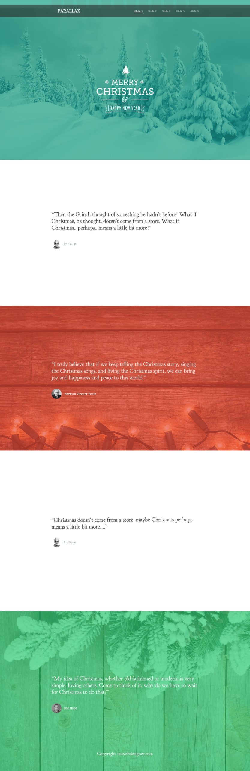
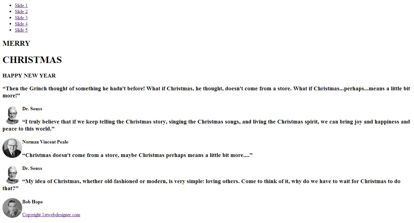
<!----- SLIDES START --->
 <div id="slide1">
 <div class="content">
 <div id="christmas_tree"> </div>
 <div id="snowflakes1"></div>
 <div id="snowflakes2"></div>
 <h2>MERRY</h2>
 <h1>CHRISTMAS</h1>
 <div id="divider"> </div>
 <h3>HAPPY NEW YEAR </h3>
 <div id="ribbon"></div>
 <div id="new_year"> </div>
 </div>
 </div>
 <div id="slide2">
 <div class="content" >
 <div class="quotes_container">
 <h3 class="quotes">“Then the Grinch thought of something he hadn't before! What if Christmas, he thought, doesn't come from a store. What if Christmas...perhaps...means a little bit more!”</h3>
 <img src="img/dr-seuss.png" align="left"/> <h4 class="author_name_gray">Dr. Seuss </h4>
 </div>
 </div>
 </div>
 <div id="slide3">
 <div class="content">
 <div class="quotes_container">
 <h3 class="quotes">“I truly believe that if we keep telling the Christmas story, singing the Christmas songs, and living the Christmas spirit, we can bring joy and happiness and peace to this world.” </h3>
 <img src="img/norman.png" align="left"/> <h4 class="author_name_white">Norman Vincent Peale </h4>
 </div>
 </div>
 </div>
 <div id="slide4">
 <div class="content">
 <div class="quotes_container">
 <h3 class="quotes">“Christmas doesn't come from a store, maybe Christmas perhaps means a little bit more....” </h3>
 <img src="img/dr-seuss.png" align="left"/> <h4 class="author_name_gray">Dr. Seuss </h4>
 </div>
 </div>
 </div>
 <div id="slide5">
 <div class="content">
 <div class="quotes_container">
 <h3 class="quotes">“My idea of Christmas, whether old-fashioned or modern, is very simple: loving others. Come to think of it, why do we have to wait for Christmas to do that?” </h3>
 <img src="img/bob.png" align="left"/> <h4 class="author_name_white">Bob Hope </h4>
 </div>
 <div id="copyright"><a href="https://1stwebdesigner.com/">Copyright 1stwebdesigner.com </a></div>
 </div>
 </div>
 <!----- SLIDES END --->
</body>
</html>
Now that we already put all of the HTML elements, our site will look like this.
The CSS
We need to do our CSS general styling first. Let’s start by adding styles to our body tag as well as H1, H2, and H3 tags. We will set the font “Museo 700” as our fonts for our H1-H3 tags. We will put shadows on each of them.
body{
margin: 0;
padding: 0;
width: 100%;
}
h1 {
font-family:"Arvo";
font-weight:normal;
font-size: 55px;
text-align: center;
color: #fff;
margin: 0;
padding: 0;
}
h2 {
font-family:"Arvo";
font-weight: normal;
font-size: 40px;
text-align: center;
color: #fff;
margin: 0;
padding: 0;
}
h3 {
font-family: Oswald;
font-weight: normal;
font-size: 16px;
text-align: center;
margin: 5px 0;
padding: 0;
z-index: 1;
position: relative;
}
Next, let’s add the other general styling. This will include the positioning of the elements on screen as well as the container of each slide.
.center { margin: 0 auto; }
.content{ margin: 0 auto; width: 960px; }
.clear { clear: both; }
Now let’s style the header section. We will add an image with a black background and add 60% opacity to the header, which will hold the logo and the navigation. For the logo, we will float it to the left, and for the navigation, we will float it to the right.
#header {
width: 100%;
background: url('../img/header-bg.png');
height: 80px;
position: fixed;
margin-top: 30px;
}
#nav { width: 410px; float: right; margin-top: 20px; }
#logo a { color: #fff; text-decoration: none; float: left; font-size: 30px; margin-top: 20px; color: #fff; font-family:"Wellfleet"; font-weight: bold; }
#nav ul{
list-style: none;
display: block;
margin: 0 auto;
list-style: none;
}
#nav li{
margin-top: 9px;
float: left;
padding-left: 21px;
}
#nav li a { color: #fff; opacity:0.6; font-size: 16px; text-decoration: none; font-family: 'Wellfleet'; }
#nav li a.active { color: #fff; opacity:1; border-bottom: 2px solid #fff; }
#nav li a:hover { color: #fff; opacity:1; }
Then, let’s add styles to our quotes, author, and images as well as to the quotes container.
.quotes {
font-family: 'Goudy Bookletter 1911', serif;
font-weight: normal;
font-size: 30px;
text-align: left;
margin: 50px auto;
}

 .author_name_white { font-family:"Wellfleet"; margin: 70px 0 0 75px; color: #fff; font-size: 20px; }
 .author_name_gray { font-family:"Wellfleet"; margin: 70px 0 0 75px; color: #94a4a4; font-size: 20px; }
 .quotes_container { width: 800px; margin: 0 auto; }
#christmas_tree { background: url('../img/christmas-tree.png')no-repeat; width: 48px; height: 77px; margin: 0 auto; position: relative; bottom: -35px;}
#divider { background: url('../img/divider.png')no-repeat; width: 300px; height: 35px; margin: 0px auto 27px auto; }
#ribbon { background: url('../img/ribbon.png')no-repeat; width: 251px; height: 48px; margin: 0 auto; display: block; position: relative; top: -38px; }
#snowflakes1 { background: url('../img/snowflakes.png')no-repeat; width: 24px; height: 21px; margin: 0 auto; display: block; position: relative; bottom: -54px; left: -102px; }
#snowflakes2 { background: url('../img/snowflakes.png')no-repeat; width: 24px; height: 21px; margin: 0 auto; display: block; position: relative; bottom: -33px; right: -100px; }
Each slide will have a background image or white background color with fixed position. We also need to add some padding to each slide to center the elements inside it.
#slide1, #slide2{ width: 100%; }
#slide1{
background:url('../img/slide1.jpg') 50% 0 no-repeat fixed;
color: #fff;
height: 600px;
margin: 0;
padding: 200px 0 260px 0;
background-size: cover;
}
#slide2{
background-color: #fff;
color: #333333;
height: 300px;
margin: 0 auto;
overflow: hidden;
padding: 200px 0;
}
#slide3{
background: url(../img/slide3.jpg) 50% 0 no-repeat fixed;
color: #fff;
height: 600px;
padding: 170px 0 0 0;
background-size: cover;
}
#slide4{
background-color: #fff;
color: #333333;
height: 300px;
padding: 200px 0;
}
#slide5{
background: url(../img/slide5.jpg) 50% 0 no-repeat fixed;
height: 200px;
margin: 0 auto;
padding: 250px 0;
color: #fff;
background-size: cover;
}
Lastly, we will style our copyright text and center it to the screen.
#copyright { color: #fff; font-family:"Wellfleet"; font-size: 14px; margin-top: 100px; text-align: center; }
#copyright a { text-decoration: none; color: #fff; }
Now that we put all of our CSS styles, the look of our site will look just like our PSD design.
The jQuery
Let’s bring this Parallax website to life. On the head section, we are going to add the following jQuery codes. Check the Reference URL.
$(document).ready(function() {
$('a[href*=#]').each(function() {
if (location.pathname.replace(/^\//,'') == this.pathname.replace(/^\//,'')
&amp;&amp; location.hostname == this.hostname
&amp;&amp; this.hash.replace(/#/,'') ) {
var $targetId = $(this.hash), $targetAnchor = $('[name=' + this.hash.slice(1) +']');
var $target = $targetId.length ? $targetId : $targetAnchor.length ? $targetAnchor : false;
if ($target) {
var targetOffset = $target.offset().top;
$(this).click(function() {
$("#nav li a").removeClass("active");
$(this).addClass('active');
$('html, body').animate({scrollTop: targetOffset}, 1000);
return false;
});
}
}
});
});
On this part of the jQuery code, we’re creating a click event handler to all the links that have “#” symbol anywhere in the href. The very next line, we will check if the link is pointing to the same page by checking for a match between location.pathname. We can then make sure that the link includes a qualified URL or just an identifier.
$(document).ready(function() {
  $('a[href*=#]').each(function() {
    if (location.pathname.replace(/^\//,'') == this.pathname.replace(/^\//,'')
    && location.hostname == this.hostname
    && this.hash.replace(/#/,'') ) {
      var $targetId = $(this.hash), $targetAnchor = $('[name=' + this.hash.slice(1) +']');
      var $target = $targetId.length ? $targetId : $targetAnchor.length ? $targetAnchor : false;
       if ($target) {
         var targetOffset = $target.offset().top;
For this part, when the user clicks the menu link, it will remove the class active on that current active menu link and add it to that menu link that the user has clicked. This will also scroll to the target div id section.
         $(this).click(function() {
 $("#nav li a").removeClass("active");
 $(this).addClass('active');
           $('html, body').animate({scrollTop: targetOffset}, 1000);
           return false;
         });
      }
    }
  });

});
Tip: You can also make the speed of the scrolling effect faster or slower by simply changing the value of 1000. (1000 means 1000 milliseconds). You might also want to use the value “fast” (200 milliseconds) or “slow” (600 milliseconds). Take note that the default is 400 milliseconds. It depends on what you need or want.
$('html, body').animate({scrollTop: targetOffset}, 1000);
This effect is quite easy to do yourself. Actually you’ve unknowingly been learning how to do this effect for quite some time. Using such tools as JavaScript, MooTools, CSS, and jQuery, there isn’t that much new material to learn. Below you can find a nice collection of tutorials and resources to help guide you along the way:
- Recreate Nike World Parallax
- Create a Parallax Website Header
- The Parallax effects with jQuery
- Background Animations Using MooTools
Final Words About the Parallax Website Effect
Parallax website scrolling effects are slowly being implemented on a lot of sites across the Web. If you take the time to look for more inspiration around, you will see a lot of advanced Parallax web designs that are sure to blow your mind.
Today, I’ve shown you how to do a relatively simple parallax scrolling website; you can play around with it and improve it at your leisure. Have fun!
This post may contain affiliate links. See our disclosure about affiliate links here.