Web design can serve as a playful exploration ground for learning new techniques. In today’s guide, we’ll dive into the creation of an underwater CSS text effect, not just for…
Web design takes a captivating turn when CSS comes into play. It enables a world of transformations, such as taking static text elements and infusing them with life. Our focus…
Embossing is a graphical effect used to give the impression that the surface of an image has been raised or pressed in. In web design, an embossed text effect can…
In the field of design, simplicity can often eclipse complexity. Minimalist design principles echo across varied creative fields — from architecture to product design, and notably, typography. Our overview takes…
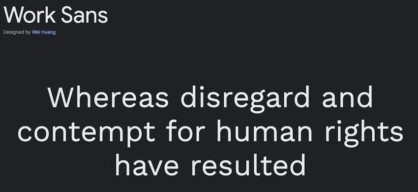
When it comes to typography, there’s a seemingly infinite number of styles to choose from. But which one is the right one for your next design?
That is the ultimate…
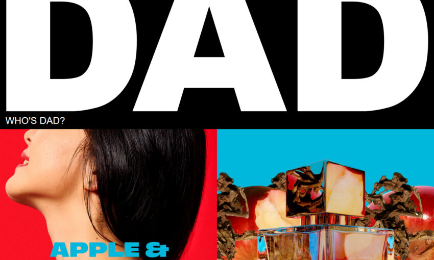
Looking for typography inspiration for your next or future web design projects? We’ve rounded up some of the most creative and award-winning examples of typography usage in these websites that…
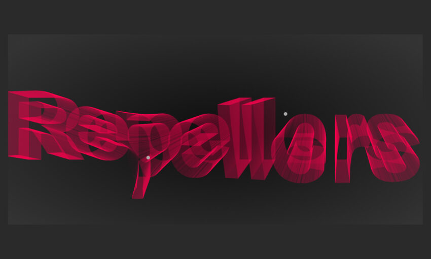
In today’s post, we’re sharing some of the most interesting and unusual CSS text effects – some with the help of JavaScript – that we’ve found on CodePen for your…
As you likely know already, when you get a new WordPress theme, it’ll come with a few fonts straight away. These are fonts that the developer chose that best fit…
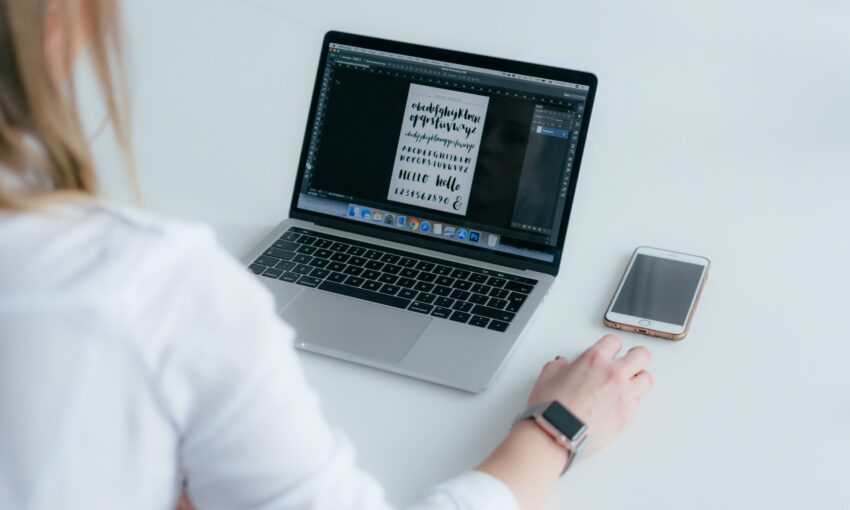
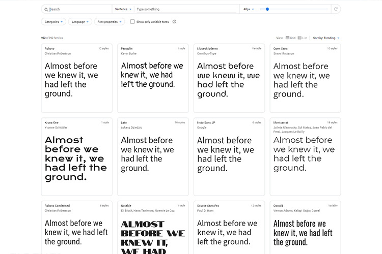
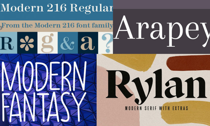
Using a modern font can really elevate the look of your work. Whether you’re creating flyers, business cards, or website headers, choosing the right font conveys important information about the…
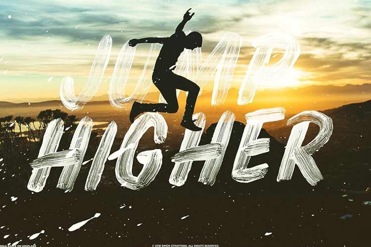
Are you on the hunt for some gritty, textured experimental fonts for your website? Grunge style typography might be just what you need.
The inspiration for many art styles, grunge…
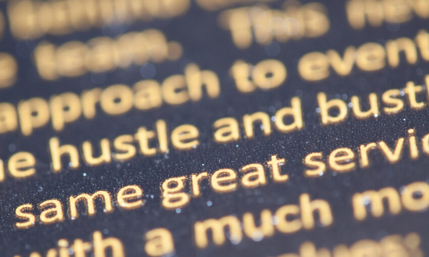
When you’re first learning the nuances of typography, all those different font types can be confusing. You might know the difference between serif and sans-serif, but do you know the…