With the numerous photo editing software available on the market, you just can’t help but play around with those stock photos. It’s amazing how people can come up with such amazingly creative photo manipulations.
It is a crazy fusion of photography and digital art. You can only imagine what tricks these designers have up their sleeves to come up with such unique and creative ideas.
With this article, we presenting this amazing collection of photo manipulation.
Your Designer Toolbox
Unlimited Downloads: 500,000+ Web Templates, Icon Sets, Themes & Design Assets

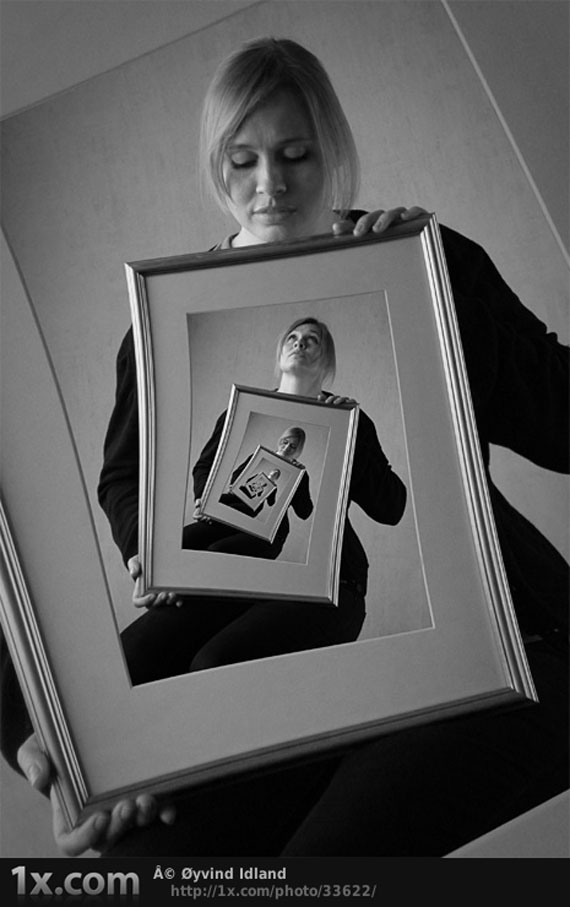
1. Escherism
2. Desperation

3. Blackleash

4. Last Day of Drought…

5. Perrier: Melt Club

6. My Lil Camera Crew

7. Tipp-Kick-Battle

8. No Vacancy

9. Elixir

10. Seperation

11. Mnemosyne house

12.The Orient Express

13. The Night of Quijote

14. Christophe Huet

15. React

16. *Scarface*

17. Baseball Pear

18. Be Yourself

19. Only OPENS, if you’re open for fantasy

20. Go Your Own Road

21. Slave Angel

22. Choices

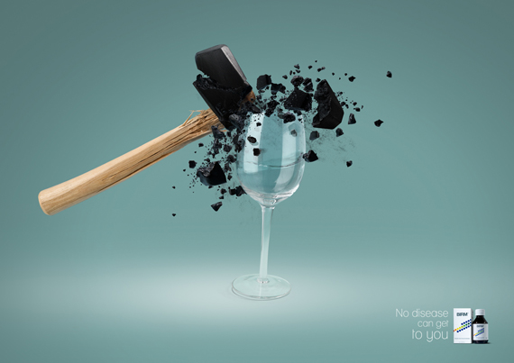
23. BIRM: Cup
24. Android Girl – Original V2

25. Bobby Car Challenge

26. H2O

27. Photo Retouch

28. Private Piece of Hope

29. Sarolta Bán

30. Cherry

31. Dragon Fire

32. As White as Snow

33. Michael Benk

34. Reflections

35. Fire Starter

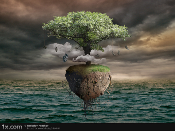
36. Radoslav Penchev
37. Madin Spain 2008

38. Never Mind

39. Parisude 2

40. Go With the Flow

41. Lost Roots

42.Only Sand Remains

43. Sarolta Ban

44. Arctic Fade

This post may contain affiliate links. See our disclosure about affiliate links here.