1. New Social Media Icon Set
This icon set contains 25 scalable vectors complete with semi-transparent shadows for use on various types of backgrounds. The download contains a .zip file with the original .ai file and an .eps version as well.
2. Free Stained and Faded Social Media Icons
This icon set includes 20 more stained social media icons for use in your grungy site designs.
3. Socialis
This is a beautiful set of social icons. This free download includes a PSD file will fully editable shape layers, plus 56 icon variations in PNG format.
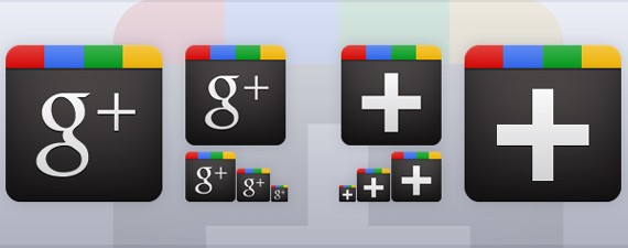
4. Google Plus Icon Vector
This set includes free Google+ icons along with a 128px optimized version and the standard 16px, 32px, and 64px version of the new red Google+ icon.
5. Lifetime Social Network Icons
This set contains 27 social networks like Digg, Bebo, Blogger, Delicious, Facebok, Zorpia, Youtube, Google+, Scribd, Technorati, Squidoo and Tagged etc – each in 6 different sizes, 3 mouseover states (link, hover and active) and 2 graphic formats (PNG and PSD).
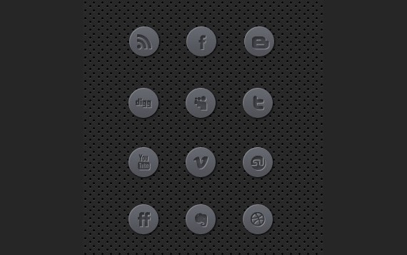
6. Clean Black And White Social Media Icons Set
A great, simple, clean black and white social media icons set perfect to be used within minimalism designs. The icon set is available to be used within commercial and non commercial design projects to enjoy.
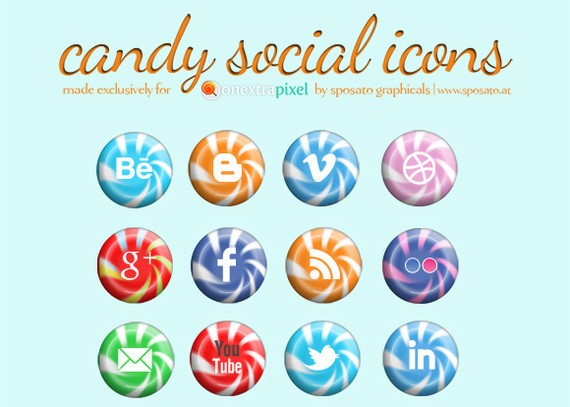
7. Candy Social Media Icons
It contains your favorite social media like Facebook, Twitter, Google +, YouTube, Dribbble, etc. The theme of this set of icons is “Candy” and the designer has created them specifically to match the social media colours.
8. Simple Mini Black Social Media Icons
Simple mini black icons which includes 12 icons in total. The icons would be perfect to be used within mobile interface design.
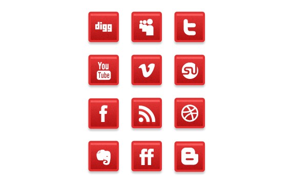
9. A Simple Subtle Red Grunge Social Media Icons
A simple red subtle grunge social media icons. The icons can be used within commercial and non commercial design projects.
10. Social media icons
This set contains some beautiful social media icons.
11. A Free Mini Simple Social Media Icons
A great free simple mini social media icons set perfect for minimalistic website designs, each icon within the set is 64 pixel by 64 pixels.
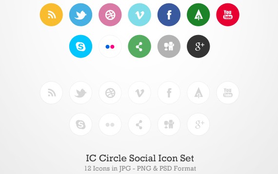
12. IC Circle Social Icon Set
The IC Circle Social Icon Set is a social icon set containing 12 icons in two alternate styles colour and greyscale as shown in the preview above. Icons included for rss, twitter, dribbble, vimeo, facebook, forrst, you tube, skype, flickr, share-this, digg and google+.
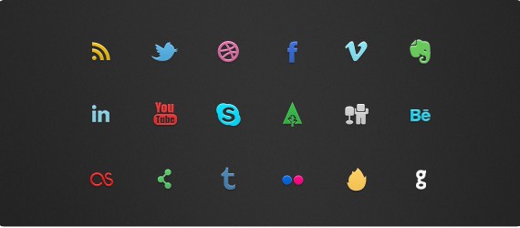
13. IC Mini Social Icon Set
This freebie is the IC Mini Social Icon Set, this set containing 18 icons in JPG, PNG and PSD format.
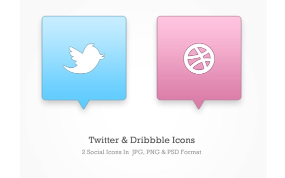
14. Twitter & Dribbble Icons (PSD)
This set contains Icons JPG & PNG Format & sizes of 256 x 256, 124 x 124 and 64 x 64 px.
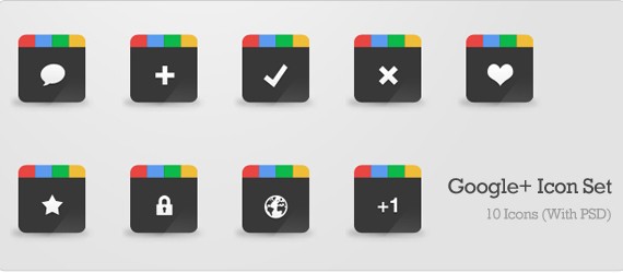
15. Google+ Icon Set (PSD)
This set contains Google+ Icons with 10 icons in total and original PSD file is included. Icons are 64px x 64px, in both PNG and JPG format.
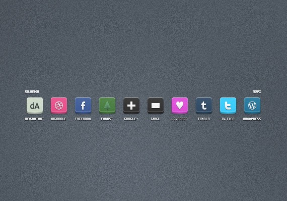
16. So.media
This set contains 32px social media icons for your project.
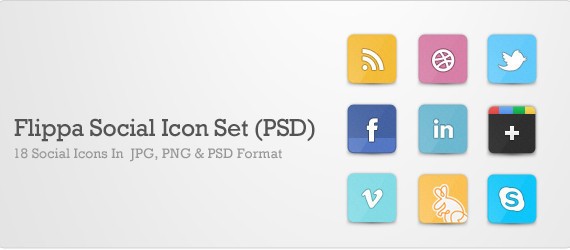
17. Flippa Social Icon Set (PSD)
This set contains 18 Social Icons In JPG, PNG & PSD Format for you to customize and use however you like.
18. Free Social Icons Vector Set
This set contains awesome free Social Icons for your design.
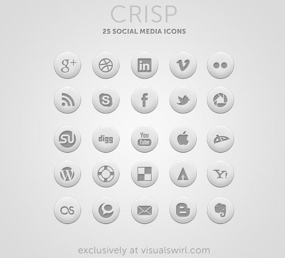
19. Crisp: Free Round Social Icon Set
It consists of 25 professionally designed round icons for social media sites. Also included are a few miscellaneous icons (mail, rss, and apple) that can be used to complete a sharing section on your blog or website.
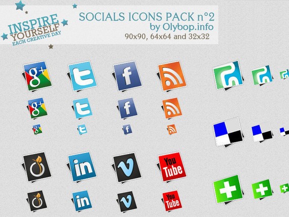
20. Social icons pack 2
This icon set contains some beautiful social icons for your design.
21. IC Minimal Icon Set by design deck
IC Minimal Icon Set includes 28 Icons in total all PNG & JPG format and a size of 64px – 64px.
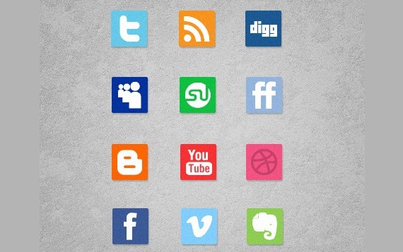
22. Slick But Clean Free Social Media Icons
A clean social media icons set, each icon 128 pixels by pixel perfect size for use within web design. The icon set includes 12 icon sets in total, each icon set available to be used within commercial and non commercial design projects.
23. Social Icons “Complete” & Free
This icon set contains some beautiful social media icons.
24. Glyphs By GSIX v2
This icon set contains some beautiful social media icons.
25. Somicro: 27 Free Simple Social Media Icons
Somicro contains 27 icons covering most of the popular social networks out there.
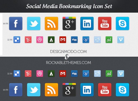
26. Social Media Bookmarking Icon Set
Free Social Media Bookmarking Icon Set consisting of 38 individual icons of the popular social networks/bookmarking sites out there. The set consists of 38 high quality icons in transparency PNG format (64 x 64, 32 x 32).
27. 6 Social Icons
This set contains 6 social icons: google+, facebook, twitter, digg, rss and flickr.
28. Round Vista like social icons
In this set you will find facebook, vimeo, twitter, rss, delicious,technorati, digg and 2 flickr icons, size: 128×128, 64×64,32×32.
29. Set of social icons
This set contains 12 icons: facebook, twitter, google+, rss, dribble, deviantart.
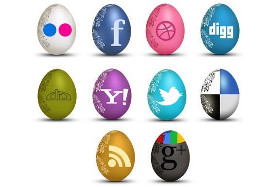
30. Set of Egg-Shaped Social Icons
In this icon set you will find facebook, twitter, google+, rss, flickr, yahoo, deviantart, dribble, digg and delicious icons.
31. Socializic, free detailed social media icons
Download this irresistible social media icons. Each illustration is 128×128 pixels and represents a “realistic” version of common social media icons.
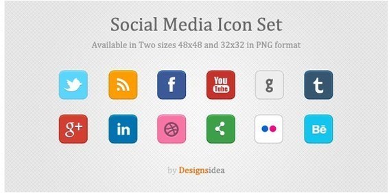
32. Social Media Icons Set
This is clean and beautiful icon pack of popular social media sites. This icon set contains 12 high quality icons in two different sizes: 48 x 48 and 32 x 32
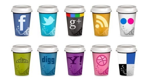
33. Set of Social Icons “Takeout Coffee Cup”
This is an amazing set of social icons: facebook, twitter, google+, rss, flickr, yahoo, deviantart, dribble, digg and delicious. This free download includes 10 icon variations in PNG format and in 5 different sizes.
34. Square Social Icons
35 popular social icons in 32×32 size are included in this free download. The file format is PSD and shape layers were used to allow for resizing of the the icons.
35. Crystal Blue Social Media Icons
This set contains some beautiful Crystal Blue Social Media Icons.
36. Woody Social Media Icons Set
This set contains some beautiful Woody Social Media Icons Set.
37. Carbon Chrome Social Media Icons Set
A great carbon chrome social media icons set at decent size of 128 pixels by 128 pixels to be used within commercial web design projects.
38. Large Glossy Social Media Icons
A large glossy icon set with a huge resolution of 256 pixels by 256 pixels. The icon set includes 12 icons in total, to be used within your projects.
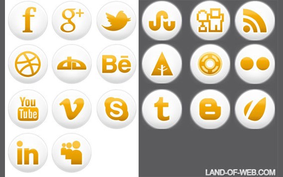
39. Simple Social Icons
This is a set of orange glossy simple social icons. In the pack you will find 20 icons in 4 sizes 256x256px, 128x128px, 64x64px, 32x32px. All icons in png format.
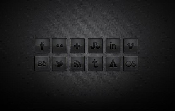
40. Free Dark Social Media Icons
This free resource contains 12 black, sleek and stylish social media icons.
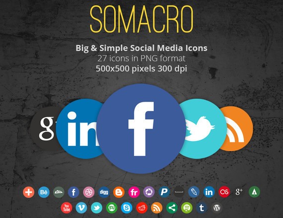
41. Somacro: 27 300DPI Social Media Icons
Somacro’s icon pack contains two variations of the same icons; one with a border and one without, totalizing 54 icons.
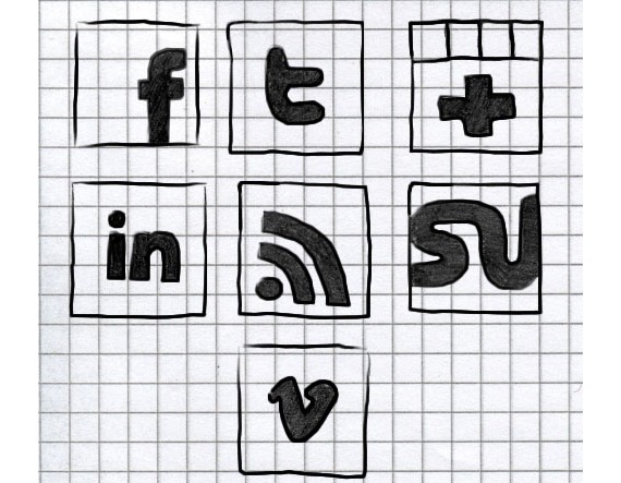
42. Hand-Drawn Social Icons
In this set you will find 7 social icons : facebook, twitter, rss, stumbleupon, vimeo, google+, linked. Icons come in one format – PNG and in 3 sizes: 128x128px, 64x64px and 32x32px.
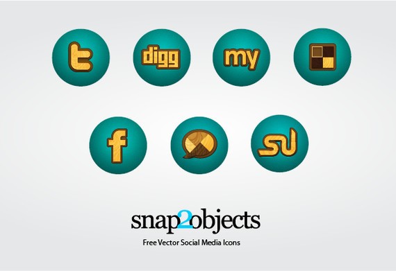
43. Free Wooden Vector Social Media Icons
This set contains some beautiful Free Wooden Vector Social Media Icons.
This post may contain affiliate links. See our disclosure about affiliate links here.