Responsive design is the process of arranging the layout in a way that all the important information is presented in a user-readable way in any kind of device or screen size.
Most designers will choose a fluid grid layout since it’s easier to handle grid based layouts in different kind of devices.
Your Designer Toolbox
Unlimited Downloads: 500,000+ Web Templates, Icon Sets, Themes & Design Assets
What is a Fluid Grid Layout?
It’s important to know the meaning of fluid grids before we start thinking about the designs. There is no better explanation than the definition given by Wikipedia on fluid.
A fluid is a substance that continually deforms (flows) under an applied shear stress – Wikipedia
So I’ll make things clear by explaining the above definition in simple practical terms. In web design, fluid will be our design or layout and shear stress will be the screen size or user device. Regardless of what the device or screen size is, components in fluid designs are going to flow and adapt to the user environment.
Importance of Fluid Grids
In adaptive grids, we define pixel-based dimensions. Hence we will have to adjust the widths and heights manually in certain device viewports. Since fluid grids flow naturally within the dimensions of its parent container, limited adjustments will be needed for various screen sizes and devices.
Mobile devices are getting smaller in size and people prefer using them in their personal work. On the other hand, desktop monitors are getting wider with higher resolutions. So we just cannot plan for smaller devices in responsive design.
The advantage of fluid grid is that we can adjust the max-width and it will still work on larger screens due to the percentage based calculations.
How Fluid Grids Work
We used to design inside fixed grids with the 960px system. Then the layout became adaptive by using different pixel sizes at different screen sizes. It was all about pixel based layout design. Now the time has come to create percentage based designs which are known as fluid designs.
In fluid grids we define a maximum layout size for the design. The grid is divided into a specific number of columns to keep the layout clean and easy to handle. Then we design each element with proportional widths and heights instead of pixel based dimensions.
So whenever the device or screen size is changed, elements will adjust their widths and heights by the specified proportions to its parent container.
Before we dig deeper into fluid grids, let’s take a look at some cool fluid designs to get an idea about how fluid layouts work.
Dusty Cartridge

Palantir.net

Dress Responsively

Fluid Grid Systems and Generators
Creating a fluid grid from scratch is not an easy task and will require time and effort. Hence it’s wise to choose an existing CSS Grid Framework or Grid Generator as the base for your layout design. The following are some free CSS grid systems and generators.
Most of the CSS grid frameworks will come with advanced built in features and have been tested across many browsers. The purpose of this tutorial is to understand fluid grids from top to bottom. Hence it’s wise to generate a fluid grid which will enable you to learn the basics of fluid grids.
I will be using the Variable Grid System to generate a fluid grid according to our preference. Follow this link and adjust the variable values. I’ll be using the following values.
- Column width – 60
- Number of columns – 12
- Gutter width – 20
Then download the fluid version of the CSS file. Now open it in your favorite text editor and search for Grid >> 12 Columns. The code below shows the content of Grid >> 12 Columns section.
.container_12 .grid_1 {
    width:6.333%;
}

.container_12 .grid_2 {
    width:14.667%;
}

.container_12 .grid_3 {
    width:23.0%;
}

.container_12 .grid_4 {
    width:31.333%;
}

.container_12 .grid_5 {
    width:39.667%;
}

.container_12 .grid_6 {
    width:48.0%;
}

.container_12 .grid_7 {
    width:56.333%;
}

.container_12 .grid_8 {
    width:64.667%;
}

.container_12 .grid_9 {
    width:73.0%;
}

.container_12 .grid_10 {
    width:81.333%;
}

.container_12 .grid_11 {
    width:89.667%;
}

.container_12 .grid_12 {
    width:98.0%;
}
As you can see container_12 is the main container. Each and every element in our design should be inside a container with the class container_12 . Then percentage based widths are assigned to classes with .grid_1 , .grid_2 … .grid_n.
Fluid grids are built using columns that are considered fluid columns. When the screen size is changed, the widths of these columns will adjust proportionally to its parent container.
We have 12 fluid columns in our grid. So let’s take a look at how the columns are stacked up in our layout.
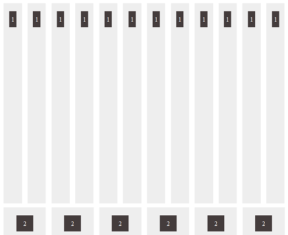
The code for the above section is given below. You can check the downloaded files for more information.
<meta charset="utf-8" />
<meta name="viewport" content="width=device-width, initial-scale=1, maximum-scale=1" />
Fluid Grid with Fluid Columns
       	<link href="style.css" rel="stylesheet" type="text/css" /></pre>
<div class="container_12" id="single-columns">
<div class="grid_1"><span>1</span></div>
<div class="grid_1"><span>1</span></div>
<div class="grid_1"><span>1</span></div>
<div class="grid_1"><span>1</span></div>
<div class="grid_1"><span>1</span></div>
<div class="grid_1"><span>1</span></div>
<div class="grid_1"><span>1</span></div>
<div class="grid_1"><span>1</span></div>
<div class="grid_1"><span>1</span></div>
<div class="grid_1"><span>1</span></div>
<div class="grid_1"><span>1</span></div>
<div class="grid_1"><span>1</span></div>
</div>
<div class="container_12" id="double-columns">
<div class="grid_2"><span>2</span></div>
<div class="grid_2"><span>2</span></div>
<div class="grid_2"><span>2</span></div>
<div class="grid_2"><span>2</span></div>
<div class="grid_2"><span>2</span></div>
<div class="grid_2"><span>2</span></div>
</div>
<pre>
Each set of components is contained within an element with the class container_12. Inside the container we can use the grid_n class to create fluid columns with specific widths.
Using grid_1 will give 1/12 width of the original grid and grid_2 will give you 2/12.
You can load the demo and resize your browser to view the fluid nature of grid columns.
Nested Fluid Columns
When you have a CSS framework, creating a grid with fluid columns is straightforward. But not all designs are going to be straightforward like the layout shown previously. We might need to create columns and rows inside other columns and rows.
Columns contained within a parent column are called nested columns. Let’s see how we can create nested fluid columns using the CSS file we generated earlier.
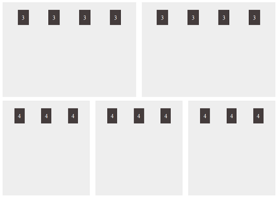
The layout given above contains 2 rows. The first row is divided into 2 sections of 6 columns and each of the 2 sections are divided again into 4 sections of 3 columns.
Likewise the second row is divided into 3 sections of 4 columns and each of the 3 sections is divided again into 3 sections of 4 columns. This is how you create nested columns in grids. Let’s see how to code the above layout.
<meta charset="utf-8" />
<meta name="viewport" content="width=device-width, initial-scale=1, maximum-scale=1" />
Nested Fluid Columns
       	<link href="style.css" rel="stylesheet" type="text/css" /></pre>
<div class="container_12">
<div class="grid_6">
<div class="container_12">
<div class="grid_3"><span>3</span></div>
<div class="grid_3"><span>3</span></div>
<div class="grid_3"><span>3</span></div>
<div class="grid_3"><span>3</span></div>
</div>
</div>
<div class="grid_6">
<div class="container_12">
<div class="grid_3"><span>3</span></div>
<div class="grid_3"><span>3</span></div>
<div class="grid_3"><span>3</span></div>
<div class="grid_3"><span>3</span></div>
</div>
</div>
</div>
<div class="container_12">
<div class="grid_4">
<div class="container_12">
<div class="grid_4"><span>4</span></div>
<div class="grid_4"><span>4</span></div>
<div class="grid_4"><span>4</span></div>
</div>
</div>
<div class="grid_4">
<div class="container_12">
<div class="grid_4"><span>4</span></div>
<div class="grid_4"><span>4</span></div>
<div class="grid_4"><span>4</span></div>
</div>
</div>
<div class="grid_4">
<div class="container_12">
<div class="grid_4"><span>4</span></div>
<div class="grid_4"><span>4</span></div>
<div class="grid_4"><span>4</span></div>
</div>
</div>
</div>
<pre>
First we create the main containers and columns as we did in the previous section. Inside the column we need to create another container with container_12 class for nested columns.
Now we get another 12 columns inside the main 6 columns. Then 12 sub columns can be divided as necessary. Now you should have a clear knowledge of creating fluid grids and working with nested columns. Let’s move further in fluid grids.
Design Beyond Fluid Grid
Most designers that are just starting out think that using a responsive CSS framework will make your design responsive. Unfortunately responsive design is not that simple. Fluid grids will adapt to the change in browser window or device.
Unless you plan the design carefully , users will have problems browsing your content on smaller devices when you use fluid grids.
Consider the screen below.
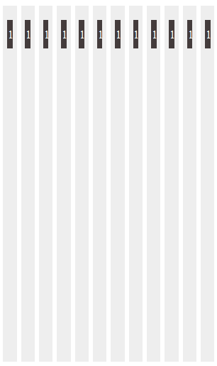
This is how the fluid grid discussed in earlier sections will display on small screens. These are just grid columns without proper data. Even in this case the number 1 is not displayed properly.
When it comes to real content it’s going to be a total mess. In this scenario we need to adjust the widths of the columns in order to provide better user experience.
You can use CSS media queries to adjust the widths of columns for different screen sizes. In the above scenario you can double the column width and keep 6 columns instead of 12 to provide better readability of your content. So make sure not to depend only on fluid grids in responsive designs.
Testing Fluid Grids
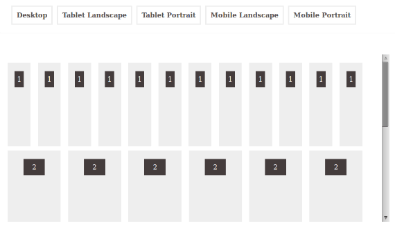
Now that we have completed the basics of fluid grids, we can move onto creating a simple demo with jQuery to test the fluid grid for different screen sizes. First we are going to create the page layout and navigation as shown below.
<meta charset="utf-8" />
<meta name="viewport" content="width=device-width, initial-scale=1, maximum-scale=1" />
Fluid Grid Tester

</pre>
<div id="device_navigation">
<div id="device_panel"><a onclick="changeGrid('desktop');" href="javascript:void(0);">Desktop</a>
 <a onclick="changeGrid('tab_lan');" href="javascript:void(0);">Tablet Landscape</a>
 <a onclick="changeGrid('tab_pot');" href="javascript:void(0);">Tablet Portrait</a>
 <a onclick="changeGrid('mob_lan');" href="javascript:void(0);">Mobile Landscape</a>
 <a onclick="changeGrid('mob_pot');" href="javascript:void(0);">Mobile Portrait</a></div>
<div style="clear: both;"></div>
</div>
<div class="main_wrapper"><iframe src="media_query.html" height="240" width="320"></iframe></div>
<pre>
Our testing page has basic HTML layout with jQuery. Element with the ID device_panel will contain the navigation for standard devices like desktops,mobiles and tablets. Once the link is clicked changeGrid function will be called with the type device as parameter.
On the bottom section we have an IFRAME which will be used to load our fluid grid. Fluid grid is contained in the media_query.html file. Now let’s take a look at the changeGrid function.
function changeGrid(device){
               if(device == "desktop"){
                   $(".wrapper").css("width","960px");
               }
               if(device == "tab_lan"){
                   $(".wrapper").css("width","768px");
               }
               if(device == "tab_pot"){
                   $(".wrapper").css("width","600px");
               }
               if(device == "mob_lan"){
                   $(".wrapper").css("width","480px");
               }
               if(device == "mob_pot"){
                   $(".wrapper").css("width","320px");
               }
           }
Once the function is called, it will check for the device using the passed parameter. Then it will change the width of the .wrapper (IFRAME) to the standard width for the device. Then we will be able to see how a fluid grid works on smaller screens.
Fluid grid used inside media_query.html file will be similar to the examples we discussed in earlier section. You can use the demo files to customize the codes. You should have something like the following screen as the testing screen.
Wrap Up
Fluid grids allow you to create responsive designs which suit dynamic screen sizes. The complexity of developing a fluid grid can be minimized by using an existing CSS framework. You cannot depend only on fluid grids to provide the perfect responsive design for you.
Adjust the fluid grid when necessary according to your design and try to provide the best browsing experience for the user.
This post may contain affiliate links. See our disclosure about affiliate links here.

