We have six unique text and video PSD to HTML conversion tutorials in this article. You will learn how to design web layouts in Adobe Photoshop and convert them into responsive HTML websites in no time!
Table of Contents:
- Convert a PSD Template to Basic HTML Video Series
- Convert a PSD Template to Bootstrap Video Series
- Code a Responsive Website with HTML5 and CSS3
- Design an Agency Landing Page in Photoshop
- Convert the Agency PSD into HTML
- Make the Agency HTML Responsive
Unlimited Downloads: 500,000+ Fonts, Web Templates, Themes & Design Assets
1. Convert a PSD Template to Basic HTML Video Series
Welcome to our Basic Web Design Video Course where you will learn how to completely code a website from scratch. In this short course we will walk you through the very basic steps on what to do and what to learn before, and during, building a basic website.
You’ll learn all of the steps, including:
- Planning
- Wireframing
- Using basic tools and panels in Photoshop
- Basic HTML and CSS coding
- How to apply your new knowledge and code your very first website from scratch in Bootstrap.
The resources you’ll need for this tutorial:
- Wireframe Template: Download Here
- Finished PSD: Download Here
The Video Series has been split into:
- Basic Web Design Video Course Part 1 – Wireframing, Photoshop Tools & Panels, and Designing
- Basic Web Design Video Course Part 2 – Basic HTML Tags, Structure & CSS Properties
We will do our best to walk you through everything slowly and clearly. So, are you ready to get started!
Part 1: PSD to HTML Tutorial – Wireframing, Photoshop Tools & Panels, and Designing
Planning and Wireframing:
What is a wireframe?
A wireframe is a visual presentation of how a website’s layout will look when it’s completed. It’s about structuring the overall layout without any graphics or actual content and placing the various web elements where you believe they will look and work best.
Your wireframe should include structures that represent images, header, footer, sidebars, text blocks, navigation and other content aspects of your website.
You don’t have to worry about drawing them yourself since there are many wireframing tools available on the web.
Wireframing Tools:
Wireframing Tools Used: Go Mocking Bird
Photoshop Basic Tools & Panels:
In this part, we will walk you through the basic Tools and Panels in Photoshop, and talk about how important they are and how each tool will help to create your website design in Photoshop.
Designing in Photoshop:
Now that you have the general idea for the website’s layout, it’s time to tone this up and make it more presentable in Photoshop. Let’s make this design as simple as possible.
In the next part, we will be talking about the basics of HTML and CSS, and with this knowledge you will learn how to convert your simple design into a working website.
So, that’s it for this part.
Part 2: PSD to HTML Tutorial – Basic HTML Tags, Structure & CSS
In part 2, we will talk about the tools you will need before starting to work with HTML and CSS, and then you will learn the most commonly used HTML tags.
For just now, we will only cover the HTML tags that are useful to beginners, we will cover the more advanced tags at a later time. Then, we will style the tags using basic CSS properties. Don’t worry, in the next videos we will go more in-depth and learn together.
Required Download: PSD Template
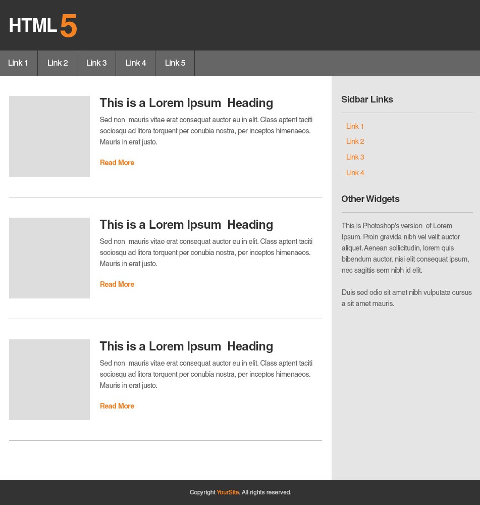
The Final Product of this HTML Tutorial:
Preparation:
Choose Your Text/Code Editor
For Windows Users:
For Mac Users:
Basic HTML Tags and Structure:
Now we will talk about the most commonly used tags that you’ll use on a website. We will cover headings, paragraphs, links, images, list items and divisions. Also we will familiarize ourselves with the basic structure of HTML markup and how to open and close a tag.
Let’s code a website!
Basic CSS Properties:
You will learn how to style individual elements and tags using CSS properties by changing width, height, colors, floats, etc. Using these basic properties you can turn your HTML markup into a well-presented website.
Now that you have finished positioning the layout structure, you can now proceed to the next part of the tutorial series, which is marking up the HTML.
2. Convert a PSD Template to Bootstrap Video Series
In this second web design video course, we willt ake you through the process of creating an Elegant Landing Page – from planning, searching for inspiration, choosing fonts, selecting the perfect color scheme, wireframing, and finally transferring the wireframe into Photoshop and rocking it out there.
Once we have our PSD design ready, we will convert it into a working website using the popular Bootstrap web framework. Let’s get started!
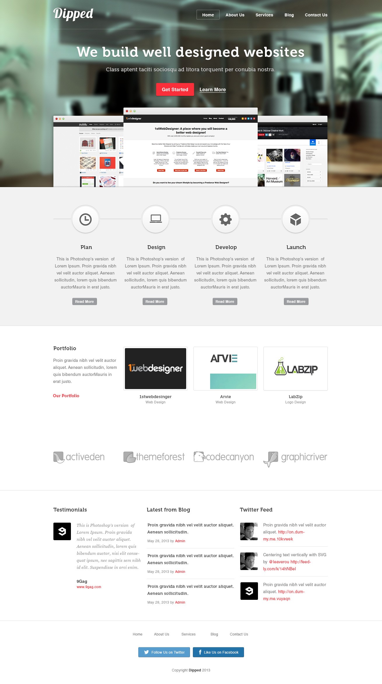
The Final Product
Resources you will need to complete this part of the tutorial:
- Museo Font
- Pixel Pattern
- Time and Patience
Design & Inspiration
Finding Inspiration & Wireframing
Let’s assume that we already know what the goal is of the website we’re going to build. The first step is to gather some inspiration that suits your taste and start doing some rough sketches using pen and paper.
Sources of Web Inspiration:
The next thing you will need to do is to create a wireframe based on your ideas.
Wireframing Tools:
Wireframe to Photoshop:
Based on our wireframe, we will transfer it into Photoshop to have a much clearer vision of what exactly the website layout will look like. What’s good about doing this is that we can focus on placing the elements, like buttons, text headings, and paragraphs, into the correct position and using the optimal sizes.
Applying Styles:
This is the exciting part. We will apply styles to all of the elements, buttons, fonts and background. Here, we can play around with a lot of stuff, for example, applying filters to images, playing with curves, and creating shadows to make the elements pop, etc.
So that’s it for the design and inspiration part.
PSD to HTML to Bootstrap
In this 2nd section of the Elegant Landing Page Design tutorial, we will be work on the coding part. Here, we will talk about how to use the popular Bootstrap web framework for transforming our PSD design into a working website.
It will be divided this into 3 sections:
- The First will be about marking up the HTML.
- The Second will be about applying CSS styles.
- The Third will be on how to make it all responsive.
Resources you will need to complete this HTML tutorial:
- Bootstrap
- Time and Patience
The HTML Markup:
Here, I will walk you through how easy it is to use Bootstrap by just linking to the appropriate file path to make it work. Then I will show you how to mark-up the HTML properly based on our design, starting from the header down to the footer.
Applying the CSS Styles:
Now that we’re done marking up our HTML, it is time to overwrite the default styling that Bootstrap provides. What’s good with this is we will not be worrying about the layout structure because Bootstrap already has done it for us by just adding the right classes for each division that we’ve markup in HTML.
All we need to do now is to style the elements to match our PSD design.
The Responsive Part:
Finally, we reach the last part of this tutorial, which is to make every section responsive. As a bonus, we will make the banner and testimonial section a carousel.
Finished!
You’ve done a great job, guys! You just completed the tutorial. I hope you can apply everything you’ve learned to any of your future projects.
3. Code a Responsive Website Using HTML5 and CSS3
Now if you were looking for a video HTML tutorial and are ready to build a responsive web design with HTML5 and CSS3 – you are in the right place. Just download the source files, view the demo and click play on the video. Let’s make a responsive HTML website!
Download the Source Files
Looking for a quick coding tutorial? – How to Make a Website Responsive in Just 15 Minutes
4. Design an Agency Landing Page in Photoshop
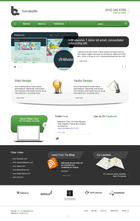
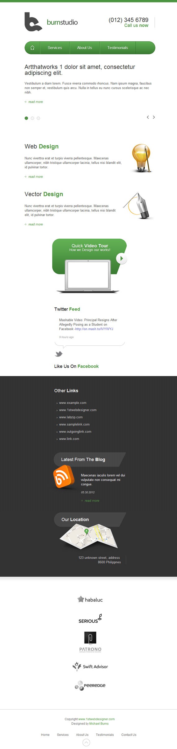
In this tutorial we will show you how to create a stylish landing page using Adobe Photoshop and then we will convert it into HTML and then make it all responsive.
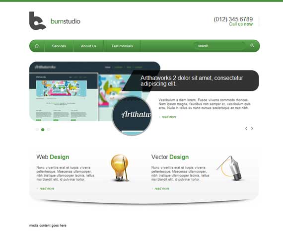
This is what we will be creating:

Design an Agency Landing Page in Photoshop
Resources you will need for the Photoshop part of this tutorial:
- Tutorial Source Files
- Home Icon
- Search Icon
- Map Illustration
- RSS Icon
- Macbook Air PSD
- Web Design Icon
- Vector Design Icon
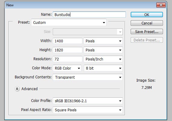
Step 1: Setting up the Document
Start by creating a 1400px x 1820px document in Photoshop.
Ruler Tool is very useful for this tutorial make sure that rulers and guides is turned on.
- Rulers: Ctrl + R
- Guides: Ctrl + ;
Also one thing important to note in using the Ruler Tool is the Info(Information) Panel.
The use of this is when you are measuring using the ruler; the information will be shown in the information panel. Make sure that this is shown in your panels to the right. If it is not shown you can access this by going to Windows – Info.
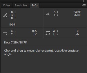
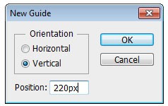
The total width of this site will be 960px. So, let’s create our first guide by going to View – New Guide, set the value to 220px.
Create another guide but now change the value to 1180px, this will make a total of 960px in the center of our canvas.
Step 2: Working on the Header
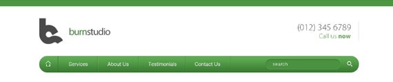
Our header will contain a logo, call to action, navigation, search.
Step 2.1:
Using Rectangle Tool(U) with a fill color of #4d9543, create a 100px by 10px shape and place it on the very top of the canvas.
Step 2.2:
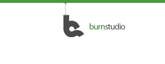
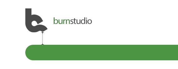
This is a personal logo that I’ll be using in this tutorial. For the Burnstudio text I used Myriad Pro 30pt, color #4d9543 and #4a4a4a. Feel free to create your own brand name using these font settings.
Once you have finished it, place the logo 40px below the green shape.
Step 2.3:
On the other side let’s add the call to action. The font I used for this is Kozuka Gothic Pro, 24pt. If you don’t have this font try to use Helvetica Thin/Light. Color will be #333333 and #4d9543.
Now, add your number and Call us now text using Text Tool(T).
I also added a 1px #c8c8c8 solid line 20px from the right side of the text. You want to align it with the logo.
Step 2.4:
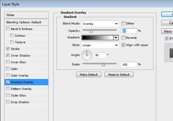
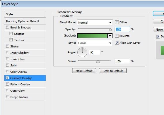
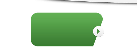
Next we’ll create the navigation. Select Rounded Rectangle Tool(U) and set the Radius to 30px. Now, create a 960px by 50px shape with a fill color of #4d9543. Place it 40px below the logo.
Step 2.5:
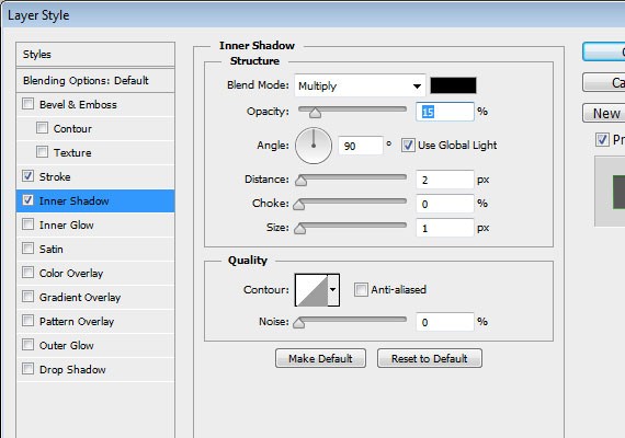
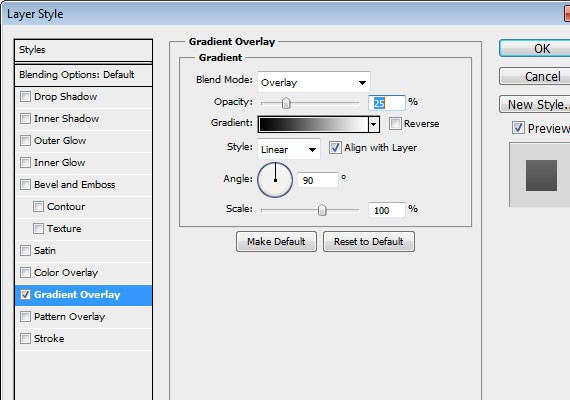
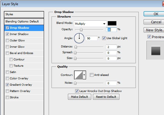
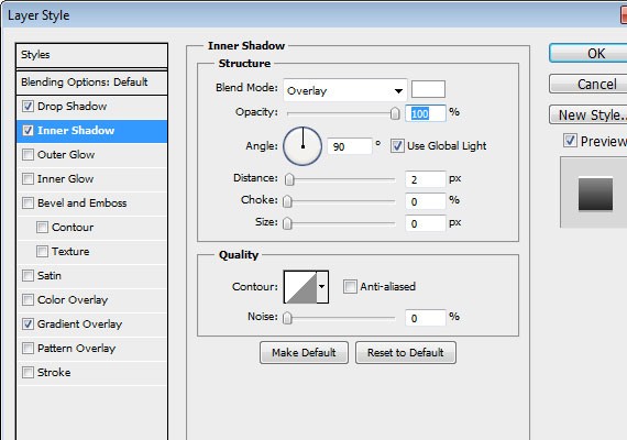
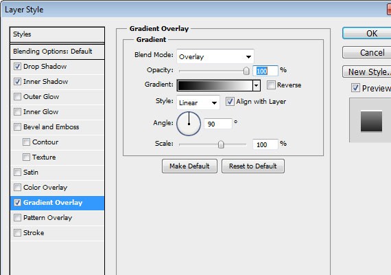
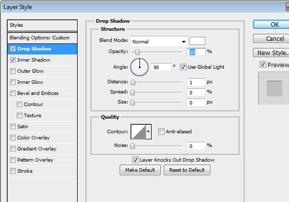
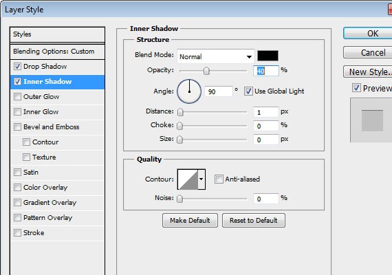
Apply these Blending Options:
- Stroke
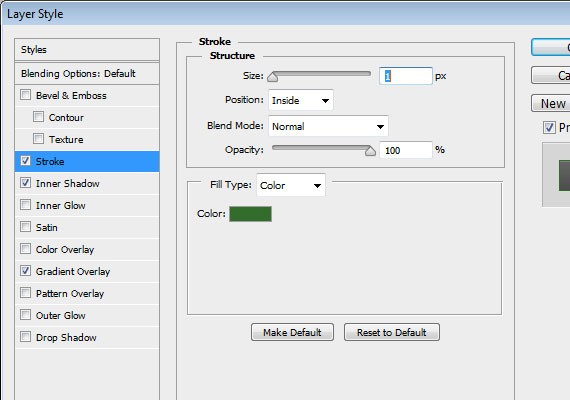
- Inner Shadow
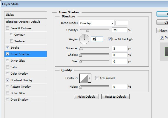
- Gradient Overlay
Step 2.6:
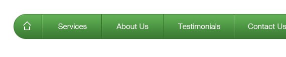
First you will need to add the home icon, followed by the links. The font I used is Helvetica Light, 15pt. Using Text Tool(T) add the following links. Note that each link has a 30px distance from the divider, so measure it using Ruler Tool(I).
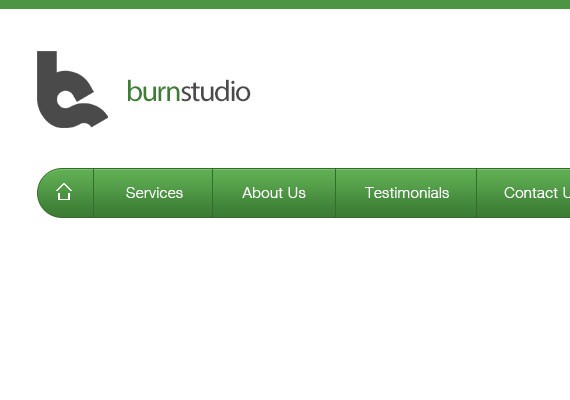
Step 2.7:
Duplicate the divider and move it 1px from the right and apply this Blending Option.
- Stroke
Result
Step 2.8:
To create the search bar, create a 225px by 30px shape using Rounded Rectangle Tool(U) with a fill color of #4b9241, place it 55px to the left. Add the (search) text using Text Tool(T), font is Helvetica 14pt. Then, place the Search Icon 20px to the left.
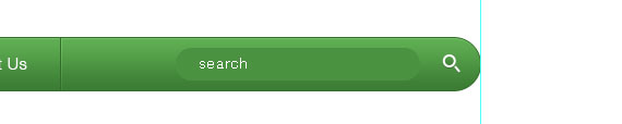
Step 2.9:
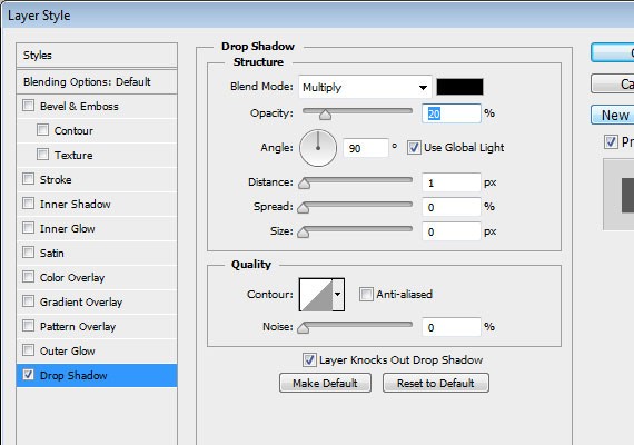
Apply this Blending Option to the search bar
- Stroke
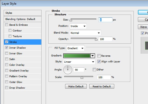
- Drop Shadow
Last step in this part is to add Drop Shadow on the icons and text to make it more crisp.
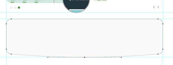
Step 3: Working on Slider
Step 3.1:
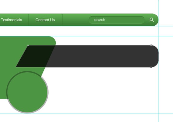
The slider part will be 300px high and 40px below the navigation, so go ahead and measure it with Ruler Tool(I).
Step 3.2:
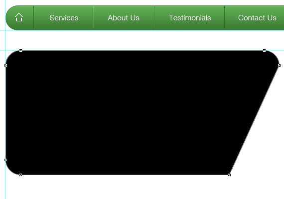
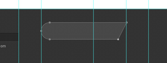
Once you’ve done it. Select Rounded Rectangle Tool(U) and create the same shape as shown in the screenshot below.
All you need to do is first create a 550px by 250px shape and customize the bottom right corner the same in the screenshot below using Direction Tool(A).
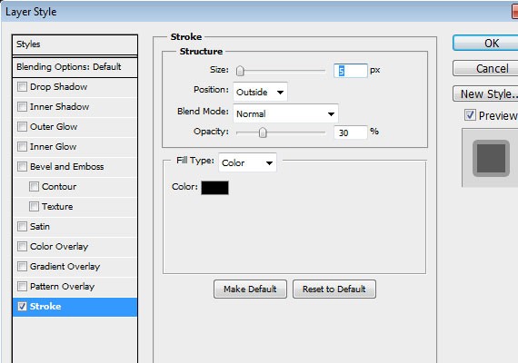
Step 3.3:
Next using Ellipse Tool(U) create a 160px by 160px shape. Fill color for this one doesn’t matter because we’ll be masking an image above it later. Place this shape at the center of the bottom right corner.
Apply these Blending Options
- Stroke
Result
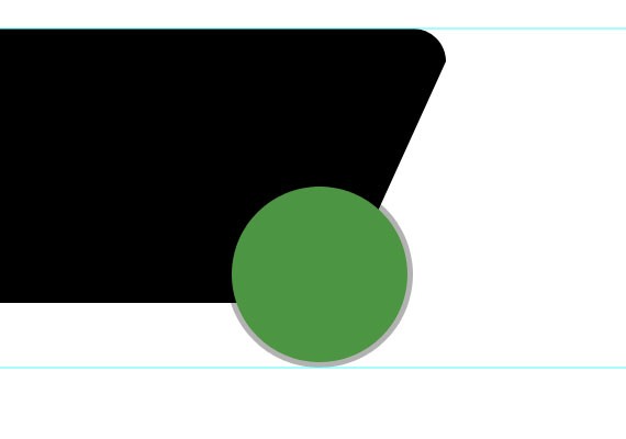
Step 3.4:
Create another shape using the same tool. Make sure the fill color is #000000 and change the opacity to 80%. For the purpose of the presentation I made it a green so that you can see how the shape will look. The shape size is 575px by 88px.
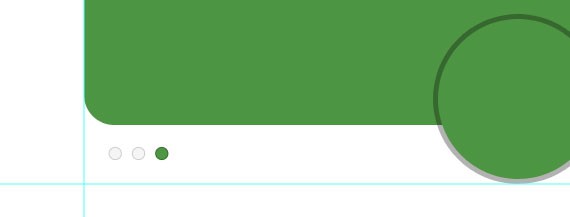
Step 3.5:
Next we will be adding the slider controls. Using Ellipse Tool(U) create a 3 13px by 13px shape. the normal state color will be #f5f5f5 and for the active is #4e9643. Place it as shown in the screen shot below.
Apply this Blending Option
- Stroke (Normal)
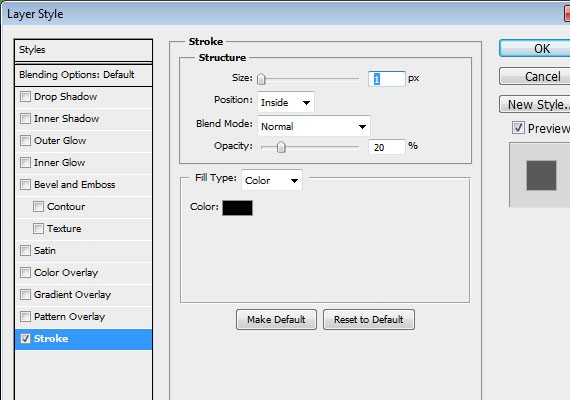
- Stroke (Active)
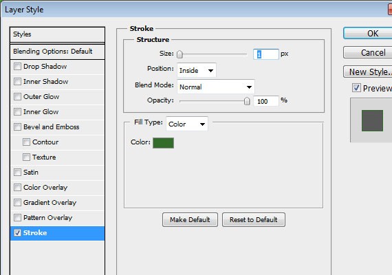
Result:
Step 3.6:
Next is the previous and next button. I created this using Pencil Tool(B). Normal state color will be #4f4c4d and for the Active the same green color. Place this as shown in the screenshot below.
Step 3.7:
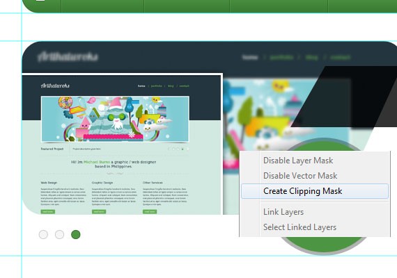
Now that we have all the shapes together let’s fill it with text and add an image. All you need to do is create a new layer above the shape and place your image there, then Right Click and click Create Clipping Mask. Do the same on the ellipse shape. I will leave it up to you what image you use.
Step 3.8:
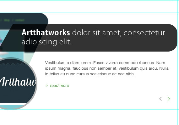
Next let’s add the text. For the heading title I used the same font as the call to action part, then for the paragraph I use Helvetica 13pt, #555555 and for the read more I made it Italic and used the same color green and added an arrow using Pencil Tool(B) beside it.
And that’s it for this slider part.
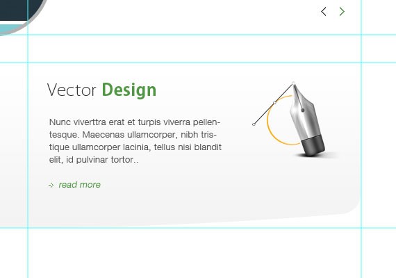
Step 4: Working on Services Area
Step 4.1:
The service area will be 240px high and 40px below the slider, so go ahead and measure it with Ruler Tool(I).
Step 4.2:
Using Rounded Rectangle Tool(U) with a fill color of #f9f9f9 create a shape as shown in the screen shot below.
Apply the following Blending Option
- Gradient Overlay

Step 4.3:
We will be dividing the shape into two so that we can align our service blocks properly. 960/2 is 480px, so go ahead and measure it with the Ruler Tool(I).
Add the following text and Icons as shown in the screen shot below. Note that text sizes and color are all the same so feel free to copy some elements as we did previously. Also the distance from the shape left and above is 30px.
- Web Design
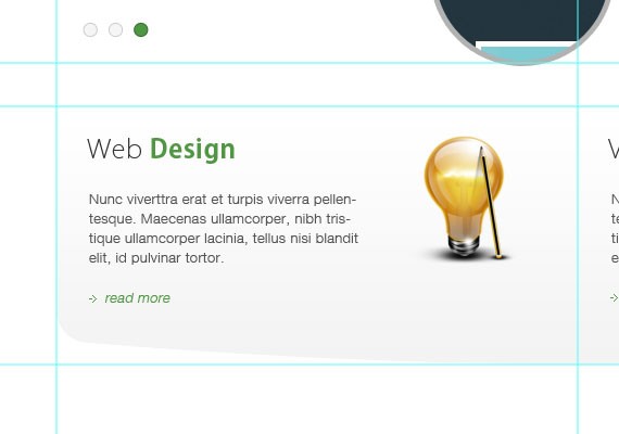
- Vector Design
Step 4.4:
Adding the shadow to the bottom part is very simple. All you need to do is duplicate the base shape and make the fill color #000000, place it below the original shape layer.
Next, Go to Filter – Blur – Gaussian Blur to 7.0, create a mask on the layer and brush over the part that we don’t nee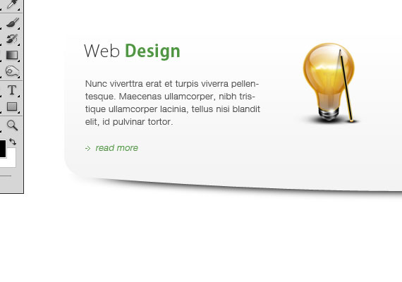
Step 5: Working on Media Section
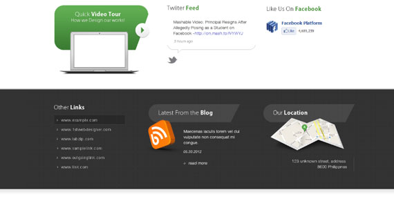
This part will be divided into 3 sections Video, Twitter & Facebook.
Step 5.1:
We will work first on the Video section. The video will take up 305px by 220px and the same distance from above. Go ahead and measure it with Ruler Tool(I).
Step 5.2:
Using Rounded Rectangle Tool(U) create a 300px by 145px shape as shown in the screen shot below with the same green color.
Apply this Blending Option
- Gradient Overlay
Step 5.3:
Next let’s create a play button. Using Ellipse Tool(U) create a 45px by 45px shape with a fill color of #f5f5f5.
Apply the following Blending Options:
- Drop Shadow
- Inner Shadow
- Gradient Overlay
I also added a play icon I created using the Pencil Tool(B) with the same green color.
Step 5.4:
Add some text with the same font, the size will be 18pt and 14pt. Lastly add the macbook air icon and place it as shown in the screen shot below.
Step 5.5:
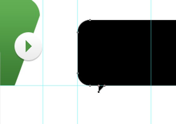
Now let’s design the Twitter feed. Select Rounded Rectangle Tool(U) change the Radius now to 20px. Create a 105px shape of width, the height will not matter. Now customize the shape by using Pen Tool(P) and Direct Selection Tool(A) and make a shape as shown in the screen shot below.
Step 5.6:
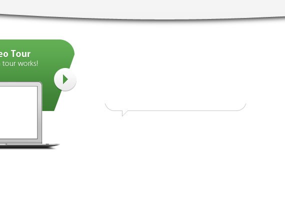
On the layers panel make the shape fill color to 0% and apply an inside stroke 1px solid #c8c8c8.
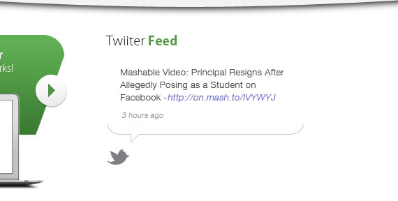
Step 5.7:
Now let’s add text and the Twitter icon. Place it as shown in the screenshot below. Heading font size is 18pt, paragraph 13pt and for the link color and the hours color is #6767c9, #999999.
Step 5.8:
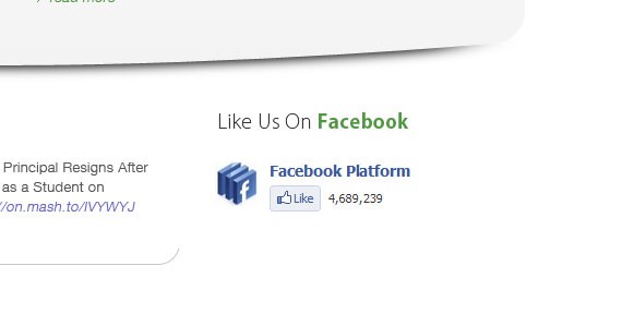
For the Facebook widget there’s nothing special I just took a screen shot in the widget page.
Step 6: Working on Links, Blog, Location Section
Step 6.1:
The footer will be 100px by 320px and 50px distance from top, so go ahead and measure it with Ruler Tool(I). Then, Fill the whole space using Rectangle Tool(U) with a fill color of #333333.
Apply this Blending Option
- Drop Shadow
Step 6.2:
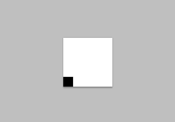
Let’s create a dotted pattern to apply in the shape. Create a new 5px by 5px transparent document and create a dot on the bottom left part of the canvas as shown in the screen shot below. Go to Edit – Define Pattern and apply this to the shape with a 30% Opacity.
Result
Step 6.3:
Now let’s work on the links section, the total width for this will be 225px. I used the same font style and size, the links have a distance of 25px from each other.
The distance of the heading from the top is 50px and 30px below. Also, I create an arrow shape using Pencil Tool(U) and add it beside the links.
Step 6.4:
Create a 225px by 29px shape with a fill color of #000000, lower down the fill color to 20%. Place it as shown in the screen shot below.
Apply this Blending Option
- Drop Shadow
- Inner Shadow
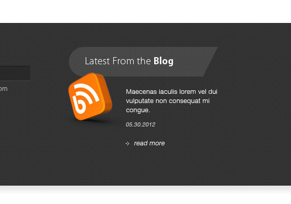
Step 6.5:
Now let’s proceed to blog section. Using Rounded Rectangle Tool(U) create a 292px by 58px shape as shown in the screenshot below. Fill color will be #ffffff and lower down the opacity to 10%. Distance from the links section is 77px.
Step 6.6:
Add the icon and fill it with text using Text Tool(T). For the date color #cccccc and for the link is #ffffff.
Step 6.7:
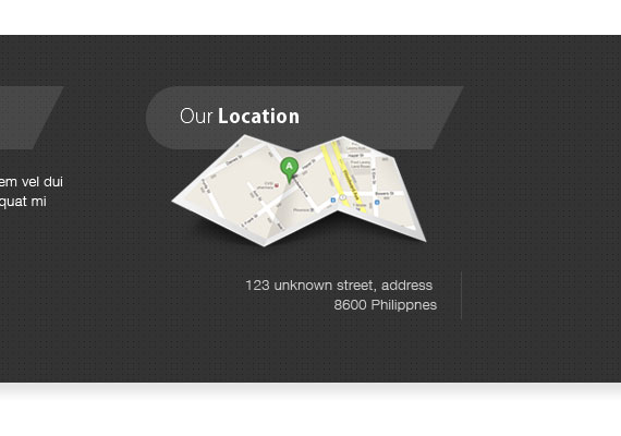
For the location just duplicate the heading and change the text to (Our Location). Add the map Icon. I already customized the map to show where is my exact location so feel free to customize yours. For the text color will be #cccccc and for the line #484848.
Step 7: Working on Footer
Well, this part is very simple just take some sample Icons and desaturate it by going to Image – Adjustment – Desaturate or by pressing Ctrl + Shift + U. This section will take up 145px of height so, place the icons accordingly and make sure it is centered. Last thing is to add a 1px #c8c8c8 below and we’re done.
Step 7.1:
Text size 12pt, paragraph color #666666, distance from top 30px, distance from text 15px.
Step 7.2:
Text size 12pt, link color #666666, 2px #c8c8c8 bottom line border.
Step 7.3:
For the back to top button. I create it using Ellipse Tool(U), 30px by 30px shape. I apply 1px #bdbdbd inside stroke and create an arrow facing top using Pencil Tool(B).
We’re done with the Photoshop part, now onto creating this PSD into working HTML website!
5. Convert the Agency PSD into HTML
We will be coding this from scratch and by the end you will have an awesome and fully functional agency layout.
Resources You Will Need To Code This Website:
- PSD Download
- SlidesJS
- CSS Tools: Reset CSS
- Time and Patience :)
Step 1: Preparation for the PSD to HTML Tutorial
We all know that in converting PSD to HTML/CSS we will need to go back and forth in Photoshop (or other image editing tool) to measure the sizes, distance, and colours. So make sure you open up the PSD file in Adobe Photoshop.
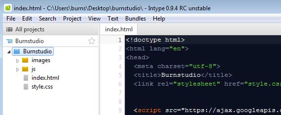
Of course you’ll need your favorite code editor and debugging tools. I used Intype as my text editor and for debugging tools I recommend Web Developer Toolbar and Firebug.
It is important to test code using different browsers every step of the way so that we can keep on track of our code. I used CSS3 styles in this tutorial, which should work in Chrome and Firefox. For IE6 trust me, it still looks fine.
Step 2: Getting Files Ready
You will need to create a directory folder and inside of it you should have /images directory for images and /js directory for JavaScript. I placed the CSS file in the root folder including the HTML file.
Also we need to export the images to be used in the PSD file. For example the The Logo, you will need to select the layer from the layers panel, copy and paste it in a different document and CTRL + ALT + SHIFT + S in order to save for web and devices, the appropriate file type for the logo should be .png. But if you’re tired of doing this you can just download the files and use the images I already exported.
Step 3: Simple Starter Layout
To build our HTML layout we should first analyze our design by looking at the Photoshop layout and identify the sections that are unique.
- Background: you notice that the background is white.
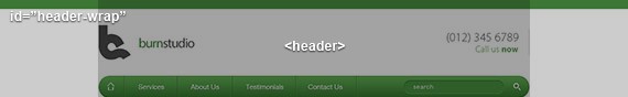
- Header: Notice that in this section the header has a green line on the top which covers the whole screen, so in order to do this we need to wrap the header with another container. The header contains logo, call to action, navigation and search.
Pay attention to the naming of id or class in every screenshot I made, these will be the names we will use when we markup the HTML.
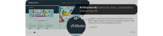
- Slides: for the slider we will be using SlideJS.
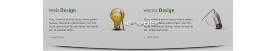
- Service: this section contains 2 columns for web design and vector design.
- Media: this section is divided into 3 columns for video, Twitter, and Facebook.
- Notice the above section slides, services, and media are positioned in the center, so we will wrap them with a div and name it container.
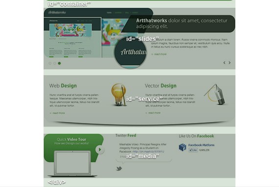
- Widget: this section is divided into 3 columns for links, blog, and location. Also you will notice it is covered with a gray dotted pattern that covers the whole screen.
- Client: In this section you will notice there is a solid gray border on the bottom that covers the entire screen and a list of clients logo.

- Footer: Finally, the footer which contain 2 columns for copyright, footer links, and back to top arrow.
Here is the image of the overall markup that we have done.
Now, Based on these notes we create the following HTML layout.
<!doctype HTML>
	<html lang="en">
	<head>
	  <meta charset="utf-8">
	  <title>Burnstudio</title>
	  <link rel="stylesheet" href="style.css">
	</head>
<body>
<div id="header-wrap">
<header>
header content goes here
</header>
</div>
<!-- end header wrap -->
<div id="container">
<div id="slides">
slides content goes here
</div>
<!-- end slides -->
<div id="service">
service content goes here
</div>
<!-- end service-->
<div id="media">
media content goes here
</div>
<!-- end media -->
</div>
<!--! end container -->
<div id="widget-wrap">
<div id="widget">
widget content goes here
</div>
<!-- end widget -->
</div>
<!--! end widget-wrap -->
<div id="client-wrap">
<div id="client">
widget content goes here
</div>
<!-- end client -->
</div>
<!--! end client-wrap -->
<footer>
footer content goes here
</footer>
</body>
</html>
Notice that the naming of the divs in every section is based on the naming we did earlier when we analyzed the PSD layout. Note that this layout is a fixed width of 960px. I know it would be better if we used a CSS framework for this project. But like I have said, we will do it from scratch.
Step 4: Working on Header Section
Now lets focus more on the header section we will mark up the HTML elements that can be found in this section.
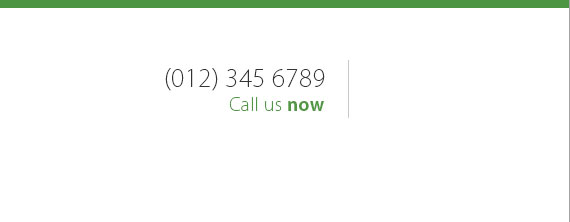
<h1><a href="index.html" title="burnstudio">Burnstudio</a></h1>
<div id="call">
<h3>(012) 345 6789</h3>
<h4 class="green">Call us <strong>now</strong></h4>
</div>
<!-- end call -->
<nav class="group">
<ul>
<li class="home"><a href="#">Home</a></li>
<li><a href="#">Services</a></li>
<li><a href="#">About Us</a></li>
<li><a href="#">Testimonials</a></li>
<li class="last">
<div>
<input type="text" name="search" placeholder="search" />
<input type="submit" name="search" value="go" class="search"/>
</div>
</li>
</ul>
</nav>
In the above HTML I just followed what I saw in Photoshop. First is the Logo, since the logo is clickable I added <a> tag inside the h2. Followed by the the call number which is wrapped in a div with an id of call. Lastly I created a <ul> list which contain links and the search.
Now let’s add the CSS as follows:
All CSS should be added in the style.css file. Also, make sure you just copy the CSS reset which I provided in the resources and place it in style.css file.
body{
	background: #fff;
	font-family: Helvetica, Arial, sans-serif;
	font-size: 13px;
}
/* FONT STYLES*/
h3{
	font-size: 24px;
	font-family: Helvetica, Arial, sans-serif;
	color: #333333;
	margin-bottom: 25px;
}
h4{
	margin-bottom: 25px;
	font-size: 18px;
	font-family: Helvetica, Arial, sans-serif;
}
h5{
	font-size: 14px;
	font-family: Helvetica, Arial, sans-serif;
}
p{
	font-size: 13px;
	color: #555555;
	line-height: 18px;
}
a, a:link, a:visited{
	text-decoration: none;
	outline: none;
}
.green{
	color: #509743;
}
.white{
	color: #fff;
}
strong{
	font-weight: bold;
}
/* END FONTS STYLES */
In the above CSS, since we have reset styles we need to style our text formats. I know that we used a different font for our headings and I don’t think Google fonts support Kozuka Gothic. But for now we will replace it with Helvetica.
Notice also I added the classes green and white, this will be used when we style green or white text that can be seen in the design.
When you test it you will have something that looks like the screenshot below.
/* HEADER */
#header-wrap{
	border-top: 10px solid #4d9543;
	padding-top: 40px;
}
header{
	width: 960px;
	margin: 0 auto;
	padding: 0;
}
header h2 a{
	display: block;
	text-indent: -999999px;
	background: url(images/logo.png) no-repeat;
	width: 214px;
	height: 77px;
	float: left;
	margin-bottom: 40px;
}
#call{
	float: right;
	border-right: 1px solid #c8c8c8;
	padding-right: 25px;
	margin-top: 20px;
}
#call h3{
	margin: 0;
}
#call h4{
	text-align: right;
	margin: 0;
}
nav{
	clear: both;
	width: 960px;
	height: 50px;
	-moz-border-radius: 30px;
	-webkit-border-radius: 30px;
	background-color: #3b7c33; /* Fallback */
	border-radius: 30px;
	/* Safari 4+, Chrome 1-9 */
	background-image: -webkit-gradient(linear, 0% 0%, 0% 100%, from(#5fae53), to(#3b7c33));
	/* Safari 5.1+, Mobile Safari, Chrome 10+ */
	background-image: -webkit-linear-gradient(top, #5fae53, #3b7c33);
	/* Firefox 3.6+ */
	background-image: -moz-linear-gradient(top, #5fae53, #3b7c33);
	/* IE 10+ */
	background-image: -ms-linear-gradient(top, #5fae53, #3b7c33);
	/* Opera 11.10+ */
	background-image: -o-linear-gradient(top, #5fae53, #3b7c33);
	border: 1px solid #336c2b;
}
nav ul li{
	float: left;
	border-right: 1px solid #336c2b;
	border-left: 1px solid #78c368;
}
nav ul li.home{
	border-left: none;
	text-indent: -9999px;
	background: url(images/home.png) no-repeat 50% 50%;
}
nav ul li.last{
	border-left: none;
	border-right: none;
	float: right;
	margin-right: 20px;
}
nav ul li a{
	display: block;
	padding: 0 30px;
	height: 50px;
	line-height: 50px;
	font-size: 15px;
	color: #fff;
	text-shadow: 0 1px 0 #387031;
}
nav ul li a:hover{
	background: #5fae53;
}
nav ul li.home a:hover{
	-webkit-border-top-left-radius: 30px;
	-webkit-border-bottom-left-radius: 30px;
	border-top-left-radius: 30px;
	border-bottom-left-radius: 30px;
	background: #5fae53 url(images/home.png) no-repeat 50% 50%;
}
nav ul li div input[type=text]{
	-webkit-border-radius: 20px;
	-moz-border-radius: 20px;
	background: #4b9241;
	border-left: none;
	border-right: none;
	border-bottom: 1px solid #5ead52;
	border-top: 1px solid #346d2c;
	color: #fff;
	text-shadow: 0 1px 0 #387031;
	padding: 5px 0 5px 20px;
	width: 200px;
}
nav ul li div input[type=text]:focus{
	outline: none;
}
/* TO STYLE PLACE HOLDER */
::-webkit-input-placeholder {
   color: #fff;
}
:-moz-placeholder {
   color: #fff;
}
nav ul li div input[type=submit]{
	background: url(images/search.png) no-repeat 50% 50%;
	border: none;
	text-indent: -999999px;
	margin-left: 15px;
	height: 50px;
	width: 16px;
}
/* END HEADER */
In the above CSS I styled header-wrap with a 10px green border, since a div by default is styled in a block display this will fill the whole width of the screen.
Then I centered the header with margin: 0 auto. Next, I styled the Logo with a fixed width and height. I also floated it the left.
For the Call I floated it right and apply a 1px gray border also a 25px padding from right. Note that to get this value you need to go back to Photoshop and use the Ruler Tool(I) to measure the distance. Since I styled the h3 and h4 with a 25px bottom margin in our base text format we need to reset it and change it to 0.
This will make the h4 and h3 in the call section back to normal.
Next, I styled the navigation with a fixed width, height and a gradient, I applied a clear both to clear the above floating elements logo & call.
All li are floated left except for the last li element, also it has a left and right border except for the the home there is no left border and for the last there is no right border.
All a is styled 30px padding from left and right 0 for top and bottom, a height of 50, a text shadow, a line-height of 50 to make it center vertically. For the class home I pushed out the text and replace it with the home icon.
Since the corner is rounded we need to specify another style hover for the home button that’s what I did below the a:hover.
Lastly, I styled the search input with a rounded radius, a green background, dark border on top and light border on bottom. Also to target placeholder attribute refer to the CSS which I comment to style place holder this is a part of css3 property.
Before previewing this to IE lower versions make sure to copy and paste the code below in the header section of our HTML file. This will enable HTML5 elements to work in older IE browsers.
<!--[if IE]>
	<script type="text/javascript">
	(function(){
	var html5elmeents = "address|article|aside|audio|canvas|command|datalist|details|dialog|figure|figcaption|footer|header|hgroup|keygen|mark|meter|menu|nav|progress|ruby|section|time|video".split('|');
	for(var i = 0; i < html5elmeents.length; i++){
	document.createElement(html5elmeents[i]);
	}
	}
	)();
	</script>
	<![endif]-->
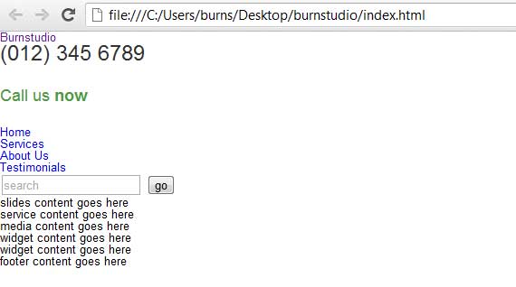
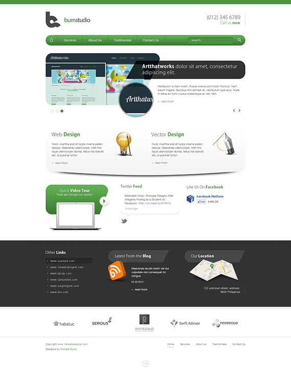
Now our layout should look like this.
Step 5: Working on Slider Section
Now let’s add the content inside the slides element, here’s the HTML:
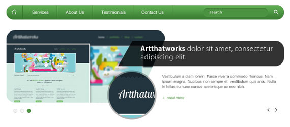
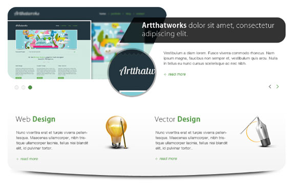
<div class="slides_container">
<div>
<img src="https://1stwebdesigner.com/wp-content/uploads/2012/09/slide1.png" alt="slide1" />
<div class="slide-right">
<h1 class="slide-heading">Artthatworks 1 dolor sit amet, consectetur adipiscing elit.</h1>
Vestibulum a diam lorem. Fusce viverra commodo rhoncus. Nam ipsum magna, faucibus non semper et, vestibulum quis arcu. Nulla in tellus eu nunc cursus scelerisque ac nec nibh.
<a href="#" class="readmore">read more</a>
</div>
</div>
<div>
<img src="https://1stwebdesigner.com/wp-content/uploads/2012/09/slide1.png" alt="slide1" />
<div class="slide-right">
<h1 class="slide-heading">Artthatworks 2 dolor sit amet, consectetur adipiscing elit.</h1>
Vestibulum a diam lorem. Fusce viverra commodo rhoncus. Nam ipsum magna, faucibus non semper et, vestibulum quis arcu. Nulla in tellus eu nunc cursus scelerisque ac nec nibh.
<a href="#" class="readmore">read more</a>
</div>
</div>
<div>
<img src="https://1stwebdesigner.com/wp-content/uploads/2012/09/slide1.png" alt="slide1" />
<div class="slide-right">
<h1 class="slide-heading">Artthatworks 3 dolor sit amet, consectetur adipiscing elit.</h1>
Vestibulum a diam lorem. Fusce viverra commodo rhoncus. Nam ipsum magna, faucibus non semper et, vestibulum quis arcu. Nulla in tellus eu nunc cursus scelerisque ac nec nibh.
<a href="#" class="readmore">read more</a>
</div>
</div>
</div>
<!-- end slides container -->
In the above HTML markup I added a class slides_container this will hold our slides elements which is wrapped by a div that contains an image, a div class of slides-right that holds the slide title, info, and read more link.
Also I added a class for the heading slide-heading, paragraph info and for the read more readmore. This will be helpful since we will repeat the HTML code 3 times and they will have the same styles if we add the CSS later.
Now let’s style all the element, here’s the CSS.
#container{
	width: 960px;
	margin: 0 auto;
}
/* SLIDES */
#slides{
	position: relative;
	margin-top: 40px;
}
.slides_container{
	height: 315px;
}
.slide-right{
	position: absolute;
	top: 0;
	left: 385px;
}
.slide-heading{
	background: url(images/slide-heading.png) no-repeat;
	width: 494px;
	height: 68px;
	color: #fff;
	font-size: 24px;
	padding-top: 20px;
	padding-left: 80px;
	margin-top: 35px;
	margin-bottom: 30px;
}
.slide-right .info{
	width: 395px;
	margin-bottom: 20px;
	margin-left: 155px;
}
.slide-right .readmore{
	margin-left: 155px;
}
.readmore{
	font-style: italic;
	text-decoration: none;
	color: #509743;
	padding-left: 15px;
	background: url(images/more.png) no-repeat 0 50%;
}
.readmore:hover{
	color: #c8c8c8;
}
.pagination{
	position: absolute;
	bottom: 25px;
	left: 25px;
	z-index: 99;
}
ul.pagination li{
	float: left;
	margin-right: 10px;
	background: url(images/pagination.png) no-repeat;
	background-position: top;
	width: 14px;
	height: 15px;
}
ul.pagination li.current{
	background-position: bottom;
}
ul.pagination li a{
	display: block;
	text-indent: -999999px;
}
a.next{
	position: absolute;
	right: 25px;
	bottom: 30px;
	display: block;
	width: 7px;
	height: 13px;
	background: transparent url(images/prev-next.png) no-repeat;
	background-position: top right;
	text-indent: -9999px;
}
a.prev{
	position: absolute;
	right: 50px;
	bottom: 30px;
	display: block;
	width: 7px;
	height: 13px;
	background: transparent url(images/prev-next.png) no-repeat;
	background-position: top left;
	text-indent: -9999px;
}
a.next:hover{
	background-position: bottom right;
}
a.prev:hover{
	background-position: bottom left;
}
/* END SLIDES*/
In the above CSS since slides, service and media are wrapped with the container div, we will style this first to make them centered. Next, slide’s position is set to relative to make it the parent element.
This is helpful so that we can position the inside elements prev, next, and pagination absolutely which are auto-generated by the JavaScript. For the slides_container I gave it a fixed height of 315px which is equal to the height of the slider image.
For the slide-right which contains the heading, info and read more, all positioned absolutely, 0 out top, and pushed it 385px from left.
For the slide-heading I gave it a fixed width and height equal to the background image, and gave it a padding to make the text align properly, also a margin to give a space and align it correctly.
For .info I gave it a fixed width with margin to align it. For .readmore first I gave it a separate margin style since only the slider readmore has this and all of the readmore links in the layout has no margins from left. Then followed by the readmore styling which has a green color with background arrow and a gray hover.
For the pagination, prev, and next buttons this is auto-generated by the JavaScript in order to style this first we need to identify what is the tag or the applied html class attribute.
To do this you need to used the Firebug tool if you’re using Firefox, if you’re using Chrome just right click to the element and click Inspect Element a dialog will appear and you can see there what element is being used.
Now that you know the element, we will target it in the CSS. For the Pagination I positioned it absolutely, placed it 25px from the bottom and left, also I applied z-index 99px – this will make the pagination right on the very top over the other elements.
If we’re not going to apply this notice that it is not clickable because the image is on top of the pagination itself. Then I floated the pagination li elements to left, gave it a right margin of 10px, added a background image with a fixed width and height.
I positioned the background by default to top since the normal state image is on top, for the current or the active state we will be going to reverse the positioning from top to bottom and lastly display it as a block level element and hide the text.
For the .next and .prev pretty much the same we did in pagination but this time it is positioned to the right.
Noticed the prev-next.png on the left side this contains the image of prev button and on the right side this contains the image of the next button.
I positioned the .next image to top right, .prev positioned to top-left, and for the hover just change the top to bottom.
Now let’s add the required jQuery script in the header. Copy the slides.min.jquery.js file from the /source directory and paste it in our /js directory.
Finally, we need to add the JavaScript code that will allow the slider to work on our layout. You should add this script just before the . Here’s the JavaScript.
<script>
$(function(){$('#slides').slides({preload: true,generateNextPrev: true,});});
</script>
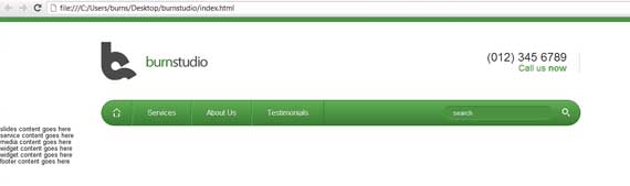
Now our layout should look like this.
Step 6: Working on Service Section
Now let’s add the content inside the service element, here’s the HTML.
<div id="web">
<img src="images/web.png" />
<h3>Web <strong><span class="green">Design</span></strong></h3>
Nunc viverttra erat et turpis viverra pellentesque. Maecenas ullamcorper, nibh tristique ullamcorper lacinia, tellus nisi blandit elit, id pulvinar tortor.
<a href="#" class="readmore">read more</a>
</div>
<!-- end web -->
<div id="vector">
<img src="images/vector.png" />
<h3>Vector <strong><span class="green">Design</span></strong></h3>
Nunc viverttra erat et turpis viverra pellentesque. Maecenas ullamcorper, nibh tristique ullamcorper lacinia, tellus nisi blandit elit, id pulvinar tortor.
<a href="#" class="readmore">read more</a>
</div>
<!-- end vector -->
I created a unique div id web and vector which contains the same elements such as an image, headings, paragraphs and readmore link. In the heading you can see I added a span and applied a class of green since the heading is combined with different colour. For the read more link we apply the same class we did in the slider area.
Now let’s style all the element, here’s the CSS.
/* SERVICE */
#service{
	margin: 40px auto;
	height: 253px;
	padding-top: 30px;
	background: url(images/service-bg.jpg) no-repeat;
}
#web{
	float: left;
	width: 450px;
	padding-left: 30px;
}
#web p{
	width: 260px;
	margin-bottom: 20px;
}
#web img{
	float: right;
	margin-right: 50px;
}
#vector{
	float: right;
	padding-left: 30px;
	width: 450px;
}
#vector p{
	width: 260px;
	margin-bottom: 20px;
}
#vector img{
	float: right;
	margin-right: 50px;
}
/* END SERIVCE*/
I styled the service div 40px from above to bottom and added an auto left and right, I also added a height that is equal to the background image. For the web div I floated it to the left and gave it a 50% width of the parent div, the same with the vector div but floated to the right.
For the paragraph I gave it a fixed width with a margin, for the image I floated it right and give it a right margin, pretty much the same on vector image and text.
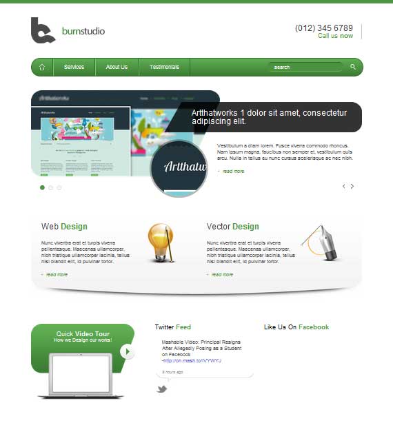
Now our layout should look like this.
Step 7: Working on Media Section
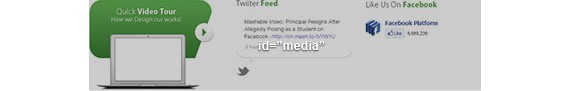
Now let’s add the content inside the media element, here’s the HTML.
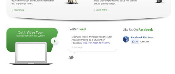
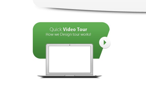
<div id="media" class="group">
<div id="video">
<h4>Quick<strong>Video Tour</strong></h4>
<h5>How we Design our works!</h5>
<a href="#" class="play"><img src="images/play.png" alt="play" /></a>
</div>
<div id="twitter">
<h4>Twitter <strong><span class="green">Feed</span></strong></h4>
Mashable Video: Principal Resigns After Allegedly Posing as a Student on Facebook -<a href="#" class="t-link">http://on.mash.to/IVYWYJ</a>
9 hours ago
</div>
<div id="facebook">
<h4>Like Us On <strong><span class="green">Facebook</span></strong></h4>
</div>
</div>
<!-- end media -->
I created 3 different sections: video div which contains text headings h4, h5 and a clickable image for play button, twitter div which contains a heading and a paragraph, lastly a facebook div which contains a heading and if you wish to add your widget you can add it by going to Facebook plugins.
Also, I added a class group on the media div. I’ll show you what that does when we move on to the CSS.
Now let’s style all the elements, here’s the CSS.
/* MEDIA  */
#media{
	margin: 0 auto;
}
#video{
	width: 302px;
	padding-top: 20px;
	float: left;
	margin-right: 58px;
	background: transparent url(images/video-bg.png) no-repeat;
	height: 225px;
}
#video h4{
	margin: 0;
}
#video h4, #video h5{
	text-align: center;
	color: #fff;
	text-shadow: 0 1px 0 #387031;;
}
#video .play{
	float: right;
	margin-top: 5px;
}
#twitter{
	width: 285px;
	height: 180px;
	float: left;
	margin-right: 30px;
	background: transparent url(images/twitter-bg.png) no-repeat;
	background-position: bottom;
	padding: 0 0 20px 0;
}
#twitter p{
	padding: 0 20px;
}
#twitter .time{
	font-size: 11px;
	font-style: italic;
	color: #999999;
	margin-top: 15px;
}
a.t-link{ color: #6767c9; text-decoration: none; }
a.t-link:hover{ text-decoration: underline; }
#facebook{
width: 285px;
float: right;
}
/* END MEDIA*/
/* CLEAR FIX */
.group:after {
  content: "";
  display: table;
  clear: both;
}
/* END FIX */
I styled the video div with a fixed width and height of 302px x 225px, gave it padding, floated it to the left and lastly added a background image. I styled h4 and h5 centered and added a dropshadow, for the play button which has a class of .play I floated it to the right and added a margin to position it on the right.
For twitter div I gave it a fixed width and height of 258px by 180px and added a background image positioned in bottom, also I gave the .time with a smaller font and lighter caller, also for the a.t-link which has a blue color. For facebook this is the same to twitter heading and floated to right.
The purpose of the group class is to force the element to self-clear its children a.k.a clearfix. What this means is the media is the parent element which holds child elements inside of it that are floating left this are video, twitter and facebook. The media element doesn’t determine it’s height when we apply that clearfix hack this will identify the automatically identify the maximum height of the child element.
Now our layout should look like this.
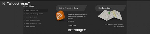
Step 8: Working on Widget Section
Now let’s add the content inside the widget element, here’s the HTML.
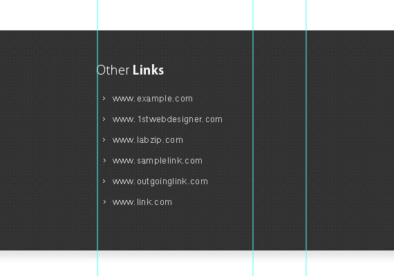
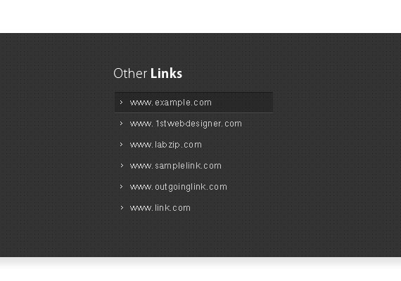
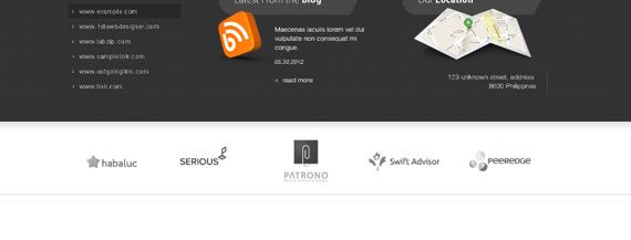
<div id="widget-wrap" class="group">
<div id="widget">
<div id="links">
<h4 class="white">Other <strong>Links</strong></h4>
<ul>
<li><a href="#">www.example.com</a></li>
<li><a href="#">www.1stwebdesigner.com</a></li>
<li><a href="#">www.labzip.com</a></li>
<li><a href="#">www.samplelink.com</a></li>
<li><a href="#">www.outgoinglink.com</a></li>
<li><a href="#">www.link.com</a></li>
</ul>
</div>
<div id="blog">
<h4 class="footer-header white">Latest From The <strong>Blog</strong></h4>
<img src="images/blog.png" alt="blog" />
Maecenas iaculis lorem vel dui vulputate non consequat mi congue.
05.30.2012
<a href="#" class="readmore">read more</a>
</div>
<!-- end blog -->
<div id="location">
<h4 class="footer-header white">Our <strong>Location</strong></h4>
<img src="images/map.png" alt="map" />
123 unknown street, address
</br> 8600 Philippnes
</div>
<!-- end location -->
</div>
<!-- end widget -->
</div>
<!--! end widget-wrap -->
I added a class group to widget-wrap, you already know what this class does. Next I created 3 div links which contains an unordered list, blog which contains a heading, image, title, date and read more link.
Lastly, location which contain an image, and the address.
Now let’s style all the element, here’s the CSS.
/* WIDGET */
#widget-wrap{
	padding: 50px 0;
	background: #333333 url(images/widget-bg.jpg);
}
#widget{
	width: 960px;
	margin: 0 auto;
}
h4.footer-header{
	background: transparent url(images/footer-header.png) no-repeat;
	line-height: 58px;
	text-indent: 30px;
}
#links{
	width: 225px;
	float: left;
	margin-right: 75px;
}
#links ul{
	list-style-image: url(images/links.png);
	margin-left: 15px;
}
#links ul li a{
	color: #cccccc;
	font-size: 13px;
	padding: 8px 0;
	display: block;
}
#links ul li a:hover{
	color: #fff;
}
#blog{
	position: relative;
	width: 290px;
	float: left;
	margin-right: 75px;
}
#blog img{
	position: absolute;
	top: 50px;
	left: -18px;
}
#blog p.title{
	color: #fff;
	margin-left: 110px;
	margin-bottom: 15px;
}
#blog p.date{
	margin-left: 110px;
	color: #cccccc;
	font-style: italic;
	font-size: 11px;
	margin-bottom: 15px;
}
#blog a.readmore{
	margin-left: 110px;
}
#location{
	position: relative;
	width: 290px;
	float: right;
}
#location img{
	position: absolute;
	top: 45px;
	left: 22px;
}
#location p.address{
	margin-top: 115px;
	border-right: 1px solid #484848;
	padding-right: 20px;
	text-align: right;
	color: #cccccc;
}
/* END WIDGET */
I styled widget-wrap div with a padding of 50px top and bottom and added a gray dotted pattern background. For the widget div I appled 960px width and position it centered. For the links div I gave it a width of 225px, floated it to left and give it a right margin 75px, for the ul list.
I added a background image, also I styled the a with a lighter gray and hover of white (I didn’t follow the hover effect in the PSD design).
For the blog div I gave it a width of 290px, floated it to left, apply a 75px margin and position it relatively. For the heading I added a backround, indented the text, and added 58px line height to make the text centered vertically.
For the blog img since we just positioned blog div to relative we can now position this absolutely to position the image the same to psd design which is left 18px. For the .title, .date and .readmore they have the same margins from left. For the location the same also in blog where it is positioned relatively and position the inside image absolutely, and for the address I added margin and paddings and give it a 1px border to the right.
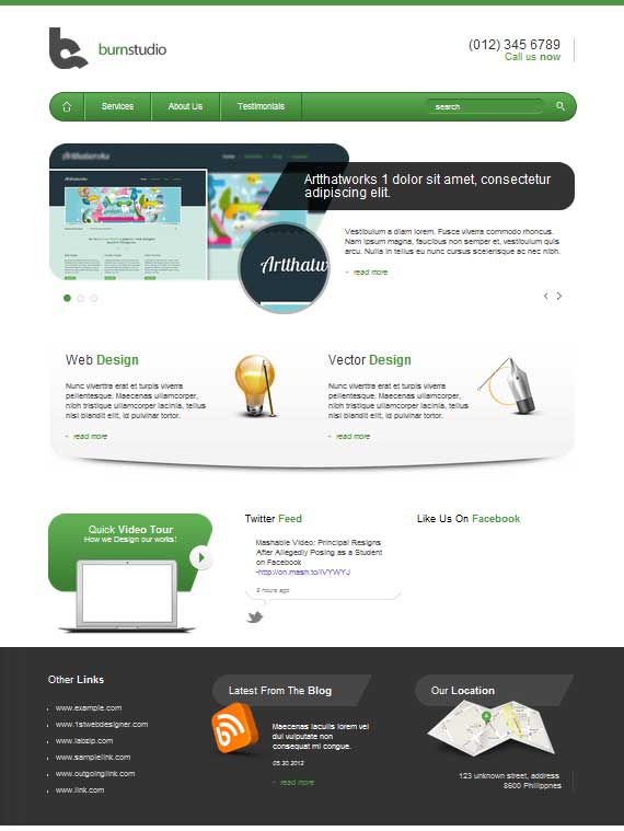
Now our layout should look like this.
Step 9: Working on Client Section
Now let’s add the content inside the client element, here’s the HTML.
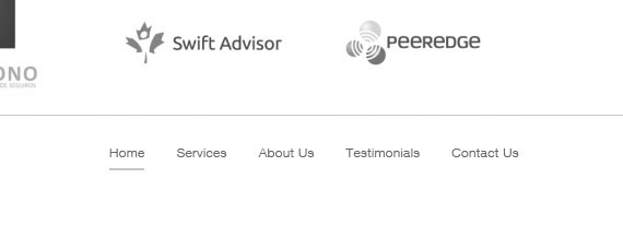
<div id="client-wrap" class="group">
<div id="client">
<ul>
<li><img src="images/client-1.jpg" alt="" /></li>
<li><img src="images/client-2.jpg" alt="" /></li>
<li><img src="images/client-3.jpg" alt="" /></li>
<li><img src="images/client-4.jpg" alt="" /></li>
<li><img src="images/client-5.jpg" alt="" /></li>
</ul>
</div>
<!-- end client -->
</div>
<!-- end client-wrap -->
In above HTML I added again a group class on client-wrap div and added an unordered list element that contains an image.
Now let’s style all the element, here’s the CSS.
/* CLIENT */
#client-wrap{
	background: #fff url(images/client-bg.jpg) repeat-x;
	padding: 40px 0;
	border-bottom: 1px solid #c8c8c8;
}
#client{
	width: 960px;
	margin: 0 auto;
}
#client ul li{
	width: 20%;
	float: left;
	text-align: center;
}
/* END CLIENT */
In the above CSS I styled the client-wrap div by adding a little gray gradient background, padding top and bottom 40px and lastly added a solid gray bottom border.
I positioned center the client div and lastly for the unordered list elements which contains the images I floated it left, since we have 5 images I divided it evenly by giving a 20% width of each element, lastly I applied text-align to make the images center.
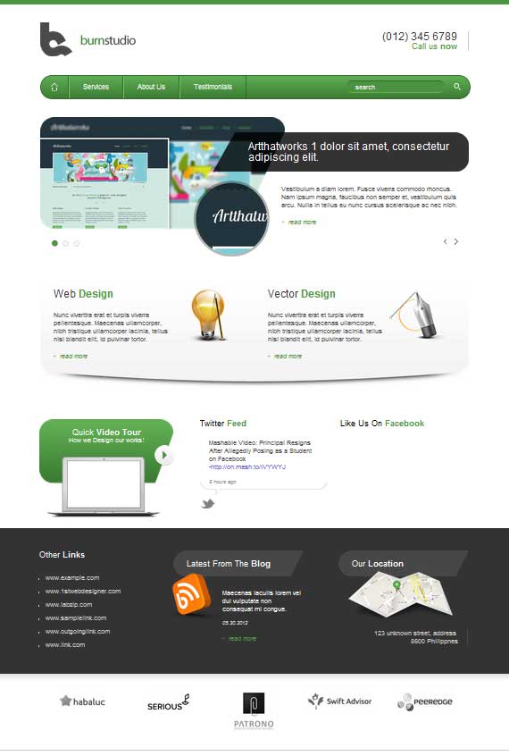
Now our layout should look like this.
Step 10: Working on the Footer Section
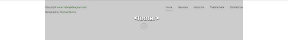
Now let’s add the content inside the footer element, here’s the HTML.
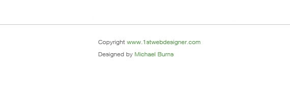
<footer class="group">
<div id="footer-left">
Copyright <a href="#" class="green">www.1stwebdesigner.com</a> </br>
Designed by <a href="#" class="green">Michael Burns</a>
</div>
<div id="footer-right">
<ul>
<li><a href="#">Home</a></li>
<li><a href="#">Services</a></li>
<li><a href="#">About Us</a></li>
<li><a href="#">Testimonials</a></li>
<li><a href="#">Contact Us</a></li>
</ul>
</div>
<a href="#header-wrap"><img src="images/back-top.png" alt="back-top" class="back-top" /></a>
</footer>
In above HTML I added a group class to footer, then created 2 section first is footer-left which contain the copyright text, next footer-right which contain an unordered list links. Lastly I added clickable back to top image.
Now let’s style all the element, here’s the CSS.
/* FOOTER */
footer{
	clear: both;
	width: 960px;
	margin: 0 auto;
	padding: 30px 0 60px 0;
	position: relative;
}
#footer-left{
	float: left;
	width: 50%;
}
#footer-left p{
	font-size: 12px;
	color: #666666;
}
#footer-left a:hover{
	color: #c8c8c8;
}
#footer-right{
	float: right;
	width: 50%;
}
#footer-right ul{
	float: right;
}
#footer-right ul li{
	float: left;
	margin-right: 30px;
}
#footer-right ul li:last-child{
	margin-right: 0;
}
#footer-right ul li a{
	color: #666666;
	display: block;
	padding-bottom: 10px;
	font-size: 12px;
}
#footer-right ul li a:hover{
	border-bottom: 2px solid #c8c8c8;
}
.back-top{
	position: absolute;
	bottom: 30px;
	right: 50%;

}
/* END FOOTER */
In above CSS I styled the footer by giving a width of 960px, centered it, applied a padding of 30px top and 60px bottom, lastly I positioned it relatively.
For the footer-left and footer-right I gave it a width of 50%, floated it left and right. For the copyright text I made it smaller and changed the color to a lighter one. For the links I floated the ul to the right and floated li to left, gave a margin of 30px, for the last-child I removed the margin, for the links I styled it the same with the copyright text and added 2px border when its hovered.
Lastly, since I positioned the footer relatively, I can position the back-top absolutely to the center which is right 50%.
Now our layout should look like this.
We’re done, Finally!
Whew! This took me so long to write. How was this PSD to HTML tutorial? I hope you learned something from this tutorial. If you have some techniques, comments, suggestions please share and drop it below. Also, for the next tutorial I’m going teach you how to make this layout responsive. Yeah! You heard it right, let’s make it responsive!
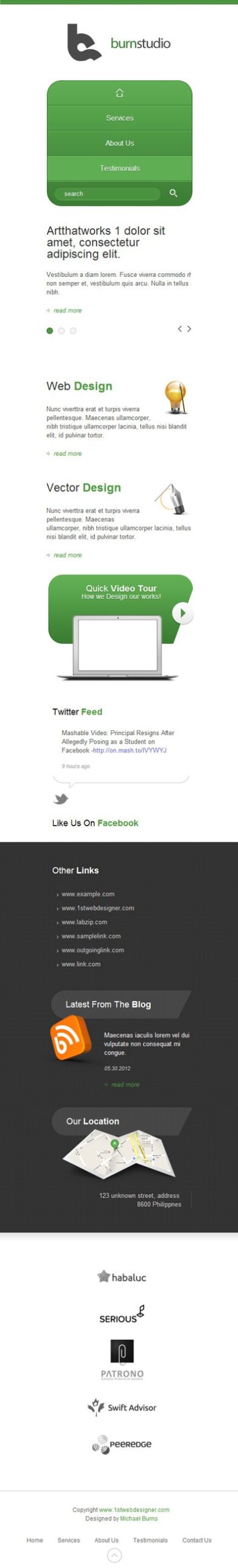
6. Make the Agency HTML Responsive
If you’re following the series, we have converted Burnstudio Design Agency from PSD to working HTML/CSS version. We have discussed how we will markup the HTML and how we will style it using CSS.
Now, in this last part of the tutorial I will show you how to make it Responsive by using Media Queries. Media Queries will change the look of the website depending on the screen resolution of the device: desktop to a mobile resolution by tweaking the CSS for a variety of viewports.
By the end of this media queries HTML tutorial you will learn how to convert any website into a responsive website.
Let’s get started!
Step 1: Preparation
Make sure that you followed the previous tutorial where we converted a PSD file into a working HTML/CSS website. Before anything else I want to point out that we need to design how it will look based on our existing design for a different viewport, in this case for a mobile device that has a max-width of 320px.
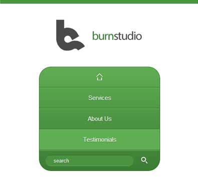
In the image above you can see the elements are the same but I styled it in a way that will suit the 320px width of a mobile version. For this tutorial we will not tackle the design process, we will jump into coding directly. Don’t worry, in my upcoming HTML tutorial I will teach you how to design for the responsive web.
Lastly, of course you still need your favorite code editor, debugging tools and lastly the web browser where we can view our coded layout.
Step 2: Getting Files Ready
Make sure you open up the HTML file and the CSS file in your text editor and we’re ready to go.
Step 3: Adding Meta Tag
<meta name="viewport" content="width=device-width, initial-scale=1, maximum-scale=1">
This will take control of the layout on mobile browsers. Place this inside the tag and you’re ready to go.
Step 4: Working < 960 Viewport
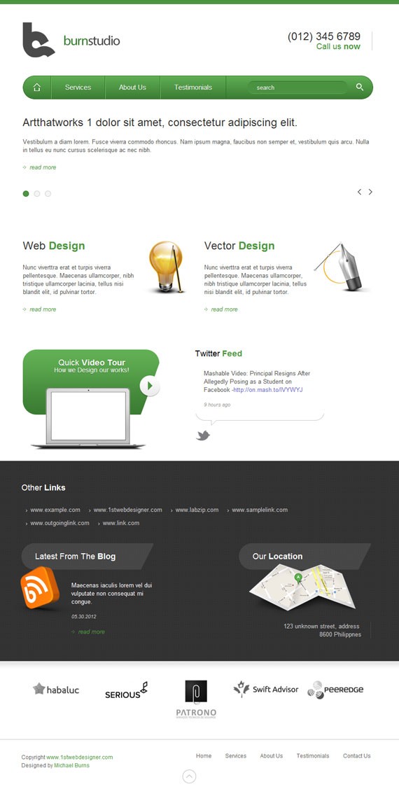
This is how our website layout will look on screens with a width of 960px and below.
@media only screen and (max-width: 960px){styling goes here}
This is our first media query that will target screens less than 960px.
Now let’s add the CSS styling as follows:
/* VIEWPORT < 960px */
@media only screen and (max-width: 960px){
header, nav, #slides, #service, #widget, #media, #client, footer, #container{ width: 768px; }
	.slide-right{
		left: 0;
	}
	.slide-heading{
		width: auto;
		height: auto;
		padding: 0;
		margin: 0 0 20px 0;
		background-image: none;
		color: #333;
	}
	.slides_container div img{
		display: none;
	}
	.slide-right .info{
		width: 768px;
		margin-bottom: 20px;
		margin-left: 0;
	}
	.slide-right .readmore{
		margin-left: 0;
	}
	.slides_container{
		height: 200px;
	}
	a.next{
		right: 0px;
	}
	a.prev{
		right: 25px;
	}
	.pagination{
		left: 0;
	}
	#service{
		background: none;
		height: auto;
	}
	#vector{
		padding-left: 0;
		width: 369px;
	}
	#vector img{
		margin-right: 0;
	}
	#web{
	padding-left: 0;
	width: 369px;
	}
	#web img{
		margin-right: 0;
	}
	#facebook{
		display: none;
	}
	#twitter{
		margin-left: 18px;
	}
	#blog{
		clear: both;
	}
	#links{
		width: auto;
		margin-bottom: 30px;
	}
	#links ul li{
		float: left;
		margin-right: 30px;
	}
}
Since our layout is now less than 960px, we will style all the main container elements by changing the width to 768px.
Next is the slider area, notice that we have a heading with a class of slide-heading, a div with a class of slide-right which contains the information and read more.
We need to change the style of this by removing the background of the heading and changing the fixed width/height to auto, zero out the padding, add a 20px margin, and lastly change the color to a dark gray.
For the img that displays on our slider we will hide it by changing the display to none. For the slide-right .info .readmore we will zero out the left margin to push it back to the left, also for the .info let’s change the width to 768px and add a 20px bottom margin.
For the slider controls let’s just move the next to right by change the right value to 0px, for the prev change the value to 25px. Lastly, for the pagination change the left value to 0px.
Moving on to the service section. When we’re coding the service section we forgot to add a group class to it’s parent container, we already know the function of the group class so no need to explain. For the CSS styling we will just remove the background and change the height value to auto.
<div id="service" class="group"/>
Inside of our service section we have vector and web that we styled by default by giving a padding of left 30px, let’s zero it out and change the width to 369px. Lastly, for the vector img and web img let’s change the margin right to zero.
In the media section since we don’t have enough space here let’s just hide facebook by changing the display to none. Maybe you’re wondering why hide it?
Well, I know we should find a way to make everything responsive, but based on what I have read from other blogs ,sometimes we need to remove/hide some elements due to lack of space, just like some other responsive sites, they remove a couple of links in their main navigation.
In widget section the only thing we need to change is the links, let’s change the default width to auto, then by floating the li elements to left and adding a 30px margin to right.
Step 5: Working < 768 Viewport
@media only screen and (max-width: 768px){styling goes here}
The above CSS is our second media query that will target screens less than 768px (Tablet Portrait).
Now let’s add the CSS Styling as follows:
/* VIEWPORT < 768px */
@media only screen and (max-width: 768px){
	header, nav, #slides, #service, #widget, #media, #client, footer, #container{
	width: 524px;
	}
	nav ul li.last{
	display: none;
	}
	.slides_container{
		height: 250px;
	}
	.slide-right .info{
		width: 524px;
	}
	#web{
		width: 100%;
		margin-bottom: 30px;
	}
	#web img{
		padding-left: 20px;
	}
	#vector{
		width: 100%;
	}
	#vector img{
		padding-left: 20px;
	}
	#service{
		height: auto;
	}
	#video{
		margin: 0 auto 30px auto;
		float: none;
	}
	#twitter, #facebook{
	float: none;
	margin: 0 auto;
	margin-bottom: 30px;
	}
	#facebook{
		display: block;
	}
	#links{
		width: 285px;
		float: none;
		margin: 0 auto;
	}
	#links ul li{
		width: 285px
	}
	#blog{
		float: none;
		margin: 30px auto;
	}
	#location{
		float: none;
		margin: 0 auto;
	}
	#client ul li{
		width: 100%;
		float: none;
		margin: 30px 0;
	}
	#footer-left{
		width: 100%;
		margin-bottom: 30px;
	}
	#footer-left p{
		text-align: center;
	}
	#footer-right{
		float: none;
		width: 100%;
		margin-bottom: 30px;
	}
	#footer-right ul{
		float: none;
		width: 75%;
		margin: 0 auto;
	}
}
The first step is similar to what we did in the previous one. Let’s change the width of the main containers to 524px.
Now that we are on a smaller viewport, which is less than 768px, our search bar will fall down the navigation. So for a quick solution let’s just hide it for now.
In slider area let’s decrease the height of the container to 250px and change the width of .info to 524px.
In web and vector section let’s change the width to 100% to fill up the whole space and by giving the web a 30px bottom margin to give space.
In media section by default our video div is floated to left let’s change it to none, position in to center, and add we will add a 30px bottom margin. For twitter and Facebook still the same float to none, position to center, add a 30px bottom margin and lastly let’s reveal the Facebook again by changing the display to block.
In widget section we will position everything to the center, so we will give the links a fixed width of 285px, change the float to none and add a margin 0 auto to position it to the center, also for the li element change the width to 285px. Now that we have the links in position let’s position the blog and location by doing the same step.
In client section by default we give it 10% width to equally divide and position the images correctly, now let’s change it to 100% and add a 30px bottom margin.
In footer section let’s give a 100% width to footer-left and footer-right. In footer-left we will position the text to center by simply adding text-align to center. For the footer links we need to add a class of group again to it’s container which is footer-right.
<div id="footer-right" class="group"/>
Now that we added the class let’s change the float to none and add a 30px bottom margin. Lastly, we will change the website width to 75% and give it a margin 0 auto to position to center.
Step 6: Working < 524 Viewport
@media only screen and (max-width: 524px){styling goes here}
This is our third media query that will target screens less than 524px (Mobile).
Now let’s add the CSS Styling as follows:
/* VIEWPORT < 524px */
@media only screen and (max-width: 524px){
	header, nav, #slides, #service, #widget, #media, #client, footer, #container{
	width: 300px;
	}
	header h2 a{
		width: 100%;
		background-position: center top;
	}
	nav{
		height: auto;
	}
	nav ul li{
		float: none;
		border: none;
		border-bottom: 1px solid #336c2b;
		border-top: 1px solid #78c368;
	}
	nav ul li.home{
		border-top: none;
	}
	nav ul li.last{
		display: block;
		border-bottom: none;
		width: 100%;
		margin: 0;
	}
	nav ul li.last div{
		margin-left: 15px;
	}
	nav ul li a{
		text-align: center;
	}
	nav ul li.home a:hover{
	-webkit-border-top-left-radius: 30px;
	-webkit-border-top-right-radius: 30px;
	-webkit-border-bottom-left-radius: 0;
	border-top-left-radius: 30px;
	border-top-right-radius: 30px;
	border-bottom-left-radius: 0;
	background: #5fae53 url(images/home.png) no-repeat 50% 50%;
	}
	#call{
		display: none;
	}
	.slides_container{
		height: 270px;
	}
	.slide-heading{
		width: 300px;
	}
	.slide-right .info{
		width: 300px;
	}
	#web img{
		width: 64px;
		height: 72px;
	}
	#vector img{
		width: 76px;
		height: 69px;
	}
	#service{
		height: auto;
	}
	#footer-right ul{
		float: none;
		width: 285px;
		margin: 0 auto;
	}
	#footer-right ul li{
		float: none;
		margin: 0;
	}
	#footer-right ul li a{
		padding: 8px 0;
	}
}
Now we’re getting to a smaller viewport which is for mobile devices. First thing to change is the main containers: change the width to 300px.
Next we will hide the call div by adding a display to none. For our logo let’s position it to center by giving it a width of 100% and by adding a background-position center top.
In nav part let’s make the navigation styled vertically to perfectly suit a smaller viewport. First, let’s give the nav of height of auto, unfloat the li elements, border to none since we have a border-left and right by default, then overwrite the style by adding again a border-bottom and top.
Now we will remove the border-top for .home and border-bottom for .last, also we will display the search bar again by applying a display block to .last also give it 100% width and 0 out the margin.
To position the search bar correctly apply a 15px margin to the left on li.last div. Now let’s position the text to center by applying text-align center. Next, we will change the border-radius to top-left and top-right when we hover to .home.
In slider section let’s just change the width of the container to 270px and for the .slide-heading and .info change the width to 300px.
In service section let’s change the width and height of the image for web and vector, lastly give the service div a height of auto.
Lastly we will style the footer links by changing the float to none, give it a width of 285px and position it to center. For li elements change the float also to none and 0 out the margin, lastly give the a element a 8px top and bottom padding.
We’re done, Finally!
And there you go, we just turned a PSD design into an HTML layout and then into a responsive one. How was the tutorial? I hope you learned something from it. If you have some techniques, comments, and suggestions please share them below!
This post may contain affiliate links. See our disclosure about affiliate links here.


