Although ghost buttons were predicted to be a web design trend, it is obvious that it just didn’t stop there. These days, the number of websites adapting this hollow button design is on the constant rise.
When you come to think of it, there’s nothing really special about these buttons, but, since they are a practically a new concept, many website owners and designers incorporate them in their web designs.
Your Web Designer Toolbox
Unlimited Downloads: 500,000+ Web Templates, Icon Sets, Themes & Design Assets
Starting at only $16.50/month!

Table of Contents:
- Understanding the Ghost Buttons
- Find the Best Location for the “Ghosts”
- The Awesome Functionality Ghost Buttons
- Elements of the Ghost Button Design
- The Advantages of Ghost Buttons
- The Disadvantages of Ghost Buttons
- Where did the Ghosts come From?
- Call to Action Buttons: A Survey of Best Practices
- 10 Crimes a Web Designer can Commit on Call to Action Pages
- Case Study: Call to Action in Web Design Usability
Understanding the Ghost Buttons
Transparent and shadowy elements are not new in the world of web design as these started at almost the same time when the flat style design was embraced. Because they are simple, and many web designers have acknowledged the importance of minimalist designs in strengthening web page designs, ghost buttons will maintain its popularity as an inclusion in many design pages.
Additionally, understanding the anatomy of these ghost buttons are not above your head:
- thin button frame or outline
- transparent button background
- light font for call-to-action
Trendy yet Simple
Ghost buttons, without question, are trendy. Nonetheless, this doesn’t mean that they are complex in terms of design. In fact, it can be said that their popularity can even be attributed to the simplicity that makes them up. Additionally, this simplicity of design is celebrated even by novices in the field of web designing because the ease they provide when they are made.
If you try to compare the ghost button designs by pros and by the new web designers, you can never tell the difference. However, this simplicity can be both a blessing and a curse. Okay, it’s a given that they are easy to design. Nonetheless, this also makes it easier for designers to place these buttons anywhere in the design.
If you are a web page designer, you need to have a clear understanding of how ghost buttons work; they are more efficient in specific areas of the design and if they are used for the right purpose. Therefore, bear in mind to never abuse the ease that comes with creating these ghost buttons.
Find the Best Location for the “Ghosts”

The middle of the homepage is the perfect place for a ghost buttons
One of the best locations where you can place your ghost buttons is the home page, at the center of the home page to be more specific.” Why”, you may ask. This is because this spot will give the ghost buttons a high level of visibility which can impact the number of visitors who will actually click them.
You need to remember that, on the whole, the home page is the center of attention of many website users. This is where they gaze for a while before finally browsing the rest of the website. Take a look at the following website and notice how your eyes move.
You can see in this website that the ghost button is right at the center of the web page. Doesn’t it catch your attention immediately as if calling you to click on it? It surely does, right? But, of course, this particular ghost button is way bigger than other ghost buttons of other websites.
Calls to Action
As already mentioned, one of the primary advantages of ghost buttons is that they call on the visitors to your website to act. Generally, they have that 3D effect, hence, they are much better than the usual CTA buttons. While it is true, though, that this innovation in buttons may not have a significant impact on your sales (if you are a selling website), ghost buttons will certainly change your users’ perception of your website.
Navigation Menu
Apart from being a great call-to-action button, ghost buttons are also ideal for navigational menu and tabs, too. No matter how simple your web page design is, if you have functional and highly usable buttons, these may be enough to satisfy your web page visitors. Take a look at the placement of the ghost button of Visage.
The Awesome Functionality Ghost Buttons
When a new design trend emerges, as a designer, you may not stop thinking how you can use it in your web design, isn’t it? The same thing can be said about with ghost buttons. However, these buttons are the most ideal for the following websites:
I. Business Website Designs
Beyond any shadow of a doubt, ghost buttons are the most ideal for business websites. While they are the most popular type, unfortunately, they are also the most restrained. Generally speaking, business websites steer clear of trendy features and common design techniques, but some just can’t resist using ghost buttons. Here are some of the business websites that use ghost buttons.
How Ghost Buttons can Affect your Business Website:
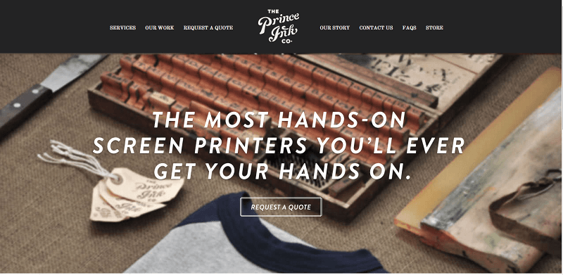
Price Ink’s ghost button changes color
1. Your business website can look more trendy and creative at the same time if you use a ghost button that changes color when the user hovers over it. Visit the website of the picture above to see how its ghost button works.
Ghost buttons complete the professional look of a website
2. Ghost buttons can make it more professional and unobtrusive, especially if you use it as a CTA.
3. You can engage your users to sign up for a product beta, much more if you place it above the fold section. This will enable the visitors to take notice of its presence.
II. Ghost Buttons for Creative Studios Websites.
If there is one type of website that almost always adapts the trend, it’s got to be the creative studio websites. Does this mean that they have embraced the ghost button trend, too? Take a look at the following websites:
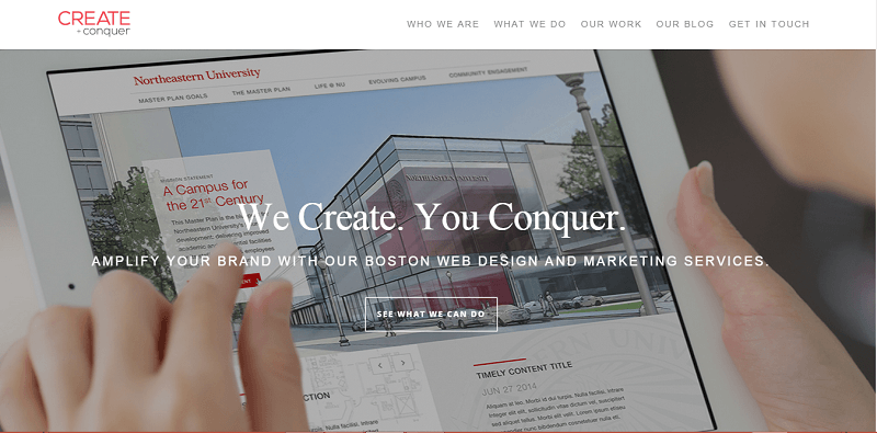
Black and white work well with ghosts
1.Create Conquer
This web site makes use of black and white colors, and its ghost button has the same colors, too. Some of the borders and the text of the buttons are black, some are white. It all depends on the background that they have.
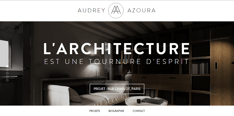
Ghost buttons add to the elegance of this page
2. Audrey Azoura
This furniture and interior design website just ooze with elegance. Apart from embracing the image-focused design, which is also the current trend, this website also makes use of ghost buttons with a color palette that compliments its theme.
III. Ghost Buttons for Software Websites
Many software companies have also incorporated the use of the ghost button to their websites. Many of these websites can give you a hint on how you can use the creative buttons creatively. Some of these websites come with only one ghost button, while others use colorful buttons and conventional shades.
Traditional still works
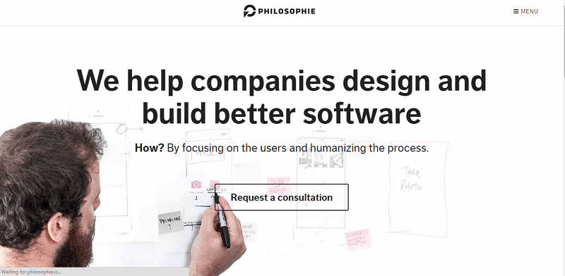
1. Philosophie
. This site makes use of the traditional black and white colors blended with the tone of pink. The designs of the buttons are dependent on the color used as their background.
Using empty buttons work amazingly
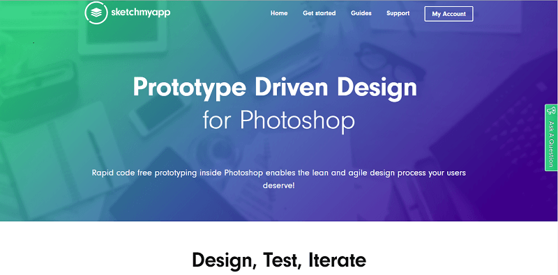
2. ShopMyApp
This website makes use of empty buttons that have a white outline; they turn into green once you hover over them. Additionally, the menu tabs make use of ghost button as well. Cool!
IV. Ghost Buttons for Education Website Designs
Many educational websites have, likewise, adapted the ghost button trend. Well, this is not really surprising as this type of website aims at attracting the youth.
Ghost buttons can be placed in other parts of your website, too
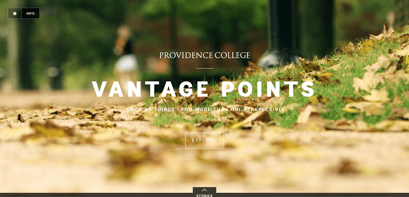
1. Vantage Points
Apart from featuring a video on its landing page, this website also makes use of a ghost button over it. Ghost buttons can also be found in the other pages of the website.
You can try different colors for your ghost button
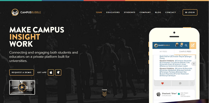
2. Campus Bubble
This website makes use of different colors and so does its ghost buttons. Specifically, the ghost buttons make use of green, blue, and orange colors. Without question, the buttons make the website more engaging despite being simple.
V. Ghost Buttons and Ecommerce Websites
More often than not, ecommerce websites are content rich. Since ghost buttons are simple and thin, they are most suited for these websites.
You can also use the double outline for your ghosts
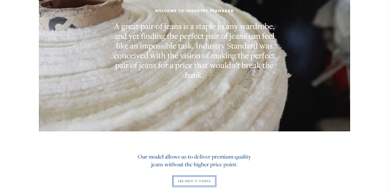
1. Industry Standard
However, Industry Standard’s double outline ghost button, without question, looks awesome on its website design. Double borders simply makes the button more visible.
An image-focused website can also use ghosts
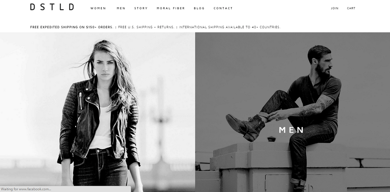
2. 20 Jeans
This online business website is another validation that it is perfectly okay for an image-focused website to employ ghost buttons. The models in the photo are situated at the right, which makes the black text on top of the white background on the opposite side attract attention. It would have been better, though, if the color of the text was different from that of the ghost button.
Its bold text works as if manipulating the eyes to gaze to the direction of the ghost button. Additionally, it only has one ghost button on the homepage above the fold, making it easy for the CTA to be noticed. Furthermore, the CTA makes use of the word “shop”, making it clear to the users what’s going to happen once they click the button.
Without Question, Ghost Buttons are Ideal for CTAs
With the above-cited examples, it should be clear to you by now that ghost buttons are ideal for almost every type of website. However, it is also obvious that many designers of the mentioned websites made of the ghost buttons for the call-to-action purpose. Who knows how the ghost buttons they have made use of work to their advantage in terms of the actions that they desire?
If you are into business, maybe these ghost buttons can help you rake in more sales. Again, who knows? However, always remember that, when adding buttons to a website, there are several things that you need to take into consideration if you want to improve the conversion rates that you’ll get.
It is normal to see a bold button over a simple background or a button whose color contrasts to that of the background where they are placed. This has long been a proven strategy to gather high CTR.
Ideal for Image-Focused Design Website
While it is true that ghost buttons can be employed in many different types of websites, in terms of webpage design, they are most ideal for those that make use of the image-focused design. How many website examples given above made use of the image-focused design with ghost buttons? Several of them! After all, with the simplicity of ghost buttons, they cannot disrupt the aesthetic value that the large images provide, as compared to the traditional buttons do. Additionally, this type of button is also ideal for one-page sites.
Ghost Buttons and your iPhone
Have you ever noticed the round buttons on your iPhone that runs on iOS 7? Well, if you haven’t, it’s time for you to realize that those are actually ghost buttons. Experts have said that the emergence of ghost buttons can be attributed to the fact that people are more passionate about making full screen backgrounds that have 50 % opacity. These backgrounds also make the interface form over them. It is an opportunity for the users to divide their attention to the background image, the reflecting styles, and the ghost elements, which may not be that visible but are, definitely, still visible.
Elements of the Ghost Button Design
As already mentioned, the most basic elements of a ghost button are a transparent outline, button background, and a light font for CTAs. However, these are not just the elements that you need to consider when your incorporate ghost buttons into your web design. You should also make sure that your ghost button is:
- contains simple and readable text
- larger than the conventional buttons
- placed in prominent areas of the page
- placed alone or in a group
- used with flat or almost flat designs
- makes use of geometric icons inside the borders sparingly and if needed
The Advantages of Ghost Buttons
Should you incorporate ghost buttons in your design? Here are some of the good points about this trend that may make you decide to go for it:
- Undeniably, ghost buttons look and feel clean. The simplicity of the buttons allows the main layout of your page to stand out.
- Since ghost buttons are transparent, they can go with almost any design that you can think of. This transparency enables them to adapt to the designs where they are superimposed.
- Ghost buttons are a continuation of the flat design. The only way for design trends to maintain their popularity is to continue the change as they adapt the new concepts.
- Ghost buttons can deliver an element of surprise as they are different from what many users have been accustomed to.
- Ghost buttons provide a great level of ease to those who will create and design them as they are meant to be simple. If you are a designer, make sure to make them subtle and steer clear from anything that may make them flashy.
- Ghost buttons have a way of calling people to act without being obtrusive. You may have already encountered many websites that feature ghost buttons that are large or larger than the other elements on the screen.
- Because they can be made large without affecting the other elements, they can easily attract users to perform the action that the buttons tell them to do. Now, talk about an effective interface.
- The transparent and linear design of ghost buttons gives the designer a subtle freedom as it enables the visual weight on the design to lighten.
- Ghost buttons make a web design sophisticated, no matter how simple the overall design may be, much more if the designer knows how to make use of the right color combination and where to place the buttons.
The Disadvantages of Ghost Buttons
While it is true that ghost buttons have a lot of advantages, there are some disadvantages as well. Hence, before you start working on any design, make sure first to analyze if a trend is suitable. Here are some of the disadvantages that come with ghost buttons:
- Ghost buttons may be placed in the part of the design that can make it difficult for non-savvy users to notice them. In fact, there are people who even have difficulty identifying the normal buttons and don’t know how to use them. How much more with the non-traditional buttons?
- Using ghost buttons over images that have varying or contrasting colors can be a bit tricky. You may have a hard time figuring out how to play with colors that can still make the ghost buttons noticeable despite the background where they are placed. More often than not, ghost buttons are either black or white. However, you may have difficulty using these colors if they are to be placed over an image or background that makes use of the same shades. You have to remember that the efficacy of ghost buttons rely much on where they are placed and how visible they are, despite their transparency.
- There are times when ghost buttons can overpower the image that they are paired with.
While it is here that ghost buttons are simple, the truth of the matter is that they are more complex than “click here”. Since the buttons, more often than not, are small, you need to be very careful in choosing the text that you will use so that it can call a user to act. Additionally, the text has to jibe with the design. - Ghost buttons can sometime lead to legibility problems, much more if they are placed over photographs or colorful backgrounds. There is a tendency for some designers to overuse ghost buttons. While it is true that ghost buttons are trendy, always make sure that you know how to limit using them. Use them for a purpose and not just for the sake of jumping at the bandwagon.
Where did the Ghosts come From?
No one is really certain how ghost buttons came to existence. Design experts can only suspect that they are a result of the combination of different factors that have prompted them to exist and be embraced by many websites. As for its name, is believed to have been coined by Tumblr.
Here are some of the different contributing factors that may have given inspiration to the birth of ghost buttons:
1. The HUD
HUDs (head-up displays) have been in existence from the 1960s and were primarily used in military aircraft. However, it was only in the past couple of years when these became a part of the popular culture and have been used in movies, video games, and car dashboards. Since the data projected by HUD is seen on top of your viewpoint, it is important that this data has to be presented in a basically lightweight and transparent style so that the viewpoint will not be obscured.
Sure, these HUDs are not buttons, but take notice that the elements of the interface are clear and their text-based units are bordered by thin lines. When it comes to introducing the HUDs to the general public, there is no denying that Hollywood films such as Ironman, Ender’s Game, and the Star Trek reboot have provided inspirations to the emergence of ghost buttons.
2. IOS 7
When Apple’s iOS 7 was introduced to the market, users were not as ecstatic about its interface filled with minimal buttons and icons that were bordered by grey or blue lines. However, it is widely believed that these contributed to the eventual emergence of ghost buttons.
3. Nexus 7
Eventually, Google also tapped the use of the ghost trend. Since 2013, it has also used the ghosts in their Nexus 7 website. It made use of a transparent button bordered by a white line, providing a good contrast to its background.
4. Bootstrap
Another contributor to the popularity of the ghost buttons is Bootstrap. It was in August 2013 when Bootstrap 3 was introduced to the market, and it was in its homepage where what seems to be a prototype of the ghost button was seen. Although it was not necessarily transparent, it had a monochromatic background and very simple characteristics. Many people started using what Bootstrap has started as Bootstrap itself is considered an efficient way to develop a website. As a result, more and more websites were developed with the inclination to flat designs and minimal buttons.
Conclusion
In conclusion, beyond the shadow of doubt, ghost buttons can really be remarkable if you know how to apply them correctly. The examples given above demonstrate that a good background is important for the visibility of the ghost buttons. It is also important to use colors that will make these buttons more noticeable. The more simple and basic the designs are, the more abridged they must be.
Now in the next section we will take a look at some of the other best practices.
Call to Action Buttons: A Survey of Best Practices
Call-to-Action buttons play a pivotal role in soliciting action from the user. To garner the requested action, buttons are placed on the website that allow the user to perform an action, such as buying something, or leading to another page for more information.
Careful planning is necessary in the creation of your call to action, and in this article I will explain the best practices for creating effective call to action buttons. I will also present you with examples in action to give you a better understanding of what works.
In order for your Call-to-Actions to work successfully, you must first determine how they’ll fit into the overall scheme of your site. By laying the groundwork, or information architecture, you’ll begin to discover how the buttons work within the web interface. To survive in the market, you have to generate revenue. So, the successful website is that which leads the reader of web page to the desired end result (“Buy Now”…”Learn More”). Now the question arises, how can we make effective call to action buttons which work in the real world.
Factors to Consider
Size
In web design, historically the larger the element, the more important it is. The size of your call-to-action in relation to its surrounding elements is essential in converting users to take action. After all, it’ll be hard to get the intended action from your user if your button is miniscule in size and blends in with the rest of the text.
- Use white space: A lot of what can be achieved from increasing the size of a button can also be accomplished by simply placing the button around plenty of white space. A button surrounded by white space will be much more prominent than one which is lost in a sea of text and graphics.
- The more white space there is in between a call to action button and a surrounding element, the less connected they are. Therefore, if you have other elements that can help convince users to take action, reduce the white space in between those elements and the call to action.

ScrapBlog
You can see the effects of using a prominent color, sufficient white space, and size relative to surrounding elements to attract users’ attention. Straightforward language conveys a sense of easiness, claiming that you can “start” right away by taking action.

Mozilla Firefox
“Free Download” button of the Mozilla Firefox is a true revolution in terms of call-to-action graphics. Its large, unevenly shaped, vibrantly colored and detail oriented button has made its mark in the industry.
Color
To ensure the user notices your button, it’s also important to consider its color. Although there are a few choice colors for a call-to-action button, it can be worthwhile to choose a contrasting color than the background. This essentially makes the button jump toward you, enticing you to click it.
- It has sometimes been said that a red button (and red text links) performs the best
- Perform some A/B testing to see what colors performs best for your website
- The performance of any button may be attributed to the contrast on the page instead of its color

Vuze.com visitors will have no problem finding the download call to action button. The use of contrasting color, plenty of white space, and placement on both the top and bottom of the page make this call to action noticeable and effective.
Placement
An effective button should be clearly visible on a page, and at least relatively prominent in relation to other elements.
- On a landing page – and indeed for most pages, where this is feasible – a button should appear above the fold. The likelihood that a button will be clicked is greatly diminished if a visitor has to scroll to see it.
- Increase the likelihood of a button being clicked by placing both at the top of the page (or above the fold) and at the bottom of a longer page. It’s likely a user may not scroll back up the page if they’ve passed it, or scroll down a page if they already see one.
- Proximity to other page elements is important as well. Obviously for an e-commerce site an “add to cart” button that’s right next to a product should perform better than one that’s further removed.
- In other situations, it is important to keep a call-to-action button close to such things as value propositions, testimonials and feature lists that are intended to stimulate conversions.
You can see these concepts in practice on the website for YourWebJob.com. By putting the call to action “Post a Job!” in a very prominent area, it is more likely that the user will notice it or remember it later, after they have looked at the site’s content.

Mobile Web Design
This call to action button is placed in a prominent location; it has large size and a distinctive color with respect to surrounding elements.

Mobile Cubix
Mobile cubix uses a round outline surrounding the “Read More” button and then leading it to the application that not only attracts visitors’ attention but also informs them what they can expect.

Making Its Use Known
Of course none of these procedures matter if the button doesn’t actually look like a button! You need to make it clear to the visitors that this graphic is in fact a button that can be clicked on to result in a specific action and not simply another element on the page. Graphically speaking there are a number of ways to do this, including:
- Embossing the button
- Placing the call-to-action text in a discreet bordered area
- Offsetting the button from other graphical elements
- Making it behave like a button when the user’s mouse hovers over it
- For buttons that are not hyperlinked (and so do not automatically generate a hand symbol in the mouse over state) this can readily be accomplished with CSS.
- A change in the button’s appearance itself on mouse over, such as a change in color, is a further signal to the visitor that the button is clickable.

Kalculator
This call to action tells users exactly what to expect: by clicking on this call to action, they should anticipate shelling out $3.99. Using the word “only” hints that this is quite a good deal, which can help make the sale.

Postbox adds value through the download call to action by adding that its “FREE” 30-day trial and reduces consumer doubt with the purchase call to action by stating it’s a “No Risk Guarantee!” More often than not web sites calls to action simply ask the visitor to Buy Now! without reinforcing the value or ease of the action.
SEO
A button, in many cases, is directly linked to a page indexed by search engines. Adding an <img> alt attribute will provide the search engines with text they will associate with the target page: if you are targeting keywords on that target place, you should employ them in your <img> alt.
To get the most out of your button, your image’s alt attribute (or, depending on the browser, an <a> title attribute) may be displayed to a visitor when they mouse over the button, providing yet another opportunity to reinforce or your call-to-action (“start your trial today!”).
Additional Resources
How to Create a Slick and Clean Button in Photoshop
10 Techniques For An Effective ‘Call to Action’
The next section will be dedicated to show the worst examples of call to action buttons. You should of course avoid these.
10 Crimes a Web Designer can Commit on Call to Action Pages
Call-to-action pages are dedicated to prompt visitors to take a desired action, whether an opt-in, a sale or any type of click that brings a user one step closer to a company’s goal. Basically, any website can be classified as a call to action page because virtually every person who creates a website has a specific action he/she wants a visitor to take. Most websites commit at least one of the top crimes listed below. Do you agree with the choices?
1. Graphic Clutter

It’s obvious this website’s purpose was show as much information to visitors as possible above the fold. While this is a valiant effort, too many graphics can work against you.
A great call to action page will send your eye to a specific area. When you look at this page, your eyes are drawn everywhere and if you were looking for a car, you wouldn’t even know where to begin.
Though this page is not a landing page, it is a prime example of why less is more when trying to increase conversions with web page design. A call to action page should include benefits, features, logos, maybe one or two images and a prominent call to action button. Any more and the page will suffer.
A website home page should follow suit while including clear navigation and an easy experience for visitors. Avoid clutter at all costs. White space is your friend!
2. Blended Call to Action

Though the call to action button on this page is outlined in yellow, it does not stand out enough from the background. The yellow also matches the font above it so it blends into the background even more. The color scheme of the page is yellow, red and orange and the call to action button follows the same color scheme; therefore, it does not stand out enough. A solid color in contrast to the page would work best.
3. Distracting Background

Many businesses want to incorporate their brand colors into their website design. While this is a smart marketing strategy, if the color is overdone or distracting, it can have an adverse effect. The bright yellow background in this web page is very distracting and it draws the eye away from the purpose of the website. If you view this website in its normal size, you will see how truly distracting the bright yellow background is.
It’s good to implement your brand colors in your website design, but not at the expense of distracting visitors away from your purpose. Your background should support your web page and be somewhat neutral.
4. Lost call to action

On this page, the call to action button is not only lost, it is nonexistent. One of this website’s desired actions is to urge users to click and find out more information about the Thank You® Premier card. The current call to action is simply text that says “Get Moving”.
If you really want to lead users to an intended action, use buttons in contrasting colors. Text will never be strong enough to get users’ attention. The button should include a contrasted color that screams “click me” without slamming it in user’s faces.
Also consider the call to action button’s proximity to other elements. For example, with an ecommerce site, the “Add to cart” button would be most effective if it were placed right next to the product. You can also place call to action buttons near places of interest like testimonials, feature lists and benefits, etc. Make sure, though, not to clutter your page with too many buttons. Keep them close to your key points and at a maximum of 2-3 per page for simple landing pages.
5. Too Much Information

When people offer us more information than we want to hear we often say it is TMI or Too Much Information. Similar to how you would want that person to be quiet, a web page will suffer this same reproach if it is suffering from TMI.
On this example web page, the call to action is not front and center and your eye is drawn to the articles instead of the “Get a Quote” text. This page, while meant to attract visitors to get a quote, leads them towards reading an article which may be too much information for this page. Content is not necessarily bad; great content outlines the pages of some of the greatest websites. But when it blurs the message of the site or distracts users from a clear call to action, profits will suffer.
For this website, a more prominent call to action in a more effective location would draw the eye there first.
The goal with a call to action page is to lead your visitors to click on the call to action button without distracting or boring them with too much information. You should include enough information (features, benefits, guarantees, testimonies) to lead them to take action without overdoing it. If your visitors cannot figure out whether or not your site will be beneficial to them in the first few seconds, they will assume the worst and hightail out of there.
6. Too many Links

This page is actually ranking quite well for competitive mortgage related keywords, but the design of the site unfortunately does not follow suit.
Unless your site is product specific (e-commerce) or purely informational, excessive text links can overwhelm users.
The purpose of this website is to guide consumers to get a mortgage quote. While classifying the links by states is a good idea, the clutter and small font does nothing for visitors’ eyeballs. As stated before, text links are ineffective as calls to action on pages like these and the close proximity of these links jumbles everything together to look like one cohesive blue link.
There is no clear call to action here. This webmaster would benefit from making this page a second page and redesigning the home page to include one or two buttons only, leading people to “Get a Quote”.
Here is a trick: Squint your eyes slightly to blur your vision and look at the page. If your call to action doesn’t stand out, adjustments may need to be made.
7. Button Placement & Location

Though this website is committing many faux pas, I chose it due to improper placement of the call to action button.
If you look on the far right (it probably took you a few seconds to find it, which is a few seconds too long), you will find a small box with a dropdown menu. This is where the webmaster would like a user to click. The only element standing out is the small red arrow and that is even questionable.
The placement and location of your call to action button is equally as important as its size and color. A great call to action will not be effective if it is surrounded by too much text or not enough whitespace, or if it is located out of sight.
Generally, it’s important to keep call to action buttons above the fold (visitors can see it without scrolling), clearly visible and prominent in relation to all other elements. If you have content that is only visible by scrolling, include a call to action button towards the end so users do not have to scroll back up to click on it.
8. Button Size

Your website visitors should know exactly where they need to go the second they land on your website. In this example, though well-designed, this “Buy Now” call to action button seems a bit small for the animation of the site. If you click on the entire website, you will notice a busy background which can distract from the small button as well.
Please note, though, that a bigger button is not always associated with higher conversions. The button should stand out from the other design elements without overwhelming the entire design, which can turn people away as well.
9. Button Text

This website used the word “Go” to urge users to click for a quote. While the design does draw your eye to the quote box, I am not sure the word “Go” is the best choice.
Though there are some basic rules for button text to maximize conversions, it is more of a function of the type of website rather than a general consensus. For example, a business offering a free trial may use “Click Here to Get Your Free Trial” while a service-oriented website may use “Get Started Today”.
General rules of thumb for call to action button text:
- Avoid being too wordy
- Keep it simple
- Add urgency
- Limited availability if applicable
- Use action words like “now” or “today”
- Always split test
When it comes to elements such as button text, the only way to determine what works best is to split test. Sometimes, minor changes can increase conversion rates dramatically.
10. No Clear Message

Many businesses are not clear on their sales funnel; therefore, their visitors are not led to take a desired action. This dealership is trying to push users to perform too many actions at once along with reading text which can be boring for people looking to buy or lease a car.
TIP: The purpose of your call to action is to get users to the next step only. In the case of the dealership, the final goal would be to sell a car, but that should not be the main goal of the website. That is the car salesperson’s job. The website should only urge visitors to take the next step which is to visit the dealership.
Don’t try to sell a car with your website. Just sell the next step!
Have you seen any call to action crimes? What call-to-action crimes have you committed?
With all this talk about ghost buttons and call to action buttons, we have one more thing for you. A case study about usability and call to action buttons.
Case Study: Call to Action in Web Design Usability
 I’ve recently been working on a new website for a very large organization. The organization is made up of numerous policy teams who are all tasked with keeping different topics of interest up to date. The one downfall of this is that each policy team considers their content to be the most important. This has led to every new section being given to us with the instruction of “making it more prominent”.
We keep informing them every time we make something ‘more prominent’ we are taking prominence from the previously highlighted sections, effectively making nothing stand out. While researching the topic, to formulate an evidence based repost for our client, I discovered numerous reasons why it’s essential to distil your calls to action down to only the core outcomes you want from your audience.
Be wary of causing choice paralysis
“…we think, if we provide (users) with 200 brands of peanut butter, they are more likely to find a brand that suits their taste. Schwatz cites surveys done in supermarkets that showed the reverse. When customers were presented with a huge selection of brands of a certain item, fewer customers bought the item than when fewer brands were displayed.”
Choice paralysis occurs when users are supplied with too many similar choices. The abundance of choice leaves consumers confused as to which option to take. They end up not making a choice at all, in fear of making the wrong decision.
Your calls to action should have clearly distinct outcomes
“…it is not so much the number of actions as the distinctiveness of each.”
If you need to provide your users with more than one call to action on a page, try to ensure that your users understand the difference between them. For example, having one call to action labeled ‘Sign-up’ and another labeled ‘Register’ would make it very difficult for any users to decipher which option they should take. If both calls to action seem to lead to the same outcome the likelihood of confusion increases.
We don’t read pages, we scan them
“One of the very well-documented facts about Web use is that people tend to spend very little time reading most Web pages. Instead, we scan (or skim) them, looking for words or phrases that catch our eye.
Steve Krug (Don’t make me think)
If users read everything on a Web page in the order they are displayed, numerous calls to action wouldn’t be as much of a problem. The individual would read the supporting paragraph, decide they want to read more about that and hit the corresponding link.
However, as Steve Krug describes, “we scan (or skim) them, looking for words or phrases that catch our eye”, which means it is unlikely that your users are going to read the accompanying paragraphs and will instead choose where to go next by the text within the call to action. The more call to actions they have to scan through, the higher the chances they will choose the wrong one.
There are only so many ways to make something stand out
Every time our client asks us to make something ‘stand out’ on a page they don’t seem to grasp our warnings that this will dilute previous calls to action. I think the reason for this is because they are used to seeing the page in its previous state and therefore have become desensitized to the previous calls to action. So when we add another one this stands out, to them, far more than any others.
However, a new viewer of that page has no previous experience with it and therefore everything is new to them and therefore fighting for their attention.
There are only a few different design techniques that can be used to make something stand out; contrast, white space, size, positioning etc. With this in mind, when you have numerous calls to action on a page it is very unlikely that any of them will stand out more than others.
More choice leads to greater dismay because expectations are raised
“When people have more choices, they expect more, because they expect that they will be able to choose the exact item that meets their needs perfectly.”
Our client’s homepage consists of a number of pods, with each pod representing a different segment of their target audience. We tried to create broad pods, to ensure that everyone who visits the site instantly notices a section that could potentially be for them. However, our client wanted to present some very specific roles along with our broader suggestions.
This presented the problem that a visitor to the site could see these more specific options and believe that there would be a specific role for them, thus raising their expectations. When they discover that their specific area hasn’t been represented, they could wrongly decide that this site doesn’t have what they are looking for.
However, if we were able to keep the number of pods to a minimum, users would be more likely to want to explore a section that could possibly relate to them.
To conclude
When thinking about the possible calls to action on your site, be sure to ask yourself exactly why every call to action needs to be there. More calls to action lead to a more complicated interface and could possibly lead to more dissatisfaction.
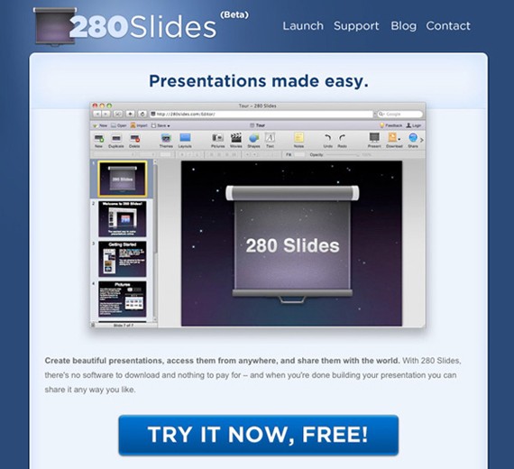
Try to highlight only the most important actions on your site, otherwise you could risk none of your calls to action being noticed. Finally, I thought I’d leave you with an excellent example of a focused call to action.
The guys at 280 slides have decided they want their users to try a demo of their product and so this is the only call to action on the homepage. They could easily have given numerous options to their users increasing the cognitive load, however they have done a great job of focusing their audience on the task they think is most important to them.
Related reading
The Paralysis of Choice and How to Improve Sales and Customer Satisfaction
Call to Action Buttons: Examples and Best Practices
10 techniques for an effective ‘call to action’
This post may contain affiliate links. See our disclosure about affiliate links here.