While different web projects each have different needs, there are some design principles and best practices that are universal to all sites.
In this article, we will take a look at five design tips to revive your stagnate website and some other great tips on redesign, and what to avoid when designing a website.
Your Web Designer Toolbox
Unlimited Downloads: 500,000+ Web Templates, Icon Sets, Themes & Design Assets

1. Think About Conversions
Design goes beyond just the aesthetics. Yes, you want a website to be visually attractive, but you must also bear in mind that a website is not a work of fine art.
Customers do not come to a site to admire the visual appearance. They are there for some actionable reason – to find certain information or to accomplish a particular task.
A successful website is one that understands these needs; thus, its design should lead people to do exactly what they are there to do. With this in mind, you have to keep in mind that the conversion potential of the website is an integral element of the website’s design.
Conversion means people transition from being just a casual visitor to becoming a paying visitor, becoming a member of the site, subscribing to receive additional information from you in the future, or even just completing an inquiry form.
Every aspect of a site’s design plays a role in driving customers to their destination and converting them.
- Images – The images should be interesting, unique, and high quality
- Color – Is the color scheme attractive and eye-catching?
- Text – This includes the use for messaging as well as the descriptions, instructions, and labels
- Navigation – How smoothly can people navigate through your website?
These are just some of the elements that contribute to successful conversions. Basically, if something is part of a site’s design, it is a factor in customer conversions. Consider the two websites used as examples below and decide which one will get higher conversion.

Device Magic has all the elements of a good conversion
So how do you know if your site has made the right design choices from the perspective of conversions? You don’t want to just make a decision and hope for the best. No, you need to test your design decisions and be able to make the necessary adjustments.
A/B testing is a great way to compare the results between two variants of a design. For instance, you may have a large call-to-action button on your site’s homepage. You want to know which color, text, and even placement will be most effective for that button.
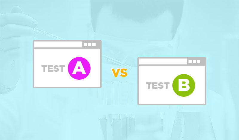
A/B testing is necessary to see what works or not for better conversion
By running a test where some users see one option (A) and others see a different option (B), you can measure the results to see which configuration performs better and results in more customer conversions.
You can then make changes and run additional experiments to try to find the best button option possible. That is the one that should make it in to your site’s final design!
2. Don’t Be Afraid of White Space
Another important property of a great website design is the effective use of white space. To non-designers, white space seems like the areas of the site where design has not been applied. For an expert web designer, however, each part of the space that they use around the images, written content, call-to-action buttons, and every other element of the site is deliberately designed.
Prominent designer, Ellen Lupton, puts it best by saying:
“Design is as much an act of spacing as an act of marking.”
Too often, companies think of their homepage as if it was a newspaper. They strive to fill every available pixel with one kind of content after another, the same way someone laying out a newspaper would fill every inch with columns of copy. This aggressive use of space makes sense in terms of newspaper printing, but websites are not newspapers and people do not consume website content the same way they consume the printed page.
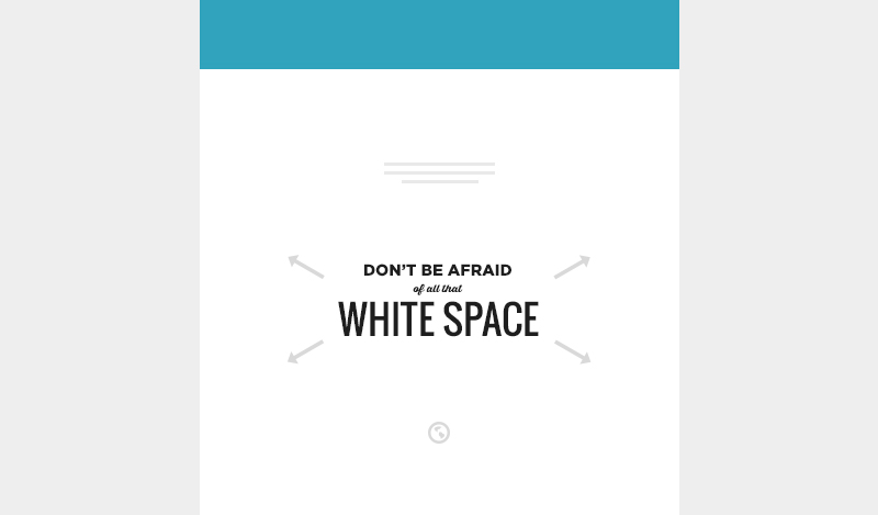
Adequate spacing between elements means a more enjoyable reading experience
For website visitors, adequate spacing between elements on a page allows for a more enjoyable reading experience (more on that reading experience shortly). It also allows them time to focus on the individual pieces of a page without being overwhelmed by everything else around it. White space gives content time to shine without fighting for attention against all of its neighbors!
One very interesting way of using space is parallax scrolling. Parallax is an effect where the foreground images on a website move at a different speed than the background images giving that site a sense of depth and motion. This effect can be used very effectively as a storytelling device.
Different page elements (images, text, etc.) can appear on screen at selected times as a user scrolls through the page. To make these elements have maximum impact as they appear, good use of timing and effective spacing is essential.
Many designers are intimidated by the technical demands of parallax scrolling because the website code needed to power that parallax scrolling can be daunting for non-developers. However, there are parallax scrolling plugins that are actually intuitive making it easier to add these effects, as well as the proper spacing between these animated elements, to your website – all without needing to write one line of code.
3. Typography, Typography, Typography
While awesome videos and stunning photographs may get much of the glory online, the reality is that the Web is predominantly text content. If there is one area of your website where some extra design attention can go a long way, it is with that site’s typography.
For years, websites were limited to only being able to use a handful of “web safe fonts,” such as:
- Arial
- Verdana
- Times New Roman
- Georgia
- Tahoma
- Lucida
- Impact,
- many more
These were fonts that were essentially guaranteed to be installed on your computer (since this is where a website reads its fonts from). In recent years, however, font selection for websites has taken a significant leap forward with the introduction of @font-face.
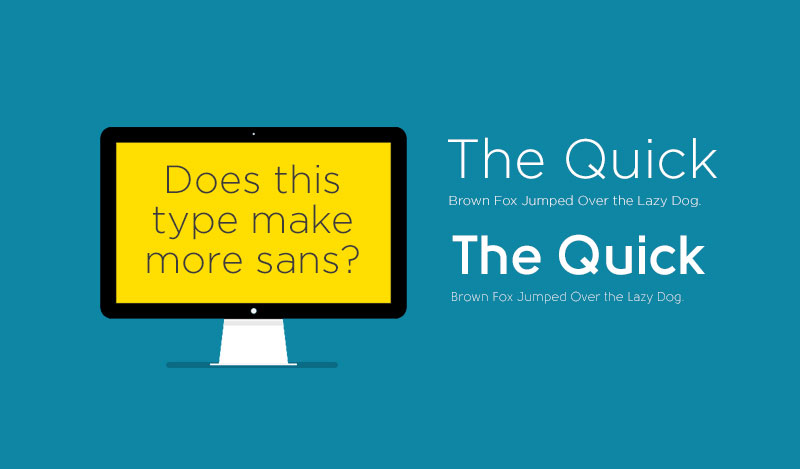
Never underestimate the power of fonts
With this method, font files can be included along with other resources, like images, that a website needs to use to display properly. Instead of getting fonts from a user’s computer, a website can instead use these included font files allowing that site access to a staggering array of font choices used in that design!
While having access to more fonts is great, how you utilize them is still important. In fact, with a big number of possibilities available to web designers nowadays, strong typography skills are more critical than ever before.
Moreover, having a plethora of fonts to choose from is awesome, but you still need to make the right choice for your particular project. Understanding what type of font (serif, sans-serif, slab-serif, display, etc.) is appropriate is the key.
Typography is not just about font selection, but also about the size and color you use for the message as well as the weight of the letters, the spacing around those letters and words, and so much more. Above all, it is about text content that is easy and enjoyable to read. Here’s a good example:
Design Can Change
Design Can Change is a good example in using the right elements mentioned in this article. The black and white font in various sizes gets the message clear inside a background of bright red with enough white space that leads you to read the short but powerful message.
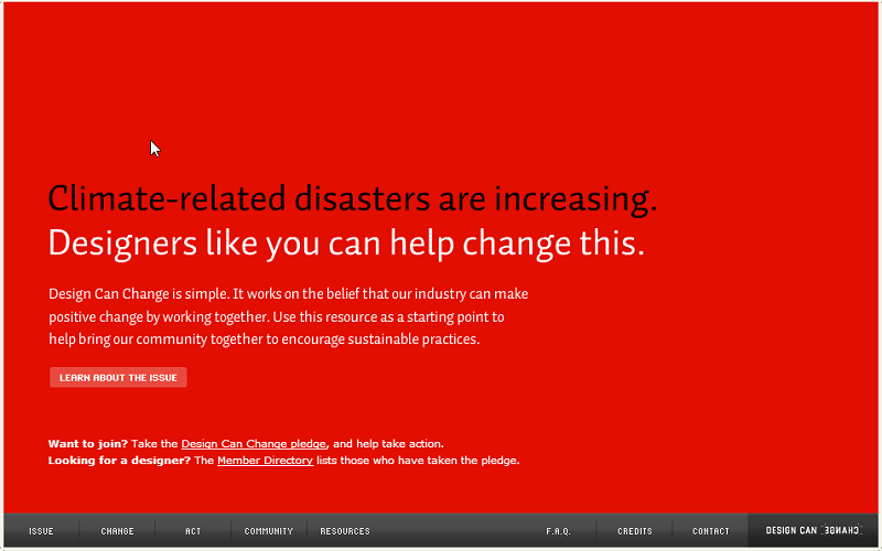
Design Can Change is a good example of balance
Remember, a website is not just a pretty picture meant only to be admired. If your site has text (and which site doesn’t), then it is meant to be read! It may be a content writer’s job to say the right thing with your site’s messaging, but great typography will ensure that the message comes through loud and clear.
4. Add Less, Not More
One of my favorite design-related quotes comes from Antoine de Saint-Exupery:
“A designer knows he has achieved perfection not when there is nothing left to add, but when there is nothing left to take away.
When designing websites, there is always the temptation to add “more stuff”. Clients request additional features to be added, they want more buttons squeezed into the navigation, or they make some other request to pile more into their new website.
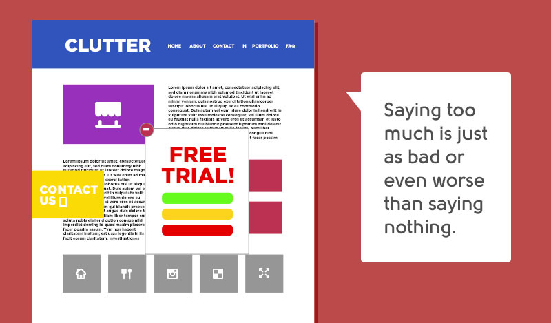
A few well-meaning words are more powerful than a plethora of information if you want to make a point
Adding elements or content that is necessary for success is fine, but anyone who has even had these conversations can attest to the fact that everything being added is certainly not necessary. Too often, these additions add clutter to a design instead of clarity. Therefore, instead of contemplating what else you can add to your site, look at what you already have and determine what can be removed.
Take that aforementioned navigation bar, for example. If you have 10 links or tabs in that navigation, your visitors will take longer to determine which link is the one they need than if you only have 8 options. If you can whittle it down to 5 or 6 options, you are in even better shape!
Less is more in this case because the fewer options someone has, the quicker they can make a decision. With the impatience of most website visitors and the immediate access to content that they demand, the type of clarity achieved through the reduction of elements (in this case navigation links) can be hugely beneficial.
Another example of the “less is more” principle is when you are trying to emphasize something on your site. Think about the typical homepage for a minute.
Many companies use this page as a platform to promote every possible piece of content that their customers may need. They add so much content to that page trying to emphasize all of it by making things big, bright, and bold. What happens when everything is emphasized, however, is that nothing is emphasized.
When every element of a page is screaming for attention, the message and purpose of that page become lost in a cacophony of noise. By removing elements, those that remain will automatically have more focus. Instead of trying to add visual treatments to a specific part of the page to emphasize it by making it bigger or bolder, try taking away the stuff that surrounds it and use the principles of white space that we covered earlier in this article.
Once the remaining element has broken free from the clutter that surrounds it, it will, by default, be more emphasized because it can now shine without competing with other page elements.
5. Have Fun… but Don’t Go Overboard
One of the goals you most likely have for your site and for your online presence is that you want to make an impression on your visitors. You want them to remember your business. One of the best ways to achieve this is by adding some “fun” to the experience. After all, a fun experience is one that people enjoy – and if people have an enjoyable experience, that is also often a memorable experience.
Now, your initial reaction may be that you cannot have a “fun” website, but let’s define what we mean by “fun” here. Fun doesn’t mean silly. A website can be both fun and professional at the same time by also adding a layer of delight to the experience. It means taking what is mundane and replace it with something memorable!
However, you must not forget that there is a line you must be aware of when adding “fun”. It is easy to go too far and get distracted from your primary goals for a site. When using this approach, it is important to know where that line is to avoid going overboard. Just remember, there is always room for fun and delight in a website experience, but it is your job as a designer to find where the line between “too much” and “just enough” is and to help bring your site to that point!
In Closing
If your website is in need of a shot in the arm, then a healthy dose of design, including the 5 tips covered in this article, may be just what the doctor ordered.
This post may contain affiliate links. See our disclosure about affiliate links here.