You won’t have any trouble finding trend reports, either. They are ubiquitous this time of year. But while others are focusing purely on what aesthetic choices are being made, The Deep End decided to dig a little deeper and show you only those trends that actually have the potential to increase conversion rates.
So whether you put these trends to work on your own online portfolio, or use them on client sites, you will not only look extremely current in your style and execution, but the result will also be goal-focused.
The UX Designer Toolbox
Unlimited Downloads: 500,000+ Wireframe & UX Templates, UI Kits & Design Assets
Starting at only $16.50 per month!
And at the end of the day, if a website doesn’t help you or your client achieve some kind of business objective, it isn’t even worth the monthly hosting fee.
Check out the infographic below, followed by some key takeaways.
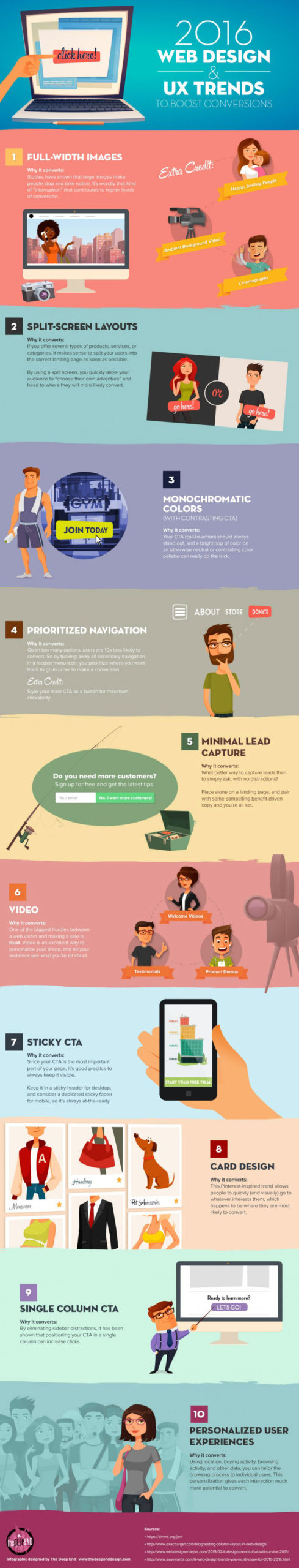
Main Takeaways:
- Full-Width Images: Using large, full-width images, videos or cinemagraphs draw people’s attention, increasing the likelihood of a conversion click. Images of people connect especially well.
- Split-Screen Layouts: These are a great way of splitting an audience, and funnelling them into whichever area on the site they are most likely to convert.
- Monochromatic Colors (With Contrasting CTA): By giving your call-to-action button a bright pop of color on an otherwise monochromatic background, it will much more likely be noticed. And a noticed CTA gets way more clicks than one you have to hunt down.
- Prioritized Navigation: When you successfully give a hierarchy to your navigation items, you can often direct your users exactly where you want them to go in order to complete a conversion. This is accomplished by providing only your most important pages in the navigation bar, hiding the rest in a secondary navigation, and drawing extra attention to your main CTA by styling it as a button.
- Minimal Lead Capture: You can increase the amount of email addresses your users provide you with if you remove all distractions. All you need is a strong headline, persuasive subheadline and a single form field.
- Video: Videos are a great way to build trust and show your audience who you are. Breaking down this barrier and winning them over will result in more leads and sales.
- Sticky CTA: Always keep your CTA visible. A fantastic way of doing this is keeping it in a sticky header, sidebar or footer.
- Card Design: This Pinterest-inspired design allows users to quickly see and click on what interests them the most, where they are most likely to convert.
- Single Column CTA: No matter how many columns a website uses, by interrupting the flow and placing a headline, subheadline and CTA button in a single column (with plenty of white space around it,) has been shown to increase clicks.
- Personalized User Experiences: By keeping track of what a user has already looked at, and providing them more of the same on subsequent visits, (much like Amazon.com does,) they are much more likely to pull the trigger than if they had to go looking for it all over again.
This post may contain affiliate links. See our disclosure about affiliate links here.